Would the WebGL build be ok?
wierdest
Creator of
Recent community posts
Hey there! Great idea! I don't know what happened, I couldn't sign the contract and kept drawing aimlessly waiting for a heart attack that never came (I mean this in the best way possible). That's why I never sign any contracts at the airport.
By the looks of it you had lots of fun putting this together, and I hope you did. It looks fun, a little rough around the edges, maybe, but great effort and an original gaming experience, for sure!
Hey there! It was fun to swim around! Controls were difficult to grasp, but made sense. The writing was terribly difficult to read. The white font against a bright background was too much. Maybe a black outline? Despite that, I stuck with it and the swimming mechanic was worth it!
Art is cohesive, too. Overall a fun gaming experience! Congratulations!
Hey there! I really like this take on the theme. I myself did something similar for my submission!
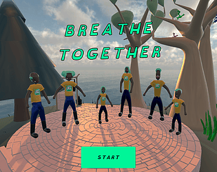
I agree the controls should have been simpler, maybe a press for inhale and release for exhale?
Another thing, the bar position needs to be at center vision, because that's what I'm trying to hit, right? Actually the decision about the bar is crucial. I would have used two separate bars for inhaling and exhale and maybe the circle animation for hold, like | o | or I would have made the bar horizontal, at least.
I missed the elephant in the game screen.
Other than that, tastefully executed! Congratulations!
Very good implementation! Incredibly scary and anxiety inducing! Great atmosphere!
I guess in the game's predicament taking deep breaths is not the best course of action, since the oxygen supply is low.
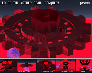
By the way, I couldn't figure out if there's an indicator for player oxygen? There's the oxygen supply, and the warning "don't forget to breathe", but I missed stronger indication. Also, I kept trying to read something about Lazarus on the bottom of the screen which I couldn't , because the screen was shaking. I think you definitely reached your goal for the gaming experience, congratulations!
Wonderful game! Solid experience, lacking nothing but the polishing touches necessary to become a real game. There seems to be a lot of words in the story, I mean, I don't need to read "the bad guys hurt people", if I can see the zombies doing just that. Your game made me realize the true gist of the theme, even.
I had thought that the theme's idea was related to: "stop and relax" instead of "tighten yourself up and keep going", even though I have already seen multiple games working the same angle. The key word was "plague". Wonderful narrative choice, now that I think about it. You went far back in the past to draw a parallel with what people are doing today. Everybody's doing that right? Holding their breath as they pass people they once knew, right? At least in very populous places. One thing that stands out is the position of the player as hero and not someone who's trying to escape. That was also key.
The more I think about, the more I think that if it were up to me (mind you that I still have to review about 300 games), the narrative choice alone could be enough to win first prize.
Glad I got to review this! Thanks for your work, and, although I'm not much of a gamer, I'll keep an eye out for Wilk Games!
I totally get that as it was the same for me. I left the part of instructing the player to the end of the jam. It was really stressful putting that part up in short time. In your case, you have to have a script that tells you what the mouse is hovering over. It's a fun project and you'll definitely be able to reuse that script in future games!
So, it's the default option! I'll have to experiment more with the itch settings! Thanks!
Solid game, everything seems to be working as expected. I think the colors could be more cohesive. I liked the pacing of the game. The narrative was well laid out, I didn't get to the part where they explain what the slime did to deserve so much hate, though. There was a robot saying "at least that slime can't jump', as if the whole architecture of the facility had been made to keep slimekin away?
Fun! Thanks for sharing!
Awesome! Great change of pace from what I've seen so far, original.
I had some trouble with the tutorial, mainly because of the white text. Black outline would be ideal. I had trouble following it, and at first I couldn't understand the goal of the submarine. I have poor eyesight, too, so it was a little tiresome.
I also thought that it was so long. I was unable to memorize all the functions. Maybe a text that could show the name and details of the instrument I'm hovering with the mouse? I noticed there was an element that said "New text"...
Overall a solid gaming experience! Thanks for sharing!
Another thing, please: you gotta tell me how you got the game embedded on the itch page like you did! It's the best so far, so neat. How do you get the player to pop and increase size like that? Is it a custom html file?
Hi there! Great atmosphere! I loved the attention to detail in the artwork. Art seems very cohesive, too, as scary as pixel art can be!
I was doing the tutorial when I noticed that the "holding your breath" mechanic has to do with the lighting circle around the player? It doesn't prevent the monsters to get to you, but it reduces the chances of an encounter, right? That's an interesting choice.
thought that it was really difficult not to get chased, even in the tutorial, but the difficulty didn't send me away! Fun experience!
Hey there! Great work with the art and overall feel.. Animations are very satisfying, effects are really cool! I'm not much of a gamer myself, so it took me over 3 minutes to jump in the black hole at the start of the gaming experience. Here's my thought process:
"I'm not sure how I influence the enemy. I mean, I know I can click and do the dash thing if I hold the mouse button down, but is it the same as the attack? I mean, do I have to hit the black hole or just click when I'm near but not too near it? I feel I didn't understand right what to do."
Anyway, it was very satisfying to interact with the elements, congratulations! Thank you for sharing!
Definitely needs a ton of polishing. All modeling & art was done exclusively for the jam. Since I did all the coding myself, I had to scope out a lot of ideas. Originally each character would have had a job and a specific area of the island! I think it's very interesting you say: "The mechanic is too simple and can be confusing". I usually think of "simple" things as not complex. Any more specific ideas for number 5? About 6, I don't think I will take this idea forward, at least for a couple of months... I'm thinking about making the assets available (after removing the lv99 logo, of course) Thank you so much for your thoughtful feedback!
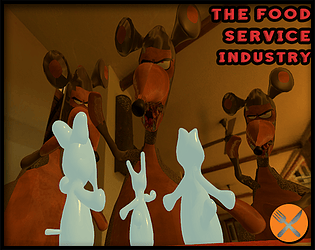
So fun! Wuffle = a gentle sniff or snort. There's a lot to learn here: how straight to the point you were with the minigames. Simple controls, allowed me to get back every time to start again.
I think that you should have the narrative angle that the wuffle is just something the job requires you to do, like a fashion model has to hold breath to keep still for photos or a chef may blow on the fire... The attention to these real details is a really strong point for the fun here.
Congratulations! Thanks for sharing. I learned a lot on how to be clear.
Amazing! Very fun indeed, great attention to narrative, with a personal touch and subtext. I agree with the other comment: the death animation is really good! Way to go! I think that after the death, you could replace "You lost" (in the narrative text) with "You blew it!".
That's more of a "relationship word", and also a pun. I'm a casual gamer, so I couldn't get past the 2nd level, so the story didn't develop fast enough for me. I expect there's the possibility of reinflating, eventually?
I loved the bold choice of metaphorical images to compose the narrative. I imagine the thought process was something like: take a deep breath -> we are like balloons in love -> we feel inflated or deflated by some romantic happening. Love requires energy, another word for energy could be gas, and so on.
It seems really well made! Very scary premise, it seems perfect for a hardcore gamer who's into difficult platformers! I'm more of a casual gamer, so I thought it was really hard to see at the beginning and I wasn't sure of the controls. I read part of the instructions (very wordy, I find it that the message has to be very visual in games) but couldn't retain the controls. Sorry about that. It's the second time I see the idea of "holding your breath slows down time". In your project that seems to add up to the lighting difficulty and made the game experience scary, indeed! Congrats!
FUN! Incredible what you did in so little time! Colliders are on point, it's perfect the way the bad guys jump on the robot! Way to go, mate! I liked how responsive the sound was, although the blips become a little tiresome after a while. Very satisfying to catch a wave, I mean, the blue area that boosts you up? The turning animation was cool too, the robot's expression is altogether insane! I didn't care too much about the shooting part... Make it a vertical escape game in which catching the wave is primary goal, then it would maximize what I loved most about it!
Thanks for sharing., and please do continue making games (you mentioned in the page this is your first)!!
LOVED THE MECHANIC!
Great use of sound, too. Movement is very satisfying, juggling the head is great, Altogether an amazing effort! Cohesive artwork, for the most part (the entrances seem a little too dungeon-like)...
The soundtrack could be expanded, it got a little tiresome after a while.
I'm not too good at puzzle games, so maybe my taking too long in moving levels is to blame there! I was more interested in seeing how well I could juggle my own head!
Really inspiring work! Thank you for sharing


