Play game
Mahou Shoujo Tactics's itch.io pageResults
| Criteria | Rank | Score* | Raw Score |
| Gameplay | #5 | 3.833 | 3.833 |
| Overall | #6 | 3.813 | 3.813 |
| Magical Girl Use | #8 | 4.167 | 4.167 |
| Creativity | #10 | 3.833 | 3.833 |
| Art | #12 | 3.417 | 3.417 |
Ranked from 12 ratings. Score is adjusted from raw score by the median number of ratings per game in the jam.
Theme(s)
Miracles and Magic are Real
Leave a comment
Log in with itch.io to leave a comment.


Comments
I had fun playing your game. A fresh tactical. I'd love to see what is your next game, or what is the sequel of this game.
It was fun!
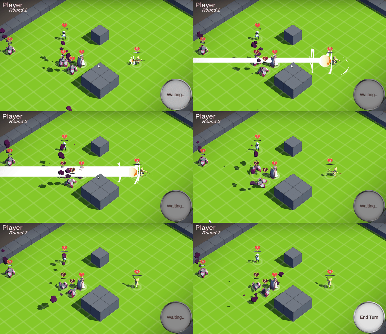
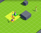
I wish it had a tutorial, though. During my first playthrough, I couldn't figure out what the yellow girl's charge was supposed to do, so I just kept attacking using the blue girl. I eventually figured it out, though.
Will you be working on this more? I want to play more stages. It looks so nice!
I'm definitely planning on building a magical girl tactics game, though I doubt it will be a continuation of this one specifically (there was a proper setting/story I had in mind for it I dropped for the Jam, along with a bunch of other mechanics like line-of-sight that would take too long to implement)
A-And yeah, Yellow's attack is pretty jank. She was implemented late and the ui for issuing orders wasn't really built for ranged attacks like hers so I had to cludge it with what I had in the time remaining.
Pretty good prototype!
It's a bit short, but very polished. Would it be take too long to add a harder enemy, even if it's just a normal enemy with higher HP? I think the game suffers a bit from how easy it is.
I never figured out how to move the camera, does it say anything in the game itself? I could only find it in the comments.
I'd love to see a longer version of this. Now that you have the basic code laid down, it should theoretically be easier to add more content, right?
Good job!
There was a harder enemy planned; implementation would probably be ~1 day's work modelling and animating, and at least another finagling them into actually being fun to fight against, going from experience with the Jam. Unfortunately, I was still implementing the Defender and some of the Interrupt orders even on the final day, so they got dropped.
I admit I kind of assumed the camera movement was self-explanatory because 'that's how it usually is', or so it seemed to me. Really, the game needs a tutorial in general.
Honestly I wouldn't mind just having the same enemy with more HP. In a full game I'd prefer avoiding such variations, but it's a jam game, so I think it's OK. And it'd be enough to make the level require a bit more strategy!
Good job nonetheless!
Holy cow! This is great! It has developed so much! But aww man? Just one stage? :3
I was literally still implementing the last MGs and orders at the very end of the Jam. You're lucky the map even has benches in it :'D
This was one of my most anticipated entries in the jam. It was short, but that's okay because it was pretty fun!
Glad you liked it!
And yeah, I'm sorry it's so short. There was... there was a lot of stuff to code...
Definitely a cool prototype. I've always loved games like FFT, Shining Force, Advance Wars, etc, so this is up my alley! The character and enemy art looks nice.
It was over pretty quick, and there was a bit of clunkiness to the controls, which holds it back a bit at the moment. But this feels like it has real potential! I second the call to see this progress beyond the jam. Nice work.
Glad to hear! I'm definitely continuing with the magical girl turn-based system after this, though probably not as Mahou Shoujo Tactics (there was a different project I had in mind for it I didn't use for the Jam because... well, no chance in hell of building it in time).
Could you expand on where you felt the controls were clunky? I presume this was some of the orders?
Yes, giving the orders sometimes felt... hmm... off. Like not quite as slick or satisfying as it could be. There was also a moment that I thought the game had frozen, but it was in a command without showing it on screen or something. I can't remember what exactly happened, but I clicked around a bunch and finally got the command to pop back up. I wish I remembered what it was exactly, because that was not helpful debug info I just gave you.
I'll give it another spin later and try and give better feedback. I played it late last night with a bunch of other submissions, and now my brain is mush.
Ok, I played it again! Overall, the controls work. Maybe I was tired the first time, but I got the caster to work this time. (Last night I kept charging and firing with no result)
As for the thing that felt like a freeze, I figured out what it is. When the enemy attacks the shield girl, if you accidentally click on a random tile instead of "tank" everything "deactivates" and just sits there. If you hit the cancel button, it goes back and the "tank" option reappears. When it happened the first time, i didn't think to hit cancel and it seemed like I couldn't do anything at all, and the enemy was just waiting in place, not attacking. Through accidental clicking I figured it out.
This one is a tough one for me to rate, to be honest.
One on hand it's very, very prototype-y. There's a massive hitch/lag spike every time you hit an enemy. The balance is poor, there's only one level and an incomplete menu. The UI is minimal and you can't move the camera.
In other words, it doesn't feel right to evaluate it as a complete game because that's not what this is and clearly isn't what this is meant to be.
The concept is good, the basic mechanics all work, and taking on this type of game for even a two week jam is impressive. I'm not sure if the art is meant to be placeholder but I actually really like the style and wouldn't mind playing a finished game that looked like this.
I'd really like to see this one developed post-jam because it has a ton of potential.
Aha... the lag...
That's actually not lag, that's a deliberate 'pause' (as in, I coded it to wait) whilst the AI 'decides' what interrupt to take. I wanted to make it more clear with some SFX and turning the screen grey but I didn't have the time. The simple AI mooks don't even Evade that often anyway.
Camera is middle click + drag. It's still not great though (you can move it whenever, including when your probably shouldn't, though it is at least limited to the map's bounds)
Yeah, if I had more time I'd try to clean things up more; more levels, more enemy variety etc.
The art is... the art is hilarious. The textures are 99.9% gradients whipped up in photoshop and creatively applied by abusing uvs. It shouldn't work. For all that though I agree they're weirdly compelling. My two complaints on that front (again, lack of time) is being able to give the MGs faces / expressions and having to battle the unity lighting system not to wash out all the colours.
Could you expand on where you feel the balance is poor? I realise having the one enemy type shoots it in the foot out of the gate but still.
Ah, okay. I mistook it as a bug, I didn't realize that it was something partially implemented. I missed the camera entirely as well.
Sometime things that shouldn't work, do.
In terms of balance, two things stuck out to me. I was able to win easily using just the blue character and the pink character; the enemies were very weak and there weren't many of them. The charge attack was also very difficult to use effectively. I think these are probably issues related to the limited scope of this demo but maybe some tweaking could be done.
Finally, a submission that I can play. I cannot overstate how happy I am ^^
Briefly played it. So far looks so great -- tho I didn't do anything that tests the game to the extreme to find any bugs. I think you should add a way to choose which enemy to attack though. Good luck!
Er... you can? Or you should be able to?
Could you describe what happened?
Hm? I should be able to? Let me check again...
Nvm. Okay, I can choose. The last time I tested it the enemy unit eligible to attack was only one :P
Aaaah, yeah. Hmm.
Would you say it's better to keep the 'auto-target when there's only one option' or just mandate the 'pick a target step' every time?
Hmm... in most other games of similar genres that I have played, it's always 'mandate pick a target step'; feel-wise I feel more in control. But it's up to you
Having messed around with it a bit, it feels significantly worse simply because it's not clear there's been a change in state. I'll need to show info/effects on the unit you're targeting at some point though so it'll probably work much better then.
'Prolly make it a menu option or something.