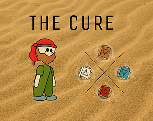
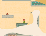
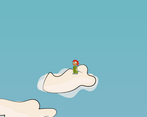
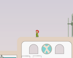
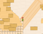
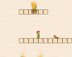
This was a really interesting entry. I liked the concept and I felt compelled to see it through to the end. I feel mixed about the art. On one hand, the background design is excellent and almost has some watercolor paint vibes, but the design of the foregrounds and platforms led to a lot of very confusing jumps. Overall, the art and music gave the whole thing a surreal vibe, especially combined with the way the levels would suddenly morph (and i mean that in a good way), like i felt a fun discomfort at climbing a tower and then suddenly jumping on solid clouds. The actual mechanical feel definitely needs polish, but you are aware of that, and my game needs it too. Great job just finishing an entire experience. I had a fun time with it!
Play game
The Cure's itch.io pageResults
| Criteria | Rank | Score* | Raw Score |
| Metroidvania | #7 | 3.833 | 3.833 |
| Enjoyment | #10 | 3.333 | 3.333 |
| Overall | #15 | 3.396 | 3.396 |
| Design | #19 | 3.167 | 3.167 |
| Presentation | #25 | 3.250 | 3.250 |
Ranked from 12 ratings. Score is adjusted from raw score by the median number of ratings per game in the jam.
Engine
Godot
Team/Developer
Re-animando Games (3 people)
External assets
Kenney's Sound FX, Youtube public library Music,
Comments
Great entry! I like the art, sounds and mechanics, i like the most the teleporting mechanic, nice work!
I love fast paced games, if you play lots of games in this jam you'll notice this is rare, most games have a very slow movement, which for me is very annoying. I loved your movement.
You combat on the other hand, is very unpolished, I didn't like that the enemy makes the same sound when hit, as my character does, also a little knockback would be good, the punch feels more like blowing air or something, than an actual strong punch.
I liked the mechanics on the powerups too, very nice.
Overall a great submission!
Super cool game really enjoyed it and finished it. neat artwork, good interpretation of both the metroidvania and alchemy theme, and the gameplay is really fun. Only negative comment i have on it is the character falls really fast like the gravity is too high but it barely affected gameplay for me. Overall a really great game!
I like how different this art-style is to the rest I've seen. I also liked the level design and how everything is structured.
However, there are some points that affect the final product:
- It may be me, but I feel that the gravity is too heavy. It makes the platforming sections feel a little wonky as you land almost after you've jumped
- Certains parts are confusing as there's just an invisible wall that prevents you from going to an area that seems to be accessible
Those are my main criticisms about the game, but I also have to say that I enjoyed exploring your post-apocaliptic environment 😄.
Too bad I can't play your game, even downloading it, I couldn't play. But I left my vote
I really enjoyed this game! I got a little confused at the controls (space to me is jump) and the fire puch felt a little slow but the abilities were all great and loved how the built on top of one another. The column area with the dash grabs was a particular favorite! The enemies felt like a mild annoyance rather than giving me anything to worry about.
The overal objective was not super clear, as in what am I looking for - It might be useful to give one early or show one so I know what I am looking for, but thats fairly minor.
The art was nice but the player was a little blurry when moving, also some of the props blended to much with the background and it was challenging just to read the level at times. But overall this is a solid submission and you all should be proud! Great submission!
I really liked the art in this game. I do have a couple criticisms though. It may just be me, but I felt like the art layer above the player was a little much. If they were objects like columns or something distinct it would work, but in this case I think it hindered my play through. Also, I think the gravity was a little too high. Movement felt restrictive. Other than those items mentioned, its a good entry into this jam!


Leave a comment
Log in with itch.io to leave a comment.