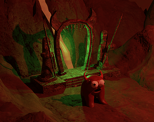
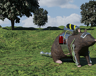
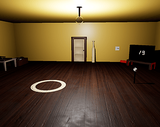
This is a genuinely cool game. I love the look and I love the little puzzles and the way the character moves around. Very nice 10/10
GameJay2112
Creator of
Recent community posts
I've never used Blender Player before so I'm probably missing something, but I click the green icon "The Apprentice.exe" and nothing runs. I see a black cmd window pop up for a second but then nothing. My artist can't run it either, but neither of us have used Blender Player before. We're both using Windows 10.
The game looks really neat, and it's really cool seeing games made with Blender. I love the idea of mixing together concoctions to unlock portals. I also am a sucker for wizard type characters, and the UI looks really polished, I really love the look of this game. Looks like a great submission!
Thank you so much for playing! We hate the walls too; the maze is gone in the upcoming build because it's annoying (it was a total misstep on my part. I thought we should incorporate a mouse maze but then it was too late to take out). We're glad you also found the menu music funny; the whole game is going to be designed around a comedic story eventually. We appreciate your constructive feedback and your kind words, thank you!
Excellent submission with great graphics, neat effects, fun upgrades, and with a very fresh (but still very Metroid) feel. I love the player character, it looks great, plays great, and I am a sucker for tank treaded robots for the main character. Great game, I'd love to see more development on this.
Thank you so much for playing! We hate the maze too, it's gonna get 86'd in the newest release. It was a miss on my part, I thought it'd be clever to start with a mouse maze, but it just ended up as a pointlessly annoying obstacle for the player. We always appreciate constructive feedback and thank you for your kind words!
Thank you for playing! Yeah maze is gonna get deleted first thing (already gone in the build I'm working on), it's a really annoying maze. The red arrow is over the center of the maze which somewhat helps to guide the player to the end (the end is in the center) but it's just not fun and very annoying, so it's gonna get cut for sure. The player isn't shown while moving as well as it was before, but originally it was positioned high so that no one can see we haven't animated anything (a pretty hacky way to band-aid the problem). We really appreciate your constructive feedback, and it helps us build a newer and much better version that will come soon. Thank you!
This is an excellent submission. I love the game feel, I love the way the upgrades show a short title of the upgrade when you get them, the melee attacking feels nice and works really well, the platforming design is challenging enough but intuitive, the boss fight killed me (because I sucked at it) and I think it's really impressive (really nice animations and design), and great polish in the UI and design. Great submission!
Thank you for playing our game! I wanted to add a slew of new HUD notifications and pause screen tips to direct the player, but I just ran out of time. It's not a very intuitive opener, and a lot of the mechanics don't quite make sense yet. A new release of the game is planned to come out soon (much more optimized, probably no maze since it's annoying, and much more intuitive). We really appreciate your constructive feedback and your kind words, thank you!
I'm really sorry about that, I goofed up and didn't have time to fix it, so it plays pretty terrible. I'm working on a version of the game with much better optimization, it's mostly complete and it run 10x smoother. I appreciate you trying the game and graphics settings would definitely be in this new version.
Super cool game really enjoyed it and finished it. neat artwork, good interpretation of both the metroidvania and alchemy theme, and the gameplay is really fun. Only negative comment i have on it is the character falls really fast like the gravity is too high but it barely affected gameplay for me. Overall a really great game!
Thank you for playing our game! Ah crap, I completely forgot to add controls to the page. The whole game is pretty bad framerate for right now, but the Forest zone is even more incredibly unoptimized. We found out what was causing the whole issue (just the little blobby guys that hop around are using tick event heavily and I put too many in) and we hope to put out a post jam release that runs nice and smooth really soon.
UE5 so far has been kind of a nightmare because a lot of stuff doesn't work completely right and having to stop and find the issue bogged our development down quite a bit. We do really love the engine and all of its new features, but we can't wait until they release a non-early access version.
Thank you, UI was a big focus for this game jam. Relearning how to do certain things in UE5 made it take longer than expected so the actual look and design of the UI is still %99 placeholder assets, and I really wanted to add in a save/load menu, but I didn't have time.
I really appreciate you trying the game out, your kind words, and your very helpful constructive feedback. Thank you so much!
Metroid Prime was basically fps and is probably my favorite Metroidvania I've played. You can make almost anything Metroidvania, it's all about having the progression directly tied to upgrades made to the player. Like upgrading the player's normal blaster to a flame blaster that can be used to melt an ice obstacle, unlocking a new area to the game.
I'm always very impressed with how polished these games from ProdigalSon Games are. Very well put together, clever level design, and I love the atmosphere that the art, music, and gameplay culminate to produce. Nice touch limiting to 8 colors per screen in order to be faithful to the 8-bit style. I also am a sucker for games where the player is able to equip armor and weapons, especially when the mechanics make it feel fresh and unique like the mechanics in this game do.
I love this game. Really nice and simple. The artwork and audio are perfect, I wouldn't change a thing. The game is really fun to control and I like the game feel, it really feels helpless when you accidentally run out of stamina right as a fish comes after you. I think this would make for a neat game where maybe your plankton keeps getting bigger and upgrading until it becomes a huge monster plankton and takes over the world (sort of like Katamari Damacy how you grow and grow until you can conquer larger and larger enemies and eventually eat the whole world) or something like that.
The bugs unveiling the level platforming is a really unique and neat mechanic. I also really like the polish of the game. Really nice animations for the player character, nice sound effects, nice method of displaying text/dialogue, and the menu with passwords is a really nice touch. Overall, I think this is a really great submission.
Thank you for your review and thank you for watching our playthrough. Yeah, I made the gun mesh myself since my artist didn't have enough time to make a gun, so the gun looks awful but I thought all of the other objects were fine (maybe also the air horn?). Also, if I had more time I was going to add a dialogue that shows that you are ordering a whole bunch of pizza to be delivered to Bug Bill's house which he never wanted. Still a bit of a stretch but the dialogue would have made that much more clear. As for the lights, I've had a neighbor get pissed that I was turning on and off the lights so I put that in; I didn't really consider that it really wouldn't be very bothersome for most people so I'll probably end up taking that out. Thank you so much for your constructive feedback, it is very much appreciated.


