Indie game storeFree gamesFun gamesHorror games
Game developmentAssetsComics
SalesBundles
Jobs
TagsGame Engines
A jam submission

Trial of the AlchemistView game page

Explore an alternate realm to collect the four pieces of the Alchemist Orb and use it to escape.
Submitted by dan.collins.dev (@dan_collins_dev) — 2 days, 19 hours before the deadline
Add to collection

Play game

Trial of the Alchemist's itch.io page

Results

CriteriaRankScore*Raw Score
Metroidvania#63.8703.870
Enjoyment#153.2613.261
Overall#213.2613.261
Design#213.1303.130
Presentation#422.7832.783

Ranked from 23 ratings. Score is adjusted from raw score by the median number of ratings per game in the jam.

Engine
Godot

Team/Developer
Solo

External assets
Hewett Tsoi - Alagard.ttf (https://www.dafont.com/alagard.font) Juhani Junkala - Epic Boss Battle (https://opengameart.org/content/boss-battle-music) Brandon75689 - Cave Theme (https://opengameart.org/content/cave-theme)

Leave a comment

Log in with itch.io to leave a comment.

Comments

Submitted (1 edit)

I really liked the interesting texture to the graphics. I think in terms of criticism i have nothing new to say that no one else has said. the most frustrating moments were not having enough ingredients to make potions in the middle of encounters, leaving me without any mana and my only choice just being to die. The combat was interesting though, I liked the crosshair aiming system. It was also interesting how the knockback propelled the player, so I could choose to get hit intentionally to ease navigation through the level. I'm not sure if that was intentional or not, so perhaps something to think about. I like the eyeball bosses! Good job and I'd love to see what it turns into if you get a chance to polish it a bit more.


(that has to be the most relatable death sound effect i have ever heard in my life. fantastic sound design choice imo.)

Submitted

This was pretty fun! Also one of the more complete entries I've tried thus far.

I enjoyed the sort of parchment texture art style.

Controls work well, it's very playable.

I think one of the more entriguing aspects is havine the player able to run out of , and manage their basic attack through crafting. Could be a very interesting mechanic.

The physics are a touch slidey for what I'm used to, although this does add some tension to the platforming.

On the alchemy menu, it would be helpful to color missing ingredients in red or some other effect so you don't have to switch pages to see why you can't make a recipe.

You got an impressive amount of work done, very nice!

Developer

Thanks a lot! Yeah, the idea of running out of mana was to prod the player into using alchemy. It was also supposed to be part of the challenge. Maybe if I had balanced things better, it would have been fine as is, but I agree with most of the criticisms about it.

I'm glad you enjoyed the texture style I went with. Its something I experimented with on my last project and really liked, but felt it could be improved.

Also, putting the red text color for missing ingredients was on the list of things to do, but didn't get around to it before I submitted.

Overall, I'm pretty proud of this entry.

Submitted

I like it a lot! great work, all the elements of metroidvania, i like the art, the sounds and the mechanics

Developer

Thanks a lot! I'm glad you enjoyed it. I'm currently downloading yours and a few more games I haven't played and rated yet. I'd like to make sure I get to all the games.

Submitted

I'm pretty amazed at  the scope of this game. It just keeps opening up into more and more rooms! I enjoy that the boss rooms feel distinct with the music change and the platform layouts allowing for interesting dodging/maneuvering. I'm also always a fan of teleportation crystals, that's a nice implementation on a map that's so large. Finally, the room transitions are super slick, near instantaneous - this is a good thing, especially since you maintain momentum on vertical movement into the next room. If there was a brief loading pause, this could get annoying/disorienting.

Here are some suggestions/feedback:

- The movement is pretty sensitive, very small button presses would move your character pretty far in a certain direction. The fall speed was also pretty fast. These two things combined with the tight platforming made for some fairly difficult rooms, especially when you have moving platforms and spikes and flying eyes all conspiring against you.

- The alchemy was a cool addition, but I think the numbers need refinement. Herbs and mushrooms were way more common than gold, but gold was needed for all the recipes. This resulted in two problems for me, 1) I had to go and grind monsters for gold. I'm not necessarily against grinding for rare resources, but the fact that I was getting a ton of mushrooms/herbs at the same time which are essentially worthless without the one thing I need was a bit frustrating, and 2) there were some rooms which would lock you in to them with enemies and if you're low mana and don't have mana potions there's literally nothing you could do but die or restart (you could always make a mana potion, but I was fairly hesitant to do so since Keys felt so important to make in order to progress).

- Finally, I personally had a rough time making out the crosshairs over the background environment. I'm colorblind so this might not affect everyone, but the value contrast between the crosshairs and background was relatively low. That said, using the aiming mechanic was fun and fighting a horde of flying eyeballs was one of the highlights of the experience for me.

Overall a super cool experience, I liked that you incorporated the gamejam's theme in a substantial way and that the world was so expansive, it is a very meaty game. Great job!

Developer

I'm glad you enjoyed my entry! I really did try to stick to traditional metroidvania elements like the map, save spots, and teleport rooms to make backtracking easier. In regards to your feedback:

  • I started halfway through the jam so I went with simple movement mechanics. I knew I could end up spending so much time trying to get movement to my liking, so as soon as I got something that felt ok, I was done with it lol
  • I liked the alchemy system as well, but as you can tell balancing it was a lot harder than I thought. Up until the day I submitted, the xp given for making an item was less, the xp thresholds for level-ups were higher, and the drop rates were so much different. After I made the last minute changes, all three ingredients' drop rates are the same. Originally there was like a 10% chance to get a gold nugget on a monster drop.  As for running out of mana, it was by design to nudge the player into using alchemy, but its been a pain point to many players. Someone suggested that if I was going to keep to that design, then I should still have the player naturally replenish their mana over time albeit slowly.
  • I'm pretty ashamed about the mouse cursor. It was like the easiest thing  I could have polished, but I was just too burnt out to think about. I'm colorblind as well and felt like it was kind of hard to see. If I could make a quick change now, it would be to change the color to like a creamy color that compliments the wall background and the environment tiles. 

Overall, there is a lot that could have been better, but I accomplished the goals I had for this jam so I'm pretty happy with it. Also, I've received some great feedback from everyone and I've definitely been making mental notes. Thanks again for your feedback and playing my game!

Submitted

No problem! The best part about these jams is getting feedback and learning from what other players are doing. :D Makes me excited for the next one.

In regards to the alchemy and mana, I would consider a different approach from having replenishing mana. (although I think this is viable as well, although carries with it its own pitfalls). I would consider disconnecting the gold nuggets from the health / mana potions entirely (or use them in a much lower ratio and have them drop more often). If possible, I would also lower the barrier to entry of using a potion rather than having to navigate a menu system, maybe binding Health Potions to 1 and Mana Potions to 2 or something. Kinda like how the Diablo franchise makes spamming health and mana potions an integral part of gameplay, it can be done, but it's a pretty big design question for what ends up being most satisfying. Honestly for two weeks of work, your entry already has enough going for it without having to worry about that kind of minutia (but it is fun to consider outside of the time crunch).

Submitted

excelent game! I really like it that you merge it with some elements of RPG, and is kit challenging, great Metroidvania.

Developer

Thank you very much!

Submitted

Very clearly a metroidvania after playing a minute or two of it. Simple yet effective art style. It was cool that you added a map. In general it was enjoyable.

Developer

Thank you very much for giving my game a go!

Submitted

this is pretty fun! had a big problem with not having enough mana though. I think having a map too of how the areas connect would make the gameplay feel more compelling and less confusing at times

Developer

You must have missed that. The map is the tab key. Fully functional like a classic metroidvania map :D Thanks for playing though!

Submitted

This was really fun! Thank you for sharing. Except for the comments already made about the spikes, only constructive criticism I'd like to offer is that once the player runs out of mana they're stuck. At least it appears that way? Unless they happen to make it back to one of those rooms that refill it but at that point it's quicker to kill yourself and start again. It might be an idea to include some form of weaker attack the player could perform to kill enemies and farm the resources required to make mana potions. All that said, thoroughly enjoyed it. 

Developer

Thanks! Yeah, the running out of mana was intentional as to prod the player into leveling up their alchemy. I should have let it recharge naturally as well.

Submitted

Hey, liked the art style and the alchemy theme integrated in the gameplay. I think adding some anticipation clues to the spikes falling from the rooftop would be nice, to avoid unfair unexpected hits and maybe avoiding that grinding objective and make the goal different

Enjoyed it overall. Cognratulations on the solo dev project ^^

Developer(+1)

Thank you! Yeah, the spikes should have been something I should of polished. It wouldn't have taken much work to do a shake effect with a grumble noise before they fell. And yeah, I didn't want the player to have to grind. The intention was to be able to play it and reach the max alchemy level at the same time you get the last orb piece. So I should have spent another day or so doing balancing.

Submitted

This is the closest I've felt to a traditional metroidvania yet, your game really captivates the metroidvania feeling!

Also, the alchemy theme is well integrated into the mechanichs, making it a 'crafting' system was a clever idea, specially when gold is one of the main components of the items!

I got to be honest about the art, it has not clicked with me. A part of me wants to like its simplicity and what you tried to do making it textured, but the other part doesn't really like it (this is just a personal opinion though).

I'd like to complain about the spikes too, most of the time they are fine, but some input about when they are going to fall would be gratly appreciated! This is a great entry in this jam, good job! 😁

Developer(+1)

Thanks a lot for your feedback and playing the game. My goal was to really stick to the traditional metroidvania while keeping it super simple. I've been wanting to improve my understanding of building UI's so i used the theme as a way to work on that. The menu, with tabs, and the subcomponents is easily the most complicated piece of UI work in my games so far.

As for the artwork, this seems to be another topic that players are divided on. They've either really enjoyed it or aren't completely sold on it. I can understand both sides so no worries about that. I'm still trying to improve my artwork as well.

Submitted

Well, I congratulate you as this is a great project, I'm more than sure that you have learned a lot while doing it!

I know how hard it is to build a GUI, but it is mostly fine as it is (except the artistic choices as I said 😛). Themes are a very powerful toolset in Godot, I've also used them for my project and it saves a lot of time if used correctly.

Great job! 😁

Developer(+1)

Thanks! Yeah, I've using custom themes in my latest projects. The real issue is building the components out and making sure they interact with what they need to the right way without parts becoming so tightly coupled that you're afraid to fix one thing and break 10 more. Also, getting the hang of margins and anchors. I'm getting better at it and I definitely learned a lot.

Submitted

If you haven't used them yet, VBoxContainers and HBoxContainers are great nodes to organize the control nodes in lists, recommended 100%!

Developer(+1)

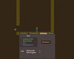
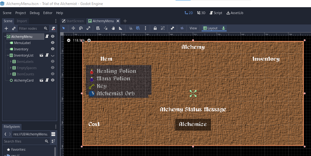
Oh yeah, I have been. For example, this how the alchemy menu's node structure looks. The item that is clicked has only it's ingredients' labels and counts revealed. I used the 2nd Vbox for spacing. I think its just the same amount of labels with a text value of four spaces.

Submitted

This game had a lot of depth in it, and a lot of variation in the platforming elements. Very well made, felt smooth playing it. A thing that got me stuck was running out of mana though. If I don't have any mana potions, and no ingredients to make one, and get stuck with a boss eightball, what can I do except load? Would have liked save points closer to bosses, and maybe a slowly ticking mana regeneration, so that the game can be played in that style too?

I liked transitioning between rooms, that felt nice in this game.

I would have liked the spikes falling down to shiver a little first, to show that it's about to fall, giving me time to react. 

Great job with this game!

Developer(+1)

Thanks a lot man. I did intend for the possibility of being screwed in a boss fight with no mana and potions. Like I've said in other comments, it was more of nudge to the player to level up their alchemy.

I can't believe I didn't consider trickle mana replenishment. That would have probably reduced the number of complaints about mana consumption and lack of mana by a 1/3 or so.

I thought I placed the save points well enough, but maybe not. I think you're the first one that brought up that point. I know two of my save points are one room away from their respective bosses (the top right corner and bottom center of the map.) Maybe that first save is a little too far away from the first boss, but my assumption was that the player would spend some time building up a stock of potions in those initial areas where enemies and obstacles aren't hard.

I actually did have a shake animation w/ noise before the drop at some point. Unfortunately, I went down a rabbit hole trying to fix a couple things, and when that didn't work like i wanted I did a hard reset on my git branch. I didn't realize I hadn't pushed that before the hard reset. It was on my list to reimplement, but I never did.

Thanks for playing my game and the feedback. There's been a lot of constructive notes that I'm taking to heart. Also, big shout out to you for implementing the colorblind mode on your game!

Submitted(+1)

I enjoyed it!  You've got a unique aesthetic visually and the gameplay itself was simple but well done.  I saw you had mentioned it in another comment but my only critique would be that I wasn't really sure what leveling my alchemy did, though I might've just missed that in the tutorial.  Great job!

Developer

Thanks a lot! Yeah, I tried my best to be clear with the tutorials, but I don't think I was clear enough with alchemy. I made the assumption that it would be pretty clear, and I was a bit off there. 

Submitted(+1)

No worries, we design things as straightforward as we can and there will always be people that don't get it lol, I know how it goes.  

Submitted(+1)

I really enjoyed this. Especially the visuals. The paper feel to the environment and characters really felt immersive even without the use of backgrounds. All that 's left is a cool soundtrack when exploring and this would be an upcoming masterpiece. Can't wait to see more of this! :)

Developer(+1)

Thanks a lot! Visually, this has been my best work so far. I'm a terrible artist and the fact that I wasn't bothered by it the entire time makes it seem like I'm getting better lol. And yeah, I'm glad I was able to convey the construction paper aesthetic and see what others think of it. I began toying with it in my last project and decided to reiterate on the concept and fix what I didn't like.

Submitted

Well, it's a good thing you did. And the fact that everyone loves your game's art style is solid proof of your development as an artist. I'm a novice artist, so i also know how that feels. Still good job.

Although, if in the future you need an artist for your next big game, I'll be waiting. ;)

Submitted(+1)

Really enjoyed this, few minor issues (mana, items dropping out of the map) but no issues at all. Very nicely done!

Developer

Thanks a lot! I intended lack of mana to be somewhat of an issue to kind of nudge the player into leveling up their alchemy, but without the proper balancing it doesn't work as intended. I though about alternate spell that would use mana and your normal spell wouldn't deplete mana, but I didn't get what I wanted figured out before i ran out of time that i had laid out for it.


Bugs aside, I'm pretty satisfied with it.

Submitted(+2)

OOOOOH Blood magic! that would have worked perfectly!

Submitted(+2)

Another Godot game, so cool!

I enjoyed the minimalist aesthetic, but it doesn't quite ad up the bunch of text that the tutorial has. Maybe if you presented the mechanics in a more organic way it would be better and match the overall minimalist aesthetic.

But you have a very solid base for a complete, yet simple and fun metroidvania game! Congrats!

Developer(+1)

Thanks a lot! Yeah, I started roughly halfway through the jam so my mantra the whole time was - keep it simple. Worked well in some ways, not so much in others lol. But yeah, this is the first jam where I made it a point to have at least some kind of tutorial. I originally wanted to have an unseen guide for the player that would make playful suggestions as a way to guide players, but scrapped that pretty quickly. 

Thanks for playing my game!

Submitted(+1)

Really cool, and i like the overal "Medieval Scroll Paper" texture as a main aesthetic ^^

The intro tutorial is also nicely implemented to help learn the mechanics especially the crafting which could have been confusing otherwise.

Small issue i'd say is that the mana depletes fairly quickly and since you're defenseless when you're out that requires stockpiling a lot of potions :/

I encountered a small bug also where the crawler enemies sometimes would drop their items inside of the floor to a point where you can't ever grab it.

But honestly other than these small issues, the game feels well made, with good controls.

Congrats and well done to you :)

Developer(+1)

Thanks so much! Yeah, the texture aesthetic originally came from my last personal project. I wanted it to look like objects were made from construction paper. My animations in that game look similar to how season one of South Park looked.  I liked how it looked and decided i might iterate  on it.

In regards to the tutorial, thanks. This was the first time a tutorial was part of my requirements and I had a few ideas of what I wanted to do, but I knew I didn't have the time for those ideas. So i just jokingly slapped static text on the level as a placeholder. After a couple times loading up a room with text, I began to think it didn't actually look half bad lol.

I could go on all day about the conflict i felt working on combat. The idea to use up mana was to nudge the player towards gaining xp. I eventually felt like that was dumb for multiple reasons. One being that having only one weapon which has limiting use is not great, and the other being everyone will want to blast fireballs as often as possible. I opted to have like one or two alternate spells, but couldn't get what i was going for down in the time i allotted for it and so mana was entirely scrapped. Now i had useless mana potions. So I went back to the original idea and gave the player more mana.

Submitted(+1)

Yeah i totally understant as finding the right balance to any mechanic for a jam is always quite hard.

I like the idea of the south park inspired look though so it could be cool if you decided to push in that direction to see what it looks like ^^

Developer(+1)

Yeah I definitely want to keep iterating on it, for at least a game or two more. There's still room for improvement.

Submitted(+1)

I still love your User Interface, it has something to me.....

Overall nice job, was good to play and confusing through all the rooms. 

Overall the Visuals of the Game could be Better.

The Theme was present, but i kinda find it hart to get Mana Potions and Keys together.


Good Work, keep it up

Developer

Thanks a lot! After geeking out at your UI, seeing your appreciation for mine is very flattering haha.

Yeah, i think my overall outstanding issue with this game is design as a whole.  I really should have planned out my rooms and worked on balancing. The game was much harder originally. The day of uploading it, i significantly reduced how much xp was required for each level. I also doubled the xp given from alchemy.

Visually, i have 0 art skills so my art could always better haha.

Submitted

nice game, man!

Developer(+1)

Thanks! Sorry for the late reply, things got a little crazy.