Play game
Earth Defenders's itch.io pageResults
| Criteria | Rank | Score* | Raw Score |
| Enjoyment | #40 | 3.500 | 3.500 |
| Concept | #62 | 3.400 | 3.400 |
| Overall | #62 | 3.225 | 3.225 |
| Use of the Limitation | #78 | 2.900 | 2.900 |
| Presentation | #88 | 3.100 | 3.100 |
Ranked from 10 ratings. Score is adjusted from raw score by the median number of ratings per game in the jam.
Team members
Only me (JAlcaldeM)
Software used
LÖVE 2D
Use of the limitation
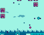
The game uses color palettes without green, a blue one for the 'Earth' side and red/purples for the 'Space' side
Cookies eaten
No cookies were harmed
Leave a comment
Log in with itch.io to leave a comment.


Comments
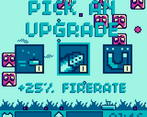
I loved the upgrade system. It's an automatic way to sucker me into enjoying anything haha. Great work!
Very interesting Space Invaders with a nice "augment" system ! Great work !
Thanks!!
I was confused about the projectiles, and thought I had to protect the earth from them rather than myself. A quick explanation of it at the beginning would be helpful, but nonetheless I got it and had a lot of fun once I understood! Nice retro style music and sprites! :)
That is actually a very smart idea for a game! Space invaders but instead of dodging the projectiles you chase them like in Breakout. One of the planned upgrades for this game was the ability to reflect projectiles back to the enemies, but I ran out of time.
nice art, nice sound, nice concept, one little thing is that i thought the purple squares were bullets so i avoided them at first. and the exp being purple and the bullets being pink didnt indicate really which was bad/good. but i dont think its too big an issue since all you have to do is go through one run to figure out, just something to consider. really nice overall! (edit: just played a little more, really nice combo of very simple features, seriously, trying to gauge how many enemies there are, where to be at what time, also trying to get the pickups at the same time, randomized pickups, worked really well together. nice!)
Yes, other players feel this way too. It will be taken into consideration for future games for sure.
What a great idea. Space Invaders mixed with the leveling system like Vampire Survivors.
Art style and gameplay is amazing.
I am so glad you liked it!!
I love the concept. The HUD and other UI blends very well.
Thank you!
Very interesting concept.
I loved the way of upgrading staff.
But some of the features seem to be overpowered (Explosion + damage basically beat the game).
Visuals are interesting, they have a very nostalgic feeling, even tho there's nothing similar on Gameboy or BGA
Yes, balance could be improved with more time. The idea was that different upgrade combinations lead to different sinergies for the player to discover. Also, with only 7 different upgrades is relatively common to keep being offered the same ones, so with more options any "overpowered" combination would be diluted. Thanks for the feedback!
Cool visuals! I like the style, but it wasn't clear to me how I was destroying the enemies; I didn't seem to shoot anything, but sometimes the enemies just died? With that resolved it would be a fun game though!
I'm sorry to hear that. After some testing I found it happening when putting the game in fullscreen. This happens because the HTML version of the game is not 100% accurate, since this is my first time trying to make a game playable in browser. If you are experiencing problems, I recommend playing the downloadable version.
Edit: for the moment, the option to go fullscreen has been disabled.
Oh I see now! I'd tried the downloadable version, but the projectiles also disappear when going fullscreen there as well. I played again without changing the window size, and it worked really well! Nice game :)
Very fun little Shoot'Em-Up!! played it through a couple of times and liked the upgrade system a lot! if i had to give a piece of constructive criticism id say: the first time i played i didnt realise that the small particles were XP and the big ones were enemy shots. I was scared to pick up the XP on the floor cos it was the same color as the shots coming at me!
Yes, I know that it can be a bit confusing, because the colors look very similar (the colors are tied to the enemies themselves). Maybe a small tip in the previous screen should clear that. Thanks for the feedback!