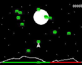
hands down best modern indie shmup. actually no contest. ost is a huge inspiration to me. thank you for making this, i think about it literally every day
paper_mint
Creator of
Recent community posts
very hectic! really like the expression in animation, sort of reminded me of ace attorney, in that theres minimal player interaction, but the differences you do make cause the characters to react in a very over the top way. main gripe with it was that some of the queues were really hard to see. the son in law's change was hard to tell apart from his regular sprites. the also, thought it was a little too "real"? like hearing the baby crying + music speed up + so many other sounds was irritating in a way. im not sure if you meant for it to be stressful in that way, but if you did it worked really well lol. can be hard to achieve "high stress" without the stress feeling unpleasant, especially when it comes to audio. thanks for entering!
yeah i forgot to change the ending screen taking a good 3-4 seconds longer than it should... but the beginning of the levels needed some sort of "break" imo. i added in the fake load screen cause the immediate transition from the calendar screen to the level was sort of jarring. i need some kind of start level screen that has a cooler more appropriate transition. but i didnt want to take out the funny dog calendar... so its sort of an unnatural pause. thanks for the play/feedback!
really nice story! liked the simple tension of the window breaking combined with the correct/incorrect dialogue. felt like it was a fairly synergistic combo. by the way, i feel obligated to plug Axelay, a shmup for the snes. judging by your visual/musical taste you'd probably really like/draw from it. or any snes shmup really. thanks for entering!
ps- i also experienced the copied dude thing, i think it has to do with getting thrown away while an animation is still playing. not sure though
i clicked on the cute dino game. i didnt expect to see an accelerated history/evolution of an intelligent species and war and progress combined with themes of the impermanence of life. 10/10 this is actually incredible. really like games that have complex and cool inner workings that can be interacted with through very simple input (click and drag in this case). impending sense of desctruction, short/sweet playtime, niec art style, lots of things going on on screen lots of progress, different structure types, different ways of interacting with one another. actually one of my favorites, thanks for entering!
really cool visual/musical style, like the gameplay twist on lethal company, really impressive amount of work in such a short time. only gripe was the frequency matcher. didnt realize what the logic was until playing with it for a bit, with the two waveforms on the top being added together to form the third waveform with the goal of matching the fourth. it is a pretty intuitive thing, but it wouldve been nice to have been throroughly explained in the game description. times where i really just didnt get how to match the frequencies, might be skill issue, i just didnt really know how to approach solving them. thanks for entering, this is a really cool idea!
graphically nice, gameplay mechanics functioned well but were a bit lacking. the level designs felt sort of random, didnt really feel satisfying to solve. tutorial was good, but i wish it mentioned how the characters moved. also, the win condition said "save half to win", but i wasnt sure if it was necessarily possible to save everyone or not, so i wasnt sure if the last level was impossible to finish flawlessly, which was somewhat unsatisfying since that meant i would either stop playing wondering if i could finish it, or continue playing an impossible level until i gave up. great overall, just a couple of mechanical quirks, didnt notice any major bugs. thanks for entering!
upgrade tree was nicely done, though once you figure it out its just sort of a matter or doing it. kinda has that solving/executing dynamic that some puzzle games have where once you figure out how to do it, theres a long "execution" which can be boring/detract from the puzzle aspect. and if you want to try a different solution, it takes a long time to test that theory. you can take advantage of that if you have a fun active gameplay mechanic, but since the ui navigation was somewhat clunky, and the main mechanic was just clicking it was sort of frustrating. really nicely balanced/themed game overall, just that solving/execution dynamic was a bit off. needed something interesting to keep the players busy imo. thanks for entering!
cool concept, liked the idea to collect things on a timer before the battle. just felt a little static since the actual system for collecting stuff was just walking around. couldve used a little more explanation in the description, especially the ally collection system + battle mechanics. thanks for entering!
ps got runtime error index out of bounds during battle
there are a lot of sort of pretty looking games that are mechanically frustrating, this is not one of them. i wanna look at this in more depth later, but the visual/audio style is really nice, and the mechanics were kept simple/small enough so you could really polish them. this is really nice, thanks for entering!
yup, i feel like many of the games in the jam need a tutorial honestly, but i dont think many people had time to make them. takes longer than youd think. thats why i tried to be as descriptive as possible on the itch page, but i thought it would be too wordy to try to explain the block placing mechanic. so i hoped people would figure out from the screenshots... i should've at least linked a video or something. thanks for the feedback!
sorry bout that, i forgot to add other keys when i exported and i never changed it cause its not technically "gamebreaking" so idk if i can reupload. i did write that z is start below the game but its easy to miss. and yep, lots o' bugs. i was up till the deadline/am not super efficient lol so i didn't have time to throughly playtest. anyways thanks for sticking with it/getting it to work! gold dog bark. its just an excess coin dump lol, makes ship bark
had another day with this after the difficulty tune up, i really like it. made it to level 70, not sure if it was meant to be played that long lol
pros
restructuring mechanic was unique, most td games penalize it so its a good change
placement ui/controls were intuitive
nice art style and variance of color throughout
upgrade towers bring a nice risk reward kind of system. less space, more power, but if you have to move itll hurt. allows players to strategize with which towers need to change
monitoring health during rounds kept player active, many td games become stagnant
cons
strategizing quickly became bland since the only difference between each day was direction, otherwise same strategy could be used every day by just "rotating" the tower layout. more details to vary play would be good
level didnt allow for much variance in strategy, felt like the only thing to do was surround diamonds with walls
monitoring walls for hp eventually became tedious, especially needing to double click rather than click once.
misclicking was easy given how close towers were and there being only two buttons to do everything
wrist hurt after many clicks of mouse lol
minor bugs/details
cant see health bars on vertically adjacent walls, minor hiccup
walls would die nearly instantly to certain enemies, no time to heal. not sure if intended
minor lag in later stages. sure its because of html mostly, but it could also be the large number of bullets.
might want to try to simplify the bullet movement script since there are so many of them.
really well made deck based strategy! wish it could be html so more people could play it, i think it would have been pretty high up there if it was in browser/file size was a little smaller. feels like something like this could have a fairly small file size too. anyways, actual design things i liked:
- varied cost types to balance resources based on what you have an excess/short supply of
- intuitive cost symbols
- caravan to give value to unwanted cards
- turn system had lots of things well connected to it, energy replenish, draw from deck, cards which gained resources every turn, going to caravan, etc.
- typing of cards and power ups which applied to them (harvest, mining, animals, etc)
only down side i guess was the stock photos lol, but honestly they worked well enough to illustrate the well tuned strategic thing you were going for, really creative way to illustrate the general feel that you were going for. one of my favorites, thanks for entering!
yep, the grid wasnt as well done as i wanted it to be... i havent done much "puzzley" stuff so i had trouble setting it up. by the time it was working i didnt want to mess with it and wanted to move on to other stuff. definitely would want to make it more substantial in a full scale project. i kind of hated the movement speed too in a way, but there are only so many speeds the player can go at a fixed framerate and "real" pixel graphics without the thing jittering and stuttering. as a bonus i felt like it forced the player to focus more on strategizing and shooting accurately providing a bit of variance in play. and if they didnt like it the upgrade was cheap so i was like meh whatever. gradius 3 does the same thing where it starts you out unbearable slow but the first easiest thing to upgrade is speed, so its sort of like a blatantly correct choice mechanic. also the final speed upgrade was over the top lol. i forgot that you couldnt undo that and just choose to not upgrade it. maybe i should take a hint from your game and add a "sell" mechanic lol. thanks for the feedback/play!
thanks for the feedback! i was worried about the ui design of those menus too, but i didnt want them to be to handholdy, and im not too experienced with ui and "puzzley" stuff, so i wasnt sure how to make it super intuitive without being overly descriptive. glad i got to try something new though, think i learned a bit from it. also i almost considered doing an endless thing, but since i placed all of the enemies manually through export variables i didnt have a good random generation thing made, and i felt like id rather just have another decent level/make new enemies/polish abilities before adding endless. and i didnt wanna throw together something sloppy so i was like nah
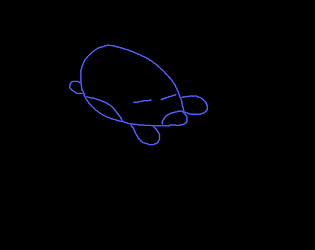
the gold dog was just a money dump for if you had too many coins/maxxed out upgrades. didnt really mean anything lol. meant to add a little extra thing at the end it it was on your save file but i forgot :P if it was in the game, it probably would have looked something like this:


