Play game
Empty's itch.io pageResults
| Criteria | Rank | Score* | Raw Score |
| Use of the Limitation | #12 | 3.692 | 3.692 |
| Concept | #42 | 3.308 | 3.308 |
| Overall | #53 | 3.019 | 3.019 |
| Enjoyment | #66 | 2.615 | 2.615 |
| Presentation | #82 | 2.462 | 2.462 |
Ranked from 13 ratings. Score is adjusted from raw score by the median number of ratings per game in the jam.
Team members
phlp
Software used
Godot, GIMP, sfxr
Use of the limitation
It's nearly the most Rogue-like roguelike since Rogue, like
Cookies eaten
0
Leave a comment
Log in with itch.io to leave a comment.


Comments
I like the old school minimalistic feel and the game is pretty tense... but having to tap keys everytime to move and doing it that fast gets kind of bad.
Sure, that seems to be a common complaint. Thanks for playing and leaving feedback!
Wow! So stressful! The difficulty is perfectly set 👍 I loved it! Polish (music, game effects, menu) it a bit, and it can become a super game (well, it's already) 😁
Thank you!
Played game on stream here: https://www.twitch.tv/asfunasfun
Nice use of limitation. Really could use some better controls. Having to tap to move is a little frustrating. Especially with my old, tired hands. Adding features that help players play your games is always a win!
Anyways, nice job.
Thanks for doing that! Sure, an option for controls would be a good "quality of life" upgrade.
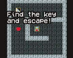
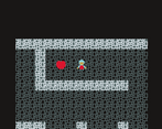
Woah our games are very similar! We both even made them in Godot, I guess great minds think the same way haha. If anything I'd suggest you use a smaller sprite size (I love 8x8 and 16x16) and some color palette, it really makes the game feel a little more cohesive. But if anything nothing but props to you man, keep it up!
Strange. I only used 6 colors (too many?) and all the sprites are 16x16. What parts don't appear to fit together?
Hmm I'm no expert at all but the colors didn't feel as cohesive, I use to cheat a bit and just take a color palette from lospec, they usually give pretty decent outcomes! I'd say the thing that messed me up just a bit are the walls, they don't generate enough contrast with the ground, also they are a little too noisy, you'd be amazed how good plain color tiles look when using an armonious palette, I mean our walls are literally 90% a flat pink xD.
I actually used a palette generated by coolors.co; I think the real problem here is the "artist". I'll try to keep all this in mind in the future. Thanks for your feedback!
Minimalistic, cute and fun to play! If you started this in 3 hours jam it’s awesome!
Thanks so much!
Interresting game, i liked it (not to flex, but I managed to win it in the first run).
Well I'm impressed. Thank you!
The concept is really great but having to spam keys gets old really fast
Sorry you felt that way. I didn't think it was so bad, but maybe if I made this again I would make that an option.
Collected all the hearts on each floor, and when I found the key, I understand, I have problems.
This made my day. Thank you!
Nice small game, the "tip" sound effect is so addicting to hear, i saw you uploaded this to the last triJam, if you made this in under 3 hours you really rock man!
Thanks so much! I didn't track time strictly, so it probably took me a little over 3 hours. And that's just actually "making stuff"; I did a good amount of planning with pen-and-paper first. Glad you like it!
Not bad! This came out to be a fairly decent and straightforward game.
Thanks!
Simple game. Pretty simple puzzle. well done.
Thank you! "Simple" was very much the idea this time.