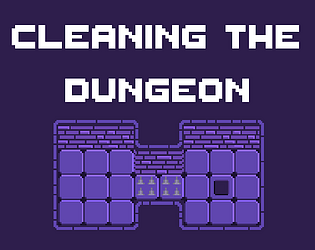
Great retro aesthetic! Game has a good balance where the puzzles are not impossible but not super simple either. Great job. There was only one thing that would've been awesome, but that's been said so much it's more played out than YouTube meme videos. So, great job and design as well.
Play game
Cleaning the dungeon's itch.io pageComments
Nice work! Really like the artwork and the music is well done, too. I had a bit of trouble understanding where the player would go when I clicked. Maybe it would help if you have some sort of indicator that shows the direction the player will be going. I was able to get to level 3 and got stuck there, I couldn't figure out how to get him out of the loop in the middle. I also couldn't get out of the tutorial, I thought I could exit or something but eventually it just said game over and I was able to go back to the main menu. Good work though, the mechanic is fun, and I felt really satisfied when I beat level 2!
This is fun! It seems like you could teach the player more at the beginning, as the first level relied on something fairly obscure.... like turning around in a hall way. I gave up on level 2, but maybe this kind of thing just doesn't click with me!
Nice idea and overall style. Reminded my of Crypt of Necrodancer. I agree with Gizmo199 - it would be nice to actually see the direction the character is facing.
This was a melodic game. I liked it a lot. The puzzles were about on par with the decision making time limitation. The music you used was perfect for the half second time thing, but I think it may have started wandering out of sync with the movement beats after a while. Great work!
Very neat! I thoroughly enjoyed the puzzles! Took me a second to wrap my head around how exactly the mechanic worked, and it was still a bit confusing for instance when going into a "corridor" or a single tile spot and trying to wrap my brain around what direction he would go as he exited. An improvement I might suggest would be to make the character turn the direction he is about to move before he goes to the next block. That way when I click I can visually see that "oh he is turning this way". Just a thought. :D Only one note:
- Make it more clear what direction the player will be moving once the player has "clicked".
Overall great work! Was really fun and the levels seemed fairly balanced!
Really interesting movement mechanic! Took me a while to get the hang of it but once it clicked it was just a matter of puzzling out where I needed to turn.


Leave a comment
Log in with itch.io to leave a comment.