Play game
Safe Course's itch.io pageResults
| Criteria | Rank | Score* | Raw Score |
| Gameplay/Design | #4 | 3.753 | 4.333 |
| Overall | #7 | 3.464 | 4.000 |
| Audio | #10 | 3.464 | 4.000 |
| Graphics | #11 | 3.464 | 4.000 |
| Fun | #13 | 3.175 | 3.667 |
Ranked from 3 ratings. Score is adjusted from raw score by the median number of ratings per game in the jam.
What would you like feedback on?
Mostly difficulty, level design and overall concept. But I'm open to any feedback or suggestions.
What did you update?
Pretty much everything. I reworked the whole project since the original game jam game (you can find the link to the old one on the game's page if you wanna compare).
Leave a comment
Log in with itch.io to leave a comment.


Comments
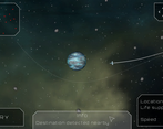
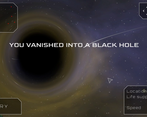
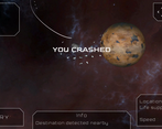
I don't know if I'm entirely sold on the gameplay loop of this one. I like the way it uses physics and how even slight changes to trajectory affect your course (feels accurate to real rocket science in that sense), but by that same token, reaching the end of each stage almost purely relies on trial-and-error because you can't know ahead of time if the changes you make will be enough to reach your destination. I might've liked it better if it felt like there was more strategy and planning involved. Past that, I don't really have much in the way of suggestions for improvement; the presentation is already solid and I like how the levels evolve to include more elements like moving asteroids and black holes.
That's fair, I admit the gameplay is mostly trial and error for now. It might not be for everyone.
I'm thinking of how to give the player more agency and ways to predict the course before launching but it's not obvious. I want to keep it simple enough and without a ton of information so it works well as a mobile game, so that's the challenge... ;)
Thanks for the feedback :)
This is a really fun physics puzzler! Accounting for the gravity pull made for some really unique solutions and I love the quality-of-life addition of showing your previous trajectory. The audio felt like a great backdrop for the heavy thinking the game asks for. I would agree with the previous comment that UI is the spot that could use the most work. For starter, using red and green is always a hazard for color blind people. I have a minor color deficiency on that spectrum so I was able to spot the difference between the bad nodes and the destination, but I did have to look longer for it than probably someone with perfect color vision would have to. A better solution would probably be to use some sort of icon so even if you can't tell the colors, you could tell them apart by the overall look. Or you could make the destination the only one with a unique look and make it a lot larger than the other dots. Making the destination really pop for its surroundings on the map I think would in general be a good idea for helping to get people straight into the action.
Thanks for the feedback. I admit I didn't think about color blindness. I'll definitely implement a different icon for the destination on the map to make it more obvious.
Thanks for playing :)
Great game! It was very fun and it's visually impressive!
I love the concept! It's a mobile game I would very much enjoy playing on my phone during downtime. I like the fact that controls are so simple :D
The UI can be refined a bit, in my opinion. I was confused at first by the amount of information on screen, but the truth is that for the player, some of that information are not important most of the time. You could try applying some rules of visual hierarchy, making less important information less visibile. The first thing that comes to my mind is, for example, that "start heading" could be a flag you put directly on the heading wheel. Sames goes for "start cargo". "Life support" and "speed", should get more relevance only after the launch. And so on.
For me, the difficulty is well balanced. I managed to complete all the levels, although it took me a while to fully understand the mechanics. About the level desing I can't see any flaws, but I would have liked to have even simpler introductory levels, with fewer elements and more obvious trajectories for the ship.
Overall it's really a good game! ^-^/
Thanks for the kind words ! I'll definitely iterate on the UI to avoid information overload (you're not the first person to mention that issue^^) and try to make simpler levels at the beginning.
Thanks for the feedback :)