Extremelly hard but very well done game! Just the controls aren't a very good choice in my opinion. Here's my playthrough: https://www.twitch.tv/videos/571614664
Play OneVsOneMillionYokai
One VS One Million Yokai's itch.io pageResults
| Criteria | Rank | Score* | Raw Score |
| Graphics | #19 | 4.192 | 4.192 |
| Audio | #24 | 3.808 | 3.808 |
| Overall | #28 | 3.885 | 3.885 |
| Mood | #29 | 3.846 | 3.846 |
| Game Design | #42 | 3.500 | 3.500 |
| Theme | #54 | 3.731 | 3.731 |
Ranked from 26 ratings. Score is adjusted from raw score by the median number of ratings per game in the jam.
Comments
Wow, thanks for the video, it really helps a lot! You´re completely right with the controls and I should also make the game more welcoming at the start, explaining better the range of the attacks and making it a bit less complex in the first waves. The MISS cooldown is just like your viewer said; it´s designed to prevent the player from mashing the buttons, you need to hit once at the right time. What´s more, landing a hit allows you to instantly cancel the attack into a new one, so you´ll always have time to act on new enemies.
Thanks again and specially for taking the time to stream this and share it, being able to watch you play the game while you comment on it is invaluable feedback!
I was really impressed by this entry! Like other commenters, I found the game punishing but fair. The timing felt strict at first, especially with the punishment if an attack didn't connect, but it wasn't too hard to get a hang of after I found an early game stretch of yokai that only spawned on one side of the screen. (Having to manage both left and right, up and down all at once at the beginning makes it a little overwhelming for a newer player, so removing the left/right issue from the first wave or two might help ease beginners into the combat without making it too boring for too long for more veteran players.) I felt like I was learning more and more about how to play each time I lost.
The only thing I felt was unfair was that, on my Mac, Ctrl+left or Ctrl+right switches desktops, which basically guarantees a lost heart when it happens (even though gameplay stops when the tab is no longer in focus, it will proceed enough by the time the original desktop slides back in for a yokai to reach the player). Although it's nice to have an excuse to blame the game instead of my lack of skills for a loss, I'd recommend either an alternate control scheme or rekeyable controls so you can circumvent the issue entirely.
Beyond the game mechanics, I love how you incorporated the theme of your game to inspire the enemies - everything, from the enemies to the graphics to the sounds, feels like it "fits" with the world of the game. And the over-the-top special moves were a blast! Honestly, as far as gameplay goes, it's hard to imagine that this was made in just 72 hours, because I feel like it's good enough be a finished product. You made an absolute blast of a game to play!
Wow, thanks a lot!!! And many thanks for your suggestion on how to ease in new players without boring veterans, I´ve been trying ways to do it but couldn´t find anything. Your idea is just what I was looking for and it will be very easy to implement!
You´re also right with the controls, Ctrl/Shift was such a bad choice to make as Shift poses problems for Windows users and Ctrl does so for Mac ones. After the voting period ends I´ll update the game with different default controls, configurable keys as well as your awesome method to ease in new players.
Thanks a lot for your feedback, really :)
Really cool game, but I am such a noob at this kind of game :D love the overall feel, the graphics fit the sounds really beautifully!
Wow, I had so much fun while playing your game! Keep up the great work. 5/5
The audio took me back to my NES days, reminds me of Double Dragon and that Karate game I used to be obsessed with as a kid. It's super difficult but I like how every time I die I clearly deserved it lol. Love the mechanic of being stunned for a second if I miss, that really makes it difficult in a fun way. My top score was 4500
Good art and gameplay feels polished. Maybe a bit too difficult at first!
Difficulty felt a little steep to get into at first, however I loved the art and the feel of the game so that kept me around to play more and more. I loved how there was a variety of moves even though I was only pressing two different buttons!
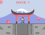
You completely nailed the right feeling for the attacks, both for the player and the enemies: the screenshake, the particles and the sound effects make them really satisfying to land and terrible to recieve. I also really appreciated the limited-colors palette and the overall difficulty of the game.
The only complain would be on the menu, but I know that when you have to make a game in such a short amount of time the ui is the last thing you would like to do. Excellent job!
Very fun skill based gameplay, i really enjoyed it. One thing i would always avoid using shift as a button for spammy things because of sticky keys on windows.
Dumb fun, that's how I would describe One vs. One Million Yokai. I mean the regular game does take a lot of coordination, but most of your score will come from the Yokai rush during your specials where you can essentially punch around aimlessly.
The enemies are all well designed, I liked the idea for multi hits on mirror-chan and umbrella-chan although I didn't play up to them.
I also loved how punishing misses were, whereas a successful kick could be reversed so as to cover enemies arriving from the back. If the Yokai rushes were nerfed a bit, I'd say this was actually very well designed.
The visuals are retro but they're superb for the style you were going for so nice job there.
And although there was no audio (at least when I was playing in the browser) all of your other work is impressive for a solo-submission. Great job!
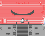
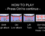
Hello, I like the game, but let me address the elephant in the room, the UI is blurry. Ok, now let's move onto what I like about the game. I love the fact that you took the time to have a tutorial in the beginning instead of giving the instructions in the description, but I feel like the screen can get a bit messy at times, some enemies overlap on others and not only is that hard to follow, but it is also somewhat displeasing, but no big deal. I recommend keeping things in line, so give the enemies a similar velocity, doesn't have to be slow, you can find a goldilock. All and all this is not a bad game, in fact it's surprisingly good, enjoyed it.
Yeah I understand what you mean but the whole game is designed around the idea of having the enemies move at different speeds, a lot of the work these days has been in setting up a system that calculated their required time to reach the player and determine the time when the needed to spawn all depending on a random speed the system assigned them. In previous tests, having them all move at set speeds made the game incredibly dull and predictable. Also, the theme of the jam is "A Lot of" so I wanted there to be many enemies on screen to give the impression that you´re facing a ton of enemies and not just independet streams of 1 or 2 at a time. If you managed to activate the special, it´s this very concept in its´ more raw form.
What I´m trying to say is that I value your feedback a lot and sorry if it looked like I dismissed your suggestions too quickly, I completely agree with your complaints but I think that the solution should take a different shape to mesh with the main design ideas behind the game and not change it too much into something else.
I think that in the end I may have set the maximum speed too high and also I should´ve made it so that faster enemies should have some kind of priority and be drawn on top of the others to maximize their visibility. This is also why I said that I should´ve given them more distinct sprites, I tried doing so but it was very difficult with a size of 16x16px and a very limited color palette . Also, I should´ve made it so that the enemies reached the player in more extreme positions (high or low) instead of in intermediate ones, that only adds up to the mess.
If you don´t agree with anything I said please don´t hold back, your comment has made me think about this issue a lot and consider new ways to improve the game, so thanks a lot for your feedback!
Other than the fact that I suck at this game, it is pretty good! Also I love how the end screen showed that with a score of 0, I broke my record! :)
Wow, this is really cool! Love the art, the music fits, cool mechanics. I'm not sure if I'm bad or the game is tied to framerate, however, as even on Wave 1 it was far too difficult for me to survive at all. Great job!


Leave a comment
Log in with itch.io to leave a comment.