Play game
SURF 'N TURF's itch.io pageResults
| Criteria | Rank | Score* | Raw Score |
| Overall | #10 | 3.703 | 4.000 |
| Sound | #18 | 3.395 | 3.667 |
| Creativity | #21 | 3.549 | 3.833 |
| Rhythm | #23 | 3.240 | 3.500 |
| Visuals | #29 | 3.086 | 3.333 |
| Fun | #32 | 2.777 | 3.000 |
Ranked from 6 ratings. Score is adjusted from raw score by the median number of ratings per game in the jam.
What was your team size?
8
How did you incorprorate the theme?
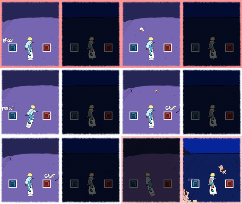
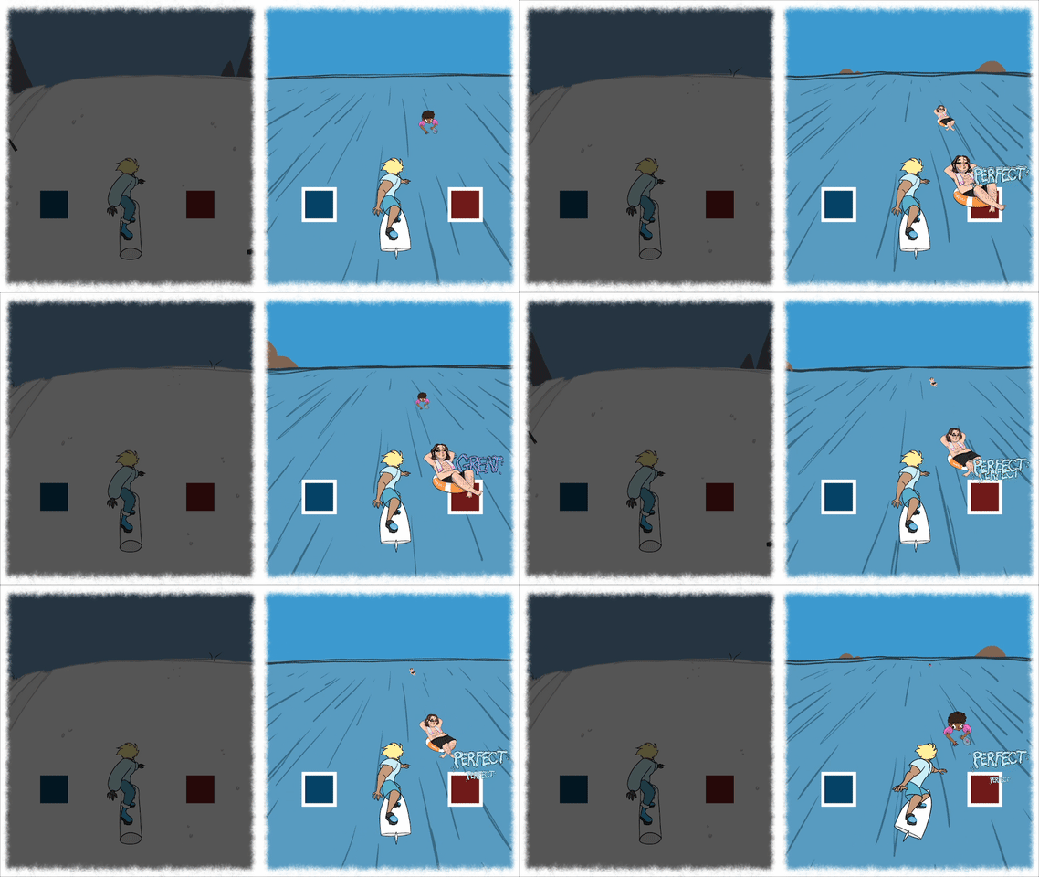
The notes that the player must hit on beat diverge between two screens, and its up to the player to swap between them in time to hit the notes.
Leave a comment
Log in with itch.io to leave a comment.


Comments
I love it! The art and music are wonderful, I really enjoyed playing it. I truly think it’s a very good game idea to keep polishing after the jam. ♥ great job!
Loved it. The Shift instruction mechanic could be in the home screen instead of the tutorial, and there could be and indicator when thing are coming on the other screen, but it was super fun, the change in music was super smooth, it sounded super good.
Nice graphics, interesting game, I included it in my Rhythm Jam compilation video series, if you’d like to check it out!
This game gives off such a good vibe, I loved it, a very interesting implementation of the theme without a doubt. the art and music are so good as well! Good job!
Thank you!
The visuals are great, and the music is really cool! I'd like to see more effects tho, like glow on the A/D buttons when you press them, some particles and stuff like that!
But something that really confused me was the fact that the hardest song only had 4 notes. Is it supposed to be like that or that's a problem with the web build?
I won't rate the game based on that experience, because I'm assuming the web build is broken. It would be really unfair if I did that.
I'll comment again after playing the windows version of the game.
Yeah! It's most likely an issue with the web build. It's (from my experience) very browser/machine based for web, and will often just not load or load notes in late. It was on my to-fix list, but I didn't have time to test it and figure out a solution. The desktop build should be a lot more stable (I hope, haha!)
Thanks for checking it out and giving feedback!
I like the game it was a lot of fun. I like the idea of switching between the two game windows, but I wish there was more of an indicator of when to switch (in the audio or visually). Also on the hardest song the notes come in really fast, it might be easier to read if they move in at a constant velocity instead of decelerating as the approach.
Thanks for checking it out!
I agree with the note thing. I never actually told them to slow down before reaching the collection area, so I'm really not sure how its happening. It's definitely something that'd be worth looking into with a more polished release :3
So creative with the theme, having to swap screens is very unique, very fun!
thank you!