Play game
Shadow of the Moon's itch.io pageResults
| Criteria | Rank | Score* | Raw Score |
| Audio | #6 | 3.727 | 3.727 |
| Visuals | #7 | 4.091 | 4.091 |
| Overall | #11 | 3.636 | 3.636 |
| Fun Factor | #14 | 3.364 | 3.364 |
| Originality | #25 | 3.273 | 3.273 |
Ranked from 11 ratings. Score is adjusted from raw score by the median number of ratings per game in the jam.
Is your game a video game or a physical game?
Video Game
Was your game made solo or in a team?
2 Person Team
Did you use any third party assets, if yes what assets did you use?
Some Mixamo animations. Songs and SFX from Uppbeat.io - authors in the credit section
Did you choose from one (or more) of the optional secondary themes?
Celestial, Bunraku, Cinema
Does your game contain 18+ content (Nudity, Gore, Language)?
Some VfX look like blood splatter
Leave a comment
Log in with itch.io to leave a comment.


Comments
This is really great work… love how many interactions you added.
A block or dodge, or even the ability to meditate in a safe place and slowly heal, or a presave, would make the combat easier to get through… the enemies have a good amount of health, and very large hitboxes on some of their attacks.
The floating eye onis are fairly easy to get once you realize how slow they move, but their auto-damage without an attack animation is frustrating.
I really appreciate how the tutorial level was designed - quick, clean, but with dynamic reveals - but I couldn’t find the path through level 2 after a couple of tries where I kept not finding keys and dying to the big guys…
The art style, music, and overall production on this is really impressive!
Thank you for the great review, Sustrato.
We'll consider these ideas as we build on the prototype. It's always great to get a fresh perspective and help catch things we missed.
Did it run smoothly on your computer? We're thinking of converting the game to pixel art to enhance the performance.
Thanks again for the great tips and let us know if you can think up any other changes you'd like to see!
*Things we're working on for the next version include:
-a block/parry system
-improved and added animations
-checkpoints/saving system
-items merchants and a purpose for the soul gems
-extra functions and improved dialogue system for NPCs to help guide the player
-improved performance/smaller file size
https://www.twitch.tv/daddiesjizzies
Thanks for DMing, played the game tonight, was a lot of fun.
Aesthetics are great, the slashing combat is good and you get some nice range on your sword which I like. Heath and Healing is well realised and the game felt very fair and balanced which I love.
The small little puzzles everywhere is the big highlight. Lots of great jumps to make (that I was bad at first, but once I unlocked the flow made the game really enjoyable). Theres A LOT of fun little jumps in this game that progress in difficulty and really made for some great platforming.
And then theres all the fun little small touches that are here and there, I love the block pushing, collecting tiny orbs from chests, dialogue trees, the crossbow that shoots an arrow upward when defeated.
All in all a great package, looking forward to more from you guys.
Thank you so much for the review! We're really glad you enjoyed it, and super happy that you noticed the little details like the crossbow animation (You're the first one to mention this). It really made us happy that the platforming has been working smoothly and that people are happier with the overall balance. Thanks so much for taking the time to review our project and for giving us so many nice compliments. We'll keep trying to polish and improve our projects and push the standard of quality and detail as high as we can with our little team :)
This game really impressed me. I liked how tutorial was made, effects for running, jumping, swinging. It is interesting to play. I didn't finish it, but I will certainly come back when I'll have more free time
Thank you very much. We really tried to make a more polished experience this time and we'll keep trying to improve for the next one!
Haven't finished it yet but a very polished experience. Nice work!
Thank you very much. Had to make up for the last 2 jams, haha
Very eye-catching art style and animations! There was a lot of variety in the abilities and platforming challenges which. Might have to try the fullscreen version to get the full visual impact
Definitely give it a try if you can. The visuals look much better in a bigger screen. I'll see if I can change the web version to accommodate a bigger screen too. Thank you for the compliments and for trying our game!
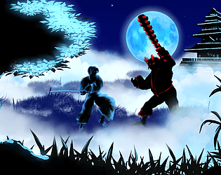
Love the artwork and the animations done here! It's beautiful and oozes style. Everything feels cohesive visually. I didn't realize they were 3D models (maybe wrong on this)! Combat feedback feels and looks good.
The character controller feels good and the movements are tight! Had a bit of an issue at times when I jumped up to a platform from below, I clip through the platform sometimes.
I suggest in the future to add a checkpoint system because it's a bit brutal to start all the way when you die. Also maybe adding a bit of a pause between the big ogre's attack. It's a bit tough to fit an attack in when he's constantly attacking back-to-back with his large hitbox.
Overall I enjoyed my time playing it!
Thank you very much for trying it and giving us the great feedback! The checkpoint idea is good. I think the Tori gates will become checkpoints in the next version. The big guy definitely needs some tweaking too. The big guy can be double jumped or spammed with attacks also, so needs some balancing. I'll check out the clipping issue you mentioned as well. Thanks for the kind words about the art style! Most things were hand painted, including the VFX, the characters were modeled in Blender, animated with Mixamo, then turned into 2d sprite sheets with Blender. It seems to help keep the game lightweight and responsive, yet allow complex animations in a short timeframe.
This game is beautiful to look at and fun to play. The concept is really cool, and it seems like it has a lot of potential to develop with the various collectibles and combat potential. The monsters look epic, and the ambience is epic.
Thank you very much for the kind review and we're really glad you like it! We'll keep building this game and work to add new environments and visuals that complement the base style :)
Is there a way to play the game in fullscreen mode? Game screen is too small on 2k monitor, i can't make out anything. Overall atmosphere of the game looks cool, i like the artwork. You can upload the fullscreen version as a downloadable file if you want. Don't delete the WebGl version, or you can't upload it again until voting ends
Thank you for asking, sure I'll upload a downloadable version for full screen too!
And thank you for the compliments, basically everything was hand-painted and animated in Krita.
The windows version is available now :) Had to make some minor tweaks to the code as the scene change stopped working for this export. * a little Godot issue. Let me know if you find any bugs. There is a grey screen that pops up during the initial load, but not sure if it's my hardware causing the issue.
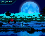
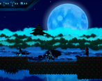
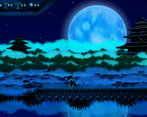
I played the game again. It looks much better in fullscreen. I haven't run into any bugs, game works perfectly. I really like the art of the game especially parallax background looks gorgeus. I noticed in this playtrough that there's a very nice tutorial level, you show all the moves and mechanics there. Is it an artistic choice that you made the player character and the NPC glowing blue and the enemies glowing red or is it bcs coloring them was difficult. Either way they look nice. Enemies kinda look like Dark Souls invaders, it's pretty cool
Thanks for giving it another try. I'm relieved to hear you didn't find any bugs too! Yes, during the previous jam people had some difficulty with the controls and what to do, so we thought the tutorial scene would be very useful. A bit of both, tbh, painting characters takes a long time, and having silhouettes with highlights seemed to work well as a style and as a time saver. Also, the contrast helps identify friend vs foe/trap. I'm really glad you like the visuals. Maybe in a later version, we'll add some daytime scenes and paint the characters in more detail :)