Play game
boss is you's itch.io pageResults
| Criteria | Rank | Score* | Raw Score |
| Gameplay | #6 | 3.923 | 4.083 |
| Sound | #11 | 3.443 | 3.583 |
| Aesthetics | #17 | 3.683 | 3.833 |
| Overall | #21 | 3.343 | 3.479 |
| Theme | #45 | 2.322 | 2.417 |
Ranked from 12 ratings. Score is adjusted from raw score by the median number of ratings per game in the jam.
Leave a comment
Log in with itch.io to leave a comment.


Comments
Nice game, the weapons feels unique, the shooting is really good and the flame that follows you that makes light is really beautiful. The boss was very easy, but the game has a nice concept and if polished up a bit it could be even better.
thanks for playing and giving your feedback! i might polish it up and release a new version(if i have enough energy and motivation)
Funky! Not much to add than has already been said, perhaps some texture changes on generation to make it feel more varied?
yeah you are definitely not wrong, some variation would have been a lot better than the 2 textures i have for the dungeon structures. thanks for playing!
yeah i wasn't too happy with the ladder generation either, and i was planning on adding some 'aim assist' for the boss but i figured not everyone will be a well seasoned gamer so i decided to leave him as is so more people can finnish the game. but thanks for playing and giving your feedback, really appreciate it!
Really great entry, I love the lighting and the weapon selection at the start, that along with level generation definitely added a replayability aspect to it. One thing I noticed is the backtracking - it's not that fun to find the door and having to farm like 200 more coins by going back a bazillion rooms, the door should spawn automatically near you when you get the 500. Also with the shotgun the boss was a pushover, you could just go in a circle and never get hit, some movement prediction formula would've fixed that. Ignoring these small quirks, it's still a wonderful game, really great job!
Loved it. Movement and weapon selection reminded of some old flash games I used to play. Nice little surprise of a game. Great work, my man!
im glad you enjoyed it! i might have been inspired by my childhood gaming experiences when i made this game.
Underrated game! The gun play is top notch and collecting coins feels rewarding.
Other then that I agree with WayfarerGames that indicators of health on enemies but also on yourself could really help (glowing red or something).
thanks for playing!
Nice entry! I love the lighting effects, they really add a sense of atmosphere.
I think the overall gameplay is good - though it needs a LOT more feedback on things being hit. Flashes, knockback, damage indicators, anything to make it feel like I'm actually doing some damage!
The overall level was fine, it did the job. The bomb didn't carry over to the boss, which I thought was a little bit disappointing ;)
Otherwise it was a solid entry - good job!
yeah i agree with the hit feedback and the items carrying through. i didn't manage to add those features in time though but that's just bad time management on my part. but thanks for playing and giving your feedback!
Hi, I'm not sure if it runs this way only on my computer because someone commented its quick and responsive, but for me the movement and projectiles are really slow. If it was faster I think it would be a great game.
hey man sorry to hear that, that would be because of the lighting system, it needs a decent computer to run unfortunately. but thanks for playing anyways.
edit: i uploaded a version without the lighting system so you can play that version instead. I'm sure it will run fine.
It helped a lot, thanks! Now it feels great! It was cool without the lighting too even though it probably adds a lot of atmosphere. I liked how you managed to make a few types of enemies so you would have to change your strategy in different encounters. I also think it's great that its randomly generated, it adds a bit of replay value. Great entry.
im glad you where able to play, thanks for the feedback aswell!
Awesome game! I do want to know, how does it fit the theme? Besides that, well, I see a lot of space to grow. Maybe add some powerups like a dash, or show the player which squares he's been in. Either way, well done!
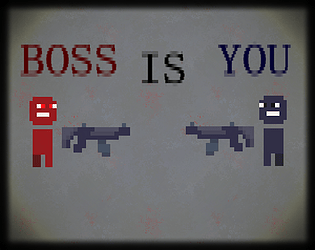
the boss is an exact copy of your player(a clone) and I suppose you didn't read the game description because it tells you how to dash, but i agree with you, there's a lot more I can add. I was thinking of improving the minimap like you suggested as well as adding weapon abilities. I might develop this game further after the jam. but thanks for playing and giving your feedback. i appreciate it.
I really like the way the character moves, the dash animation, the movement is quick and responsive, the sprites are simplistic yet effective, I really like this game
thanks for playing! im glad you enjoyed it
I see the core game, mechanics but firstly game losing unique bc it lil bit minecraft, dungeon, Dani and other it’s not big problem but.. 2nd The boss is player, yes but I can’t say that clones is the core mechanic( Anyway that plays you have idea, game, you lost decor but it’s ok, you have details and alot of hard work
i agree it doesn't fit the theme that well. i spent too much time on the details and mechanics but i think it was worth the gameplay regardless of the theme. thanks for playing and giving your feedback!