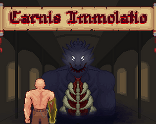
Play game
Carnis Immolatio (CHECK DESCRIPTION)'s itch.io pageResults
| Criteria | Rank | Score* | Raw Score |
| Art | #4 | 4.059 | 4.059 |
| Creativity | #22 | 2.824 | 2.824 |
| Overall | #22 | 2.603 | 2.603 |
| Theme | #27 | 1.882 | 1.882 |
| Fun | #33 | 1.647 | 1.647 |
Ranked from 17 ratings. Score is adjusted from raw score by the median number of ratings per game in the jam.
Leave a comment
Log in with itch.io to leave a comment.


Comments
I love the cool vibes of spooky catholic horror, those were done very well (:
it's a bit slow paced tho which can lose people sometimes, and the hitboxes and attack telegraphs are a bit wonky so they don't feel super satisfying.
still tho this game has a really fun style and great art and vibe. good job!
my rating: 1 weird peepee ghost arm out of 2
Doesn't Immolatio mean "Immolation"?
The full title translates to "Sacrifice of the Flesh" (friend of mine took it from Latin)
Immolation of the Flesh
the art and animation is seriously impressive! It reminds me of Blasphemous. But your game is seriously lacking in the other departments. I think you misplaced your priorities this jam. this level of attention to detail should really be something you do when you have infinite time post jam. focus on your mechanics!
the gameplay was pretty unimpactful and one-note, the movement looked jittery(not sure what's going on there exactly), and the boss was way too easy to cheese. this could be really great if you add some more depth to the combat. try dodging through enemies, grabs, blocking, maybe a kick that doesn't do much damage but pushes the enemy back, there's lot of stuff to try in a melee combat game like this and it would look great in your art style.
keep it up, but work on improving your process.
It's a shame this game seems to have shipped with a error where the player was placed, otherwise, the movement and combat mechanics were not very fun. However the art that I did see was really good!
NOTE: THIS VERSION OF THE GAME DOESNT WORK
PLEASE PLAY HERE:
https://flowlab.io/game/play/2589430
the movement/combat feels very slow and lacks depth, the art is great though
Thank you for checking out my game!
I really wanted to add more depth to the combat. I was hoping to make it more thoughtful and strategic. Instead I spent all my time on art :P
JAB JAB JAB JAB JAB JAB dodge spike JAB JAB JAB JAB JAB JAB JAB JAB JAB JAB JAB JAB JAB JAB JAB JAB JAB JAB JAB JAB dodge spike JAB JAB JAB JAB annddd he’s dead
Game is basically just watching the intro animation, watching the animation of your arm being removed then walking up to the boss and beating him to death, doesnt help that theres no sfx or juice for damaging him and the fact that you barely even have to dodge the crystals since you have so much health.
Nice art tho.
I ran up to the boss and punched him repeatedly with my left hand until he died