Play game
The Marked - Squid Fighter's itch.io pageResults
| Criteria | Rank | Score* | Raw Score |
| Overall | #12 | 2.802 | 2.917 |
| Innovation | #14 | 2.482 | 2.583 |
| Overall | #14 | 2.535 | 2.639 |
| Gameplay | #16 | 2.322 | 2.417 |
Ranked from 12 ratings. Score is adjusted from raw score by the median number of ratings per game in the jam.
Leave a comment
Log in with itch.io to leave a comment.


Comments
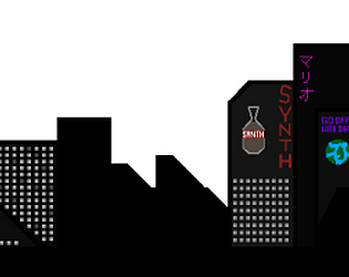
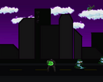
This is an alright beat 'em up style game. The art style is fine, but I feel as if the use of colour could have been better (the enemies are vastly different from the backgrounds and player). I noticed that my E attack was not as responsive as my Q attack, and it was a slog using that over anything else.
Regarding the rest of the game, there's not much to say. The player not having any noticable health removed any sense of urgency or survival, and I went in guns ablaze. The lack of feedback when attacking an enemy made me unsure if the hits actually went through or not. The ending was abrupt, as I still had an enemy in front of me when the game anti-climactically went back to the main menu.
I feel as if there is some work to be done here, but with a bit of work it could definitely become something proper.
Hey! thank you for your response, I intended to include a health bar. it had gone wrong and had to be removed last minute. I thank you for your critique and use this for later projects.
Pretty good attempt at a side scrolling beat em up game, the art work was really nice, I feel that the animations can be improved somewhat, especially the attack moves, you need to hold the attack buttons for the animation to fully go through, but you don't need to do this to do the damage.
A really good attempt at a double dragon beat em up style game. I thought that the sprite work was really good and the art itself was unique and worked well. Some improvements would be setting up a health system for the player to make it more competitive and strategic with how you attack the players and having no way to lose isnt the greatest for a fighter game. Overall a good attempt.
Pretty cool game with really nice visuals. I feel like a health system and lose condition would be a great way to improve it but for now it's a solid submission that hit the brief nicely and looks really good - you should all be proud!! :DDD
A good foundation of a 'Double Dragon' style game, with some decent character art and animations. Being able to walk on a 3rd Axis using a 2D perspective was something I wasn't aware of initially but was well implemented on the whole.
I don't believe a health system or 'lose condition' is within the game as I couldn't seem to die at times which did make the game incredibly simple. In addition, it did seem at times that the player attack happened the instant a button was pressed which is fine if the animation didn't make it seem like it would attack at once. Keep your visuals and in-game data consistent.
On the whole, this submission is entirely serviceable with some room for improvement, but is largely functional and visually appealing. Perhaps consider what you could have done with the time you were given and what went right and some improvements that could be made. Good effort.
Thank you for your honest review! we faced some heavy problems during development, files going missing and more. there is a lose condition where if you get hit about 12 times, you lose the game I feel that this number should be lowered to make the game harder. Time management did play a key role in how the game turned out to be honest and it should of been managed a lot better. again, thank you for reviewing our game :)
Really nice start to a brawler game, the sprites are fantastic and the atmosphere is well established. I love the animations for the attacks but it's a bit strange having them only play when the key is held down. I do like how the sprites get slightly bigger and smaller the closer they are to the camera, that's a nice touch.
I'm sure you know how you would take this further (player health, clear end goal etc) but this is a really solid start, nice one!
A well designed game, I liked your menu screen with clear instructions on how to play the game and loading into the game having background music to make this stand out to the player, I would of liked to of seen a lose condition within this as nothing would happen after leaving the player not attacking for a while which I would of liked to of seen a game over screen or something, I feel that the art and design was done well as well and another level would of made this stand out as well, but a clear attempt has been made and is a good submission so well done!
Nice design, unsure about a few things.
FIrst thing to ask, is there a lose condition? I found my first run of the game fairly easy, so I let myself get swamped by enemies and... Nothing happened. It ultimately removes any challenge from the game, which is a shame.
The enemy, player and scene designs are really well-done though, however the animations are a little minimal in some areas. I'm unsure as to what the "jab" animation is actually meant to be, as it's on the hand that's on the other side from it's hitbox?
Aside from this, the game was nice to play. Well done.