Play game
Craven Edge: Samurai Blade's itch.io pageResults
| Criteria | Rank | Score* | Raw Score |
| Overall | #2 | 4.048 | 4.048 |
| Gameplay | #2 | 3.952 | 3.952 |
| Overall | #3 | 4.143 | 4.143 |
| Innovation | #4 | 4.048 | 4.048 |
Ranked from 21 ratings. Score is adjusted from raw score by the median number of ratings per game in the jam.
Leave a comment
Log in with itch.io to leave a comment.


Comments
Very cute game! really enjoyed the visuals and all the animations as well as the sound affects! the game felt very retro and reminded me of my old game-boy games (Which was a nice nostalgic trip), the game play was enjoyable and i felt a lot of work went into polishing this game :) Well done !
This is an awesome submission!
This would be something really fun to play with some friends.
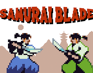
I liked the art work, and the mechanic for actually being able to parry the attacks. This game is rather amazing!
I'm really impressed, an awesome submission and I can't really say much to improve the game itself, I would possibly suggest to smoothen out the animations further by adding frames and I get with what they're wearing that it would be harder to animate but some walking animation would work. Well done to you and your team on a great game.
A really fun and addictive game to play with some friends. I felt the art style was outstanding and the actual gameplay itself was really fun and immersive even though it was just some simple mechanics. Overall a really good job and well done to the team.
This is fantastic example of how a couple of simple mechanics can be combined to create high depth of gameplay. Love that winning is based on timing and mind games rather than button mashing, it makes it feel great to win and that it was my own fault when I lost. The art is at a professional standard and the overall style is cohesive, it really makes the game stand out. Not really much that I can criticise, this is a such a solid game. Well done to the whole team!
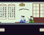
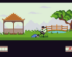
This is a really well made game, honestly I can picture this being released on the GBA back in the 00's. The overall art of this game is really good and well done, I especially liked the extra little detail in the dojo using actual Japanese characters in the scrolls on the wall which is a nice touch. The gameplay is fun and tense, had a lot of fun playing this. The inclusion of multiple levels is nice as it adds more variety to the game. The inclusion of a level selector would have been nice on the main menu as opposed to the round selector. The only other critique I have is the audio on the bridge level which could've done with a bit more work due to how it suddenly cuts in and out, other than that this is a great game, GOOD JOB!!
This game takes me back to playing games on the GBA or even occasionally on the NES, very reminiscent of the past. The beauty of making games inspired by older games is that they are really simple to make with modern day engines. Your choice to do something like that, intentional or otherwise, definitely worked for you as this game is incredibly polished and everything plays really well. The graphics are really good, almost professional if this was a game on the GBA/NES. Audio add to the level of polish overall creating an enticing experience. Gameplay is fairly simple, but works in its favour, with two options leading to a 'Rock-Paper-Scissors'-esque scenario where you can outsmart your opponent. Despite the simple controls, complex decisions can be made. You even added a jump forward and back motion with double tap! This, with perhaps some tweaks here and there could be placed on a marketplace.
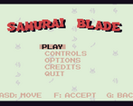
I feel like an ability to choose an arena from the menu would be a nice feature, as it took a couple of retries to get to see all of your arenas. The main improvement that I think should be made is the hitboxes as avoiding damage can be a little difficult at times, and a slightly smaller hitbox would help compliment the "Simple but Complex" system that you have designed. Finally, consider your controller bindings for local play. Whilst you can play both systems with 1 or 2 hands, it does feel like player 1 would have a smaller advantage since movement would typically be controlled by the left hand. Are there other keys that you could have used to mitigate this problem?
That being said, most of my critique can be considered nitpicks as this game is well polished and the issues encountered would have little effect on general play between two people. This is definitely a strong submission that you should all be quite proud of. Well done!
Wow this is an amazing game!!! Everything in this game looks so well made from the artwork to the gameplay! The characters and backgrounds look so good! You should all be really proud it's awesome well done!!! :D
wow, a very well designed game which really stood out to me from the character designs to the background which combined fit perfectly, I liked the retro style and sound effects that were also added to the game which really stood out to me the most and by having the menu working with animations with clear instructions made the game look to near professional standards, if there was something that could be added I would say a selection of fighters, but from going back over to backgrounds to end on a positive I like how every time you load it is different every time which made it unique, you should all be very proud with this submission, well done!
Really well made game! The art is amazing, the characters and background look so good and the animations are amazing. Not much I can suggest to improve it, good job!
pretty amazing game, when others are thinking of complex games, trying to imitate triple A games, you guys kept it simplistic and easy to understand, and with a beautiful art style. Honestly id believe if someone had told me this was a classic game on the NES back in those days.
Unable to launch the game as there is no love.dll file. Shame, as I thought this game looked dope.
Oh no! Just going to grab that file now and give you a Drive link, sorry for the pain!
https://drive.google.com/open?id=1-rMIXX92MeElpm1Q3CbOEKxCcHbVSzUK
Sorry for the inconvenience! The file you need is in this Drive link. Please let me know if you have any more issues!
(Alternatively, re-downloading the game should also work now!)
Thanks! I guess it would be common courtesy for me to actually give you a proper review now!
The game looks stunning, with the graphics really delivering on that consistency in colour palette, pixel size, and theme. Really feels proper to a professional level. Unfortunately (for me), I was alone in my flat when I tested this game, meaning that I didn't get the full experience of fighting another player one-to-one, but I'll do my best to summarize my thoughts here regardless.
The simple controls reflect that rock-paper-scissor vibe that most fighting games have, with the attack-deflect synergy. I would have liked to seen that being fully implemented, switching the deflect for maybe a counter and making it so the counter could be overcome by something like a grapple. Now, maybe I'm wrong here and the system you have in place works a lot better than what I'm proposing, and I'm just unable to properly test it. If that is the case, disregard this last paragraph!
In general, I have a hard time to put into words what makes this game feel professionally made, but I think I could summarize it all by saying "Juice". This game feels like it has been juiced to bits, to get everything feel more impactful, such as the small shake the samurais go through when they deliver a killing blow, the impactful sound that goes along with that, and more.
There were some issues I found though. When an enemy goes down, you could keep on spamming the attack key on their corpse and the game would not continue. It would be stuck in some cruel limbo. Also, if I timed it correctly, I could skip an entire round, because I killed the enemy again between frames. It's not the biggest bug in the world, but it is a bug nonetheless. The lack of walking animation did bother me a bit, but it is not something that's really that important.
Thank you for the feedback!
I can understand trying to make the game feel more like a rock-paper-scissors style fighter of sorts, but I personally feel like the parry creates a more complex scenario, as upon a successful parry, each player is presented with the chance to either continue attacking or dash back and reset the situation. While I do see the appeal of having an option that beats parrying, it essentially exists as "idling". "Idling" beats parrying by letting you hit them after their parry animation has finished (since there's a cooldown on them performing any other non-movement action), sword strikes beat "Idling" and parrying beats sword strikes. I feel like having a true counter to parry would make it under-perform overall, since it would essentially be the only option to lose to two types of "actions", and the current effect created from being parried leads to a more interesting scenario that continues the game other than just ending it.
Thanks for finding those bugs! While there's not much we can do about it now, I'll try to be more intensive with testing for the future.