Indie game storeFree gamesFun gamesHorror games
Game developmentAssetsComics
SalesBundles
Jobs
TagsGame Engines

mitchellbull

104
Posts
12
Followers
7
Following
A member registered Sep 23, 2019 · View creator page →

Creator of

Recent community posts

Not a bad attempt. The artwork and animation felt really nice. There was no collisions above or below the screen so you could just infinitely go up or downward.

I felt that the enemies perhaps moved a bit too slowly especially considering their projectiles didn't go as far as the players.

A good submission, some good designed enemies in this, both in an art sense and a behaviour. The game played out pretty smoothly and difficulty increased at a steady pace. Audio as others had mentioned would have definitely added to this. I think animations would also have.

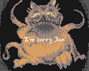
Very nice artwork, I love that dragon looking creature and how each of the sprites would tie its design to a computerised theme. I like that a scoring system was added, but were levels based around hitting a certain score? If that's the case, I don't think this should be done as score so much as progress through a level, the score would be to bring a person back to try and get it higher either throughout the entire game or a level basis.

The main menu button didn't seem to really work for me and enemies colliding with the player didn't seem to do damage, bullets did the damage.

I did however enjoy playing this, though it did have some challenge to it.

This is an amazing submission, the artwork, UI, sounds/music, controls and feel all come together to make this feel like a professionally made game. The intro/tutorial was a brilliant addition, as well as the variation in enemies giving the game a lot more depth.

I love the little jelly bean guy, it's such a simple design but holds a lot of weight.

Feedback was amazing, having the little bean telling you to watch out as well as having ship wobble.

If I was to pick on something though I'd say level 2 and 3 had enemies that seemed 'out of range' either to the left or the right, this feels like it was intended and isn't bad, but I think sometimes they can be a bit too hard to hit, with having the small window of moving back towards the center then outwards again to get extra distance.

A nice submission, the game was enjoyable and played out quite nicely, the artwork was clean and you could tell what each sprite was. The extra detail to animations was also quite nice.

I thought that the boss had quite interesting attack patterns, it felt like an actual boss.

The addition of score was also a nice touch as it allows the player to see progress easily, I don't think this comboed well with the raven enemies though, they felt a little hard to kill before they went off screen, most of the points in my experience came from the peasants.

Well done on making a very solid, enjoyable game though.

The game looks awesome, the planes looks amazing and work well with the sound effects and music.

I did find it a bit difficult, I also noticed that enemies were able to destroy each other and this gives points to the player (don't know if this was intended).

Nice use of font for the game over screen, it really screams that something bad had happened.

When moving forwards it seems that you destroyed some of your own bullets (this however didn't damage the player so I can't see it as a massive issue).

Level design and including the player in story was really well thought out.

Reticle feedback of distance or locking on was very nice, although it seems when I hit one of the walls I would just stop until I either pushed out of the way (this could have something to do with the below) or eventually just started phasing through walls (I think I destroyed the wall collisions).

I feel the lining up of shots was a bit difficult, maybe it should have shot towards the enemy when within a certain radius of the reticle?

Some point, I think after the health restored it seems I was impervious to damage.

Ultimately, I do think this is a well made game, well done to you and your team.

A good submission, the artwork works really well with the theme/concept, it plays out quite nicely and there's enough difficulty to keep your attention. The boss definitely looks awesome.

I feel that there could have more feedback for the boss, something to show that bullets aren't going to work until an opportunity arises, rather than them going right through. Turret sprites would also look and feel better if they were to face the player when shooting.

However it was an enjoyable game, well done.

A solid attempt at an r-type shooter, movement mechanics built on the concept making it feel as if you're under water.

Artwork looks nice and animations feel smooth.

I feel that the abrupt deaths are a bit unfair and bullets seem to have an issue firing backwards (towards the left).

I think that this is a very solid submission, I really liked the visuals and the idea behind it.

The scoreboard and minimap are a nice addition, it gives flow and gives the player knowledge of improvement.

I discovered that with the amount of shields you were providing that you could just run through most of the bombs, this still gives points to the player, using this method you can make it to the end of the level rather quickly.

Awesome examples of screenshots and a video, most people seem to be forgetting this, it does give a good idea as to what to expect from the game.

I'm rather impressed by this game, I feel all of the components blend together really well, music, sound effects, art style and concept all come together to make a really, really nice retro sci-fi game.

It's difficult to point out a negative to this well-polished game, I can appreciate the extra detail to feedback for the player though, like when you hit a wall.

Awesome art style that definitely stands out, as I notice it from week to week.

I really like it, the animations are smooth and the gameplay is quite enjoyable, I loved how the player looked more 'traumatised' as the levels went on.

I think after the boss, although not necessary, some indication as to moving on is needed as I was just waiting thinking it needed to load. Likewise with the death to the left, although you'll find out very soon if you just leave it to consume you, or you run into it yourself, something indicating death would look nice I think.

P.S. I suck, I couldn't get past the 3rd boss.

Hah, I love it. A very entertaining idea.

Nice artwork, simple controls and very intuitive. All the sounds and bg music work really well together.

I did have a preference of using the laser bolts? type projectile since the missiles were sticking to the left part of the screen. Other than that though, the game played over really well.

Brilliant game, I enjoyed this game and I had to keep trying until I beat it.

The artwork and animations look great and work smoothly, the hitboxes seem to work quite well as well. My only real qualm as mentioned by another commenter was the similar colours of the bullets and the background makes it a bit of a strain to see.

Oh wow, I am impressed. This reminds me of the gummi ship building on Kingdom hearts, and that is one of my favourites - which makes me a little biased.

I would like to point out that the bullets coming from turrets were a little difficult to see, I was wondering why I was taking damage for a portion of the time I was playing.

Nevertheless, a really fun game and an awesome concept to build upon.

Thank you DrgnSlyrVic, a lot of effort went into this game, we really appreciate the compliments.

Ah yes, the button held would have definitely been a good addition for playability, I for one had overlooked that point.

I'm definitely proud of the majority of our team, they put in a lot of time and effort to get this game up.

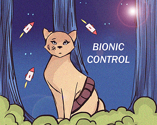
Thanks UP941967, we were entertained by the idea of a cat that was against an army of mechanical animals.

I agree, I also loved the story put together by one of the team, they should definitely be proud of themselves. :)

(1 edit)

Thank you very much for the compliments Yerduso, we really appreciate that.

I agree, the UI placements as well as power up  timing could definitely have been bigger, a fix  for the collisions with the projectiles would definitely make the game more enjoyable. In future I definitely think we need to allow for more bug testing as well as have more people on the bug testing. I would also say it would have been nice for the animations to have been slightly smoother as well as more variations for certain actions.

However I think for the majority of the team I am happy with the amount of time and effort they put into it and think that we came out with a fairly decent game, well done to the rest of my team. :)

It may not have turned out as you expected, but you can definitely see that effort was put in, so long as you've acknowledged where you've went wrong and how you can address that in future, then I believe there's always a way forward.

Awesome game, felt very professional especially with the addition of the options on the main menu, character and stage selection is also a very nice addition. Sound goes very well with the theme of robots fighting. Well done to your team for an awesome submission.

A very nice attempt at a beat em up, art style, animation and music all synchronises quite well, some initial indication to control would have been nice as well as enemy health.

Very nice submission, definitely matches the project criteria, a good theme that matches the rest of the game well. My main issue would be that fighting in this game seems to just be a matter of hitting and taking hits, except you don't know how much health your enemies have and if you're targetting the enemies in the second level, the bullets seem relatively difficult to dodge whilst fighting.

Thanks Kaputtea.

Appealing game with decent control, I can't say I agree with your choice of attacking keys - having two attacks above and two below the movement causes your hands to get in each others way. 

A decent attempt, it could do with some way to indicate controls, animations also seem a bit quick.

A nice game, but I don't think it really fits the criteria of a beat em up, it does however play quite well and is appealing in appearance. There are some issues with enemies - you can stand on top of enemies heads to avoid any damage completely, and despite having full health certain collisions seem to instantly kill you.

Pretty good attempt at a side scrolling beat em up game, the art work was really nice, I feel that the animations can be improved somewhat, especially the attack moves, you need to hold the attack buttons for the animation to fully go through, but you don't need to do this to do the damage.

Unfortunately can't really play it because of the issue with controls as you're aware of, nice artwork that seems to have been outsourced and needs attribution as mentioned in a prior comment. Animations work quite well, but control of the characters seem sort of out-of-whack, perhaps turning down the amount they move at would help.

A decent game, works quite well and reminds me a lot of Rayman, The artwork is nice but I feel the addition of animation would get me into the game more, as well as some sort of target. It was an interesting choice of sound effects for punching and kicking.

Nice art work, the animations work quite well with actions and movement and the game seems to play quite well.

A unique attempt at a street fighter game and interesting concept, I like the free hand menus, but to some I can see that being hard to read. I was playing on a laptop so I couldn't really fully experience the game, I feel like improvements to animations could reallu compliment this game.

Not a bad attempt, I found it a bit difficult to start, you take a lot of damage from head on encounters (which you've given health packs for either way) and you need to dodge turrets constantly aiming at you (which you can destroy in most cases) - I think this difficulty spike is a bit high to start with, and the enemies sometimes seemed to hit me when using a hit and run tactic which didn't show through an animation.

All in all a good submission.

Interesting submission with nice artwork and animations, the punching didn't really seem to work very well for me as well as seemingly being hit when I wasn't close enough. Some improvements to the hit boxes, a reason to come back (score system or maybe levels) and I think more to dying and it would be improve the game a lot. Well done on a well made game to your team though.

I'm really impressed, an awesome submission and I can't really say much to improve the game itself, I would possibly suggest to smoothen out the animations further by adding frames and I get with what they're wearing that it would be harder to animate but some walking animation would work. Well done to you and your team on a great game.

Thank you Vic.

Thank you Charlie, it is a difficult one to plan for time wise when you don't actually have the ability to perform the task, when you're in need of learning as you go along, though that's not really an excuse, since I didn't have the ability I should've lowered the bar a little bit, that could have also had something to do with the rest of my team not contributing, i don't know. 

I'll be there, don't worry. 

Thanks Kian, I appreciate the compliments, i do think the animations could've been taken a bit further, it'd be a lot smother had I added more frames. 

Ah, that's something I'll have to take into account in future if I use numpad, thank you for pointing that out. 

Unfortunately it seems on itch io you can bypass the game page completely (specifically the description of the page where I included the information) however I also commented below with further information, I apologise for the incomplete state of the game, for simplicity's sake I'll paste it again here:

Controls

Player 1 / Player 2

Directions

W / UP

A / LEFT

S / DOWN

D / RIGHT

Punch one

J / NUMPAD 1

Punch two

U / NUMPAD 4

Kick one

K / NUMPAD 2

Kick two

I / NUMPAD 5

(attacks can be used whilst ducking, standing and in the air)

(1 edit)

Unfortunately, I've had to upload an unfinished game, but there's only so much I can do on my own.

I'm uncertain on how to improve group communication, but the unfinished elements can definitely be improved.

Important details below.

Unfinished elements

1. Diverse and improved (increased amount of frames) sprites

2. Controls screen (ability to change controls, see below for controls)

3. Ability to win

4. Proper and fitting background

5. Stage selection

6. Audio

7. Pause menu

8. Attack effects (Knockdown, knockback, Knockup etc.)

Controls

Player 1 / Player 2

Directions

W / UP

A / LEFT

S / DOWN

D / RIGHT

Punch one

J / NUMPAD 1

Punch two

U / NUMPAD 4

Kick one

K / NUMPAD 2

Kick two

I / NUMPAD 5

(attacks can be used whilst ducking, standing and in the air)

Interesting concept. It plays quite decently, however you do seem to get stuck on obstacles and enemies, in the enemies case once you pull away you die. The hole part way through was hard to notice as well. All in all a decent platformer though.