Play game
PERIMPETUM DIABOLUS's itch.io pageResults
| Criteria | Rank | Score* | Raw Score |
| Graphics/Animation | #71 | 3.727 | 3.727 |
| Overall | #113 | 3.218 | 3.218 |
| Music/Sound | #113 | 3.182 | 3.182 |
| Technical Implementation | #119 | 3.091 | 3.091 |
| Fun/Design | #133 | 3.182 | 3.182 |
| Theme/Limitation | #169 | 2.909 | 2.909 |
Ranked from 11 ratings. Score is adjusted from raw score by the median number of ratings per game in the jam.
How does your game apply the limitation (and optionally, the theme)?
en concepto de extinción
Team Size
Solo (1)
What main engine/tool/language did you use to construct the game?
GAMEMAKER STUDIO 1.4.999
Leave a comment
Log in with itch.io to leave a comment.


Comments
Love seeing another GameMaker dev! This game was a blast to play. I felt a bit too strong as the player, and then after taking down the first boss and the second one came out I thought ... OK, ramping up the challenge! I guess that fight is for another day though.
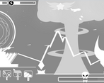
The controls are intuitive, but only after playing for a bit did I realize the cannons had their own cool down timer and my own Air Force bombardment was automatic and on its own timer. You have a really nice animation for when the cannons are ready to fire, but you don't signal to the player when any of their other attacks are available or how much of the resource they cost to use.
If you cleaned up the UI some to make those things easier to follow, this is a game I could see myself spending a lot of time on! It had some of the best bits of Galaga in it, with great extra attacks.
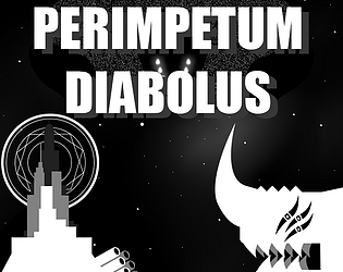
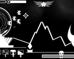
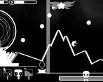
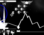
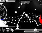
I love the art and animations on the player, environment and enemies, but I do wonder if you should have used a wider palette. There's beauty in the black and white, but you also had some red, blue and I believe green. Even if you stuck with one extra color, but did a slight hue shift in either direction for the enemies and the player defenses, it would make the screen easier to read in the intense and fun moment-to-moment gameplay.
Overall, great work and a gem of the jam.
Nice visuals and binding your actions to different keys was a good choice. A bit hard to tell when an action is available to, maybe some sound keys would help in that department.
Very nice game ! love the visuals very simple but looks very good !
Great job :)
I love the visual style and the concept, the boss could've had a bit less hp though :P
cool game well made i like the graphics as well and the combat system aswell
Lots of fun to play. I particularly enjoyed the various abilities you could use to fight with. I also really liked the graphics. Overall nice work on this.
It def fits the theme: NUKE THEM FROM ORBIT. Enjoyed the moment playing this, I feel some balancing is needed for some perks and for the main gun but overall it was a cool experience. Art is quite cool, simple but looking great.
I liked the art, and the sound.
I liked the energy for using special abilites, even though I really only used the rapid fire and missile ones.
The rapid fire could clear the entire screen really well, making the waiting for recharge for the nuke not really worth it.
But I beat it! And I would have played it more if there were more to play!
Good job!
nice art!