Indie game storeFree gamesFun gamesHorror games
Game developmentAssetsComics
SalesBundles
Jobs
TagsGame Engines
A jam submission

Overtime OverheatView game page

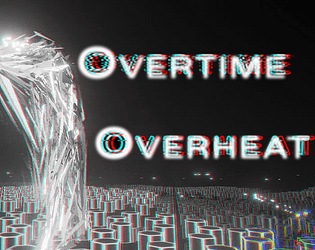
Microwave fighting game
Add to collection

Play game

Overtime Overheat's itch.io page

Results

CriteriaRankScore*Raw Score
Theme/Limitation#14.3754.375
Technical Implementation#44.2504.250
Overall#64.0754.075
Music/Sound#303.7923.792
Graphics/Animation#314.1674.167
Fun/Design#363.7923.792

Ranked from 24 ratings. Score is adjusted from raw score by the median number of ratings per game in the jam.

How does your game apply the limitation (and optionally, the theme)?
There's a bossfight and the closer you are to the edge, the stronger you are

Team Size

Pair (2)

What main engine/tool/language did you use to construct the game?
Unity

Which diversifiers did you use, if any?
Anti Chromatic (with an Anaglyph effect)

Leave a comment

Log in with itch.io to leave a comment.

Comments

Submitted (1 edit) (+1)

Wow, what a great entry! I never thought it would be so fun and satisfying to shoot a microwave to death. I loved the controls and the trauma mechanic, really well done!

The only negative feedback I would give is that I didn't feel the "The close you are to the edge, the stronger you are". Perhaps because I always focused on dodging the attack while shooting to the center, I did not feel the impact of being close to the edge. But I loved this ideia, which increases risk and reward.

I would love to learn how the visuals of this game were made. Please, if you ever release a devlog explaining it, message me :)

This is one of the best entries I've played so far, Congratulations!

Developer

Hey sorry I missed your game before the rating period ended, I was kinda busy these couple of days. I made a postmortem on my game if you want to give it a read :P Thanks for the feedback too!

Submitted

Nice! Will do :)

Submitted(+1)

God my eyes and pc we could not finish the game, it runs at 15 fps xD but I like your art style reminded me of the matrix
Developer

I didn't optimize this game at all, I knew it wouldn't run well on lower end pc's, sorry! :P

Submitted(+1)

Nice art and gameplay ! excellent take on the theme. Had a great time playing  it ,altought i could not beat the macro wavus ;(.

Great work ! 

Submitted(+1)

Really good game! The controls feel great as an action game and the visuals are absolutely stunning! Really enjoyed this!

Submitted(+1)

Game looks really good (even tho a bit hard to see at times) and gameplay is really fluid. But I'm also really bad at shooters like this, Could just not beat the microwave, but I had a good time !

Submitted(+1)

Maybe the game is simple in mechanics, but the graphics are insane!

Submitted(+1)

I am honestly blown away by how this game looks. The fact that this was completed in 10 days is astonishing! The sounds were satisfying and the boss's attacks were anticipated just enough to allow you to react. Kinda interesting how I have almost the same base concept, just with worse execution lol. 5/5 in every regard!

Submitted(+1)

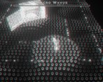
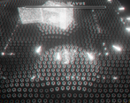
The art style was very interesting, I liked those wobbly hexagones.

Submitted(+1)

Insanely beautiful and vibrant game. I really enjoyed the challenge but I spent too much time looking at the wavy battlefield xD

  • I noticed that on my machine, the longer I played, the more laggy the game was becoming. This felt like as if the "shooting" projectiles weren't recycled / or maybe were destroyed too much? This will lead to constant garbage collection which can spike pretty high. But there could be many reasons, just guessing.
  • I know you picked mono-chromatic diversifier, but I think this game would benefit from color-coding boss attacks. Sometimes they would be hard to see since they either just merge with battlefield or with player's own projectiles. This is not a major issue though.
  • You mentioned that closer to the edge you're becoming more powerful... I believe it's true, but it didn't feel like it. I guess you could add something like a bar that shows the current power of your shots or maybe change SFX of the gun (more loud, more rough) or maybe change the way the boss's health bar depletes (bigger chunks, more stutter, etc.)

Really beautiful and fast-paced. Love it!

Developer

Hey thank you! I'm 100% pooling all projectiles, but I haven't profiled the game so the problem might be somewhere else. Color coding was physically impossible for me, because I used a monochrome shader instead of keeping the art black and white, but I agree some things could be color coded. The "more powerful" is just more fire rate (also more shot speed and more recoil but that doesn't increase the power), so it's not that significant. But there could be an UI element that shows you that. 

Thanks for the incredible feedback!

Submitted(+1)

Really incredible game! Absolute 5/5 in every category!
Some of the attacks were a little too difficult to dodge, but that made it so rewarding as well!
Also a brilliant take on the theme! Great job!

Submitted(+1)

Crazy good ! Loved the visual style !

A bit hard, but that's a good challenge. Only little critic is the laser which is very hard to dodge. but appart from that, nothing that can't be mastered. :)

Great job !

Submitted(+1)

Above everything else it is fun to play. Replayable, dynamic, stylish. Themes implemented superbly.

Submitted(+1)

Guys... this is insane, freakin awesome aesthetic, shoot sound is satisfying and really mad boss, i'm still stuck on Noodle master, i've only reached 50% of his health, damn crazy
and good trade off the use of the edge really good job!

Submitted(+1)

This was so amazing. And also so well designed. From amazing lighting effects to good usages of checkpoints. It was very impressive. There are only two very minor things I want to say. Since attacks don't immediately stop when the boss reaches zero health, you can die after you think you have defeated a phase, which can be very frustrating. Also, the following laser seems nearly impossible to perfectly dodge. But those things were extremely minor. 

Submitted(+2)

This is pretty great! The art style is cool but also a little trippy, but still fun! I like the mechanics of having to choose between being close to the edge for damage but too close is easier to die, and that your HP is just how much your get knocked back. Great design elements, and a killer score!

Submitted(+2)

Love the artstyle and the gameplay here! Feels a lot like Furi, which I am admittedly very bad up. I was only able to get up to the Noodle Monster, not sure how far in that is but there was absolutely no way I was going to beat him. He spawned more of his orb tentacle things faster than I was able to take them out (I'm assuming you kill those and then the boss is vulnerable again). Game felt great to play! There were a few moments though when the art style made it difficult to judge where the projectiles were coming from so I didn't quite know how to dodge them. Maybe thats something I could get better at with time but during my playthrough it felt a bit unfair. Anyway, great job! 

Developer(+1)

That's the last phase, in hindsight I should've probably prevented spawning more beacons when they're still up :P

Thanks for playing! 

Submitted(+2)

I really like the aesthetic for the game, and it was fun to play with a controller!