Play this funhouse
Simon Says's itch.io pageResults
| Criteria | Rank | Score* | Raw Score |
| Creativity | #284 | 3.462 | 3.462 |
| Topic | #291 | 3.462 | 3.462 |
| Simplicity | #369 | 3.615 | 3.615 |
| WOWIE! | #403 | 3.000 | 3.000 |
| Sound | #426 | 2.923 | 2.923 |
| Fun | #483 | 2.923 | 2.923 |
| Visuals | #535 | 2.846 | 2.846 |
Ranked from 13 ratings. Score is adjusted from raw score by the median number of ratings per game in the jam.
Music Source
I used FamiStudio to create the game music and all the SFX used
Credits
Twitter: @RykuzuS, itch.io: RykuzuStudios
Leave a comment
Log in with itch.io to leave a comment.



Comments
Wild chaotic clown energy the game, just through in a reference or two of worthikids Wire or Big Top Burger and I'd lose my mind, good job!
Pretty fun concept!! Love the chaotic graphics:) Small tip: the parallax background is going the opposite way to how it's supposed to, unless that's on purpose. Makes it super trippy and hurts my eyes
Thanks for the feedback! Though the parallaxing was set to move to the left when players move right, which I believe is how it should be. And my apologies for the colorful background, it wasnt my first intention to do that.
Oh you're right, I made a mistake. It's going the right direction, but it's faster than the foreground (ground + objects). That's what I meant lol
This was definitely a unique experience! As a jam game there were of course bugs and annoyances, but they didn't stop me from enjoying and completing the game.
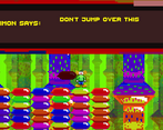
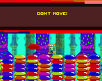
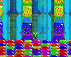
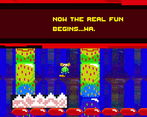
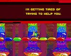
As the most unique element, I want to talk about the visual design a bit. There are of course so many colors being used, but you still managed to make it a coherent theme. The colors definitely conveyed the clownhouse, and the design of the speech bubbles actually reminded me of the Simon Says kids' toy. Given more time to work on this, however, I think you could still effectively convey your theme without hurting the players eyes. In particular, the changing background was a bit much, and I think if the environment's brightness (by which I mean the background and tileset) was turned down a bit it would help the player character and the speech signs stand out.
I like the design of the player's clown. His walk animation is a bit funky, which I assume was partly on purpose, but it still felt a little off. I'm not an animator so I can't really explain why though. Sorry!
To me it looks like the signs use the same asset as the floor. It would be helpful if they were different. Also, I was a bit confused by the last hallway at the end of the game, as there were many signs, but many didn't show me any text?
I appreciate the checkpoint system, and I think they were well-placed throughout!
Just like the visuals, the music matches your theme, but is a little overdone. Also just like the visuals, I think the music can still be effective even when toned down! You mentioned in a comment below that you wanted to practice making music for this game. Most jam games I've played have a basic repeating loops, but I think you did a good job in writing something interesting! It has variety, yet is still unified. The quick runs of notes circling around on each other stood out to me as the most unifying element of the music.
My advice to make it easier to listen to would be to balance all the craziness with some resolution. The music is running at full speed on full blast 200% of the time. Bring in some slower ends to phrases (and for that matter, just give us ends to phrases at all), resolve to some nice stable chords in between the fast runs, vary the texture by playing less notes at one time. Any of these could provide the listener with a bit of respite, and make the clowny-crazy bits more interesting by contrast!
Thank you for the amazing detailed feedback! That background was the last thing I wanted to do, but I was kind of running low on time so I stuck with that.
That clown animation was somewhat the idea I had of it walking, but I don't think I animated it to its fullest potential so you were right there.
That last hallway was supposed to show text, but it just ended up moving too fast, which I couldn't fix in time sadly.
I definitely appreciate the advice for making music. Im really glad you enjoyed it and I will keep that in mind to space out my notes and add rests to certain areas! I'm still learning in the areas of chords and such so I am looking forward to using all this helpful information. Again, thanks for the feedback!
I think that was a really creative game and a great way to incorporate the theme. My brain may hurt a little from the color changing but it was worth it! Really nice job and well done!
Thanks! I wanted to try and add more visuals so it wouldnt be plain and the colorful background was my last resort
I can see your effort on the animations and visuals.
I think there were a lot of times that I died and I didn't understand why. (I also died alot to the spikes)
This was confusing, I guess you aimed for it so good job. I do think that you can have the text not in a sign, but on the screen - that way the player won't have to stop and read the text, and he can have more flow in the gameplay.
Well done! A jam isn't an easy task. Be proud of yourself.
Thanks for the feedback! I was trying to go for a animated version of it, but it didnt fully work. There were lots of bugs I couldnt fix in time either sadly.
I liked the idea of the game and character of Simon. The parallax backgrounds move waaaay too fast and they were distracting at points though, and the pillars shouldn't be at the same level of contrast and brightness as the foreground. The death animation/process is also a bit wonky and interrupted the game loop.
Thanks for the feedback! It was my first time working with parallaxing in game and I thought I set it pretty good, but this is helpful to know nextime.
I do like the effect it aims for. Makes the funhouse seem really endless and expansive, like a fever dream. Also please check out my game if you have the chance!
Nice game! Though I thought clowns loved to stay at a funhouse, lol. My only criticism would be with the platforming and the UI. The platforming felt kinda funky in some places, and I think reworking the jumping would be a good idea too. I loved the scene transitions, I suppose you used Image components on a Canvas to achieve that. However, the dialogue sometimes shows up before the dialogue box pops out. Other than that, I enjoyed escaping the funhouse, and I think the difficulty was pretty well balanced for a jam game. Good job!
P.S Simon didn’t thank me for playing
Thanks for the feedback! That is true, but this wasn't your ordinary funhouse. Im glad you pointed out these errors because I know I had to fix them, but I was in my last hours of trying to polish the game and I couldn't get to all the errors and I did use the components in canvas. :D
Also, my apologies for Simon not thanking you. He's still hurt about letting you escape XD
Some feedback:
- Your music is very annoying. Like, very annoying. Next time you participate on a jam, you can team up with a musician... just like I did on this jam.
- Why does the "honk" button keep changing?
- Sometimes I'd just respawn dead. This makes no sense.
- Why do sometimes the spikes stay even after I die? I cannot do any progress if they are there.
- Keep what kills you consistent. It seems like at the beginning of the game I died to a red thing. Later I stopped dieing to that.
I still beat your game. The screenshot I took only has a white screen, mainly because I thought that was the winning screen, but after I finished taking the screenshot some text popped up. I think it was something on the lines of "The clown escaped the funhouse...". Here is a white screenshot then.
Thanks for the amazing constructive feedback! I was practicing on making music hence the reason I didnt want to team up. I was trying to add some variety to the game but I meased up a bit on that. But thanks reporting that bug and for playing!
I like the concept and it fits the theme well