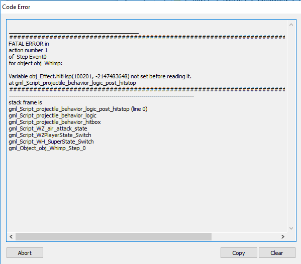
I just pushed an update with gamepad support and a few other fixes including the boss not dying when it should, tell me what you think.
Thanks for the feedback, I'm glad you had fun despite the issues.
AWK
Creator of
Recent community posts
Nice, thanks so much for the video. It's so interesting to see someone else playing the game and trying to figure things out, it's difficult for me to visualize how a puzzle might be solved since I already know the solutions so videos are invaluable for me.
You said you only understood the blue blocks later in the game and your video helped me understand why, you seem to have learned it in level 5 (second in the video) once you were forced to go around the pinned box to place the blue block in the bottom right corner, I think I will be making a simpler version of this level earlier on since it seems to be effective, other people who played the game also seemed to be more comfortable once they played that level.
Again, thanks a lot!
Big improvement to the presentation since I last played but the gameplay feels like a step down, it's just way too easy and I only failed by dying on purpose after doing the same thing over and over with no apparent difficulty curve after the first few waves.
Gearing feels like less of a necessity than before, the kamikaze ships are too slow.
The gears UI indicator is a bit too subtle, I only noticed it after a few minutes playing.
Gameplay video:
It was hard, I did enjoy it but I usually have a high tolerance for difficulty in general.
Maybe it's too much for the very beginning of the game and I don't like how I was forced to not buy items just to keep my health full, you could try difficulty options or a roguelite system that starts off the game simple and keeps increasing the complexity by introducing new moves, enemies, items and such.
I was mostly just being too conservative, I think it's because I wasn't sure of how much slo-mo I had in the heat of the moment, maybe you put the health and slo-mo meters around the crosshair to make it easier to see.
Another gripe I have with the UI is how the ammo count distracts me when I'm not looking directly at the crosshair, I think it should be another color and not as bright as the crosshair.


