Indie game storeFree gamesFun gamesHorror games
Game developmentAssetsComics
SalesBundles
Jobs
TagsGame Engines
A jam submission

The Great OrdealView game page

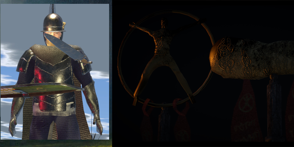
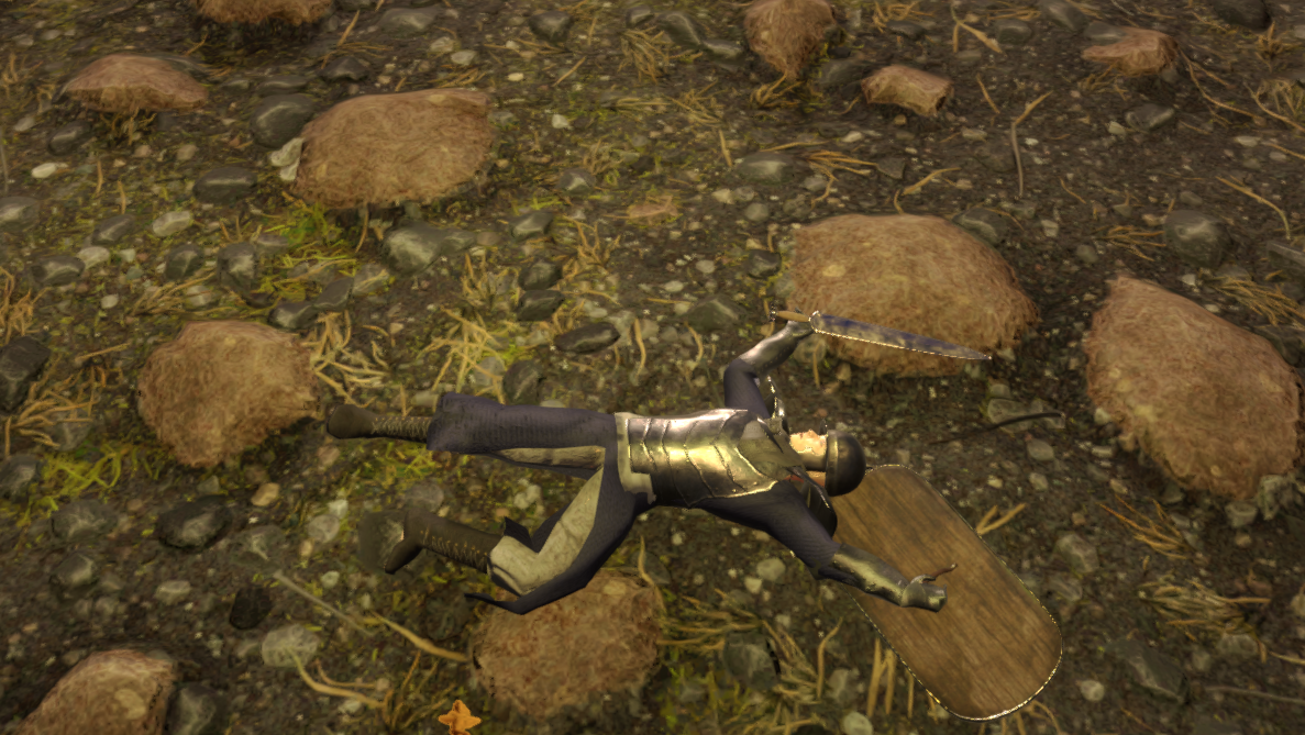
Soulslike Musou ARPG prototype. Truth Shines!
Submitted by Vita Brevis (@songofthepearl) — 2 days, 23 hours before the deadline
Add to collection

Play slog

The Great Ordeal's itch.io page

Leave a comment

Log in with itch.io to leave a comment.

Comments

Submitted(+1)

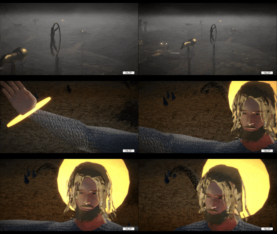
The cutscenes are absolute kino, man. Just amazing.

The game is a bit sluggish, maybe because of my weak PC, or maybe it's not very optimized. But it's a lot of fun - the attacks connect, some of them look very nice and flashy - though I think TTK is a bit too high. Maybe that's why I feel that it's a bit sluggish.

Feels very similar to Untitled Roman RPG, except now with over the shoulder view. Is this an evolution of that one, or a different project? Even has the same "Clip out of the intended area" bug

But it's fun, even though jank. I'm curious to see where you'll take it.

Btw - if the game detects the controller - it breaks until restart.

Developer(+1)

  • The cutscenes are absolute kino, man. Just amazing.

thank you so much, also thanks for streaming

  • The game is a bit sluggish, maybe because of my weak PC, or maybe it's not very optimized. But it's a lot of fun - the attacks connect, some of them look very nice and flashy - though I think TTK is a bit too high. Maybe that's why I feel that it's a bit sluggish.

i am curious how it plays on the lowest settings on a weak PC. if you set it to 640 resolution and option C graphics, i do wonder how it would perform. (no need to check now, i'm just curious in the future)

  • Feels very similar to Untitled Roman RPG, except now with over the shoulder view. Is this an evolution of that one, or a different project? Even has the same "Clip out of the intended area" bug

haha, i think i fixed that bug in the latest patch. thank you for exploring it so diligently.

yes, a lot of this carries over from roman RPG - same character controller, different camera, entirely different RPG character system. i think i'm slowly inching closer towards my goal of a fully featured souls style game.

  • But it's fun, even though jank. I'm curious to see where you'll take it.

i'm glad you had fun, that's the most important part.

i look forward to continuing to work on this and hopefully make it worthy of your time in the future.

  • Btw - if the game detects the controller - it breaks until restart.

no controller support as yet, it's going to take a total overhaul of my input system. next big challenge for me codewise.

thanks again and i hope you will play again in the future once i've smoothed things out a bit.

Submitted (2 edits) (+1)

Absolute jank and I say that in the best possible way. I had a fun time playing. It's actually quite impressive how many systems there are for a one man prototype, while still being somewhat functional. From the looks of your profile, you've jumped into a lot of different projects and I remember playing the roman game, which this game looks like it borrows a lot of content from. I'd encourage you to stick to one project to completion. This projects very cool but will probably need too much work for one person to make fully functional. On a side note, it appears that there might be a lot of plugins at use. If this is the case, I'd recommend avoiding this habit in the future and programming these systems from scratch, creating each new system to completion and without bugs. That way you'll end up with a less buggy game, learn a lot and have systems that you can more easily port over to new projects. If this isn't the case, then please ignore. Back to the game though, it actually has some great atmosphere and concept. You clearly have a lot of skill and vision. It'd be nice to see it used for a game with the potential to be used to completion.

Submitted(+1)

From your Page, why bind heavy Attacks to Strg+Lmb, why not hold Lmb to charge up?

Played roughly 20m.

Title Music is nice. Title Screen is a Placeholder I'm assuming.

Graphics Quality Option A, B or C? I don't understand, but if you're recommend A, I'll use that one.

Both the T and A Posing in your Character selection is bad, it could be more dynamic Poses. You also don't need to put the 99 Point max there, the Player can't reach that anyway.

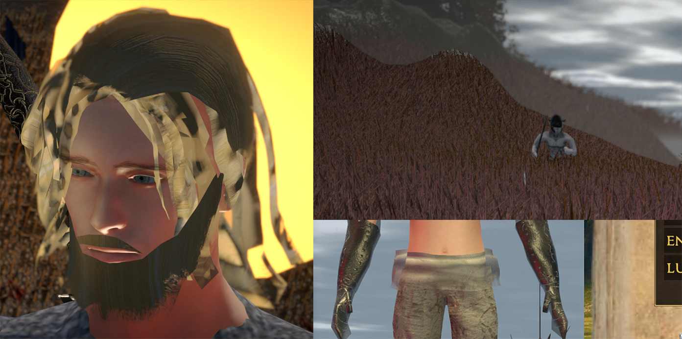
You have a bunch of clothing Issues on the Witches Costume.

Not being able to type a name but chose from premade ones is an interesting Choice on your End.

You definetly do not have the rights to Black Sabbath. Also probably not to that Author.

After the Intro the Screen stays black until I skip it manually.

Camera spins endlessly, due to detecting the Controller but not any Deadzone or similar probably.

After unequipping my Pants I can not reequip them because apparently I lack the Requirements for it, even tho it officially doesn't have any.

Why can I only cast spells as a Witch and not swing my Stick? What happens if I run out of Mana as I did in the Tutorial, do I just die? Also Lock-on doesn't work, and pretty much all of it is very barebones, and remotely functional.

For some Reason now that I'm out of the Tutorial I am punching after I finished casting a spell.

When you travel from the Camp to the Camp, you get half locked in the Map Screen. I was lucky to get my Mouse back on Screen somehow.

Also why seperate the Areas by a Map, why not walk there?

Second Area, when I ran down after a bunch of bad Collisions, Swords lying at my Feet, me having endless Talentpoints and spamming Flamebreath since it deals full damage on click, rather then when the cast finishes, and obliterates everything in front of me, I stopped being able to walk, so I'm going to stop here.

It's very early, and extremely rough. Pretty much everything is broken at this Point I think. 

I'll try this again next DD, hopefully its more playable then.

Developer (2 edits)

thanks for playing Tomodev. and sorry it's so broken.

  • From your Page, why bind heavy Attacks to Strg+Lmb, why not hold Lmb to charge up?
  • Camera spins endlessly, due to detecting the Controller but not any Deadzone or similar probably.

no controller support yet, should've put that in the game page. i'm an idiot

as far as attacks, i just personally prefer having a separate input for light and charged attacks.

  • me having endless Talentpoints

could not replicate, did you have 99 Talentpoints or? after playing 20m you shouldn't have more than 7 or 8

  •  spamming Flamebreath since it deals full damage on click, rather then when the cast finishes, and obliterates everything in front of me,
  • Why can I only cast spells as a Witch and not swing my Stick? What happens if I run out of Mana as I did in the Tutorial, do I just die? 

the witch is meant to be OP for lore reasons. you regenerate mana by hitting enemies with the flame breath. of course i didn't explain this in the tutorial because i'm an idiot. the witch's "wand" is as small as a finger so swinging with it wouldn't make sense. sorry about the punching and movement lock bugs.

  • Also Lock-on doesn't work, and pretty much all of it is very barebones, and remotely functional.

can you explain a little more detail? lock-on has some problems i know, what specifically was not working with it?

thanks again Tomo. you're the best

Submitted

I just had 1 talenpoint, it jsut didn't get removed on spending.

Lock-on just didn't activate on any button Input I tried.

Rest seems to be mostly just based on the early Stage of the Game then.

Submitted (3 edits) (+1)


This is jank, and not the good kind. I'll start off by saying that I've never played the Dark Souls games or any games like that. I don't like games of that type but I do like Dungeon Siege and Diablo so you can take all this with a grain of salt. Feel free to ignore anything that you think I've misinterpreted about your game or your intentions for the game.

OVERVIEW

First off, out of every single game this Demo Day, this seems to be the one that unambiguously has the most impressive production value, presentation, and sheer scope. Even judged against other Demo Days it's still in the top 10. The game successfully captured a very fitting atmosphere. The cutscenes at the beginning are very well made and wouldn't feel out of place in a AAA game from 2002. The UI art looks very stylish. These things are a good reason to give the game a break over its many shortcomings, but they also set the expectations enormously high. The intro sets you up for a complete and polished experience, and then the game starts...

This is the most bug-ridden game I have ever played. Somehow that never resulted in a crash or anything serious breaking, but there's so many bugs here that I don't even think it's possible to cover half of them. The game's most impressive accomplishment is also its biggest shortcoming -- it's clear that the game's development focus has been on content development when it would have been much wiser to first ensure to make the gameplay as bug-free as possible. The scope is grand, but it's easy to forget that even AAA studios with thousands of employees struggle with the sort of thing you're trying to do here. It's admirable, but the mountain of bugs speaks for itself. The fact that you manged to pull off a working 3D combat system is great. The fact that you implemented over 10 distinct classes is great. The fact that your presentation is outstanding is great, but it feels like your priorities are backwards. To me it seems that you should get a single class working without any problems before you start adding the other 10.


PRESENTATION AND GRAPHICS

Presentation and graphics are amazing if looked at on a macro scale. The individual models, animations, UI design decisions, and so forth are questionable. They get the job done as temporary assets.

If the lore presented in the game is anything to off this might be one of the most unique and unconventional fantasy worlds I have seen. Using something that unique as a base for an straightforward action game where the lore is nothing but background flavour seems like a massive waste. There are no opportunities to engage with the story. The dialogue system is clunky and sparsely used. The choice to put the dialogue box at the top of the screen is baffling and makes the dialogue screen unpleasant to use. The (click to continue) prompt requires you to click on the text itself rather than to just click anywhere -- the wording is misleading. Sometimes the continue dialogue option is (click to continue). Other times it's just (continue).

I don't understand the obsession with taking the deepest most fleshed out fictional worlds and making action games or movies out of them.

The rock theme in the intro doesn't fit the game.

Not a fan of the depth of field blur. It makes the game look cheap.

Breakable containers are nice but the way they shatter looks weird.

The tooltips that you get in the item and character menus are positioned in a nonsense way and seem way too big for their purpose.

The eyes option during character creation doesn't appear to do anything. For this sort of zoomed-out game a "face" option would be much more appropriate. That's besides the option for facial hair.

Hair looks strange but then you notice the transparency effect that it uses can be seen almost everywhere. I don't understand why it's made that way because it doesn't look good.

GAMEPLAY

When you're creating a character for the first time you are given 0 information what each stat does or what they affect. This is a horrible game design mistake that turns off people who actually like these types of games immediately, since they are left to guess.

Why are the controls only viewable in the tutorial starting area? Ideally you should be able to look over an overview of the controls at any time, especially for a game that uses more than 5 keys.

I'm not sure if the tutorial works. It tells you some specific controls like the jump in a good contextual moment (when you actually need to use the jump to get over the tecnch), but a lot of the tutorial text just seems placed at random intervals and can easily be overlooked. The first few popups just show up one after the other. The tutorial does nothing to teach you about the significance of the character screen or the upgrades there, or even the character skills as a whole. It's very easy to completely forget the skills exist with some classes.

The loot drop system is bad. I'm going to assume this is probably how the Souls games do it but this type of loot drop approach is usually associated with MMORPGs where they do it out of efficiency. Dungeon Siege and Diablo have much better drop-pickup systems and while those systems are more complicated to implement they compliment the flow of gameplay much better and help avoid the type of confusion that the Great Ordeal creates when you have 100 enemy drops stacked in the same 50 square centimeters. The fact that interaction targets are automaticlaly selected and very difficult to control by the player makes in even more diffcult to target a specific loot container which means some loot might not be even possible to get to unless you also pick up all the loot around it first. I just stopped caring about the loot after a while, and this is a bad sign, since your primary audience with this game is loot junkies so if you can't appeal to them with more clarity in the loot system it's a huge missed opportunity.

The level layout is extremely jagged with a lot of steep inclines. Given that the character doesn't seem to be able to climb slopes too easily this makes traversal frustrating and sometimes makes you wonder if you're even supposed to be going the way you're going.

The combat feels nice to engage in occasionally and there's definitely the foundation for something good there but it's completely broken and spastic in its current state. Constant rubberbanding; lag spikes every time there's more than 40 npcs on screen; lack of any clear difficulty progression -- the way the gameplay works right now is just constant trial-and-error. There's nothing particularly challenging or strategic about the gameplay loop and there's nothing particularly satisfying about the combat encounters besides the enjoyment of dispatching the enemies one by one, and watching the occasional head fly off.

Enemies spawning out of thin air in the tutorial is obnoxious and doesn't look right. Consider having them run out of some kind of tunnel or something similar

The way that enemies spawn is ridiculous. The player is close enough when it happens that it's extremely obvious they generated out of a single point you see them rubber band away from each other.

BUGS AND ISSUES


Too many to list, but I will mention the ones that stood out to me the most.

Visual glitches constantly. Animation poses don't load sometimes. Skyboxes turn black sometimes.


The game makes my PC's fan enter overdrive mode. This is standard with Unity when the FPS cap is removed in the editor but I have never seen it happen on a game build until now.

The intro doesn't end on its own. You have to skip it manually once the cutscene ends.

The interaction prompt is weirdly coded. It shows up when you're 1-2 meters away from the thing you need to interact with but not when you're standing right next to it. Sometimes you can't get it to appear and have to move around like a crazy person trying to activate something.In some very rare cases clicking the interact button when the prompt is visible on screen does nothing and you have to leave the interaction range and come back. I remember this happening with the map at the camp. Interactions in general are really unreliable since some times you can't seem to even get some of them to activate the prompt, so you're blocked from interacting with them.

You can't enter the menu when character is locked-on to an enemy and a lot of times when you are in combat in general. Ignore if intentional.

Characters switching to T-pose for a few frames every time they are switched on the "continue" screen.

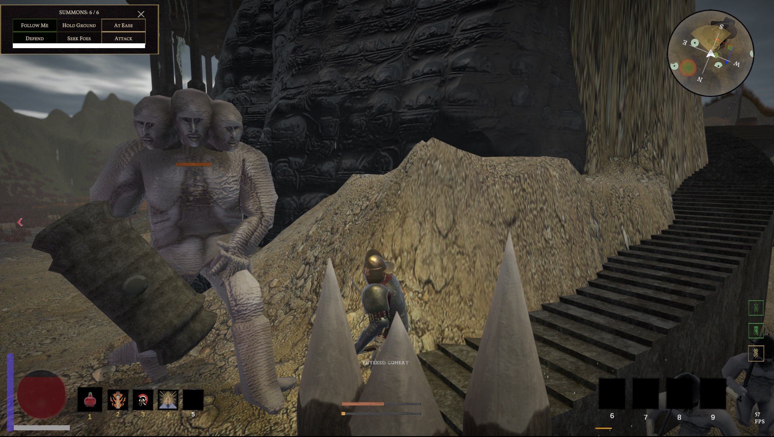
Opening the battle summons screen makes the cursor disappear your only option is to back out with ESC.

After you change your hair from bald to any hairstyle for the first time you can no longer go back to bald. The character model is stuck with a basic hairstyle while creating a character. It's possible that the default setting is not supposed to be bald but that is another bug also and it just activates the default hair for the first time only after you switch hairstyles.

During the intro cutscene the character controller is working and you can hear your character attacking when you click.

Exiting a save and reopening it changes the time of day. You can exit in the middle of the day and when you come back it's early morning. Why? Speaking of which the transitions between the times of day happen instantly which gives a strange impression.

One time when I loaded into the world the game was stuck in "cutscene" mode for some reason. This is just loading into the world, no cutscene was played before that. I could still control the player character but the UI was disabled, there wa a "skip" button in the corner, and all interactions were blocked until I clicked space to skip.

At all other times opening some menus (such as the map selection screen) which seem like they should freeze the character controller also allowed me to just use attacks and skills to my heart's content while the screen was open.

After jumping into the first "mission" a dialogue interaction is displayed but you can walk around while it's on screen. I don't think you should be able to move around while in dialogue. When the point captures happen this also starts dialogue interactions but in those cases you're in the middle of combat usually so you almost immediately click out of dialogue by accident or don't even have time to read anything because you're being attacked.

The healthbar of every single enemy that has taken even the slightest amount of damage is permanently visible no matter how far away from them you go. It doesn't seem like it should be that way.

You can still hear the outdoor sounds of rain and the horn ambiece while you are inside the Nonman's Well

The levers start twitching after you use them.

Broken or missing display on the geography underlay of the minimap in some locations.


The summons just keep hitting the air after there's no more enemies to kill.

Some enemies spawn stuck in the level geometry. This is the Scrancs at the bottom of the Nonman's Well and the big guy enemy in the first level.

Odd choice to allow players to access the missions after the first two considering they are unfinished levels.


~~~~~~~~~~~~~~~~~~~~~~~~~~~~~~~~~~~~~~~~~~~~

Great work on what you're accomplished but the issues need a lot of attention. The game's scale is grand but the polish and attention to quality is not there.

Developer (1 edit) (+1)

thank you so much for this incredibly thoughtful and detailed review. i'm humbled by the scope and breadth of your analysis and i'll do my best to reply to key points you brought up:

  • The fact that your presentation is outstanding is great, but it feels like your priorities are backwards. To me it seems that you should get a single class working without any problems before you start adding the other 10.

i believe everyone in amateur solo game development has their own approach to the problem of, "how do i make a game?" for me, i absolutely started backwards. i wanted to make my dream game from the start and didn't want to make anything else, and so i hacked a bunch of disparate systems, github repos, store assets, chatgpt scripts, and my own terrible code and into some semblance of a game, something that had all the features i wanted. soulslike 3D combat. on model clothing swapping with stats. dialogues with branching options. dynamic weather. cutscenes. physics. skill trees. etc. etc.  i've been refining and reshaping this emergent, enigmatic mess over the last two years, from samsara, to roman game, to now..... this. my point in presenting this horrid, bug-ridden prototype to demo day is that i could make all these systems functional and work in the barest way possible. now that they are all there, i must go back and refine, refine, refine, until something resembling my dream game arises from the muck.

  • If the lore presented in the game is anything to off this might be one of the most unique and unconventional fantasy worlds I have seen. Using something that unique as a base for an straightforward action game where the lore is nothing but background flavour seems like a massive waste. There are no opportunities to engage with the story. 

the lore of R. Scott Bakker is quite possibly the deepest in any fantasy series in existence. i want my game in some small way to honor its maddening complexity. at present, only the functionality of the RPG system is in place, and none of the content. in the future, the RPG content will be the real essence of the game- the combat is just the Meat of the game, but the RPG storylines will be its Soul. each class has a different starting location and storyline, with each ending in multiple endings - what is the fate of the soul of a sinner? what does it mean to become a violence-crazed killing machine that slaughters the enemy in droves, hungry for more and more power, even in the name of great righteousness? the meta-difficulty curve of the game will really lie in the player's choices.

  • graphics and UI issues

as i said in my page description, everything is placeholders. i am aware of most of these issues, and will address them in the future.

  • The loot drop system is bad. 

the loot that the sranc drop is meant to be low quality junk. the good loot is found in the chests and after killing Bashrag. i strongly agree with you though that i need a better pickup system. the diablo "press alt to highlight dropped items" is a nice feature and will, i'm sure, be a pain in the tushie to implement. but i think it will be worth it, as you say.

  • NPC and combat issues
  • Dialogue and input issues

all will be addressed in due time, i promise you.

  • The interaction prompt is weirdly coded. It shows up when you're 1-2 meters away from the thing you need to interact with but not when you're standing right next to it
  • The levers start twitching after you use them.

i believe you must have played a version before 7, the current build hopefully fixes both these small bugs.

  • Consider having them run out of some kind of tunnel or something similar

good idea. something i've been meaning to do.

  • You can still hear the outdoor sounds of rain and the horn ambiece while you are inside the Nonman's Well

that whole "level" is really nothing more than a rough test area at this point. i probably shouldn't have included it in the demo build.

  • Great work on what you're accomplished but the issues need a lot of attention. The game's scale is grand but the polish and attention to quality is not there.

thank you again for your kind words and extremely helpful and detailed feedback. i know i will be spending the next year or more addressing every one of these issues and trying to extract something wonderful from this mire of jank. it's comments like yours that inspire me to keep going and make this a proper game, so thank you again. i sincerely hope you will consider playing again in the future when so many of these issues have been ironed out. 

Submitted(+1)

Yeah, I did play the version that was first submitted to Demo Day. I just jumped into that one because I already had it downloaded.

> the loot that the sranc drop is meant to be low quality junk.

That's alright, but I think the problem is more that the items have so many stats that are hard to follow that it makes it tedious to have to wonder which items are better than others. If the items dropped by Sranc are supposed to be trash then consider reducing their buffs even more. For example the Sranc helm which I assume is supposed to be a basic trash helm has a list of 10 buffs and debuffs on it which makes a player wonder if there's anything special about it, instead of making it immediately clear that it's a trash helm with almost no use value. Item tooltips seem to suffer from information bloat. Not every item needs to have a billion stats and a whole essay of information. If you keep it sparse for the unremarkable items and scale it up based on how rare the item is, it communicates better to the player which items are really worth paying attention to.

The lore snippets on the items are a great touch, but since the tooltips are badly positioned and unintuitive in the information they give it discourages the player from reading through the whole thing to even get to the flavour text. Tooltips should definitely resize with the text.


> i wanted to make my dream game from the start and didn't want to make anything else

I hope you know what you're doing. Developers like you are an inspiration because of your passion and ambition but this could easily turn out to be yet another case of dreaming too big and getting burned out from the scope. Would gladly play it again in the future as long as it keeps improving.

Developer

i should probably just have loot drop as in-world props. a sranc helm looks like a sranc helm,  arrows look like arrows and not a glowing loot bag. i tried doing this before but had tons of issues. back to the old drawing board. thanks again for the input and i'm motivated to continue to try to make something worthy of another playthrough.

Submitted(+1)

holy shit, we have dark souls at home, but unironically.

i like the aesthetic you are going for, and you have put great effort in creating this world and the animations

some things that bothered me:

rotating the camera with the mouse feels very stiff and slow

when i talk with somebody i would want to be able to close the dialogue by pressing anywhere, not specifically "click here"

when i capture a point i lose control of my character for a few seconds but the game keeps running, so i find myself surrounded

Submitted(+1)

https://www.twitch.tv/videos/2137434972

Submitted

I never got to any combat tutorial or otherwise, as when I selected the Camp on the map, I died.


Developer

hmm, it seems you're not the only one who found this bug... exiting to the main menu and reloading your character should bring you back to the hub scene! 

Submitted(+1)

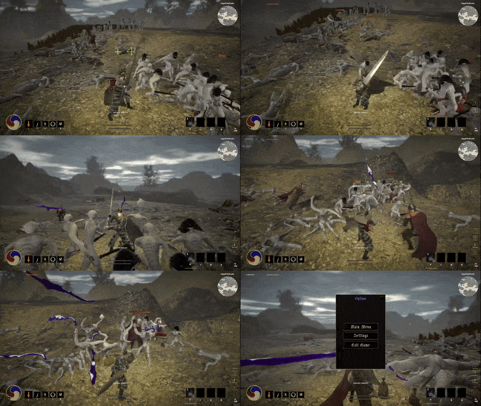
i have seen the great ordeal and i believe it. a lot of games tend to have the whole "the enemy is dire and their numbers uncountable" and i just go "yeah sure" but in this one i felt it. clashes with 30 enemies on screen, huge maps, hundreds of foes, big towers, and a lot of blood later, yeah you nailed the scale.

i'll go chronologically with my feedback.

the intro sequence had no right to be this cool. the only issues i had is that the lady's voice is a bit quiet, and there's some pops in the audio. at some point the cutscene finishes, but instead of automatically taking you forward, you still have to press the Skip button to proceed. a bit weird.

i don't know the source material so a lot of stuff felt very Dune 1984 style of "the narrator is using a lot of custom words and you are just meant to roll with it", but i got the general vibe. this of course depends on what you want your core audience to be - fans of the books will surely get it and not require anything, but someone foreign to it all will go "ok i have no idea what's going on, who is this guy, what's all this". something that isn't tied to the source material is the character sheet/stats, which i think could use details. some are obvious, but what would Conviction affect?

tutorial works and makes sense. ghostly green pots are a bit unusual but not a big deal. some animations are a bit wonky, such as being able to move while the tail end of the attack animation is playing, and the character's right foot being bent as he walks

some wonkiness like having E to open the dialog menu, but mouse to select? at least have it possible to press a number to select an option, since that's near the E key anyway. another silly conversation thing is the speaking character's name/title at the top left changes dimensions based on the amount of dialog spoken.


this is a really cool visual and the first moment of the game's scale matching to the game's plot/narration.

had a minor bug in the camp with the map. i accidentally selected the camp when i meant to teleport on the field, but this restarted the cutscene showing holy-man and the camp. i skip it, but this takes me back to the map screen except the cursor is out of bounds so i can't really do anything except return to menu and reload

onto the field of glory

having several dozens of enemies holding a point is GREAT. the ragdolls are lovely too, although they sometimes dont occur. i noticed this specifically with archers. my big grips is that i can always see the enemies spawn once i approach the capture point, which takes me out of it. i think just spawn them a bit further away and have them sprint towards you? something else that was a nuisance was that the cutscene UI would turn on when i capture a point - even if i was mid fight. no need for that at all, methinks.

the summon reinforcement skill is great for these fights

i clear 5 fountains and head up towards the top of the tower, when the big troll guy shows up

another very cool encounter, he came out of nowhere. i avoided him and climbed up

the tower is cool but the sequence of the elevator a bit too slow. if you're going to maintain that speed, give me something to look at while it goes on.

i clear the bottom floor. all the enemies got stuck and dint attack me, so i pull the lever and proceed to the troll room. reinforcements summoned and the troll + spawner dispatched, its a long hallway to return to the camp.

this was a very fun sequence, from the start of the camp to returning to it.  i ended up sticking with the starting weapon since equipping a flail didn't really seem to do anything, it didnt have a visual and did no damage. some items also had unusual stats that i didn't know how to interpret, like madness resistance. i'm surprised at how good your save system seems to have worked, i would always respawn in the correct position and everything else seemed to work fine.

once i returned to the camp i had multiple other destinations, but i accidentally selected the battle i just came from. it teleported me to the tower, so i stopped there since i didn't want to walk those two long hallways downstairs again. probably worth it to add some idiotproofing to the map screen since i made a mistake every single time i tried using it.

long story short, it was a lot of fun. kinda surprised how quickly you were able to put this together. the scale of the game is your greatest strength, so i suggest leaning into it. need more giant monster fights or giant 30 on 30 battles! 

you clearly know where you want this to go, so keep doing what you're doing!

Submitted(+1)

Worked on linux with wine proton heroic

-Couldn't understand what the narrator was saying because her voice is too low

-You need tooltips on caracteristic because I have no idea what they do in character select

-Warpig from Black Sabbat took me by surprise

-Was stuck at the first door after taking the point, E didn't work

I'm curious about the game.

(1 edit) (+1)

I'm pretty sure I saw this in the threads, its not the Kenshin game but another one!

The  concept is quite interesting, it definitely has potential! I saw the influences from a mile away, the Warband selection screen, the Elden Ring cruxes, and then the entire dragon wall from Skyrim.

I played as the spear warrior, poking felt really weak because you are always outnumbered and I always defaulted to using the wide swing instead. Perhaps the LMB attack could pierce and hit multiple opponents as well.

There's a bug where the smiling jesus cutscene replays if you reenter the camp. The map to other places also seems to only work on one side, was boggled by how that worked out. I also suggest moving the (second) grey map away someplace else to avoid confusion as well.

I think that summon skill could respawn minions close to you instead of having to wait for all of them to die first. They are very apt to run off and hit random enemies too. Maybe they need an attack range leash.

Story is very Zanzibarty, I think that is intentional. The Nohumie wear no clothes, therefore they must die! Something something, failed me. The names are also really foreign to me so I have no idea what's going on.

Skills could also have more impact, currently it feels very ragdolly . I wonder if impact flashes or light blood/shake effect on screen could help. Technically it isn't a musou game since people aren't flying everywhere in epic fashion, its closer to a Soulslike in that it is more grounded.

Wish you good luck dev, and get capsule art more fitting for your game! Like a nordic warrior slashing through mobs or something!

Submitted(+1)

This game is pretty awesome.  The intros were amazing, it really sets the tone well.  I couldn't believe the amount of classes I could pick from, but I picked the slave guy the the hand crossbow and sword.  

My first bug was I loaded into the battlegrounds, then ran right back to the camp.  After this, the map didn't work, so I reloaded, and every time I went to the battlegrounds I fell through the ground.  So I made a new character, and it worked!  I was smacking guys all around it was tons of fun,  Got the cyclops boss, took the elevator and pretty sure I got to the end of the demo.

Feedback

- Targeting is kind of weird.  Lots of times I'd turn around *just* as my spell was going out

- Some spells (like my ground AOE) felt kind of small compared to the effect

- Terrain can be hard to navigate, but I never had too much of a problem

- Soldiers kind of got lost all over the place

- Needed to stand really close to check points, and it was hard to tell if they were being captured or not.

Anyways, super cool vibe, super cool game.  Loved it and can't wait to see where it goes.  

(1 edit) (+1)

Pretty cool game so game so far! Only had a few issues:

The audio for the intro monologue after character creation was really crackly.

The NPC combat targeting seems off; a few of my guys where just stuck slashing at the air. Maybe they're trying to hit an enemy that clipped under the floor? I'm not sure.

Terrain is overall really jank my character keeps getting caught on every little bump especially when going up slopes

I summoned guys while on the elevator and they just kinda stayed floating in place at the elevation where I summoned them

Maybe I'm missing something but the elevator ride is egregiously long

At the bottom of the elevator there's just a bunch of stuff floating, I'm not sure if I'm at the end of the demo and this is just an incomplete area or if there's stuff that's supposed to be loading in but isn't

I thought the atmosphere of the game was really cool so far, I really liked the music.

Submitted(+1)

The intro is absolute kino!

Started my ordeal as a swayal witch, just because of her transparent appearance! Turned out, her magic doesnt use mana. Good for me, i could heal every little wound with a right click now. The atmosphere is classic Vita Brevis, a calm and harmonic, yet sad music and historic surroundings are always nice. The sprite men at the camp looked funny up close, especially waving in the wind like they are foliage. Only went down to them to die because i didnt find the way forward. I followed the other trail before up until the chest and killed some pale men (Sranc i think they're called?).

Anyhow, the jank is strong in this one and maybe stronger for someone using a german keyboard. Got stuck in conversations multiple times because i had no cursor to pick answers. The settings told me its the arrow down. This was a lie however as it did nothing. Rebinding to that key was not possible because it said "the key is not available". Sometimes i managed to get further in a conversation because i somehow retained the cursor from looking in my inventory beforehand i guess. Said inventory betrayed me at first too: i swapped my staff for the shield i had in there, just to see no shield on my witch. So i wanted to switch back, just to get the message "requirements not met". So no staff either. Didnt really matter since the witch is too strong even with her bare hands and mammaries.

The movement and controls were weird for me. Tried controller at first, but its useless in the menu. When in game, it kinda works, but i dont know what button does what, so i switched to mouse and keyboard. The mouse sensitivity was a bit too weak for my tastes and i didnt find an option to change it, but i managed. Another bug of the options menu when in game, is that the keybind settings overlap once you hit escape while having them open once. Open the menu again and voila: keybind settings above the rest.

Tried a second run as Coithus Grimmel (which is a really funny name to me) and tried the tutorial. A few new things happened there, like trying his beast summoning skill but not seeing any summoned beast, the control options for the summon were visible though. I wish i could play around with that and see what everything does. Then i headed to that closed gate with the lever. I pulled the lever, but nothing happened. Approaching the gate made the enemies behind it glitch towards me, some roman soldiers appeared out of nowhere to help, but to no avail. Coithus penetrated the floor and fell into the void.

Oh and one more thing that i noticed: all the VFX, like blood splatters and fire/smoke from spells seem to be locked onto its characters position/rotation, making it look really weird. This can probably be fixed pretty easily and make the battles look way better.


Hopefully you can make use of my descriptions to polish and fix things, because it seems like a possibly larger long-term project with lots of potential and fun to be had. Couldn't help but see all those things in the keybinds like shape shifting, which makes me want to see it in action!

Developer(+1)

thank you so much for the detailed feedback and sorry for the excessive jank! i appreciate you for slogging through it!!!

going to see how many of these bugs you mentioned i can fix this afternoon before work, and hopefully get a new build up right away.

i'm gonna do that right now, then get back to you on some of the other points you brought up. 

thanks again for playing <3

Submitted(+1)

Did a quick check on the new version and i think theres something really wonky with the input handling. I can now rebind keys as i like and for some actions it also works when pressing the key, but others, like showing the cursor, dont. I only now understood that "center mouse" meant to click the middle mouse button lol. Which makes sense, because the default binding now says M2. But rebinding it to P for instance, doesnt work for me. Putting other actions on the same key do, however.

Whats really confusing for me though, when playing as the witch, left/right clicking uses spells and i can only attack physically when im out of mana (which happens now, yay!). Strong attacks seem to randomly use those spells on slots 1 and 2? 

Anyway i can confirm that mana consumption seems to work now, equipping the staff on the witch does too and she doesn't start with a shield in the inventory anymore. And theres now a projectile firing off when using the right click heal spell?

Developer(+1)

you are awesome. thank you so much.
cursor issues, like collider trigger issues, are ever the bane of my existence.

i'm currently pushing out a second hotfix which simply removes the cursor toggle from the keybinds menu. it'll just have to be hardcoded to CenterMouse for now... 
glad mana worked for you now. in the latest fix, i've set the fire orb to a separate spell rather than having it be the secondary fire of the fire wand (thanks for catching that!) also she should no longer insta-heal when casting her shield spell.

your feedback is invaluable, i can't thank you enough Mett! can't wait to do a deep dive into PLUNDERGROUND this weekend!!!

Submitted(+1)

Just doing my part!

Will check again tomorrow with a fresh mind and try a different class. About the CenterMouse thing, maybe put in a little icon for mouse buttons instead of spelling them out, this might avoid confusion for idiots like me. I remember Elden Ring having a small black mouse icon with a highlighted button doing this, which works like a charm.

Developer(+1)

new build is up, hopefully all those things are now fixed or at least band-aided!

Submitted(+1)

So i downloaded version 5 today and started fresh with an arabian themed scimitar man. Dont remember all the details after the run, but it was the last nation i think. Started at the tutorial, this time the door seemed to open correctly using the lever, but the enemies couldn't get to me like they still collide with it. From the camp i talked to the bossman and took his order to go to the battlefield. The cursor stuff filtered me from this part last time, so having cleared that up opened up the game for me personally.

The big battle was a real hassle. I think other comments already told you about the issues of group fights with allies, but it felt really detrimental to join a fight because of them shoving you around. You had little control over your character in such a big group of people. Hitboxes of attacks made that even worse: the attacks with the scimitar seemed to sometimes not hit at all using the light attacks, so i mostly spammed charged ones. Dodging is almost impossible, because pressing Q didn't instantly roll me away, maybe it needs to cancel the current action and it doesn't? Locking on is very confusing too if theres more than one person. That got even worse with the three-headed-giga-sranc down in the tower. I had to lure him into the hallway and not lock onto him to have a chance of beating him and i did. Its hard to say, but i had the feeling his buddies helped me by shooting arrows in his back. Had a little laugh when i looted him and i got the turtle shell charm three times, but that turned into sadness as "requirements not met" prevented me from using it once again. So much for describing my experience with the whole run.

Had some possible bugs and other issues in there too:

  • before entering the tower theres a chest, when interacting it doesnt seem to do anything but remove the prompt
  • interaction prompts feel off, because they appear but sometimes you still need to adjust your distance before you can interact
  • pressing C to open the character sheet shows 4 buttons to its right, one of which disappears when hovering... sadly i couldnt read what it was for because it disappeared too quickly
  • had a few cases where the game didnt respond, but this only happened when starting the game and focusing something else before it booted up properly and when quitting.... dont think this happened in a build yesterday
  • finally less a bug and more an annoyance: while sprinting its hard to stop doing so, you seem to need to fully stop moving... releasing both shift and W isnt enough if you press W again briefly afterwards

Apart from all that, i checked the witch once again for the right click action (the shield) and it doesnt shoot projectiles anymore. The general appeal of the game is pretty rad i can now say after having seen the real thing. Big meaty battles, with lots of slashing sounds and blood is disturbingly satisfying. Ambiance and music do a lot too, like others said and it delivers that feel of a big war going on, which is great!