Indie game storeFree gamesFun gamesHorror games
Game developmentAssetsComics
SalesBundles
Jobs
TagsGame Engines
A jam submission

(a)wokenView game page

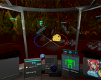
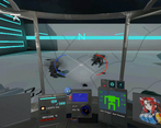
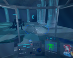
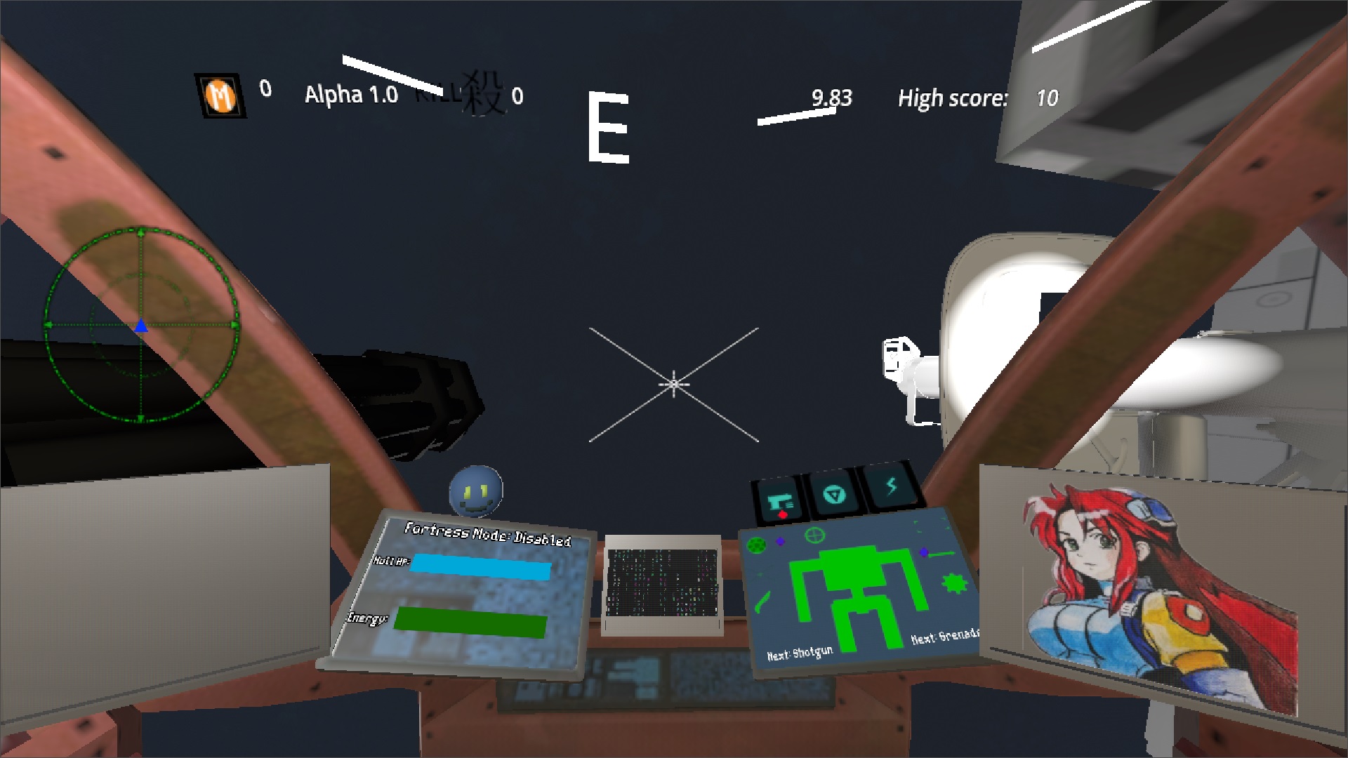
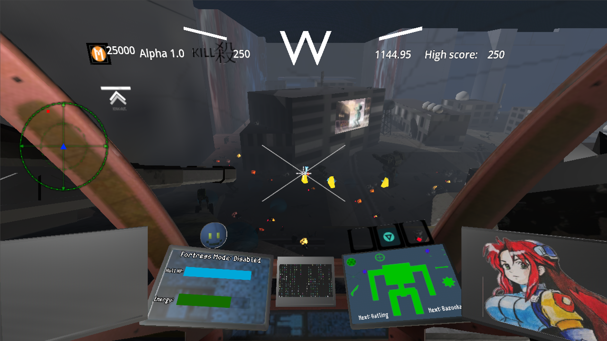
FPS with mechs.
Submitted by Federx (@FederxDev) — 2 days, 23 hours before the deadline
Add to collection

Play game

(a)woken's itch.io page

Leave a comment

Log in with itch.io to leave a comment.

Comments

(+1)

Yo, cool mech game.

here's a strem:

Walked around, shot some dudes. In the story mode, I stopped in a spot where I kept dying to dude that was very far away. I never got to understand how to avoid his attack.

I think it's an interesting game. I'm curious to see harder levels, or what future scenarios there could be. But tbh, from what I played, the gameplay didn't click for me. There wasn't anything that got me excited while trying it. The enemies I fought seemed kind of just be standing there and shoot really slow missiles. But to be fair, I've never played a mech game,  and I don't really play FPS games, so yeah.

Something I wanted to mention that may be kind of silly but big fan of the anime girls. It's not only that the portraits are cute, but I really dig their designs.

So yeah, not a lot of feedback, but hopefully the footage is useful to you somehow. Good luck!

Submitted(+1)

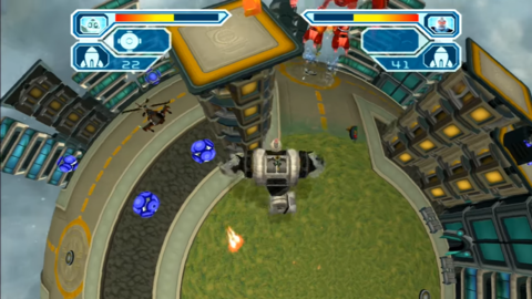
The main city level (Ol' Reliable) reminded me of playing Ratchet & Clank: Going Commando back in the day on the PS3. There were these Clank segments where you'd march around and blow apart dozens of Megacorp thugs in a city that had blue glowing windows and a familiar sort of vibe, good times.

Ratchet & Clank 1-3 Review - Ratchet & Clank - Giant Bomb

You could probably throw in some helicopters in addition to the mecha come to think of it, though aiming might be tricky

If you could figure out a way to procedurally generate city levels and have some upgrades/power ups I think you could have a really polished arcade/endless mode, but I sense you plan on developing a full story and campaign. The dialogue takes a bit too long between pauses, it could be sped up to about twice the speed, maybe add a typewriting effect as well? I like that you're also hand painting the character portraits traditionally, that's a cool touch.

You could juice up the enemy combat a bit more by perhaps having them fizzle out or catch fire first and then explode? Or maybe leave behind broken wreckage to maybe loot or kick around? I know memory needs to be cleared so not all games can really handle having a million objects permanently in the level, but even some simple burn marks on the ground would be nice.

I appreciate also all the AGDG easter eggs, the Blorb plush on the dash is a fun touch!

Submitted (1 edit) (+1)

This game needs a lot of polish and more content but it's a good start. I had fun just running around and blasting things in arcade mode. The gameplay can feel janky at times since enemies can spawn right on top of you and cause you to take damage without realizing it. The scale of the levels seems off, for instance the windows on the buildings are HUGE compared to the cars (though I realize these are probably placeholders). The story mode levels obviously need a lot more fleshing out as they're mostly wide empty spaces right now. This game seems pretty ambitious, which is good, but be careful of scope creep. Looking forward to seeing this game develop. 

Submitted(+1)

Definitely a great improvement, I had almost zero stutters

Walking and shooting feels nice, I think its time to work on the enemies, they are too slow and stupid and unfun to fight with

Dialogues before compain missions are strange, a kept pressing random buttons untill get that they are automatical and just delayed, you need to make them animated and/or wait player input to progress

Aslo sniper thing in one level are broken, it hits you every time despite the laser pointing in different direction

Submitted (2 edits) (+1)

There was no campaign mode when I last played this IIRC, so I will try that first. The VN-like parts are neat but please let me click through the dialogue if you're not going to have VAs, it's just wasting my time otherwise. On that note, I didn't pay attention to the in-level dialogue at all while playing. I'm not gonna stop playing to read whatever's happening, I suggest either giving the characters voicelines that I can listen to as I move or cutting the feature entirely. I see that you added new sprites for the character view, but, uhh... the damage sprite isn't good. It deviates from the style so much that it's offputting. 

The game is very easy, you can strafe around enemies and use the two main weapons to take care of nearly any threat. Like GorriDev said, it feels underwhelming and doesn't force the player to use the mech to its fullest. Frankly, I don't even know what the items do nor how to use them. The only point where I was close to death was when I first encountered the sniper enemy: it's a little bullshit since its aiming laser is not indicative of where its bullet will actually land. It also seemed to instantly fire at me when I first saw it but I might be misremembering, if that isn't the case then give it a warmup period.

Not sure what's up with the Abovespace level, we Getter Robo/Gurren Lagann now? Anyway, the campaign is alright but feels aimless. The level design needs some more intricacies to be engaging, there's only so much mileage you can get out of wide long hallways. Some more objectives would be nice, e.g., protect this thing, stay alive for X amount of time, etc.  

It feels like you're getting ahead of yourself to me. I think you should perfect the gameplay core, i.e., the mech movement and combat, and only then start making mountains of content. Either way, I'm eager to see where the game goes.

Most importantly, I didn't see my game's thumbnail anywhere. You can consider yourself my enemy now.

Developer(+1)

i have an excuse ready for most easter eggs i did not include.

yours? i forgot it... sorry.......

yeah i made the campaign easy on purpose for testing. i'll add more enemies and stuff

the sniper "laser" is designed to warn you about its presence rather than actually showing you where it's aiming at, but a lot of people found it confusing.

the space level is completely useless. but it looks so cool.....

Submitted(+1)

My main complain is the lack of a cooldown indicator for slow weapons, I just keep spamming click until they shoot again.

Also are you going to add a quick dash for dodging? I assume this is inspired by slower mech games like mech warrior, but I love to go fast in mech games that allow so.

Developer(+1)

there already is a side dash for dodging. shift + left or right

Submitted(+1)

Oh I only tried shift forward, so I assumed it was just for running, my bad

Submitted(+1)

Nice, I can see some improvements since the last time I played this.

The new linear levels work okay for a first campaign level sort of thing, it still has the problem where enemies are too simple to let the player use the mech properly, the enemy walkers in particular are not a threat in the slightest. It doesn't help that they shoot at you before they can actually see you, hitting the walls or floors in the process.
The sniper sentry things keep tracking you even after their aiming laser stops, which I assume is unintended, but an enemy like that could be the perfect thing to force the player to use fortress mode or the deployable shield.

Visually the massive textures on the giant walls kind of ruin the sense of scale your mech has: it looks big when next to a tree, then it looks minuscule when compared to those gigantic metal plates lining the walls.
Once, in arcade mode, the grenade launcher's projectile moved one of those black mechs instead of exploding on impact.
Also you should get around implementing proper preloading: the stutter when something new loads in for the first time is annoying.

I like the storymode dialogues, the various Godot puns got a chuckle out of me, and thanks for referencing tankgame in the tutorial, it put a smile on my face.

Form here if I were you I'd focus on making enemies which are fun to fight, then work on levels to put them in, but regardless it's clear that progress is being made and I'll definitely play a(woken) again next DD

Submitted(+1)

The recoil on the bazooka is great. I used the Lockon Missile a lot more this time around, I remember it being really unclear how it worked before while now it’s Streak SRMs in MechWarrior where it gives you the lock tone immediately, really good.

Pretty much everything still needs a layer of polish, but some things that stood out this time:

  • The really sudden freeze upon completing the level or dying
  • There’s no way to skip through dialog, either in-game or the cutscene
  • The enemy snipers should probably have some sort of tell that they’re about to fire
  • The directional damage indicator doesn’t seem very reliable, I was losing huge chunks of HP from the little spider dudes and it was making me look up to the side instead of down beneath me.

I think I mentioned this on the discord but now that you’ve got the rotation on the gatling gun, the other weapons need some sort of cooldown indicator. In the short term you can just have a little transparent gauge show up beside the crosshair for the weapon on that side which flashes or just disappears once the weapon is ready. Along with some sort of charging or mechanical sfx this would be fine. The really classy way would be to have some sort of over the top pumping animation on the weapon itself on top of the above.

My favorite secret so far:

Developer

you can skip the cutscenes by pressing esc.

thanks for playing!

Submitted(+1)

For context it's being ages since I played a mech game. I'm talking MechWarrior 3 or 4 ago. I'm that old.

I had a blast playing the arcade mode. The movement and shooting is great. I also kind of cheesed it by going on top of building and shooting down the baddies with the railgun and lock-ons. Maybe add a flying enemy to give a challenge to cheeser like me. Also you went crazy on the easter eggs! There's so many!

For the negatives, the game ran well but had massive lag spikes in the story mode. Meanwhile it ran fine in arcade mode, so I don't know what was going on. Also let's say the story mode levels needs some love! Although the "o'reliable" level was nice. The sprint should consume energy too, because for now there's no draw back to sprinting everywhere.
One more thing, is the grenade launcher supposed to shoot where you aim? Because it didn't. 

Overall I had fun, and I'm curious to see where you take this game!

Submitted(+1)

I can feel major improvements from last DD.  Mech feels better to use and move around.  Mostly used the machine gun and grenade launcher.  Was able to get decent high scores in arena mode this time.

My specific advice would be to add some menus to the starting/ending UI.  Even just white and black boxes would help make it easier to navigate.

Keep up the good work!

(+1)

Something very strange happened to me most times I started a level (either in the Arcade or Story mode). The mech would immediately fall to the ground with me looking up the sky unable to move from this position. Sometimes restarting the level a couple of times would work but in some occasions, even after many restarts I'd still remain with the mech lying helpless on the ground. 


When I managed to get the mech to work the gameplay was fine. It's been a while since I played a mech game so I don't really have a reference but the areas were interesting to navigate and the enemies' behavior seemed well programmed at this stage. They efficiently pursued me wherever I went but were usually easy to deal with when coming from within the cockpit view. When they approached me from behind I had trouble positioning myself to avoid damage. Getting shot from the back was usually how I died.

Appart from the bug I reported above (which could be related to my own computer but I haven't experienced this with anything else), I had a good experience with the game considering it's at such an early stage. 

Developer

peculiar bug. i never heard of it in previous feedback, but it might be related to how i'm not clamping the camera vertically? no clue honestly.

(+1)

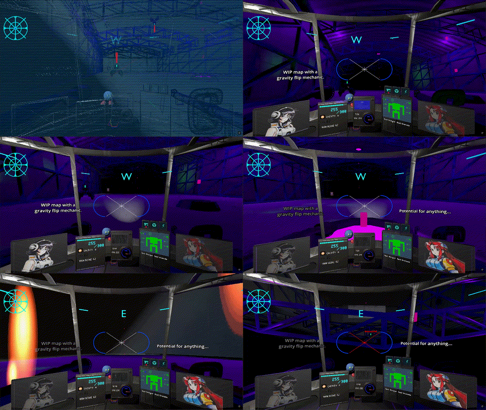
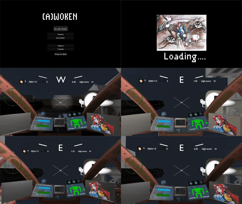
Here's how it usually went:

(+1)

I found exactly what was causing this. While playing your game I had my "unofficial" PS4 controller plugged in which I use sometimes to test my game. While I didn't use it while playing yours, just having it there plugged in caused the mecha to fall immediately nearly everytime.

Submitted(+1)

I don't play mech games much but I still figured out more or less how this works. I think the one major thing I didn't understand was what the red circle selection on the HUD does.

The first missions were manageable. I did not understand how to clear the solar system one. Then I got to the highest building on the city stage and there was nothing there. I had no idea what to do in that one either.

I recorded my thoughts, but unfortunately the game spontaneously reverted itself to fullscreen when I started and that appears to have messed with the recording.

Developer

the space and city stage are old stuff with no actual story elements implemente to them, i should have written it somewhere.

thanks for playing.

Submitted(+1)

Wasn't a huge fan of the story levels but blasting things in the arcade was fun. 

Feels like you can't die if you know what you're doing though

I don't know how much I should nitpick since I don't know how much you plan to change but here are some random thoughts: 

Repair + railgun seems very strong, you can heal while reloading shots. It is fun to do but it made me not use the other weapons. The homing missile was also fun to use, I love the lock-on sound. Sometimes it blows up in your face when you fire it close to wall and its hard to tell what happened and where the missile is getting fired from. The other weapons seemed underwhelming compared to those two so I did not use them much.

The game was stuttering when I first started it. Eventually it ran fine but it was annoying at first. I couldn't check the controls when I'm in a game, it only shows the movement controls.

The enemies seem much more dangerous from up close, they drain your health very fast when they are next to you but aren't as dangerous from range. I'm not a huge expert on mecha games but imo it should be the other way around with strong enemies with powerful ranged attacks (that you can dodge hopefully) and small enemies with weak melee attacks that are annoying or maybe disable parts of your mech. Also I'm pretty sure some of the enemy projectiles disappeared while they were travelling. And even if they didn't they were far too slow to hit you.

I didn't really get what the items did. I assume one of them is a shield, no clue about the other two. It's probably explained somewhere but I feel like you should be able to figure it out yourself. Maybe there could be a voiceline or text message when you use one of them saying what exactly you are activating.

I like that there is an energy bar, having more things to manage is fun. I think it should also be drained by the sprint though and that way you can maybe make the sprint even faster? More mobility options is generally more fun

Developer

you are the first one to actually see the lock on + railgun as viable, i always saw the optimal combo being gatling + bazooka personally.

the enemy projectiles are slow by design, but i DO have to make their despawn timer longer.

thanks for playing!

Submitted(+1)

-Main and sub menus are blurry at times. Also the cockpit looks really jaggy. Unless you were going for that aesthetic, please invest into antialiasing. And one more thing, the portraits during the cutscene look crusty, while the cockpit picture looks fine. Is that on purpose?

-Jumped right into story since I've played the tutorial last DD. I like the cute little tank, too bad I gibbed him almost immediately, whoops. The destructible wall connecting the end to the start is kind of neat, but as far as I could tell it looked the same as the other walls. Not great design.

-Sprint feels almost the same as walking, if you can't make it faster increase the FOV to make it fake the sentiment.

-HUD is good fun, very rough of course but I like the idea.

-Don't suddenly put up buttons when you finish the level, I accidentally clicked main menu since I was about to shoot at the wall. At least make it obvious you are about to cross the finish line, or don't accept input for a second after popping it up.

-It annoys me, I didn't realize until the second mission that I was missing the ending cutscenes(and I only saw it after clicking main menu). Given how the intro is started automatically, I assumed it would just play them as they came.

-Solar map is fun, but it has no purpose?

-Oh I guess that was the whole story so far. I replayed to get the full picture. It's decent fun for what it is.

-Gameplay on the whole is very easy.  I hope you add enemies that actually make me want to change weapons, or maybe just add ammo so it forces me to switch it up. The levels seem to be based around getting a faster time, but the movement gameplay is severely lacking from what I could tell. Best I could do is hold sprint and look for shortcuts. Maybe spamming side dashes is faster, but that's a pain. Regardless of that, it felt boring to traverse the levels, sorry to say. That said, I'm looking forward to next time.

Developer(+1)

thanks for the feedback.

for the next demo i will work on supporting multiple resolutions so those who don't want the crustyness can get rid of it.

Submitted(+1)

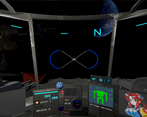
Can't remember what was added since last time, but ive been seeing your progress posts on twitter so keep up the good work! Don't need to labour points others have made, but a few suggestions might be, addd the N E S W display at the top of the screen to the minimap to reduce clutter, atleast then most of the UI is in the bottom third of the screen. Would love to see a completed level from you, with all the buildings and stuff in place fully textured and everything.

Developer(+3)

i WISH i had the skills to make all the buildings and textures of an entire level lol

Submitted(+3)

You'll get there.

Submitted(+1)

I fuckin love (a)woken. I think you've reached a point where you're gonna wanna take a big polish pass on everything that's here and make it shine. I know the claustrophobic UI is going to be very controversial among DD players, but please don't remove it! The clutter and claustrophobia of the cockpit are a selling point for games like these. That said, it does need a ton of work and polish. I couldn't tell you exactly what I'd like to see, but it feels hard to read the cockpit elements at a glance in its current state. Aside from that, the levels need a lot of work, but the foundation here is fun as always. You've got a great game on your hands, but it definitely needs some polish! I'll be eagerly waiting for your next updates. 

Developer(+1)

finally somebody who can see a glimpse of my vision. all those monitors and garbage on the screen making the enemies hard to see, they are all intentional.

your comment warms my heart, and rekindles my hope for the future of this project.

Submitted(+1)

Yeah, sometimes you've gotta just kinda say 'no' to feedback if it goes against your vision. Not to say feedback should ever be completely ignored, but with niche genres you'll definitely have to go directly against popular opinions sometimes. Make a game you want to play, that you can be proud of, and you're 100% gmi. You definitely know your target audience, and that audience is a bit on the small/niche side - and that's okay. You don't need to appeal to everyone, just that small group. You got this, so don't give up!!! It's REALLY fun. 

Submitted (1 edit) (+1)

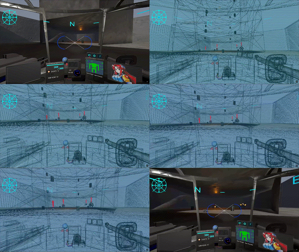
I think you should clamp the camera rotation down and up (with a small safety margin maybe) cause some weird stuff happens when you try to do a backflip it would look like:
$camerabase.rotation.x = clamp(camerabase.rotation.x, deg_to_rad(-30),deg_to_rad(30))

I like how responsive the aim is, it felt like i was playing csgo

being able to shoot incoming rockets mid-air would be cool

I had some trouble in the more enemies-filled levels; since i can't hear them moving around

I'm looking forward to more redhead shots, keep up the good work WGMI !!!

Submitted(+2)

Ok, I tried the campaign, I wasn't ready to embark back in the cycle of guilt. Brouzoufull game anon, still a lot of work to be done, sound effect aren't heavy enough, no sound when I walk.

A lot of stuff on how the game is presented still need to be done. But progress is progress, and I fell in love with your game. You better kept it up!

Developer

thanks for your continued support. i will keep working on it and making it better.

(3 edits) (+1)

I went into this game thinking it's not the type of game I'd enjoy. I was wrong. I also went into this game thinking that there's a reason why so many people praise it. I was wrong. 

Let me start by saying that you are one of my favourite devs; I see your passion; I am taking into consideration this is a prototype and not a complete game; and I can appreciate the creative vision I see in the demo. However, that doesn't get you off the hook. I'm not gonna beat around the bush.

This demo is bad.

MAJOR PROBLEMS

Is the game stimulating? Yes. Did it feel like playing something from 20 years ago? Yes. Is it clear that you put a lot of effort into it? Yes. Is the game fun? No.

There's almost no weight to anything. It's a mech game, yet you can't feel the weight of absolutely any part of it. The combat it good for a dopamine hit but it's not very engaging at all. There's no tactical angle to it. The enemies do not display any sign of strategic thinking. The guns aren't interesting to use and there aren't different enemies and situations that demand different approaches and weapons. These are all things you should be thinking about if this is planned to become a game that people want to play and replay.


This is UI gore.

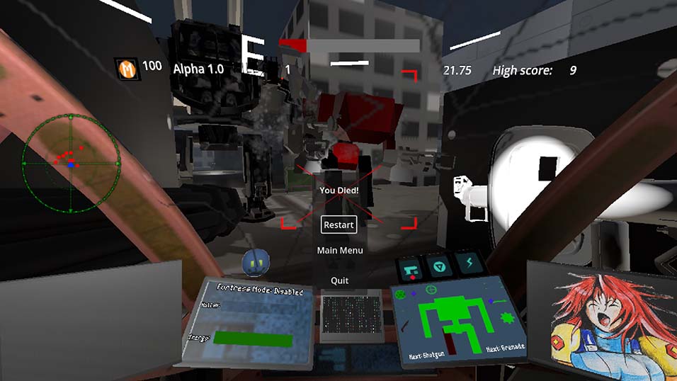
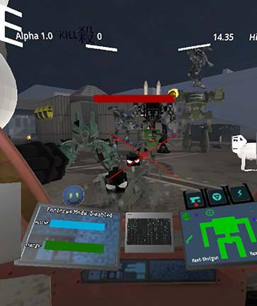
The UI is distracting, messy, and disorienting. I get what the game is going for since it's a "mech game" but there's two problems: The UI takes up an enormous part of the screen in a game that's supposed to be an FPS. You have limited readability of an environment and enemies that are hard to read to begin with in a game where having awareness of your surroundings is key. Second problem is that all of the important parts of the UI do not have the contrast or colour design to make them stand out, which means that the player doesn't have immediate awareness of those UI elements unless he takes his attention away from the action to check the interface. It's unclear if a lot of the UI icons serve any purpose or if they're just there for decorative filler. I did like that the screen cracks as the health goes down because that at least give a good way to track health.

Lag spikes constantly. Sometimes happens when beginning to shoot a group of enemies or when walking into some objects. It happened the most often when you open fire for the first time during any level.

There's a lot of jank. Twitching and teleporting across the levels. Some of might be intentional (I assume) but the game doesn't make that clear so half of the time you wonder what even happened.

The level design fluctuates between good and awful. For some reason the best designed level is the arcade stage. The story mode levels are really barren and boring to traverse through.

I remember someone in the thread saying that the game is messier than ever and needs polish and I agree.

MINOR PROBLEMS

The bots that snipe you with perfect accuracy from across the map are bullshit. I'm not even sure if the game has health pickups to recover from that in any way. Even if it does it was never made clear.

In the arcade mode enemies spawn in these big piles. Often they spawn stacked on top of each other.


What does fortress mode do? It's not explained even in the tutorial.

The text boxes overlapped a few times.


For some reason getting hit by a rocket turns you 90 degrees to the side.

Since the cockpit bobs up and down, this happens constantly which makes it even harder to read the dialogue.

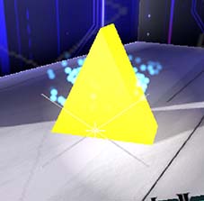
There's a lot of objects around the levels such as the yellow triangles and the transparent blue orbs where it's unclear what they do or what they are or if they even do anything.

CONCLUSION

Here's some positives: The character art is really good and looks professional. I was mildly intrigued by the story and I thought the dialogue was uniquely styled. I hope this feedback is useful to you.

If this is just a learning project and it's not supposed to be a commercial product eventually then this is great work, but the game I'm seeing now doesn't do anything special to make people want to play it again and again and again. I enjoy seeing your progress.

Developer(+1)

the people praising my game have always done so ironically to make fun of me, so you shouldn't think too much of it.

i barely touched the enemy AI so far, i do plan to rework it. 

yes, this is indeed my very first learning project, so the jank is an unavoidable part of it.

at least i'm glad that the arcade level felt more polished, i've been working on it for longer.

thanks for playing, and sorry for the subpar experience. i plan to improve it in the future.

Submitted(+1)

The movement is a little clunky but that's probably appropriate for a mecha game. Personally I'd add a FOV slider, because it felt kinda narrow. As you know from the stream, there needs to be some voice work with the dialogue because it is too fast to read at a speaking pace most of the time.