The Discord is for Mercer University students. The theme is “Sacrifices Must Be Made”. The game jam page has now been updated to reflect that. Good luck!
CupidOfDeath
Creator of
Recent community posts
Thank you so much!
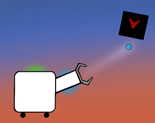
I’m sorry to hear that you were frustrated by the controls. The movement seems to need more tweaking. I tried to have the gun movement as accurate as the player wanted it to be by including toggle-able gun acceleration and sensitivity in the settings. You’re spot-on about the lack of communication. Since the game is extremely simple, I tried my hardest to communicate everything without a formal tutorial but that apparently needs a lot more work. You’re correct in understanding that you lose your jump-pad upon being touched by the enemy robots and the recoil power of your gun increases so that you can jump using the recoil itself. The enemies turning green was meant to indicate that they’ve completed their objective of touching you and can hence no longer harm you.
Thank you very much for the terrific feedback! Thanks also for playing 😄
Hi! Thank you for the kind comment. I’m glad you liked those elements of my game.
It totally makes sense now that I think about it that the kill tokens needed to be animated or something else needed to be done to emphasize their importance since, as you’ve pointed out, they’re hard to even notice atm.
From your comment and those of a couple others, I understand that the dominant strategy that emerged as a result of the fall and die instantly rule is pretty boring and discourages movement. That is crucial feedback which I really could’ve used during development. Nevertheless , it taught me the importance of playtesting early and often. So, thank you very much both for your feedback and for playing my game 😊
It’s totally not your fault for being unable to move around the level that much. I’ve realized that the movement mechanics were begging for a more open level but I failed to understand that while developing.
I was this close to implementing a system where collecting enough kill tokens would grant you lost parts. After reading your comment, I regret not implementing that.
Thank you so much for playing my game and leaving a comment :]
I'm very glad that you found my game fun! Thank you for letting me know about the floatiness of the controls. I did intentionally want the robot to be a bit slippery when it had wheels so that the recoil mechanic and the bombs become a considerable threat but it's clear from your feedback that the values needed a bit more tweaking.
Also, I didn't do a great job of communicating that the recoil got powerful when you lost your jumping-pad so as to compensate for your lack of ability to jump. Sorry about that and thank you for pointing it out. Big thanks for playing and taking the time to leave this comment :)
I really appreciate you pointing out the positives and negatives of the game. I'm delighted to hear that you liked the aesthetics; I'm not an artist by any stretch of the imagination. Many of the issues that you've mentioned seem like they could've been detected and rectified earlier on had I done some playtesting. So, I've learned a good lesson there. Thanks also for making me aware of the bugs. I did know that they existed but since I only used it how it was intended to be used, it never occurred to me that a user might not realize that and that I should fix it. Goes to show the importance of playtesting again. I am very grateful to you for taking the time to play, analyze, and leave an elaborate comment that taught me good lessons. It is sure to stick with me in the future and help me make better games :D
Wow. Thank you so much for taking the time to play my game and write this detailed comment. Your feedback made me realize a lot of areas where I can do better at communicating to the player. And you absolutely shouldn't be required to view the screenshots in order to play; I should've done a better job of communicating the rules of the game more clearly.
My intention with the enemy eyes being grey before touching the ground was to communicate that they're not hostile and won't hurt you if you touch them before they've been fully deployed.
Also, you are absolutely right about the dominant strategy being staying in the lowermost platform. I should've done a better job of incentivizing movement to higher platforms.
I don't think I will be updating the game any more since I've marked this project complete but your feedback has been precious in making me see what I couldn't see through the lens of a developer and I'm sure those lessons will help me make better games in the future. Thank you very much again. I'm glad you found my game fun :)
I'm wowed! This is great for a jam entry. You can clearly see that a lot of effort and love has been put into it; the graphics and the great music design are a testament to that.I like the story element and how you incorporated the theme into the game. If I'm not mistaken, not only is the game taking place in nostalgia land but it is also trying to refer back to classic games such as Mario and Megaman. Kudos for going above and beyond. Great job! :D
Thank you for playing my game and commenting! I was aware of those bugs that were caused by the input system but didn't have the time nor the immediate idea to fix it. Thank you very much for telling me about input queue. I really appreciate you not only pointing out the problem but also the solution :)
Goodness gracious! This is downright inspiring. First off, the art style is unbelievably cute. The overall polish is spectacular. The music really carries the tone of the environment and I love that detail. The mini-games themselves are well designed and executed with the perfect amount of difficulty to them. Most importantly, it truly made me think back to the time of young first love and it elicited a part of the similar sweet emotion in me that I had once experienced and thought I would never experience again. 10/10 in my books. Awe-inspiring!
Amazing entry! There is just so much to like about it. The polish including the art, the music, the sound effects, etc are amazing. I don't know if the original frogger game had collection as a mechanic but I really appreciate it in this one. Moreover, the fences are a great challenge. Also appreciated is the high score and health system. They introduce a lot of replayability. I couldn't stop myself from playing till I completed all the levels. And the difficulty escalation is perfect. The design decisions are brilliant and the polish is great. Any criticism I make will be nitpicking. Kudos!
Hello. Thank you for playing my game and leaving a comment. I think you are right in stating that it might be a bit too luck-based. And the idea of having multiple apples to give the player more choice had been in my mind since the start and I would've loved to implement it. But, I was very pressed on time due to which I couldn't do it. Thank you for your constructive feedback. I really appreciate it :)
Thank you very much for playing and commenting! I'm glad it could surprise you. You are absolutely right. There is no need to reset the game so abruptly when it ends. It's only there because I was running extremely low on time and couldn't manage any time to implement proper user interface and polish. The idea of stepping forward in time using a key is very interesting. If I decide to improve the project in the future, I will most certainly keep this idea in mind. Thanks again :)
It was a very cute game and the tutorial texts were fun to read. The gameplay itself was fun. The way in which the different ducklings and the other creatures interacted with each other made the game very enjoyable. I also love how the game doesn't force you to play a particular level but lets you select which levels you want to play. The music is also apt for the gameplay. Well done :)
The art for this game was very fitting and lovely. The music was very fitting for the intense battle that was going on. The concept was great too. Sun blocks the sun bullets and moon blocks the moon bullets. However, I saw no real incentive of dodging the bullets. You could take all of the hits and nothing would happen to you. Nevertheless, good job :)
Wow. This is such a good game. It's one of the games from the jam that I played for a very long amount of time because it was so much fun. It really makes you feel like spiderman when you're swinging and perfectly jumping to grab those feathers. Top marks on presentation, the visuals were very good. Very fun to play and the music was fine too. Maybe a comfort feature such as a pause system would've been appreciated but even without it, the game is great! Good job developers. :)
The concept was really really unique and out of the box. I loved to see the numbers grow. The UI is also clean which makes it better. However, it'd would've been appreciated if you'd explained the mechanics a little bit better preferably in game. Also, I was never able to get anything above spider. Even though I'd maxed every stat out, I waited for half an hour but nothing after the spider came. So I quit the game.
Summary: Very good concept and presentation but mechanics could've been better explained and implemented.
The narration was awesome! And I liked the art a lot too. The "Ah, there goes another one" is such a good touch. The gameplay is where your game lacks. I was more interested in hearing the narration than playing the game. Maybe your game was just centered around the idea of narration and not focused on gameplay. In either case, top marks for narration, good artwork but the gameplay itself was not very fun.
I found a game whose idea is similar to mine! Though, I would suggest improvements in the mechanics of the rope. The rope is very springy which makes swinging a lot harder than it has to be. Despite about 10 minutes of trying, I couldn't even get past the first level which is sad. So, the difficulty curve could've been improved. I'm happy to see a restart level system implemented here. The space bar seems to make the boxes change color but I didn't find its application described anywhere.
Summary: Happy to see comfort features such a restart level feature but the mechanics need to be executed better and the difficulty curve needs to be addressed.
What I love about your game is the music and the art style. The start screen was so atmospheric. I literally spent 2 minutes just on the start screen admiring the art and the music. It hit my feels somewhere. The idea was also very unique and cool. However, the execution itself could've been done better. The movement controls felt a little bit stiff and the objective of the game wasn't communicated to me. I wandered around here and here, unable to get anywhere. I was unsure whether the game had levels or whether it was an exploration game. Maybe a map would've helped in this case. Furthermore, I once dropped my legs somewhere and it couldn't be retrieved back. It just fell into some void of sorts. In such scenarios, a simple restart button would've been enormously helpful rather than me having to shut the game down by pressing Alt+F4 and re-opening it.
That being said, please do not think that I am trying to prove that your game is bad. That is not my objective. I just want to give you an honest opinion from the perspective of a player so that you can hopefully gain insights into the psychology of a player who picks up the game for the first time and hopefully use this knowledge to make your games in the future more fun for the player.
Have a good day sir/madam :)
I wasn't aware that you could take down files during the voting period. Thanks for pointing it out sir. I took it down.
Thanks a lot for playing my game! I went with the speedrun platformer because I had to compensate for my small amount of levels. I only had 24 hours to make the game. So I chose to add the speedrun element to it to make it more replayable. I'm extremely happy to see that you liked that aspect of the game. And I am sorry for the hard levels. I found no time to allow playtesting and I myself could glide through the levels with S grades. So, I thought the levels were easy. Your feedback is very insightful in that it made me realize that what I find easy, as a developer, might not be easy for new player. I'll be sure to adjust the difficulty of my future games not based on my own playthroughs but by getting it playtested from my friends. Thank you for this insight.
And yes, you're probably the world record holder as of now because no one else has commented their grades :D
I apologize for the short content. It is primarily so because I only had less than 24 hours to make the game because of personal busyness. Yes, there's only a single mechanic in the game but I assure you, it's enough to glide through all the levels with great times. Thanks a lot for your feedback sir :)


