I do not like clicker/automation games. I like this game. Very cute, very simple! No bugs no fuss, just walk around and grab things while watching your little buddies do the same, then when you least expect it... SPLAT! Great sound design, maybe the resource graphics/icons could be a little bigger?
Deerbell
Creator of
Recent community posts
A brain wracking sliding block puzzle game where you feel like the the sliding block. I would rather play this than a Professor Layton Minigame, and that's saying a lot. Other comments have stated this doesn't fit the theme but I'd argue it at least grazes the theme given most puzzles need to be solved backwards and you're literally changing how you expect to play based on the order you reach your goals.
The idea of turning reloading a gun into more than just pressing a single button is something we need to see more of in modern games. I'm a big fan of the aesthetics, UX and atmosphere, but it would be nice if you could reload your gun when there aren't enemies nearby, unless I'm missing something. Overall a great experiment in alternative shooter mechanics!
Excellence in art and delightful absurdity. If anyone (including the developer) claims to understand what is being conveyed here they are probably wrong. The meaning of art is either for the artist or for the audience, in this case I like to think it's both. Bravo.
P.S. Good sound design, really good, thank you for the good sound design.
This is the most frustrating piece of crap I've ever played. I want more! 🙇♀️
Really though, what a hoot. Great job on the presentation and snark. Only suggestion is implement a minimum primitive size so you can't subdivide yourself into something you can't even see. I don't think I'll ever find the right pattern to solve this, and I've been playing puzzle games for decades!
Minimalist graphics! Confidence in design! BLOOD! Strong visual identity and even stronger gameplay. The twist of life drain was a nice touch.
The tutorial was well done though I think the ending was bugged and I had to restart to proceed. A few bugs here and there with hit detection on enemy attacks and my character not dying at an empty life bar but given everything else going on not a bad problem. I do think the 2 kinds of dodge alerts should have their colors changed to be more distinct but they are at least different shapes.
This game is a great example for others that you can achieve great graphics and gameplay in a limited timeframe if you just focus on what matters. I would absolutely come back and play this again if there were more levels or variety!
A charming jaunt that gave me a sense of nostalgia for when I first started making games, more importantly it left an impression of surrealism without being heavy handed.
It's great to see someone who is aware of their scope and project management and can still set and reach goals they are proud of. I would have liked it if the NPCs had collision or possibly more things to say, however the lack of narrative cohesion lends itself to the work.
We are participating in a game jam where rating entries is set to the random mode, where you are given a queue of 5 games to rank before being given more. This is a nice system, and the capability to shuffle games and set the desired platform is great (although it would be even better if you could select multiple platforms)
The problem is when a game can't be rated, but is not really "broken". In our case, a game in the queue uses the Godot runner and refuses to launch on a fairly new laptop with discrete graphics. This isn't really the dev's fault, and there are commenters that have had luck starting the game. Reporting the game as "broken" would be inaccurate, but more notably appears to send a report to Itch moderators, which is hugely overkill.
There are also a few games with other significant barriers to entry (requiring an emulator, being exported as an installer instead of a single executable, apparently triggering an AV false-positive). Users may feel unwilling to deal with these issues and may not want to rate those games, but that doesn't really merit reporting the entire page to Itch. In most cases this will probably just lead to people rating the game 1-star and moving to the next game instead of filling out a big scary report form with their email address.
It seems much fairer for devs if jam rating-related reports were a little lower stakes, going directly to the jam owner with an optional checkbox to send a copy to Itch moderators in the event a game is actually completely broken, spam/malware, etc. If there is a concern users might abuse this functionality, a jam owner could approve or deny based on the information in the report, there could be a cap, etc.
I'm always really pleased with Itch's visual design, especially dark mode - it's nice to be able to bring up pages in a dark room and not be blasted in the face with a blaring white background and garish colors (unless someone's themed their game page like that).
But the theming on analytics is really difficult to read once you have more than one game. There's not much of a distinction between the colors assigned to each game, they can appear to blend together when the bars are ordered light to dark, and it seems like the colors assigned to each game change depending on what's currently active in the panel. I can't really tell at a glance which game is doing well without clicking (or hovering, which I can't do on mobile) - I just know it's the sort of purplish one that's darker than the brighter magenta one.
It'd be nice if we could just assign hex codes to each game when viewed in the dashboard, so we could use our own palettes.
We recently published a game pagethat doesn't have any screenshots (yet). In this case, the possible options are to add a sidebar, which automatically shows the cover image and looks a bit strange otherwise as a giant blank column, or to hide the sidebar, resulting in a layout that makes text verrrrrrry wiiiiiide and difficult to read on a widescreen display. Adjusting the text to compensate by adding extra line breaks, etc, means it no longer flows well on mobile devices. We went with the latter to avoid the cover image showing up in the sidebar, but it's not great.
I think it would be nice in these cases to have at least one of the following two options in the theme editor:
- Simple "Include cover image in sidebar" toggle checkbox, so that at least you could use the sidebar layout with no screenshots, even if it'd be blank
- Even better, have an additional sidebar setting that functionally compresses the main game information column to the same width the sidebar would force it to if it were enabled, but behaves like the Sidebar: Hidden setting in that the column is centered. Even if it weren't customizable and just took up the same space the sidebar did, that'd be helpful, but a dropdown or box with some % max width settings would be nice.
Have you ever looked at the moon or other space objects and said, "I hope I can destroy these with nuclear missiles someday"? If so, that's kind of weird and you should respect the beauty of the cosmos. However, your dreams might just be a reality. Not just as tonight is a full moon (making it easier to aim), but because of the release of BOMBARDMENT:hd|FW: CEASELESS ASSAULT OF ROCKS!
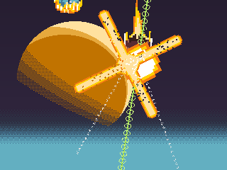

A horrific number of asteroids and assorted ice balls have descended on Earth and really messed the place up. Thankfully, "DOME CITY" was constructed years ago, and you're entrusted with its defense for whatever reason. With your help, we can make asteroids extinct forever and avoid being crushed to death by using various monstrous weapons like flak cannons and beam towers or very cute weapons like the beeping "seeker mine" to defeat them.
If you like "Missile Command", or even "clicking", you might enjoy this arcade-style vertical scroller with game jam origins, remastered for the anniversary of some fictional space rock related events on Sep. 13th in Space 1999 and Neon Genesis Evangelion. I don't know what genre this game is even in, but it's fun, and you don't have to pay for it, and that's probably all that matters. If people like it, perhaps it could get a full sequel with more weapons, more levels, and one of those demo modes that you'd see on arcade games that flash "INSERT COIN" and if you don't have any quarters you just sit there and pretend you're playing even though everyone knows you're not. Anything is possible, so feel free to download it.
Does the "release status" field for a game have any sort of impact on visibility (search/etc), or is it only for tagging/informational purposes?
We're in kind of a weird liminal state between "released" and "in development" for a game so I'd like to make sure there's no problem switching to the latter if we decide to do major work on the game similar to an Early Access model. I seem to remember something about this when doing research about how search visibility works, but I think I'm maybe mixing this up with the "it won't show up in search unless there's at least one download" thing since it looks like "In Development" is also intended for Early Access. Any info would be appreciated!
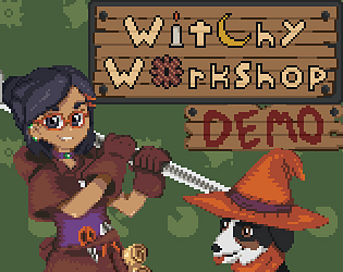
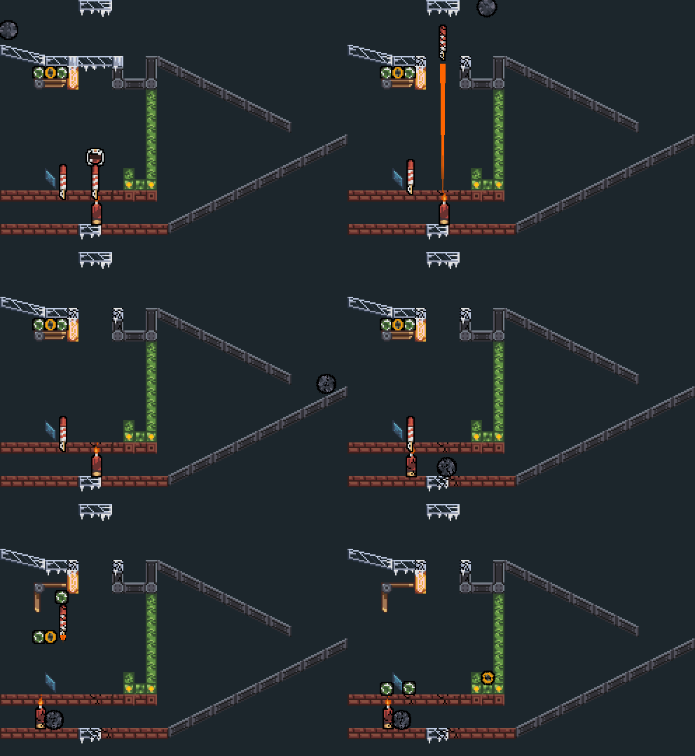
Witchy Workshop, potentially the only game in history about solving magic physics puzzles as a dog, has been released. This initial Windows release features 30 puzzles and a wide variety of parts, like elemental and directional spells, skulls, gears, more skulls, crossbows, windmills, bombs, bouncy walls, grimoires, a surprising number of additional skulls, crystal balls, fireworks, and more!
If you're familiar with games like The Incredible Machine or Contraption Maker, please give it a try! If you're not, please also give it a try! We've tried to make the game easy to pick up but a challenge to master (I know everybody says that, but if you're making a good puzzle game, it's kind of necessary). See more and find the download at our Itch.io page.


