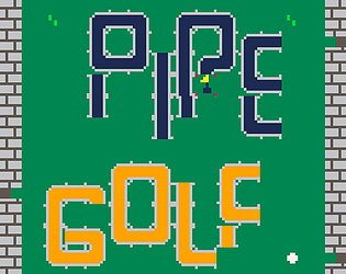
Pipe Golf is a short puzzle game where you play mini-golf with no putter! You must create a path for the golf ball to land in the flag.
The game can be found here https://dow-the-dev.itch.io/pipe-golf
Here's a peak at the first level!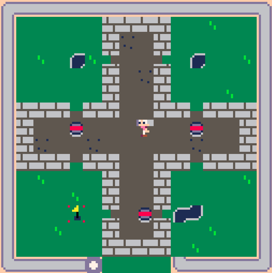
Dow
Creator of
Recent community posts
The game is VERY hard with the narrow paths, but besides that you had an incredibly clever idea for the theme and great implementation of it. The visuals were excellent, and the game didn't even need a tutorial.
I'm only sad because growing big on the main menu didn't result in anything (that I noticed)
I was initially confused as to how it met the them and was ready to be critical of it, as I was just landing on the ground for the first few jumps. In almost a No Man's Sky-esque way, though, the game opened up to be a lot bigger than I thought with the upgrades. Seriously, the dynamic change in music as the view got bigger was a great design choice.
I've played games like this before, and this was an excellent take on the genre. The theme helped this, and you interpreted it in a great way. I actually found myself playing this one for way too long and had to move on. Great job!
My only criticism is maybe the sharp sounds used for the boosts and teleportation.
I loved the transition, and the artwork in general. I'm sure it took time to create those unique customization options for the character, and I think it gave your game a unique charm that other games didn't have.
I liked the house burning mechanic, and how you could lead the villagers towards their own houses, destroying refuge.
The gameplay was tough, I couldn't figure out what some of the power-ups were doing, or really how to play the game very quickly, but it is a good interpretation of the theme.
I'm surprised. This interpretation of the theme is an advanced version of what we wanted to do; I was actually hopeful that our idea was unique. Regardless, great job with the approach. The art is incredible for the time frame, very well done. Very tough, I don't think I can beat it, but good job with what I played.
💜
I've played most of these blind, without reading the descriptions so that I have just the game's instructions to tell me how i should approach it. I didn't understand at first but after realizing I was inconsistently getting a green flag, and piecing together the theme, i figured out the gimmick. That timer is relentless!
Good, cute game once I understood the gimmick.
💜
Excellent game, seems like there was a lot of effort in the art and I noticed no bugs. I'm usually quite critical in my reviews and offer some criticism, so I'll offer that in a slightly better version of this, the player could skip dialogue that they've seen before. Great job and I don't want to spoil the end but good job with it, regardless of how common it is to see that dichotomy portrayed.
💜
I like the interpretation of the theme. I have seen a lot of people doing platformers where make the player switch some part of the screen, but this game is a unique take on the theme and it's got weird addictive gameplay. I personally think my team's interpretation is unique as well. Good job, and nice art!
💜
Cute game, good music and clever platforming. I love bunnies!!!
💜
I will recommend, though, looking into something called Coyote Time, it's something I think would have been useful here (or more importantly, future games). The idea is analogous with old Wile E. Coyote running off the side of a cliff, defying gravity. Basically, adding it here would just give the character a tiny window to be able to jump when transitioning into mid-air.
I initially had the idea of coin flipping for my game too, but ultimately went with something different because I couldn't think of something good. You implemented this well!
It was not as easy as I thought it would be! Nice job! Only thing I'd change is how far the coins can get from the camera. It can be really hard to see them.
First, I want to say I think some people are struggling with the jump because they may not know they can double jump, understandably.
Pretty good idea but could have benefited from some fixes to how the monsters moved around. I really liked the idea of throwing them in or trying to keep them wrangled on respective sides to meet equilibrium, clever thinking. Good job with this especially with the art.
Ok this damn goblin was the silliest pixel art I've seen this jam and I was seriously expecting the game to be a little lackluster. While short, the game is charming because of the cleverness of the puzzles and I won't 'spoil' the end but the final room and the end sequence was great, too.
Congrats, you made me like your silly looking monster.
💜
The art was adorable, and the concept was well executed mostly well. Would have recommended making the tiles alternate between two colors to make it easier to count how many steps would need to be taken, definitely.
With that said, I would have really struggled with understanding how to actually play if I didn't find out about this kind of game a few weeks ago. Regardless, loved the idea.
💜
Yeah, we both agreed that it was hard and that was the intent. Something did feel slightly off, though, and that might have been it. We tried to fine tune a lot, but movement was low priority among the many other things we were learning. This is good feedback for whatever we each do next!
I personally really loved the title screen, but that's good to know. I wonder how others feel. We could certainly have taken the saturation down a bit.
Thanks for taking the time to write this, it means a lot.
💜
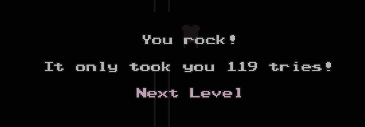
I am committed to finishing games when I start them, but damn 119 tries, that is sorta indicative of intuitive design as others have pointed out. Good audio, loved the post processing.
For the last level I put a sticky note on my monitor because of how annoying it was to have to switch quickly, but I'm sure that's been pointed out to you. Great take on the theme, regardless of some small issues.
Played through the game, it was good! A little hard to get into some place because of how fast the player moved and how big the player was, as mentioned. I've seen some platformers that are pretty unforgiving and have you restart a whole level if you mess up, and it seems like you guys thought through some edge cases so that it wouldn't need to happen. Great job.
Also, I didn't realize this was pixel art until I looked at the tags. Looks unique and great for pixel art, to me. And I loved the dedication to Josh's wife, very sweet.
😊💜
Thanks for the feedback! We actually tried this, and it felt good, but we felt like it would make for pretty interesting level design to force the player to position themselves around the enemies.
We didn't get as many levels in as we wanted to, so maybe this concept didn't shine as well.
Thanks again! :)


