Yes. It uses the Skid engine for graphics and input and Colyseus for networking.
Flaise
Creator of
Recent community posts
I almost didn't get past level 1. I discovered how the reality-shift thing works on accident from stumbling around in the level for awhile. A bit of helptext built into the level would be useful in lieu of having the time to make a tutorial.
If you haven't already, could you please rate my team's game? I'd much appreciate it.
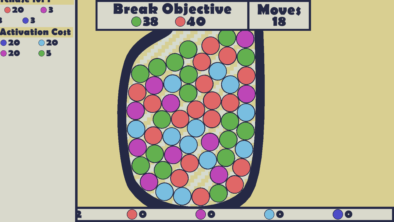
I like it. But I got deadlocked on level 2. That was a big difficulty jump because you both added another color and made the playing area more narrow. You should change one of those details or the other from one level to the next, not both. Also it may make the game easier to balance if you just add a shuffle feature when there are no more matches.
I had no idea what anything on the GUI panel on the left meant because I couldn't see all of it. I have a 1600x900 monitor and for some reason several of the games in this jam just won't fit.
If you haven't already, could you please rate my team's game? I'd much appreciate it.
It's not bad. I think you've got a good start that could be expanded upon into something more detailed and interesting.
I agree with all the other comments and would also add that the character controls feel awfully "loose". If it were me, I'd keep the jump height the same, decrease jump speed, decrease gravity so the descent of the jump matches the ascent, increase the horizontal acceleration so the top horizontal speed is reached much more quickly, and decrease the top horizontal speed and bullet speed slightly.
I'd also suggest you use a lower-pitched sound effect for the shooting (or run a low-pass filter over it) because high pitched repeated sounds get annoying after awhile.
I think the camera shake would look fine if it were for a heavier weapon with a much lower rate of fire but for the faster weapon, it needs toned down.
Also, if you haven't already, could you please rate my team's game? I'd much appreciate it.
A purrfectly accurate depiction of the adorable little entropy machines that cats are. I like the extra work you put into the web page banner and background and tutorial.
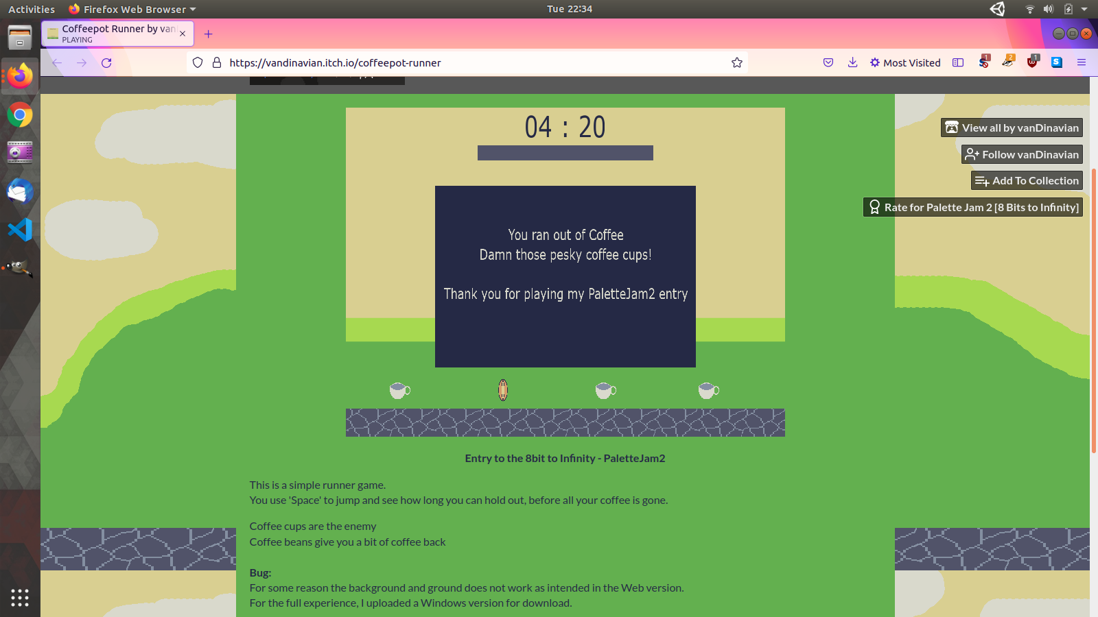
I played on the WebGL version because I'm on Linux right now. I do see those platform bugs you wrote about and I can't seem to move on to level 2. Am I doing something wrong?
Also, if you haven't already, could you please rate my team's game? I'd much appreciate it.
That's an interesting idea taking advantage of modern technology to have the bricks scroll smoothly. I found the paddle deflection rules confusing. Normally in a game like this, hitting the ball with the end of the paddle makes the ball go at a low angle in the direction of that end of the paddle. In your game, doing that sometimes reverses the direction of the ball and sometimes it just makes the ball keep going as though I hit it with the middle of the paddle. I do wish there were sound. Even a very simple and generic sound clip from one of the free sound sites out there would have made the blocks feel a little more... "solid?" and improve the experience noticeably. But everything else seems to work pretty well, so good job!
Also, if you haven't already, could you please rate my team's game? I'd much appreciate it.
So this is kind of like playing Zelda but with guns, right? Just kidding. xD
The shaders and AI are really good. I love how an AI that hears only one sound searches every room until it finds me. It's quite cool how the differing sound radii let me divert the bots so they look away from where I want to run. And despite its simplicity, I believe I understand all of the visuals. 5 star technical implementation; this is the only game in the jam I've played so far that I don't know how to make myself.
Honestly, the biggest problem with this game is its cover graphic! You don't have a lot of ratings at time of writing and I believe that's because at a glance your game looks like one of those low-effort newbie projects so people aren't clicking. (No offense to someone with little time and experience, of course - I was there once too!) Your technology is on the impressive side and you guys are selling yourselves waaaay short. At the very least replace your cover graphic with one of your screenshots.
EDIT: Also, if you haven't already, could you please rate my team's game? I'd much appreciate it.
Definitely one of the best looking games in the jam. I said this before but it reminds me of Gyruss in particular. Also Guardian Legend. I almost gave you a perfect 5 but felt like I had to dock one because so many projectiles look almost like stars. It's a small point to nitpick but I have good vision so you have to be losing a lot of players over that. You drew the bigger monsters throwing bigger projectiles to give the impression of them being stronger but that's backwards. The big ones still only hit for 1 damage and they're easy to see and dodge. The small ones are impossible to see unless I look directly at them, thus turning my attention away from the rest of the screen.
I wish my fighter were slower, actually. I see numerous gaps in the projectiles that I could barely fit through but end up not doing that because I have to move at a direction that isn't on the keyboard. At the speed the fighter moves, it's really hard. I s'pose if I liked the game enough I could just practice but oh well. I made it onto the bottom of the leaderboard on the first try so I guess I should stop complaining. Haha.
I didn't see any powerups after level 1. Is that intentional?
When I'm at the far left of the screen, launching a missile volley makes the missiles go off-screen and get deleted. As you may guess, I haaaate that.
Good job overall! Very polished for a game jam.
If you haven't already, could you please rate my team's game? I'd much appreciate it.
It's pretty interesting. I like the premise of the game and the way the monochromatic terrain makes all the objects of interest stand out.
The movement is a bit frustrating sometimes. The slow horizontal acceleration is such that I have to peck the buttons rather fast when I'm near spikes to get next to them and for some reason it feels like it's more effort than it should be to just stand next to the spikes without gliding onto them. And the instant vertical acceleration and gravity speed make it so the time window to successfully jump up through a narrow ceiling gap to a new level is short. I feel like the most interesting part of the game is learning what items to use in what order in order to solve each puzzle and concentrating on the run'n'jump aspect feels like a distraction as a result.
I had to stop on level 4 because I couldn't figure out what the purple button-like things on the right are. I broke the vial to cross over and jump around near them myself and then I tried again and carried the turtle over and threw it at them and got munched instantly. Already I can't think of anything else to do on that level.
Also while I was writing this, the turtle's pacing brought it off the spikes over to the buttons on his own and the music cut out and won't start again.
But overall, good job. Thanks for making this.
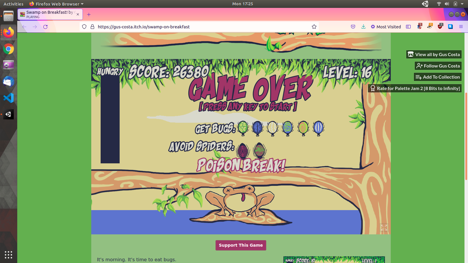
Quite simple but it's reasonably well executed for what it is. The difficulty progression isn't smooth, though, because the hunger meter speed doesn't scale with the availability of food. More speed doesn't make it more difficult because more speed = more food. Thus, in level 2 I feel like eating a spider means I'm in trouble. Level 3 and 4 are actually easier than level 2 and by level 7 or 8 I barely see the hunger meter dropping.
This is pretty good. It definitely feels like a pretty full-featured metroidvania platformer.
The only things I could critique would be 1. the amount of space the camera takes up, making it so I don't see as many details in anything that you drew and also 2. I don't like the keyboard layout. I wanted to press W to jump and Enter to shoot. E is not well placed for that because my index finger already has to be on D so I don't have any finger positioned well for E. So I reach across the keyboard with my opposite hand. Space for jump only feels right when I'm using the arrow keys with my right hand but I'm already used to using W so why not just use W for jumping?
EDIT:
And I forgot to comment, I thought it was cool that the dangling chains are pushed by those sliding walls.
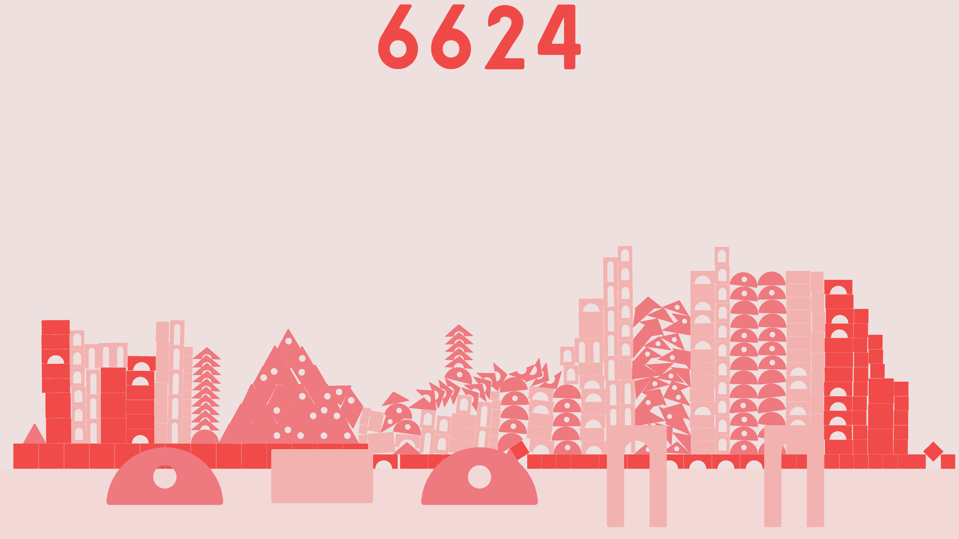
Got that far before quitting. It runs at 2 frames per second on my machine because the physics engine won't settle.
It's a cool game. It sure beats picking up blocks and putting them away when I'm done. You should make it so that when you accidentally release a block below the floor, it goes back into the tray instead of making a mess of the foundation.
Hey guys. I'm thinking about participating in this next jam and I don't have a team yet. I've been programming video games for many years and you can see some of the results here: http://flaise.me/ Send me a message if you're interested in collaborating.
Hi, I'm interested in collaborating. I code, mostly. My portfolio is here: http://flaise.me/
Any artists or coders looking to collaborate? I've been programming for many years and I have a portfolio here: http://flaise.me/


