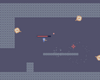
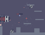
Play game
BREAKER 1600's itch.io pageResults
| Criteria | Rank | Score* | Raw Score |
| Fun/Design | #20 | 2.446 | 2.538 |
| Theme/Limitation | #24 | 2.446 | 2.538 |
| Overall | #24 | 2.253 | 2.338 |
| Technical Implementation | #24 | 2.372 | 2.462 |
| Graphics/Animation | #25 | 2.224 | 2.308 |
| Music/Sound | #29 | 1.779 | 1.846 |
Ranked from 13 ratings. Score is adjusted from raw score by the median number of ratings per game in the jam.
Team Size
Solo (1)
What main engine/tool/language did you use to construct the game?
Unity
How does your game apply the optional theme "break"?
The player must destroy the enemies to advance further
Which art and audio did you / your team NOT create from scratch?
None
Which art & audio did you / your team create BEFORE the jam started?
None
Which diversifiers did you use, if any?
None
Leave a comment
Log in with itch.io to leave a comment.


Comments
It's not bad. I think you've got a good start that could be expanded upon into something more detailed and interesting.
I agree with all the other comments and would also add that the character controls feel awfully "loose". If it were me, I'd keep the jump height the same, decrease jump speed, decrease gravity so the descent of the jump matches the ascent, increase the horizontal acceleration so the top horizontal speed is reached much more quickly, and decrease the top horizontal speed and bullet speed slightly.
I'd also suggest you use a lower-pitched sound effect for the shooting (or run a low-pass filter over it) because high pitched repeated sounds get annoying after awhile.
I think the camera shake would look fine if it were for a heavier weapon with a much lower rate of fire but for the faster weapon, it needs toned down.
Also, if you haven't already, could you please rate my team's game? I'd much appreciate it.
Fun game! I included it in my Palette Jam 2 compilation video series, if you’d like to take a look. :)
screenshake is a bit too much, and could be massively improved with music, but overall good job
The game is a little on the short side, and could really use some music. It's a good foundation to build from though. I also agree with the others, the camera could use some work.
The game is fun, and I agree with the others that the camera should show a bit more of the action. A suggestion of mine would be to give the enemies a bit of inaccuracy / make them aim towards where you are walking to, otherwise constant strafing is just an easy way to win.
Nice start to an action platformer, but would like to see some better feedback for the player during gameplay.
PROS:
CRITIQUES
Nice little game !
You should consider offsetting your camera a little bit to the top since most of the enemies are above you and it's kinda hard to aim if they're off screen.
apart from that, it's a pretty fun little game. good job :)
Pretty fun game! It was pretty enjoyable to play.
The camera is way too zoomed in for the speed the player is going at, its kinda hard to see what you're doing since you're changing everything around you too quickly. The text shaking when you shoot is also a nice touch although it makes the text pretty difficult to read when you're going by.
Wouldn't mind more levels, and the boss scene could use some more HP, but nicely done!