


Play game
VoidRift's itch.io pageResults
| Criteria | Rank | Score* | Raw Score |
| Metroidvania | #33 | 3.019 | 3.375 |
| Presentation | #35 | 2.907 | 3.250 |
| Overall | #36 | 2.683 | 3.000 |
| Design | #40 | 2.460 | 2.750 |
| Enjoyment | #42 | 2.348 | 2.625 |
Ranked from 8 ratings. Score is adjusted from raw score by the median number of ratings per game in the jam.
Engine
GameMaker Studio 2
Team/Developer
dev-beings
External assets
Font: Orbitron (https://fonts.google.com/specimen/Orbitron)
Leave a comment
Log in with itch.io to leave a comment.
Comments
What I liked:
Suggestions/Improvements
Overall, I enjoyed playing your protoype and congrats on submitting!
Thank you for playing, and the helpful comments!
In response to your suggestions:
1. Yes, absolutely. We have quite a bit to do in regards to player/enemy feedback, showing player health, etc.
2. Agreed!
3. This is a good one. As we move forward with design, the gameplay "feel" and pacing will be a critical element to help this project find its legs. Or treads as it were....
4. Also agreed. Probably wheel up/down to cycle weapons, middle click to open weapon ring.
Good game! nice art and levels, the movement is a little slow and the music a little high but very good work!
Thank you for trying it out! Will definately be working on the movement as we go along.
Cool space themed entry !
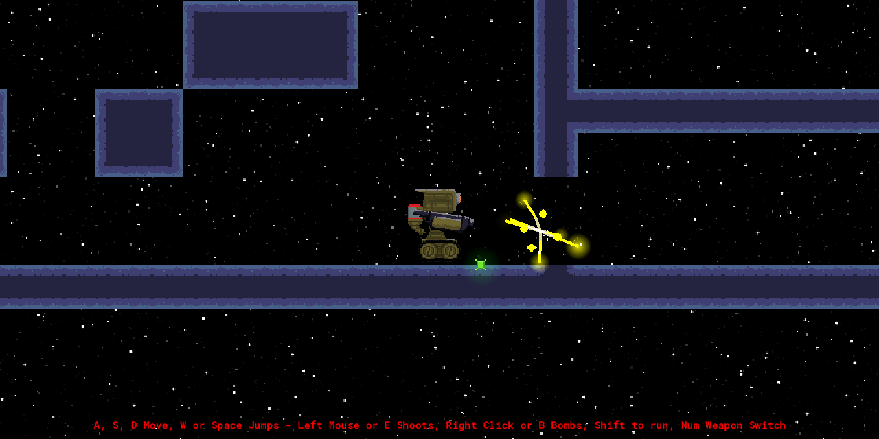
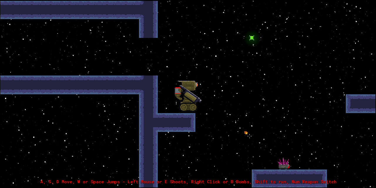
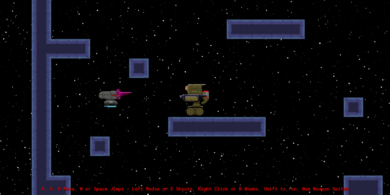
I really like the title screen the player robot and the void alien robot creature things designs, nice and detailed pixel art.
The emphasis on exploration is also really well made, with just a bit of a downside that you can easlily get lost in the level cause it seems huge, i like the fact that you went for no hand holding but here a few landmarks or helps with navigation would have been nice.
On a similar aspect, i like that you can just try found powerups to see what they do, but the first 3 weapons don't seem to get any sprite change so i wasn't even sure i had them in the first place (appart from one which looked different but couldn't get cause it was behind a door i didn't have the ability to open yet) one last issue would be character movement speed, i get the sprint button but it is ultra fast making precise platforming a bit hard, and the regular movement speed is really ultra slow.
Now that being said the game is good besides all that, and i've had fun rolling around this space structure trying to progress, i also really enjoyed the details like the sparks your bullets make impacting any surface, and the music really captured that feeling of space i.m.o.
For a first collab as you mention on the game's page, you guys did a great job together.
Well done :)
Excellent submission with great graphics, neat effects, fun upgrades, and with a very fresh (but still very Metroid) feel. I love the player character, it looks great, plays great, and I am a sucker for tank treaded robots for the main character. Great game, I'd love to see more development on this.
There are some really nice elements in here. The robot looks super slick and I can see the independent movement of the parts, that's really cool. The particle effects are also super satisfying and just fun to watch. I was also super drawn in by the simplicity of the title card, very nice work.
Unfortunately, I struggled a lot with the movement. I saw in the comments below that you wanted to give the sense of a diminished character who becomes stronger, but I ended up just overcoming this by holding down shift the whole time I played. It's definitely commendable to reinforce thematic elements with gameplay, but I think in this case it didn't feel great and I had to overcome it by making the game less enjoyable by dashing at breakneck speed everywhere...).
Secondly, the map was fairly difficult to navigate. I know that if I get into the next room and drop down to the left I'll encounter a boss, but that was about as far as I was able to get in terms of building a mental map. There weren't many places where I could go, "Aha! This is THAT part of the map, I'll remember how to get here in the future."
Also as has been mentioned, the parallax was pretty rough on the eyes.
Overall I think that you did a good job of realizing what you wanted to with the robot, and the amount of work you put into it showed, I look forward to seeing what you come up with next time if you participate in MVM XVI!
Thank you so much for the awesome feedback! I love what Colin did with the design. The movement, however got a little funky with the different parts. I'm not sure what that was about. It's nice to see the parts were noticed. The boss, is also comprised of several pieces.
Great perspective on the map. I think it will feel a lot better with a tighter and more focused design. When it was built, I decided to change the collision system to a tile (vs. object) based system which presented a lot of other challenging issues I was not prepared to handle. Something also prevented the final room from loading, which is why the end screen wound up being just an image. I think it will be great to have a write up about the process once we are done with the Jam ratings.
Yeah, the movement was supposed to be better earlier on, but I ran out of time making collectables and the upgrade logic. I think ultimately, it just feels better with better movement. Will definitely be tweaking this.
A mini-map is planned to aid with navigation, but I also think the tighter level design would aid in this as well. I'm thinking about a different approach to the level design as well.
Thanks again for playing!
I like it, may be too simple yet, but the movement is fine, and shooting feels nice, maybe a little camera shake would be cool too.
Interesting concept, but please remove the super fast parallax, its nauseating.
Thank you so much for your input! That's really helpful :)
We struggled a bit with getting the art assets right, and in the end decided to remove the backgrounds. I can definitely see how leaving that motion produced an undesirable effect and would have been a lot better if it was a static image.
Movement could use some work, could use some more powerups too. shooting things was fun but the game was disorienting at times. I really liked the effects on the gun
Thank you for playing!
I definitely agree with you on that. I had some difficulty getting all the pieces (head, body, gun, legs) to all align an play nice with movement and animation. I also found out the hard way that if your sprite isn't even, it gets stuck in walls. Conceptually we wanted to show a character with decayed movement and capabilities that gradually got repaired and refined.
I think ultimately, without the background tiles, the animated stars to show motion were just too much. Thanks for input!