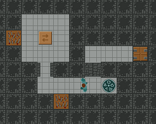
Thanks, happy to help scare. Hope you recovered, though. :)
GreenBeakCrow
Creator of
Recent community posts
Thanks for your feedback! I already implemented a little buffer zone around the items so picking up is easier, but it seems it still could be larger.
Considering placement, the items are actually placed on a grid, but there's an additional offset to hide that. The grid is just to make it easier to prevent items overlapping. Don't mind the scoring too much (as in "I want perfect score") because I had something in mind for the contracts like "reach at least 50 accuracy to pass". Another option instead of showing numbers would be having categories like "+++", "++", "+" and so on, that would hide the imperfection a bit. Though I personally like the sensitivity.
Hm, I could not figure out how to play. Most of the time space doesn't do anything. And when I reload, the game downloads > 100 MB of data again, so I wasn't too inclined to try often. Please host the game directly on itch the next time if you can, then you can just hit F5 to reload and use the cached data.
Nice concept and visualisation. Though two factors make this game really difficult for me:
1. The fact that the gene moves upwards but your cursor does not. I'd prefer the cursor moving alongside the gene and then maybe continuously.
2. Having to look away from the actual puzzle to see what base comes next. How about your cursor being a queue of bases to you always can see what's next at the same place?
Start the game with a joke, I like that!
Well, I'm kind of proud that when I was asked to type a word starting with J and an X inside I came up with JUXTAPOSITION. :D But couldn't remember any word starting with K and having an M. Well, native speakers definitely have some advantage here. But I actually had a lot of fun with your game, well done!
Out of curiosity: what dictionary source do you use? It seems names are not recognised (or I did type them wrong all the time.)
[Edit]
Only two minor complaints I forgot to mention: pressing space after your shift does nothing for me, and the initial message you get from your instructor was gone too fast for me so I couldn't read it the first time I played.
You marked the game as having Linux and macOS builds, but as far as I can tell there is only a Windows version inside the archive. Please adjust the tags accordingly. I was able to run it through wine on Linux, but I had some problems as there was no text visible and I couldn't quit the game without killing the process.
So the basic mechanic seems to be alright, I can jump and dash and collect things, but I actually have no idea what I'm doing there. At some point a red curtain fills the screen and I can't do anything anymore, so I guess I'm missing something here.
In my opinion the game does not really benefit from being 3D instead of 2D. In 2D (side perspective) you could much better assess if or when to jump, if you can make the jump etc. Though the graphics do look nice.
As the others have noted the pouring does not always work. Like half of the time just nothing but steam comes out, though it seems the customer doesn't care, the amount of each ingredient is apparently of no importance.
I like the general mixing idea a lot. It reminds me a bit of the old game Pizza Connection where you had to recreate existing pizza recipes by putting ingredients on the dough. So you could perhaps give a recipe and a picture and the players would have to guess the correct amount and place a fruit or some other decorations according to the picture seen. The closer you get to the original the better your rating.
The keyboard controls don't feel smooth or fitting to me. Since your score depends on how fast you are, being limited by the movement speed of the tray feels like a burden. You could instead make everything mouse controlled - allow the player to pick up and place the cup and move the tray around by mouse. But you'd have to be a bit careful as to not flip the cup over or spill its contents by moving too fast.
As others have said difficulty is a problem with this one. You could make this more into a planning game instead of mostly reacting by having a kind of schedule for each direction element and make the accepted products at each terminal known it advance (for example as a queue). You'd then have to plan ahead when which item is where and so on. Rating would be possible in categories like fewest switches or maybe average distance travelled.
The sound design is well done and the graphics do their job of being informative and not distracting.
The main character is definitely a cute little fellow - good job on achieving that with only two animation frames! The mechanic could support some interesting level design, I'm curious what there is possible even just using the elements already present in the first level.
It's just a prototype, but for the sake of completeness it's a bit odd the character vanishes into the void when stepping on the arrow pointing downwards, and you can move and even complete the level after you are out of turns because controls are still enabled.
The game is done well technically, no complaints there, though I'm not a fan of having to use the whole keyboard and mouse simultaneously. I could use both hands typing the letters, but switching back and forth with one hand between mouse and keyboard to remove the damaged cubes is time consuming and not very ergonomic IMO, and I hate to have one hand only to type all keys, it just feels too slow and burdened. Maybe it wouldn't be such a problem if not most of the cubes were bad ones. The factory really should look into improving their production quality. :o
I would very much prefer a mechanic where you can identify the damaged cubes just by looking at them and then type out the cubes that should be sorted out. I wouldn't mind having more letters/words on the cubes then instead.
On the plus side this is one of the rare cases I have seen on Trijam where 3D makes a difference because it's fun to just watch the cubes tumble and roll around. How about building on top of that? You could have some kind of box where all the cubes are in, and the damage might show only on one or some sides but not all, and you'd use the keyboard to shuffle, tilt and mix the cubes around so you can spot the bad ones and then type them out.
I have mixed feeling about this game. It's quite complex for a game made in three hours, but two factors reduce the fun aspect for me: first the fact that time runs from the beginning, so there's not much planning before everything rolls, opposed to the likes of, for example, Spacechem or Infinifactory which I adore. Second the level design, or the lack of. It seems to be pure random, and though I haven't looked into it very much, it seems for some levels you are not able to fulfil all three desired outputs because you'd have to cross belts (or change them on the run which to me feels a bit like cheating).
I prefer an approach with more planning beforehand and then sitting back and watch how your plan unfolds - or not! Which is part of the fun and challenge. You could easily add some constraints to where the different elements can be placed by the level generator to ensure each level can be completed "perfectly".
The graphics are not very intuitive, so some more detailed explanation on the game's page would help very much. Took me some time to figure out the output symbols' arrows are arrows and not part of the product I had to deliver, so I was clueless how I should form those lumps into the more sophisticated shapes.
If you'd rule out those complaints I have I guess I'd enjoy it a lot more!
Overall a nice game you made. The first time I played it was over very quickly and wondered why others found it too easy. Played again, and maybe I was just unlucky before (too many boxes I had to swap), but also I missed that you can drop and pickup a box at the same time.
Music and sound effects fit well, the graphics feel too rushed though and don't harmonise well IMO.
Good work with some quirks. Like others I find the sound effects very fitting and the visuals are a consistent set.
It does miss a restart feature. Does the game have an actual end? Once I figured out the controls and mechanics I got quite far, but basically nothing changes, so I don't know if I'm missing something.
I noticed that the claws sometimes pop into vision a little too late, so you might have a bug regarding visibility somewhere.
What was your thought on the theme? Is the setting supposed to be a factory?
These aren't the classic game of like rules, or are they? You mention bugs on the game's page, so maybe that's that. Main issue I have is that I can't pause, and the game ticks too fast to be able to create some intended structures before it all goes to waste. :o
Other issues you may already be aware of: grid lines have rendering problems when zooming out, and somehow I got to around 800 points, but performance went down quickly, so the game got unresponsive.
I'm curious how it will shape up with the bug fixes out! Seems promising.
Funny moment when the shrooms started attacking! But when is the game ending? Having some highscore in there suggests it does end. I punched shrooms until my mouse finger hurt, but they still kept coming at me and the game didn't seem to end. I only noticed the mouse cursor changed to the text input thing when hovering in the middle area of the game. So is there something missing?
Nice writing, I swear I could feel some sarcasm in there! When I got told about I should paint I had hoped that I could draw a tree and hence all trees would be visible with my own self drawn image. That would have been great!
Just out of curiosity: were you actually left by an artist you wanted to make a game with?
The main issue is that my drawings that should help me navigate just vanish after some time (or whatever the cause is), so there I'm stuck again in a blank room. Also the maze seems to be rather large, so a faster movement speed would be most welcome. Finally the text was sometimes a bit too fast, especially when distracted, so I'm missing a "click to continue" mechanic here.
The impro track was, to be honest, more on the annoying side.
Overall well done, though I have some issues. First one is that in each level you spawn inside a wall giving a quirky view and that you don't face the exit right away. So you lose valuable time. The other thing is that when using H for a hint all platforms turn invisible again, even those I had visited before. Might be intended, but I think it's unnecessary. Movement could be a tad faster.
Just a personal view on platformers: they just feel weird to me when I can't jump. :o
I liked that there are trampolines in it, makes fun bouncing around!
Well, that's a way to use a gun I've never seen before! Took my some time to actually understand how it's supposed to work. I was stuck in the usual mechanics that I thought I had to shoot (as in kill) the other guys but wondered how on earth I can dodge this bullet coming for me. So well done breaking this trope!
I didn't get to try the upgrading system as money spawns way too rarely.
Nice idea to have some snake like ice trails as enemies. Am I correct that the ice snakes do not react to the player's movement? So it's mostly luck if you are able to reach the present? Well, I couldn't see any pattern, so I just assume it's random. Would be nice to have them react to something so the game would be more of a puzzle and less of dice rolling.
First off, I had some technical issues. The web version will show the credits all right, but when I click "Start", the browser freezes completely for about 10 seconds or so before there is a crackling sound, the music starts to play and a popup says "lost webgl context, please reload". When I do, all repeats again, and if I don't there is nothing rendered so I can't play.
Tried the Linux version and it works fine apart from some hickup after pressing "Start". So it seems you have some demanding work going on right after the scene loads.
The music fits nicely and other than the above the game works fine. Regarding the gameplay I'm a bit torn. On the one hand, most of the time there is no sense of direction, even using the controller to show the obstacles usually doesn't help much as you can't see the room's boundary or any fixed point. I was running around randomly, collecting the batteries, using them up (to mostly no avail) and eventually be pure luck finding the exit. On the other hand, maybe that's just the point of the game, to feel and be lost. However, due to the lack of any means of orientation as a player I didn't feel any accomplishment when finding the exit.
Using the controller should, in my opinion, allow the player to actually gain information. It's perfectly fine to have the player run around and make guesses about the environment, but then the usage of the controller should have a "alright, now I know more than before!" moment which wasn't the case for me. Also the problem with running around and guessing in the current state is that you don't know if you are actually running or have your face right against a wall. This could be fixed by, for example, having foot step sounds if you actually move, or by making the player leave some kind of probably vanishing but visible trail.
Another option would be to abandon the third dimension (as in 3D) as it is not included in any game mechanic (apart from being able to look up or down, but there's nothing ever to be seen. Instead, make a 2D game with a top down view where the level is fixed and the player moves around on the screen. This way as a player you'd at least know where you are, but not where to go in a maze with invisible walls. You could add some moving walls or another kind of dynamic obstacle to prevent the player from just walking along the walls until the exit is found.
I made this game for Trijam #55: The 3 hour game jam in about (probably a bit more than) 3 hours.. Should you happen to like it I'd like to see your creations, so please share!
Can I participate using a "port" of one of my existing games? By that I mean I'd make the game use the required resolution, colours and audio capabilities and thus redo all assets. But the actual logic might work just fine. Is it allowed to reuse it? If not, is it fine to reimplement without copy/paste?
Thanks for playing, I just watched the recording on twitch. I can see you were confused at first because you didn't know the rule includes two colours or accessories. 14 scans is all right I guess, during my testing I usually also tried to find 5 culprits with a scan and then deduct the rule, which takes around 10 scans or so. Maybe next time I can make a game that's not so hard to get into during a stream. :)
This seems be a nice exploration game. I like the planet visuals and the background.
To me the controls where a bit too responsive, and I have the feeling the gravitational force might not be implemented correctly, but I can't say for sure. Sometimes, though, I have gravity set to maximum negative and still pass by planets more or less unaffected. The overview could be better at times, you could maybe scale the zoom depending on the distance to the closest planet.
Regarding zoom I had a bug that caused it to not reset after leaving a planet where I stayed some time so I practically had no idea where I'm going.


