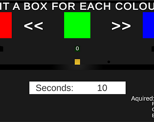
Excellent concept with an educational bonus for those who want to know more about bits. Nice gentle on the eyes aesthetic using simple primitives, but has a well formed set of simple mechanics that make it easy to pick up and play and fun to beat. I also felt the level progression pacing was also excellent
Gruff Wright
Creator of
Recent community posts
this was great to play, audio atmosphere was really cool too. Love the grey scale/ black and white styling and felt it fit the game jam theme really well. I would say it was quite innovative and the simple art style is really complimentary all in all. I really like this casual game and the UI / tutorial and win/ lose conditions were well executed IMO :)) well done
Thank you so so much for the comments and feedback - You are absolutely correct and I expect to see these glaring kind of issues ironed out in any future revisit.
I took a limited concept and provided an almost literal outcome for it really I guess, but felt it had some scope in the player mechanics of the game play, or at least I ended up thinking that ha. [actual GMTK2020 submitted version was super, super broke(sadface)]
Doh...Sound
Doh...Maps
Doh...Purpose and story driver beyond collection mechanic
Doh...Procedural gen'd stubs replaced with detailed Env props
Doh...0% 'Game Juice'
... and it goes on and on to be fair :)
The provided details here [in your feedback] have gone into the Trello for it and a they have really become the milestones for any next attempt/ revisit - these have actually been truly golden so thank you so much for critiquing it with such a pro attitude in the aid of move something forward :)
It's a back burner for now...chucked into the box with all these others I've never let see the light of day haha
Again, Thanks so much for the critique and valuable feedback, its really been very much appreciated.
Gruff:)
Thank you so so much for the comments and feedback - You are absolutely correct and I expect to see these glaring kind of issues ironed out in the next iteration.
I took a limited concept and provided an almost literal outcome for it really I guess, but felt it had some scope in the player mechanics of the game play, or at least I ended up thinking that ha.
Sorry @Cooper Anderson, I thought I'd written non diagetic UI in the changes description - my stupid bad but with respect to this question, I was going more in the vain of improving the current Diagetic UI on the space guy and ways to improve this visually :(
Sound is literally non existent in the game at this point, but I had initial delusions of grandeur that in 48 hrs I could code out a procedural audio handler for proximity to walls, collectables and textural changes to background audio based on level progress.
It's a back burner for now...chucked into the box of nothing special with all these others I've never let see the light of day haha.
Thanks so much again for the critique and valuable feedback, its really very much appreciated.
Gruff:)
Thank you so so much for the comments and feedback - You are absolutely correct and I expect to see these glaring kind of issues ironed out in the next iteration.
I took a limited concept and provided an almost literal outcome for it really I guess, but felt it had some scope in the player mechanics of the game play, or at least I ended up thinking that ha.
It's a back burner for now...chucked into the box with all these others I've never let see the light of day haha.
Thanks so much again for the critique and valuable feedback, its really very much appreciated.
Gruff:)
Really loved the concept and the lil old guy / concept of time nuance [theme was well on point, I felt and enriched beautifully by its visuals too] ...If I had a critique: there may have been better initial [forced] controller/ movement indication in the UI right before setting off, but honestly I picked it up very quickly, the visuals indicate pretty well that holding key down is the answer to whatever happens next [first time play, start screen] and it's sort of obvs it's gonna be A and D after one quick check over the usual "regularly used keys for moving in games" to get playing in the first level. However, brand new game players might not be familiar to these 'regular game controls/ keys' definitely making it a valuable addition to your initial on-boarding UX.
Loved the style [it was inspired], really enjoyed the game - My top one so far this jam :)
Thank you so much for trying it out, the video feedback and for the comment, you are so right, it bugged out, the later version available post the submission has this and reboost fixed - I unfortunately did not comment out a bit of code that stopped the boost regen occurring [as a test] I'm so stupid, uploaded some changes in a panic and of course this happened ....XD
haha thanks and well done for actually getting into game especially if you tried \PC version. my space guy was a quick nurbs build in blender and then applied s free mixamo anim to it :)
Yeah the key to getting through level was definitely gently gently or out control you go :)
Thanks so much for playing :)
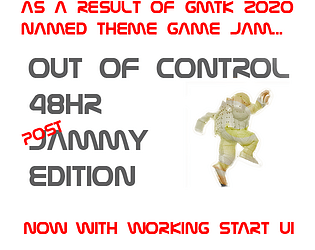
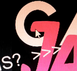
I'm so sorry, I cocked up the Entry Menu UI, [see image above showing mouse cursor if you want to get in without this major fuss] :( FIXED IN POST SUB DEADLINE VERSION Here:
https://gruffy321.itch.io/out-of-control-revised-post-gmtk-submission-deadline


