Woa, this is a deep cut! It's been ages since I've thought about this, but dodging works but simply dragging the cursor over the growing circles to keep them from firing - one hand has to stay on your mouse to keep you alive, while you operate your keyboard (reloading your gun) with just one hand.
Hailrig
Creator of
Recent community posts
Heyho! Thanks for playing. I agree about the full screen point - was kind of a case of leaving it at the default screen size for too long until it might have broken something to change and I just wanted to sleeeep. But I agree, should have changed screen size from the get go. Thanks for noticing, we did indeed increase the hitbox size of the prisoners as well as allowed a few frames of wiggle room if the player clicked to the side of a prisoner and then dragged their mouse onto the prisoner to correct. But yeah, bigger screen size would have been a good thing.
On the points of improoooovement,
- In terms of draggable guards, they are :) though I wish that they guards felt punchier. Making the decision to avoid messing with pathing in 48 hours limited the design space a little - one of the things that an iterated on version would have to implement.
- We agreed that it should have some manner of additional failstate, but were running low on oomph to do something complex. We debated adding a simple time limit, but felt that that might have frustrated more than helped and decided to leave it sans fail state.
- True! That'd be super sweet. Though, I feel that bigger levels would require more mechanics to make the gameplay a little more diverse. I'm not sure bigger would have been better without some more diversity in the content that we *super* didn't have the oomph to put in. Still, I agree that it's where we'd go if we iterated on the idea.
Toaster recommended I check this game out, heck that's pretty good. Really dig this. If I were to trot out my niggles though, they would be that sometimes an enemy can get spawned in my path such that it really feels there wasn't much i could do. Also, as I kept the cursor very close to the ship so i could spin it around in the period between the move and the shoot the fact that sometimes shots go in weird directions when your cursor is close became very noticeable. But that aside, an awesome game.
Neat. I didn't mind the 5 seconds too much, but I wish there was more to use - I often found myself just clocking on enemies. I also got frustrated a few times when he made *questionable* pathing decisions, usually involving sitting in a corner. Hit a bug where he teleported off map and fell forever.
Good show! Played it to double digit waves twice. Most of my comments have been addressed already (Particularly the gun UI bit.) but I might also mention that I sometimes found myself accidentally picking up health packs too early (when I hadn't really lost much health) and that I wished the pistol had a little more oomph to it.
As an aside, I wonder how a game like this would feel if you had to immediately fire the weapon when you picked it up. Probably would require some redesigning, but the idea intrigued me.
In any case, good show indeed, hope you enjoyed the jam.
Thanks for the comment, Colin. We were concerned about front loading the game with words, as the experience itself is a very "go fast and break things" style of pace and we didn't want it to start slow. We had also hoped to implement some safer space at the start of the level that would teach you how things work in a more forgiving and interactive nature, but that was cut due to the eternal march of time towards our deadline. Still, in hindsight I agree that it would have been better to front load all of the information and accept the 30 seconds of rules exposition to ensure the player had all of the information they need.
Hey! Saw your game was updated, so I thought I'd give it another run. Escape brings up the menu! I tried to be more thorough this time around - finding the bracelet, etc... I saw that escape brought up the menu, and smiled a little. Also, I noticed this run around that I wasn't the only person with an appreciation for jokes about sinks :)
Cheers,
Lucas.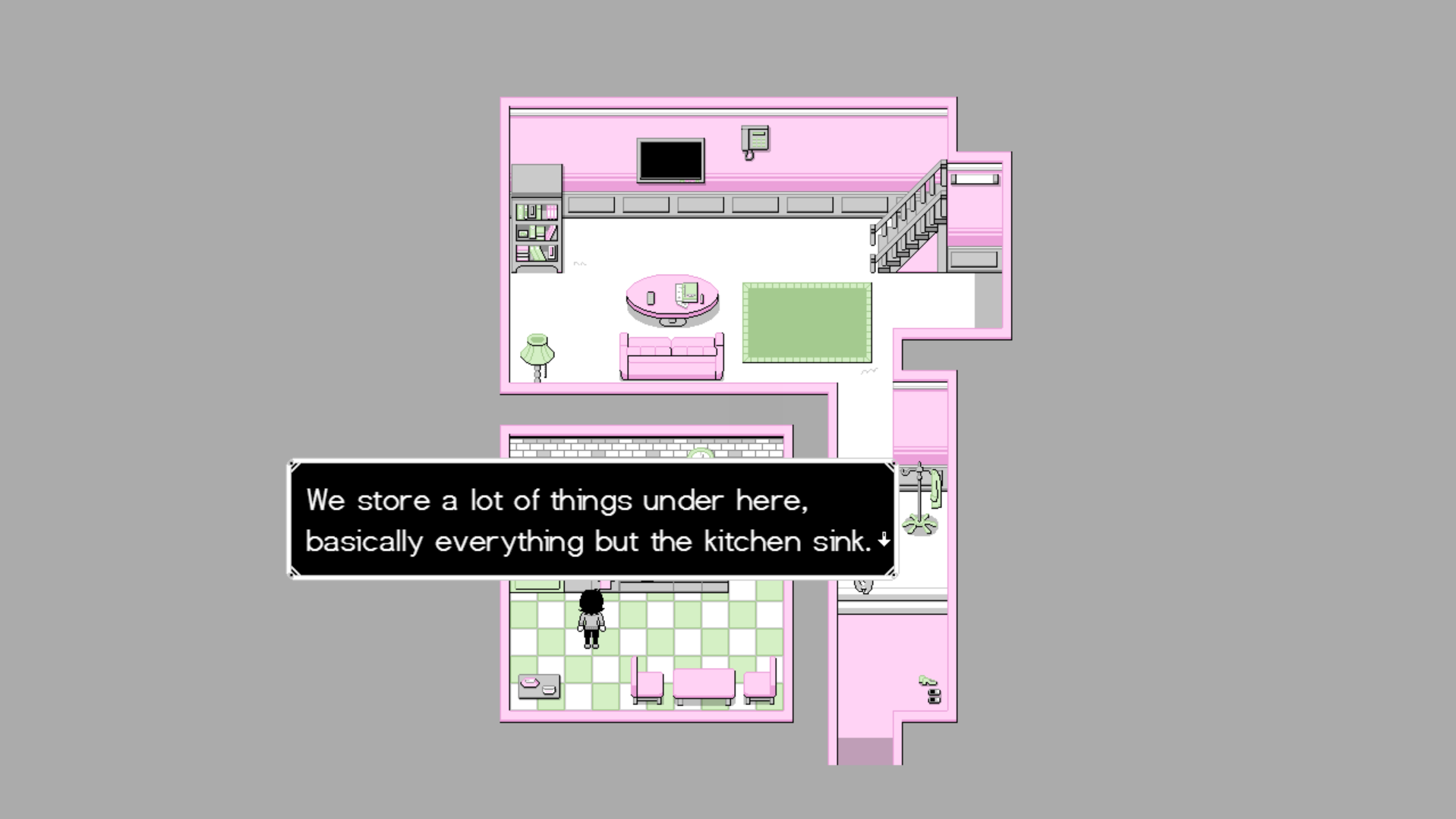
Yeah, getting a hand full of people to run through our game really helped us learn what things needed to get adjusted so that players would try it out or explore the area. As to our philosophy on detail, we used a mindset of "We will fill the game with so many references and secrets, they HAVE to find something." Though admittedly, this meant a lot of content that may never/rarely get seen - never a good fact when you are working on a time crunch. Ups and downs, I suppose.
Hiya! I enjoyed my time with this quite a lot. The assets were all quite solid and added to the expiriance without being the focus of it, and the writing was done quite well. I had a lot of difficulty finding the menu to access my keys (I basically just rolled my head over my keyboard 'till it worked) and I also found the minor passability issue mentioned by another person, but it didn't detract from my time with the game. I in particular would like to commend your use of screen flashes and various fonts being displayed across the screen - it really helped communicate tone in a way I hope I can learn from. Also, the animations in the bust images were a great touch I wish I could have implemented in my own game.
I look forward to what you do next,
Lucas Harvey, one half of the team behind The Rosewood Masquerade.
PS: Cats make me feel better too.


