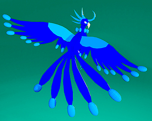
This game is a lot of fun! It reminds me of Vampire Survivors. One change that I would suggest is lowering the saturation a bit on the background. There needs to be more contrast between the objects on the screen and the backdrop. At multiple points, I had a little trouble seeing things, which is a big problem in this kind of game. Other than that, you did a great job creating a satisfying gameplay loop!
Javajon
Creator of
Recent community posts
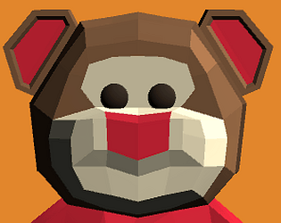
I really like the idea behind this game! Although, I feel that the controls are not quite responsive enough. I found that I was helpless to stop the big Chonker over and over again. Even when I finally felt like I was getting the hang of the controls and managed to hit it with some beans, it barely moved. The whole experience is somewhat frustrating. I think that it could be fixed with a few changes. I'd say the most important thing is to make the repulsion send all the beans forward instead of simply outward. There is currently little reason to send the beans in all directions and a lot of reason to fire them all in the same direction. Also, it would be appreciated if the mouse could be made invisible and locked to the center of the screen. It got stuck on the bottom of the screen at one point. After all these criticisms, don't get me wrong, I still enjoyed what the game had to offer. Good job!
This game is pretty fun! I especially enjoyed the mechanic of getting ammo from enemies. It forced me to think about my resources. I would just suggest allowing the player to switch which ammo type is active to allow for even more interesting decision making. Overall, this is a very cool project with a nice level of polish.
I had to stop myself from playing this game too much. It's so much fun! Also, the music definitely makes it for me. It wouldn't be the same without it. One criticism that I have is that the mouse sensitivity is too high. I assume that you set it for the trackpad? I would love to some sensitivity options. Oh, and I still haven't beaten that boss level, but I'm trying. Don't make it easier before I beat it!
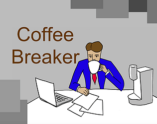
This game is an interesting synthesis of multiple concepts to produce something brand new. It's very fitting considering the subject of the game. I love the art! I can tell that you worked hard on that aspect. I do have a few criticisms about this game, though. I wish the dimensions of the screen could be a little larger, or that the UI elements were bigger. I spent a good minute or so trying to read the instructions on the title screen. Additionally, it may be better if the different gameplay elements were more streamlined. While the different recipes were interesting, I found it a bit of a chore to repeatedly walk across the room. To be clear, this is a great game and an excellent display of your skills. Before I forget, I would also like to suggest the implementation of some kind of lose condition. Without one, the experience unfortunately grows stale rather quickly. I know that this is getting unnecessarily long, but I thought all of this was worth mentioning. All in all, I love this idea!
Hey, I thought this was a great game! The presentation in the beginning looks very professional and the tutorial feels natural. After obtaining the paint gun, however, the game was frequently interrupted with long freezes. I would guess that this has to do with it being too intensive to render all the hexagon objects, as it only happens when I move too quickly. It's a shame because I was looking forward to seeing where this game was going. I hope that this can be fixed soon.
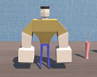
This game certainly fits its title. I enjoyed its simple, yet fun gameplay. The ideas for obstacles are very creative as well!
I noticed a few places to improve in, though. You could make the player and obstacles sprites more clear by increasing their size and resolution. Also, I think that adding a visual effect when something hits you, (like the player character flashing red), would make it significantly better. Nonetheless, I liked it. Good job!


