Indie game storeFree gamesFun gamesHorror games
Game developmentAssetsComics
SalesBundles
Jobs
TagsGame Engines

Leaf

36
Posts
2
Followers
A member registered Apr 14, 2023 · View creator page →

Creator of

Recent community posts

An interesting take on a bullet hell where you're shotting bullets down rather than just trying to avoid them. The perspective felt a bit off, especially when trying to shoot the projectiles that were furthest away. But a cool idea executed quite well, that also looks quite good.

Really fun game. The movement felt fluid and fairly responsive, and being able to see the timer pretty much everywhere was a nice touch. The platforms you could jump through seemed to be a bit hit or miss at times but overall a really neat experience.

Nice art and atmosphere. Definitely some more polish and juice needed here and a tutorial would be nice, but with some more work this could definitely turn into something really good.

Probably something more visual such as the enemy flashing slightly red, maybe some particle effects, and maybe a slightly delay on the sound effect so it can be heard more clearly. But still overall the amount of work here is impressive.

Yeah, with the right upgrades the spiral cannon can be an absolute monster. Thanks for playing and commenting :-)

You seem to be the exception in using one of the line cannons, they were very powerful in earlier version of the game, which unfortunately mostly seems to have been lost in the last few builds. Thanks for playing and commenting :-)

Thanks, It was one of the first ideas I came up with when I saw the theme. I honestly thought more people would've gone for it. Thanks for playing and commenting :-)

I'm surprised at how seeminjgly unique my interpretation of the theme was. Thanks for playing and commenting :-)

It seemed a fairly obvious interpretation of the theme to me but it seems it was more unique than I expected. Thanks for playing and commenting :-)

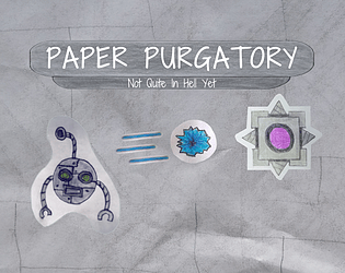
Yeah, the controls being rather unintuitive seems to be a critique that's come up a few times here. I had an idea for the tutorial that probably would've made things easier to understand (rather than the text wall it ended up being), but I wasn't sure how to implement it and I didn't want to waste the time on that that I could spend on other things such as attempting to balance the game. Thanks for playing and commenting :-)

Thanks, I wasn't sure about the art style for most of the time I was making the game but it seems to have ben recieved really well. Thanks for playing and commenting :-)

Polish seems to be a critique comming up quite often and I can easily say I agree. I can also agree on the reroll scaling being a bit on the high side but I didn't want it to be able to be constantly used as it has the potential to be rather powerful and potentially slightly upset the (vague) balance of the game. I tried to make the other cannon viable but after removing the mechanic of your projectiles damaging you from the lower difficulties the circle cannon certainly became a lot stronger than it was in earlier versions. Thanks for playing and commenting :-)

Thanks for playing and taking the time to comment :-)

I do feel I should've made the tutorial slightly more intuitive. Thanks for playing and commenting :-)

I wanted to add more to the UI but by the time I was got to that point I was burning out, and the extra art really takes a while as I was drawing it on paper then importing it into the game. Thanks for playing and Commenting :-)

The current balance of the game took a while, it isn't perfect but it's certainly better than it was, I would like to improve it though. Thanks for playing and commenting ;-)

Yeah, this was a bit of polish I wanted to add, but by the time I got round to it I was quickly burning out as it was the last day or two of the jam and this is the first full game I've made, but thanks for playing and taking the time to comment :-)

The other projectile types were unlocked in the upgrade menu, unfortunately because of the sheer amount of things on that screen they didn't really get the focus they needed. The crosshair idea is probably a good thing to add. Thanks for playing and commenting :-)

Yeah, the upgrade system took a lot of work to get even remotely balanced and I wasn't entirely happy with the scaling, so it may be something for me to go look at again after the jam. Thanks :-)

(1 edit)

I drew them on paper then imported them via GIMP. Thanks for playing and commenting :-)

Nice Theme, Art, Music and Sound Design. All implemented really well into a smooth experience. Really enjoyed the "You have limited bullets and you recharge them by collecting them (from enemies)", which I have seen other games using but it certainly seems at its best here. No Notes.

A cool well executed experience. Definitely seeing the undertale inspiration but I would say this classes as a bullet hell, well done.

I saw this during its development on the discord, and I think I played an earlier verison. It still has the polish it had then, the cool baseline idea, really groovy music and a clean aesthetic. I think my only main point of improvement would possibly be adding I frames, as I found it was very easy to suddenly loose 2 or 3 lives through one bad position. But overall a really polished, well executed game.

Another seemingly unique take on the theme, really cool. Some more juice on hits would be nice and it took me a while to notice the health bar in the middle of the character. But overall a cool idea executed really well.

A really unique interpretation of the idea of limited movement. Definitely felt janky at times sand some feedback on how you were advancing through the game would've been nice, but overall a reasonable experience.

Really cool interpretation of the theme and there seems to have been a ridiculous amount of work put in here to make 10 full levels. I feel there should be some feedback to hitting enemies so you know you're doing damage. But overall a really awesome game.

The art in this is gorgeous. It feels a little clunky with the dialogue popping up so often, but there are definitely some neat ideas here and a bullet hell with a story certainly seems to be a fairly unique idea.

A lot of aspects of this game have the beginings of something that feels cool, and the concept itself is interesting. It feels a bit awkward to use energy for everything including movement (seems to use at a very similar rate to the charging up), but the begining of a cool game is there.

Took a little bit to figure out (I didn't notice the explanation in the description), but once I did it was a fairly enjoyable experience, with a clean easy to understand aesthetic and nice controls. I found it a little idfficult at times to try and collect my bouncing bullets but quite often they were destroying the spawning enemies anyway so it wasn't a major issue. Overall good experience.

A Really Unique take on a simple idea. Limited ammo is a fairly simple idea from the theme but the implementation of it is as far as I can tell unique or very close to. I feel the difficulty could've ramped up more and having to constantly move between the mouse and keybaord felt a bit clunky but overall a really cool idea and a very fun game.

A polished short little experience with great atmosphere through the minimalistic audio and the visuals. I feel the theme possibly could've been implemented a bit more and the abundance of pickups made it feel a bit straightforward, but still very enjoyable overall

Great, stylised and polished visuals, sound and gameplay. I'm on a QWERTY keyboard so the controls felt a little wierd but apart from that a great concept executed well.

Very polished 3d style. A neat well scoped game with a lot of polish. Feels like there possibly should be a dash or slightly fewer projectiles as at a certain point I felt I couldn't stop running into them. (Also once the boss and everything else was destroyed nothing seemed to happen). Overall though very enjoyable.

Looks and feels quite polished, especially a fan of the neon on black aesthetic. My main point of improvement is there feels like a lot of time is spent just moving through the same pattern of bullet with the same couple enemies until the boss that spends a lot of time offscreen is reached

Looks, Sounds and Feels really polished. My only main issue is the fact that colour-wise there is no way for me to diffrentiate between my projectiles and the ones I want to avoid. Apart from that though really fun.