Indie game storeFree gamesFun gamesHorror games
Game developmentAssetsComics
SalesBundles
Jobs
TagsGame Engines

Makrost

58
Posts
4
Followers
9
Following
A member registered Jul 20, 2019 · View creator page →

Creator of

Recent community posts

Glad to hear you played it for a while :). Will look into simplifying the power ups visuals in the coming weeks. The curent buff logic is as follows:

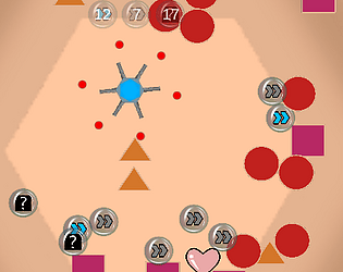
Blue arrows buff represents the player body colour and grants movement speed. Gray arrows buff represents the colour of the cannons and grants attack speed. Mystery box represents confusion and grants already mentioned buffs and also amplifies rotation. The hearts is as simple as it gets, bonus health.

Wow that is weird. The fact you played the game so far and that there was a bug. At 4000 points the third level starts, could you tell me which section(shaped or tools) was the third level and was the invisible wall vertical or horizontal? 

Yeah I thought of that, but it seems a bit clumsy. Also seems a bit more realistic, when you touch the particle.  Guess better mechanics would be to create a field around the particle, where you can move it,or alternatively to create a separate control circle on the bottom right. What do you think of those options?

Thanks, man. Creepy minigolf experience is a good way to describe the game :D. Good luck finding  the hole.

Thank you for the feedback! I will surely change the level layouts after this jam.

What did you not like about the controls? Was it because of the pulling back mechanic or using the mouse to click furiously or was it because some of the shapes were hard to go through? Anyways I think you will love the controls after I make some more animations and cool effects for the movement.

How would one path per the width of the camera sound? Then there would always be a way to go, also could then make it more fast-paced. Also a question, how does the overall width of the playfield seem? Is it too big or too small?

Well, the idea was that I would make an energy particle and the movement would show power with explosions or etc. Guess I got carried away with smooth gameplay and overall gameplay.

I had tough decisions to make with the camera size, the big picture benefitting labyrynth solving and small view benefitting exploration and mysteries. The second option sounded better for me so I went with that. I guess it would be more fun with less dead ends and faster tempo overall? Also special effects coming in nearby future ;)

Sorry for the early dissapointment, but thanks for the positive comments. The emphasis was certainly on the visual aspect and gameplay :)

Thanks man, it was the first time I took time to make my own music. That was the last thing I was expecting to get praise on, really appreciate the feedback.

I also just thought that it would be great if you could invest some gold to make something push the gold out of the corner. Or just have a button in the middle that does that. Just an idea though, hope this helps. :)

The visuals look really nice, could use some eating animations though. Also my game is similiar to yours and I think that it is really cool when you get health when eating someone.

Not bad at all, could use some objectives for the people who do not feel like reading all the text.

I think this game needs a very easy stage. Really hard to understand what is going on and how to win at first. The opponents seem to be coded well though. Good job!

The game mechanic is cool, but quite hard to understand. My suggestion would be to make easier stages, where the player could learn controls and how he can affect the game. 

Yeah the clunkiness is a big issue, could also use some more colours. The idea is good though and puzzle games are always intruiging.

Pretty much of a slideshow game. Would like to see the characters in motion and moving. 

The game is a bit repetitive and some bugs need to be fixed like shooting particles appearing when dead and spamming should be stricted. 

Everything was enjoyable except the gold getting stuck in the corners. Could maybe use some paths where gold cant go and players can push the gold out from the corner?

The controls were nice and the game was pretty challenging at first. My advice is to make some extra chill music and add some effects that appear when you get 10 more score.

The game was a bit slow for my liking. Was cool to stay still and just kill everyone. Would be nice to get a cooler floor.

Great mechanics but the art could use some work. Love the shooting and speed difference.

Good idea, but could use some more interactions. Like moving buttons etc.

Never mind beat it in like 5 min and almost a cramped arm.

The difficulty setting was good in that the mana spheres were  hard to click on. Also I think the "you are crazy this is insane" level is a bit too hard. Would love to see lightning or other spells implemented.

The diagonal angle view was a no from me, did not really enjoy it. The gameplay was clean though and so were the visuals. Would love to see the enemies move around too.

If this game is meant to frustrate then you did a good job. Would be cool if the turtle would stop running animation when stopping. Also downgrades and slow jumping would be cool.

Love the puzzle solving and some of the puzzles were challenging. Also good idea to use the inverse player as well. My only suggestions would be a chill soundtrack and more levels.

This has promise, but would have liked a more complete game. Always have fun tho ;)

Love the music and artsyle. The first things I would change would be slower movement of lava and a death animation. Keep up the work!

Really cool idea and I would love to see where this will develop. The game was also a bit too creepy and would have liked some enjoyable scenes as well.

Really complete game for the 3hour period. It was a shame that the gameplay was for only 55 seconds, could have at least doubled that. Nothing else to complain for and that is a huge compliment. Really smashed it.

Really cool and complete game. This game felt like a game developed in a week, not 4,5 hours and that´s great. The time limit on the first slope level is almost criminal. Tried a tactic for 5 min until I was fast enough. Rotation should be really looked at. It took me like 10 min to find out that I can rotate and it is really hard to do it fast. I recommend using arrow keys for rotation instead of the mouse. Would make the game for fast-paced and fun. Love this game!

Not really fan of the random movement. The player went around in empty rooms for 5 minutes. You should let the player dash at desired directions at least. I can see the potential and I would love to play if I could get some more action.

Cool complete game, love the mechanic of taking over other objects. Was also pretty balanced, just needs some further levels.

The movement needs more smoothness and movement in all directions. Otherwise a cool shooter and keep up the work!

Really cool visuals, could use clear edges and harder gameplay, but this game as a really good retro vibe.

Pretty hard to play, but cool sprites.

The controls need a bit of work. Could not move at all with small dragging. Also dragged my player out of screen and couldnt fix. Great idea, but needs some work.