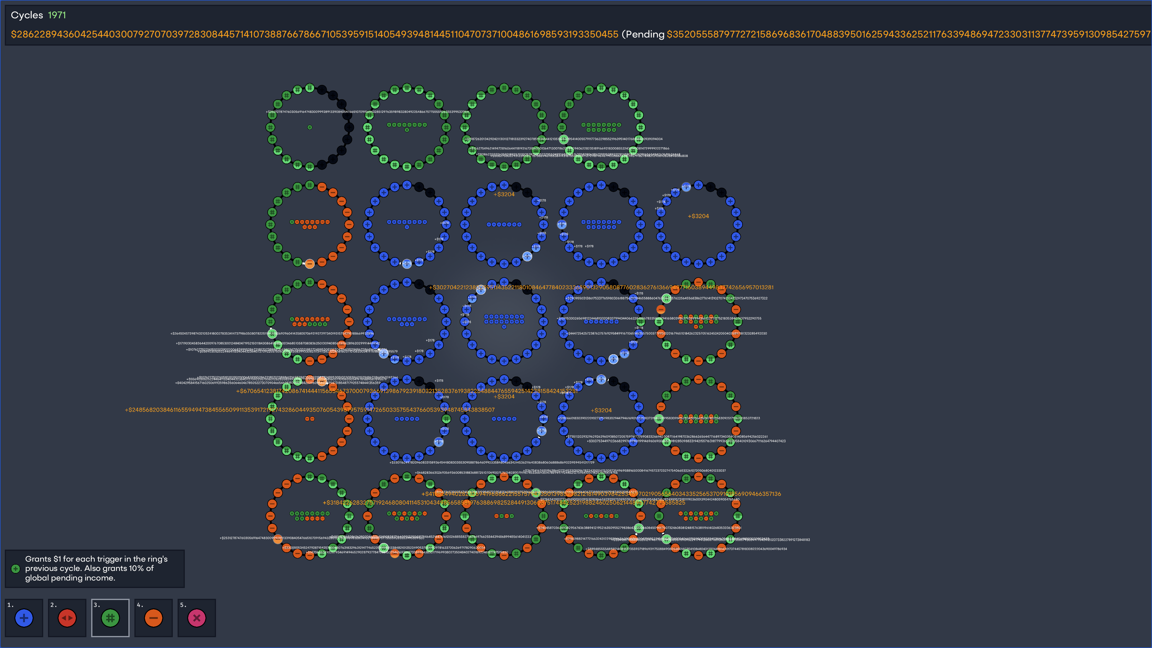
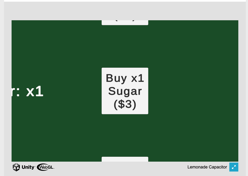
Wellll, I can't shop anymore because the bank account balance pushed the shop GUI off the right hand side. :)
I had fun though!

I enjoyed it a lot! There's great visual and audio polish: music, colors, moving background, SFX, screen shake... I'm taking notes to try to bring more life to my future jam entries! :D
My only suggestion is to lean into the "card" theme a little more, if you'd like. For example:
- aesthetic: choosing a card (highlight chosen one, animate it), drawing cards (SFX, animate)
- mechanics: could make it clear there's a deck that you're choosing from and there's some math/odds involved in what's coming next.
p.s. I was surprised that the pieces on the card != the color of the pieces in the gameplay. In the screenshot you can see red for the "z" shaped piece on card #2, yet the one in the game is yellow. It would improve cohesion if my chosen piece looks exactly like the one entering the tetris arena.
Thanks again for sharing your game!
Nice work! I really enjoyed the game concept, and found it engaging.
---
Thinking a little about the UX...
I had trouble mentally mapping
W S
A D
to my mental model of four directions
W
A D
S
and then to which color each one was.
I wonder if showing the potion colors UI in the same layout (four directions) as keyboard/controller would make it easier to remember which key is which color?
Alternatively, you could make them potions on a belt displayed horizontally, and then use 1,2,3,4.
Thanks!
The game hangs together well and is intuitive to play.
I agree with your "few next steps".. adding more variation for the spawn rates and asteroid behavior help would keep me hooked. Otherwise, maybe exploring the ship's movement feel (add some momentum? ability to "boost" or do something jump-like?) or juice (visual/sound) would make flying and dodging extra fun.
Nice work!
[bug report] When I first loaded the game, I wasn't able to see the full UI (this monitor is 1440p and vertical). I moved it to a different monitor (4k, horizontal), and then it worked fine. I'm not sure how to fix this.. perhaps you are using exact pixel sizing for the game, and it doesn't resize to work on lower resolution monitors?
Just wanted to share so you're aware of this behavior for your future projects, and in case anyone else reviewing projects in the jam is blocked by this (or knows how to fix it).
Thanks! 
Thanks for sharing! The UI worked well, and I was able to sell lemons and rake in the money.
I think it would help to have more in-game insight into the simulation, as without that I didn't have any reason to modify the two bars (price or more/less lemons). It seemed liked I could make a profit just by buying the resources on the left and then selling them (clicking "next day") without tweaking those knobs.
So why should I change them? Possible ideas:
- there are goals you're trying to hit, that require you to modify them (e.g. you must pay back $500 in 10 days)
- you need to respond to a changing world (e.g. customer preferences or willingness to pay changes), so what you did on day X isn't still the optimal thing on day X+1
Congrats on making your first simulation game!
Enjoyed it a lot!
I too would like a score counter to understand how I'm doing.
I can see how this fun base could easily grow: more types of people (varying speeds or movement behaviors, positive and negative points), more elevators. It's kinda like a tower defense game, now that I think of it.
Thanks!
The music and sound effects gave it a great mood as I marched along after rolling the dice.
I enjoyed the concept of changing dice faces. It took me a few turns before I understood what swapping meant, but after that I was counting ahead to see what numbers would help me to dodge the next snake(s)! I still fell back to the bottom of the board :D
Yay and congrats! I'm glad you had an engaging run through most the game.
I would LOVE to spend more time doing exactly what you describe: more enemy diversity, more card diversity, etc... as well as polishing up the non-mechanics parts of the game like art and animations.
p.s. Thanks for the bug report!
Thanks for taking the time to play and share your feedback!
I was hoping that auto-battle would be faster (10 to 20 seconds), just long enough that you could see observe how your deck build performed before tuning it further by buying new cards. Unfortunately, I didn't manage to create good ways to force a quick battle during the jam, so it was possible to build really slow decks! In fact, you're basically invincible if you just buy a ton of shields... but it makes the game super slow and boring.
A possible forcing function to make battles faster could be something like: the player takes 1 HP of damage per turn in battle. This would force you to build a deck that deals damage quickly enough, else you die!
Some inspiration from Derek Yu (maker of Spelunky) on why it's so important to finish a game:
> Holy crap, you released a game! Congratulations, you just leveled up, big time. Benefits include: increased confidence, a reputation for being able to complete projects, and an understanding of the entire process of game creation! The best part, though, is that you have a nice little game that I can play and enjoy! And I do like playing games, almost as much as I enjoy making them.
https://makegames.tumblr.com/post/1136623767/finishing-a-game
Thanks for playing!
Sorry you hit the "reset" bug; I didn't manage to fix it before the deadline but should be easy to resolve.
Your feedback on "understanding what's happening" is spot on, and something I want to improve in future game jams! Some ideas for this one: add content to the itch page which explains the game; add more animations and feedback in the game so it's clear what's happening (drawing cards, doing damage); clearly separate the player turn and the enemy turn
Really enjoyed your game! Each battle was a mixture of action and puzzle. I enjoyed the various end of level rewards.
I also appreciated the there were both mouse and keyboard controls. Once I got the idea of the game down and could figure out what I wanted to do with my turn, the controls made it easy to play quickly.