This is sooo clever, love it !
Mathieu Schmerber
Creator of
Recent community posts
It was incredibly daunting to start and understand the game, so one way to improve it after the voting deadline would definitely be adding an in-game tutorial. And the UI could also use some work to make them a bit more straight forward.
That aside, this was a very fun game to play, you definitely need to play once or twice before getting the gists of it, but once you've done that you're in for a lot of thinking and fun. Well done :)
So I've been thinking about my entry and its future since I'm really proud of it and you guys seem to enjoy it a lot as well...
The issue being that my game concept is great, but only for a game jam that is. In fact it's quite hard to extend my concept into any bigger project. For sure I could split my systems and make a bigger project, for example reusing my combat system and make it a dungeon crawler 2.5D game or whatever, but nothing that really tickles my interest.
What I'm thinking could work, is a mobile version. Due to the simplicity of the inputs, it wouldn't be hard to make it into a mobile version, and it could definitevely fit the format. I'm thinking of maybe adding a more general progression system like gaining a currency while playing, one that can be spent to unlock new in-game upgrades or something.
What are your thoughts, would it be worth it to make it into a mobile game, or should I just leave it be as a nice entry in my portfolio ?
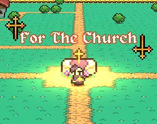
For The Church: https://itch.io/jam/brackeys-9/rate/1932730
Thanks for your feedback !
I have an actual patch at hand, waiting for the voting deadline to be over. This patch will fix the detrimental bug as well as improving balance, so that it's actually possible to win ^^
I've never given any thoughts about creating devlogs even tho I enjoy them quite a lot ! So sadly I don't have any rush of me working during those 3 days, but I could definitively explain how I went about every aspects. Definitely thinking about it now, thanks to your comment that is ;)
It for sure is to hard definitely, but I'm still happy you enjoyed it !
This fit the theme as the end of the day is the beginning of the night, so you have this very clear game loop with a clear shift of mood and tone both artwise and gameplay wise. You could also see it as ending lives of your people will be the beginning of a new day as you could survive the night thank to these sacrifices.
I'm really happy to read that !
I feel you, art was and is to this day my weakest point. I mean of course today I'm finally able to produce something pretty, but there's definitely a long way to go still, I'm way more of a programer than anything else :)
For pixel art I believe that I followed this guy back in the days: https://www.youtube.com/playlist?list=PLmac3HPrav-9UWt-ahViIZxpyQxJ2wPSH
However there's probably better playlists now, since it was 3 years ago.
For the soul effect, I'm spawning a soul where people die and programaticaly lerping its position towards the shrine according to a curve I setup, nothing really fancy hahaha
Oh this game brings me back ! I absolutely love the tone you've set in the dungeon, its really lacking a good music !
The major flaw I want to tackle is that my hand was getting sore from all the clicking, would be nice to be able to hold down and have the player run in the direction of the cursor. Other than that I think some more balancing could be nice as we are definitely very weak on the earlier lives, but hey that's a nice entry given the time constraints, keep it up :)
An overall nice top-down game entry, I really like the animations you made for the red slime jump !
Here's a few things that could be easily improved:
- The tilemap is kinda glitching sometimes, you would see this kind of clear borders around chunks. Since you work with unity, it would be a good idea to package your tiles within an atlas to avoid this visual glitch.
- With how fast the player moves, I wish the camera was a bit quicker to catch on, or that the camera were to look ahead of the player rather than following it.
- The main improvement to go for would definitely be on the combat system. I had to spam my inputs for my character to slash, as sometimes the input would just not work ? And it's also somewhat tricky to understand when we do hit the slimes.
At first the art threw me off as I'm really not used to the style, but I came to really like this uniqueness and in the end I'm amazed and am wondering how you came up with this, nice take !
I also believe that this is the first game I saw this JAM thinking about musics to complement the theme and it does work out greatly, well done !
I had some framerate issues but nothing much, and also at the beginning of the game, there's a yellow code warning popping on the up top of the screen
The concept is great and the game is very polished, that's one of the best game so far in term of concept !
I just wish the enemies had an actual pathfinding, as sometimes they would just get stuck on the wall while following the player, which ended up being detrimental (to a small degree) to the gameplay.
The concept is incredible !
I just have a few points of improvements:
- The feeling of the jump teleporting you up feels really weird and rough, it may be just me but I really didn't like how it felt
- I don't have a gamepad, and 'E' didn't actually do anything on my end so I couldn't interact and got stuck early on so I couldn't test a lot of levels :(
Nevertheless, the mechanic is very cleaver, so well done !
Everything is just so good from design and art to sound design, man congrats I had a ton of fun !
The game over screen got me such a laugh, that's genious !
I really have nothing much to say, the controller is very precise, the animations are very well done, really really fun experience, would recommend.
I like the way you interpreted the theme definitely !
I just think that this game is quite hard to be honnest as there's definitely multiple solutions for some word. Also the music could use of some more work as it gets repetitive real fast.
A major improvement with no effort would be to be able to submit by pressing enter
I like the take on making a tower defence in a side scroller view, and I think this could very well be experienced further. Also great art style, I will say that not having sprites for the projectile is a bit of a shame since it breaks the composition.
However nice work, I'm just going to list out ways of improvement:
- The UI is a bit overwhelming, it takes a big place on the screen and definitely takes time to get used to it and fully understand it. Plus be aware that it does stack when you press escape in the shop, may be bug prone.
- The game pace should be more tense I believe, especially for the earlier waves, everything feels very slow you need to wait a lot of time while there isn't a huge threat on the screen.
- The shop is definitely a nice mechanic and I like the 4 items, however I had this bug when the shredding tower would down enemies to 0 health without killing them


