Thanks, mate! I definitely straddled that line and feel I often went on both sides of it!
Pawa
Creator of
Recent community posts
Thanks for the feedback, I appreciate it! I like the way you phrased it. I’m thinking maybe the experience would be improved by offering precisely both modes: a free, relaxed mode and a different, more scenario/mission based mode? In my head these two approaches were always in opposition but… why not both? Thanks for this light bulb!
Dude. The songs on the intro and on the first room are just insanely good. Is that an electric violin? Throw this person an Oscar already.
This game already feels like a finished product, but duuuuude, I legit want to listen to the music on the go. Not a fan of how the incredible music of the intro, so epic and orchestral in scope, clashes so hard with the (also incredible) Wipeout-like music on most of the rooms. Other than that…
The sound design is also top notch. I wish there was a different sound for when the player is hit vs when the enemies are hit, but all the sounds are amazing, super raw and real.
This is really the complete package, it’s fun, looks gorgeous, sounds like angels singing, but the sheer awesomeness… it’s a shame the game performs so poorly after just a bit of gameplay. It’s a jam, all is forgiven. But this game (and soundtrack) is so close to receiving my money on Steam that I gotta nitpick. I also think the initial graphics highlighting the enemies, while super cool, are really too much. They are not legible and make the screen feel too busy. The font is also really hard to read; I want to get in on the story, but the font is hard to read and the cutscene skips too fast.
Dang, the lengths I had to go to say something negative 🤣 This is just top-notch stuff, guys. Amazing work
Thanks a lot for your well thought comment! I understand what you say; I admit I developed Strata in equal parts art piece and game. Most of the effort went towards caring for the overall experience and telling the story I wanted to tell, and less so in making an engaging and fun game. These two directions frequently contended with one another, and in doubt I went with the art, acknowledging it would make for a worse video-game
As I wasn’t sure how to turn cellular automata into a game to begin with, this was an exercise of pure experimentation to see what would come out of it. And as such comments like yours are gold for whatever (if anything) will come next for these ideas. So thanks a lot!
Very cool! You really made something very interesting out of very simple, tried and true mechanics. The glass both hurting and alerting the guards if you push boxes into it, is very clever - I don’t recall seeing that anywhere else.
I think there’s a bit of a dissonance between the title and the theme/lore of the game. The game is very fantasy-like, and the title makes me think of Ocean’s 11. Both are fun, it’s the mix that felt odd to me.
The music absolutely slaps! It does get repetitive after a while, but gosh, does it ever slap! Great job!
The Linux version works!
I echo the other commenters. Pretty hard, but pretty fun. I like the windmill tactic when you hold both keys at the same time.
I got stuck inside the geometry several times with the color switch mechanic in a rather short playthrough (what?! a jam game with bugs?! /s), but with effort I always managed to unstick at least. It is a very clever and ambitious mechanic! Good job!
Thanks! You use the mouse to add cells, click the empty squares
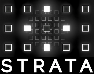
If you want to try to “beat” the game (you can’t really beat the game, it’s endless), notice how when you add cells, the numbers on the left change. Each cell consumes X resources (upkeep) and produce Y resources (production) per day (the time is on the bottom right)
On the left you have the stats for the Stratum you’re on, and on the right the stats for the entire tower. Try to keep your Balance (the difference between your upkeep and your production) positive!
Each floor has different upkeep/production per cell, so experiment to see what works best
I think this wall of text has grown enough, so I’m gonna leave it here with some closing thoughts.
Strata was made as an art piece as much as a game. I sincerely hope you have fun with it, but I do hope it provokes other feelings as well, good or bad.
It has some hidden meanings (maybe not so hidden, it’s hard for me to tell) that may look like bugs but aren’t. Some political and philosophical views, and certainly a lot of me in it. It turned out as quite the portrait of where I am and how I think and see things at this point in my life. And I am very happy with the result.
Thank you to MYline media for organizing the Jam, a big thank you to everyone that plays Strata, and an even bigger one to the brave souls that made it this far into my ramblings!
Keep being awesome <3 Talk to you soon
I was adamant on having a web version to make everyone’s life easier to test the game (and to make sure I knew what people were going to experience, since I’m on Linux and most people are on Windows - always risky to ship builds I can’t properly test). But I admit I’m not super thrilled about the result. Which is why I still recommend the native versions, even if I understand the obvious friction they entail, no one has the time for that.
363 entries as of writing, that’s awesome! Can’t wait to test some of these, and I’m sure every participant is feeling the same!
I’m really happy about the sound component of the game too. I HATE, and I mean HATE making sound design and overall working with sound. But for this project I was unusually inspired. Found some great atmospheric samples and kept everything very grounded, very natural. Rocks and water sounds mostly, a heartbeat to signal the passage of time, some wind and some birds… I really like the atmosphere and I think all sounds really help each other shine, it’s a cohesive package.
Here again I had some really annoying technical limitations. I don’t really get why, but Godot’s audio system really doesn’t like to be on the web. I thought it was related to threading, but I tried exporting with threads on and off and didn’t really see any difference. I’m sad to say that the web experience is rather worse than a native build on this aspect too. Sounds that didn’t loop as they should, and audio effects are just outright missing. Not happy about that at all, but also not really sure how I can improve that. Definitely not with the time I had left
I was dealing with roughly 3500 cells total at that stage, and in the interest of time I didn’t optimize a single damned thing. After all, while testing with an integrated graphics card I even had effects and sheez and the game was looking great at ~60fps (CPU bound), so there was clearly no need to optimize anything, we’re good baby!
Thing is, on Desktop and Mobile by default Godot uses a Vulkan-based renderer that is performant, full of features and overall awesome. On Web however, it needs to use an OpenGL 3 based compatibility renderer that is much more limited. No effects, much smaller limits on things like how many meshes it can render at once and no per-instance uniforms! I could only get it to show anything at all when I reduced the tower to just 3 strata. That was not nearly enough
So I ended up having to spend the two last days of the Jam refactoring my approach and using multimeshes instead of individual objects - basically, several mesh instances are combined in a single mesh resulting in a single draw call, but retaining the ability to be individually positioned and colored. A bit like dynamic batching in Unity, with different trade-offs.
I’m glad I didn’t go this route right away because it allowed me some freedom to experiment, but I’m glad to say implementing this was much easier than I feared. The more I use Godot the more I like it, it’s uncanny. So when I was done, I reduced my draw calls from a peak of ~2500 to ~45. The multimesh also allowed me to easily set vertex colors, so I used that to make cells darken with age instead of the unsupported-on-web per-instance uniforms. A good solution solves multiple problems, right?
Didn’t really have time to find a way to make the glow effect on the web. Pretty bummed about that, it adds so much to the game
Because verticality was so important and I thought right off the bat that it would look super cool to have that woosh when we change floors, it was obvious right away that 3D was the way to go. I had never made anything serious in 3D in Godot, but I figured that since I would just be using simple cubes, I’d be fine (foreshadowing)
Setting up the graphics and animations was rather simple, and I even made a simple shader to use per-instance uniforms so I could color each cell as it ages. I’m an absolute noob at shaders, so I was pretty happy
I made a fatal mistake, though. Even though I knew I wanted the game to be playable on the browser, I didn’t really test it until it was almost done. In the past I’ve done similar things in Unity and never really had issues, so I assumed Godot would be just as accommodating
I assumed wrong! When I tested it on the browser, the GUI was fine, but NONE of the 3D appeared. Nothing at all, black screen
This only was my second jam, and the first by myself. My first jam was with a friend just a little over a month ago, and it went great. One of the ideas we talked about then was to explore cellular automata as a game play mechanic. We couldn’t then, but since that’s an idea that has been on my mind for years now, I used the 1-bit jam as the kick in the pants I needed.
It really made sense, cellular automata are binary; each cell is either on or off. I like the way these very simple systems can yield very complicated behaviors and beautiful results with a simple set of rules. The same way that the minimalism of a black/white restriction can help focus an art piece, be it a photograph or a video-game.
When the theme - Tower - was revealed, everything fit into place. I had already been thinking about ways to model a little society and introducing resource management to the classic neighbor-based algorithms we see in cellular automata. So with Tower, it became obvious: a stratified society, stacked vertically. Strata
Seems like all the cool kids are posting about their games, and I wanna be cool too!
Check it out here: https://pawa.itch.io/strata
Feedback here: https://itch.io/jam/1-bit-jam-4/rate/3026320


