The presentation is awesome. It feels like I am playing something from the PS1. The time trial is challenging, but if you utilize your abilities effectively and optimize the routes you take to collect all the treats, you too can complete this little holiday adventure. Good to see you're still working on stuff Cyreides! Thanks for the Christmas present.
Rooibos98
Creator of
Recent community posts
A short, but sweet monke game with a simple premise. The downhill section is my favourite part of the game as it feels satisfying to gently maneuver the monke into hitting ramps and rocks in the pursuit of more speed. I get into a bit of flow-state during that part and the overall presentation is appealing to the eye (I particularly liked the consistent UI design and choice of colour palette). I do feel that the final score you get is not consistent with your performance and it feels like luck plays more of a factor than your skill level. Maybe increasing the left/right movement speed of monke could help with that, but regardless, this is a fun game.
Quite impressive for 72 hours! I couldn't find the reference to the composer of the music, but then realized it was you! Very cool.
Really liked the presentation and had no issues with the controls. I do think it is too easy and the AI could be smarter, but the game-play loop is fun and satisfying. The recoil push-back mechanic reminds of another game I played recently :^)
The Win/Lose screen options could have been better and pressing Quit on the HTML5 version crashes the game, but these do not affect the core experience. I could definitely see this becoming a fully fledged video game.
One of the better games I have played throughout the jam despite its simplicity. I could easily see this idea expanded upon into a fully fledged game. There are a lot of possibilities. Perhaps a slight oversight on level 2 where if both characters are in the area with the button, you essentially soft-lock the game because neither character can jump out and progress to the goal. I couldn't figure out a way of getting out. Also, maybe try experimenting with a physical camera or various camera settings so the camera doesn't clip out of the map and obstruct the views of the characters. Other than that, great job!
I earned over $800.00 bucks before customers stopped coming. Not sure if that means I won or not, but I had a good time regardless. The dialogue was varied enough, but I was unable to identify what each customer wanted as the game progressed. I liked opening up the catalogue when a new customer arrived and the presentation was simple, but effective. Would be cool to see this idea further expanded upon!
Very cool game. I really like the character, his animations and his expression. I also like the story, the visuals and general creativity radiating from this game. However, the physics and the behavior of the roulette wheel feel inconsistent and so it took me some time to grasp how it all works. Sometimes I'm running along all fine and dandy, but then my guy will be pushed rapidly to the edges of the screen and fly off or get it by some temporary invisible wall. To me that's a minor issue and the rest of the game is solid. This is one of the better games I've played throughout the jam so far!
I started the game, refused to give my employees a pool table and lost the entire game. 10/10.
On a more serious note though: this game relays heavily on reading text, but your font size, position and alignment make it difficult to read. In fact, I would say that the biggest problem I have with this game is its lack of clarity and definition. Everything kind of blends together visually, making it hard to focus on the important stuff. For example, the bars on the left side of the screen are the same colour and shape as the background or how the buttons on the main text box are actually the same sprite as the main text box. It's hard to read everything, visually speaking.
Other than that, I liked the variety of realistic situations to solve and how there were some scenarios that had more than just two ways to solve an issue (it's good to have more choices in this type of game). The music and style is simple, but effective and I found it refreshing that you can't just pick the 'best' option every time. You need to keep all aspects balanced in order for the company to succeed (I lost a playthrough because I was too focused on satisfying the employees, for example.) I cool idea that could be taken even further!
An interesting idea, but this is barely a game. The only strategy to prolonging your existence on the game board is to move away from the dice, but even then, because the enemy die roll so quickly, it is still largely up to chance whether or not your position will be compromised by the dice roll. I could see this idea working if the timer was either slower or the game itself was turn-based as opposed to real-time. This would allow actual strategy in your dice's movement and allow you enough time to plan ahead based on the odds.
Unrelated to the game itself, but your game's zip folder contains your project's working files as well as the build. Not only that, but it also contains your Library folder, which takes up quite a lot of space. Perhaps consider just uploading a build of the game next time, because not only can people access your entire project now, but the download for this game was over 550MB (which is huge for a small game like this). It took quite a while for your game to download and that may turn people off and prevent them from experiencing your game. Other than that, I think your game could easily be taken further and expanded upon!
A solid idea, but there are a few bugs and balancing issues. I spawned as many golems as I could at the start and that was enough for me to destroy everything. The doggo's keep getting stuck on the path and the golems don't seem to like the doggo's, as once I had destroyed all the towers, the golems proceeded to group up and attack the doggo. Not sure if that was a feature or not, but I can't seem to win the game regardless. I like the presentation: the animations, the models, the style choice and the particle FX, but it needs a few bug fixes and the core gameplay re-balanced. Would be cool to see this idea expanded upon.
Doggo getting attacked by golems: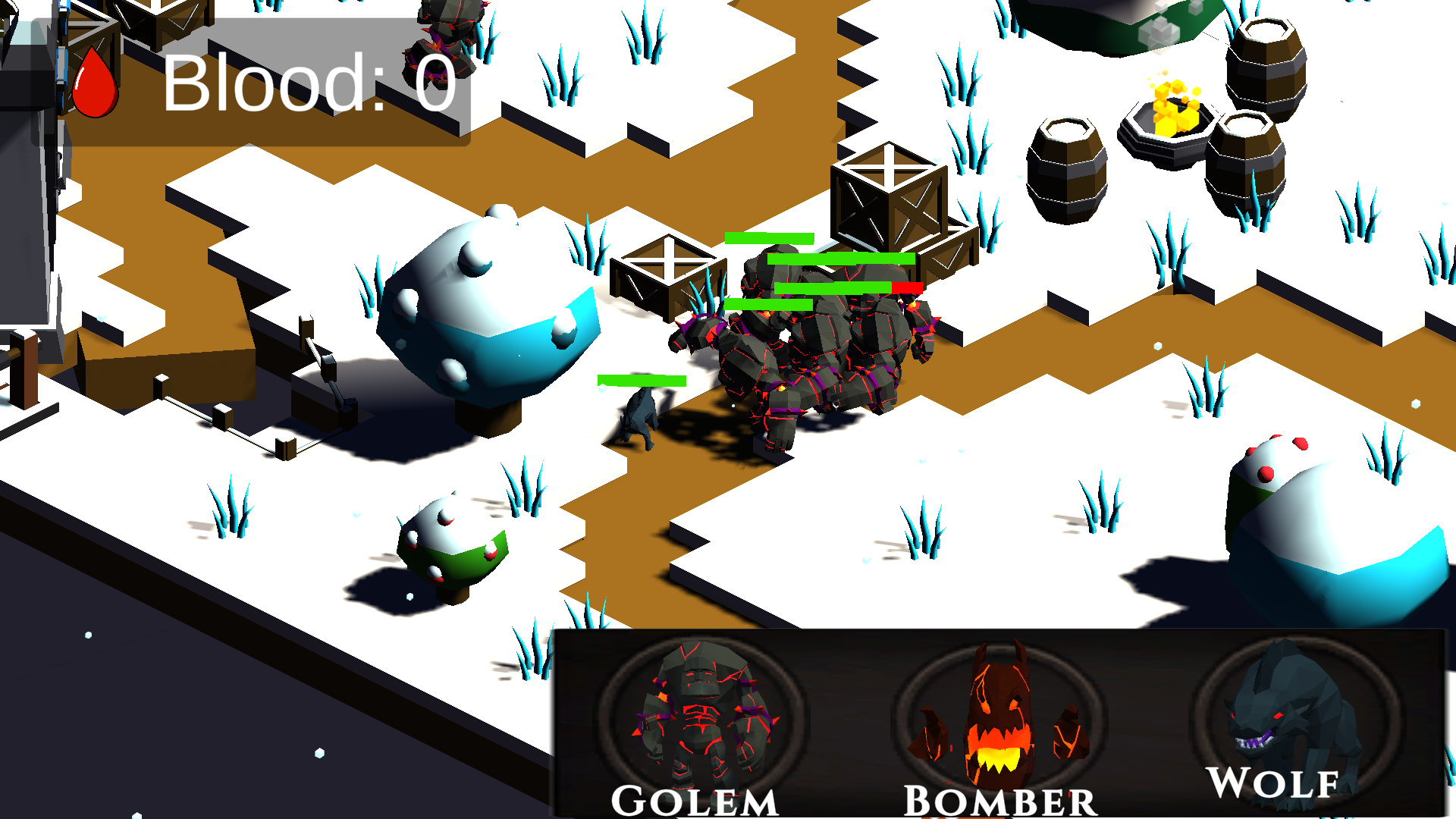
I like the idea, but it's unbalanced. The enemies are too fast and heal you too much. The shooting felt good, but as I kept playing, I found it to be a near pointless exercise, because the enemies re-spawn so quickly. It was just easier to run away from them. The healing projectiles also feel unfair as they move so quickly and I don't have enough time to react. I like the presentation though: the little jellyfish character, the healing bots and their animations look cool and the intro sets the tone for the game nicely, even if it is unskippable (a little annoying). You could definitely take this idea further!
Taking a preexisting game and reversing the roles is an interesting idea, but I don't think it works in this case. Some levels feel impossible and others are a cake walk. The physics don't feel quite right and it's annoying having to watch the little drawing animation play at the start of every level. The music is nice and the presentation, while simple, gets the job done. With a bit of re-balancing and tweaking of the core systems, this has the potential to be a fun game.
Took a bit of time to understand how the controls work and the game's main objective, but I had a fun time. I'm glad there were several levels rather than just a couple. I like the MS Paint style visuals and the music was pleasant to listen to while platforming. A cool concept that could be taken further.
This is a surprisingly fun game. I did encounter an obstacle or two that filled up the entire length of the screen so I didn't know if I had to move it up or down until I started moving it around, which was difficult to manage at high speeds. Not sure if that was intentional to increase the difficulty or not, but it did feel a little unfair. While this game is lacking in presentation, I actually found it to be more engaging than another similar game I played during the Jam called Inversion Flappy Bird (go check it if you haven't already). This is a cool little game with an idea that could be taken further.
I managed to get the game working just fine, but I encountered some issues in-game, like being unable to access the upgrade area after winning (only after losing, and this only occurred once in my entire play through) and how every attack/jump button keeps doing the same attack. It also seems that spamming the same LMB attack over and over again results in winning every time.
However, the presentation is very good. I love the little creatures stuck behind the bars in the background, the character designs and the hero drinking a potion during the fight. All really nice touches, I just think that the core systems in the game need a bit more tweaking and cohesion. This is a cool idea that could easily be taken further!
I think the premise of this game is that you control a vampire named Ivan and you are the boss of the castle (think Dracula in Castlevania: Symphony of the Night). You have to defend yourself with boss attacks from the knights/heroes with your selected attack moves. Cool idea and is in line with the theme, but unfortunately, the game appears to be broken. Borderline unplayable. Could just be me though.
Cool idea. I'd like to think that the priest is only trying to help you get better, but you keep running away from him. Ha ha! The ending is sweet (the wedding bells was a nice touch). Noticed a spelling mistake on the main menu, the volume slider doesn't appear to work and it's a little annoying not being able to pause the game and exit. Still had fun though.


