Thank you!
shweep
Creator of
Recent community posts
Generally don't have a lot of time to work this jam but the deadline is a little more lenient I can squeeze a small game in. While the theme implies the setting of 70s-90s and beyond at least for the mascots I like the idea of a 70s restaurant chain being hopelessly tied to the 60s with Jambon being a Beatnik. Sorta like A&W using a classic Hanna-Barberra branding.

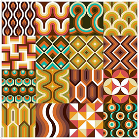
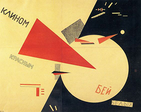
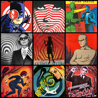
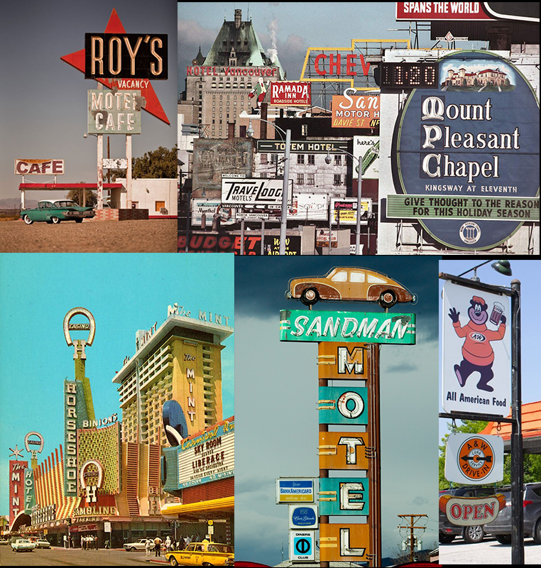
Gathering up a moodboard of 60s graphic design and the trends at the time, I see a lot of teals, browns, orange, and swirls it sometimes blends in the 70s territory with how surreal the choices can be but still has the post-WW2 optimism that the 50s had. I'd like to really go into the spy aesthetic. Whether the secret government research is a branding or actuality I'd like delve into the conspiratorial/paranoia aspect that seems to plague most of the Cold War era.
Then I realized that, fast food chains in the 50s and 60s also had a boom in car culture due to the highway being more prominent. Fast foods would often have drive ins where you could eat at your car. Sometimes it wasn't about the food but to show off your new ride at a typical hangout for teens. I recall my grandparents talking about how their friends wanted to work at A&W just so they could roller skate food over.
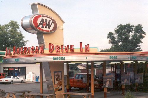
One thing I'm noticing the most is the absolute over elaboration on signage. In excess the American highway seems like a giant drive-thru mall full of wonders. So I think I'll set the game in this particular location.
So to keep the game simple I'm going to have it be a first person game where you're stuck in a car and can't really move. Instead you're spying on customers and passerby's that go into the restaurant. I haven't really thought about the how or whys of it, but generally want to communicate a contradictory state of optimism and paranoia. 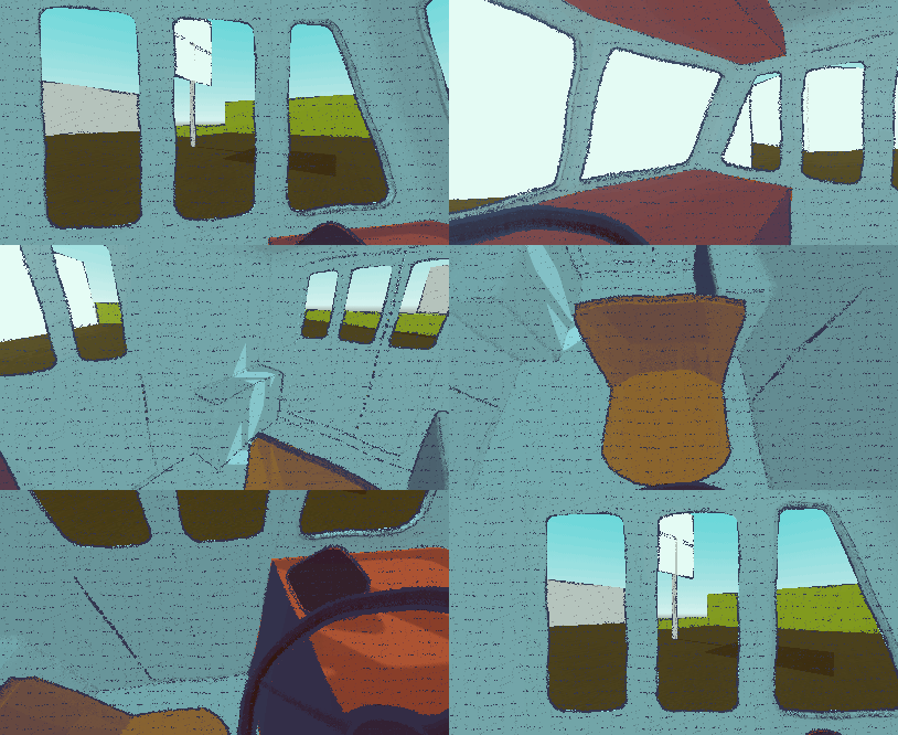
Right now I just have mouse control tied to camera turning and some colored cubes. Grabbed a free 3d model of van that was vaguely 60s enough. Though very hard to find cars of a specific period of low poly so might have to make them myself.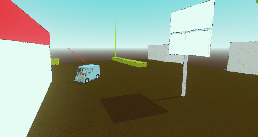
All I got for now.
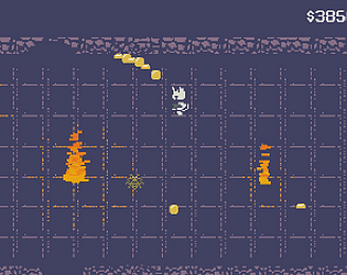
Game is now released, you can play and vote for it here! https://shweep.itch.io/echo-gunner
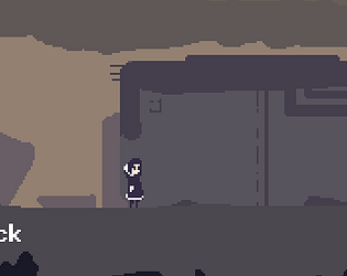
Level 3 is kind of just an empty level with some story bits and music left in. Sadly the game is not entirely complete but the first 2 levels have actual gameplay in them. I'm mostly proud of the music Delaney did and hope it wins an award. The music really did set the whole mood for the game.
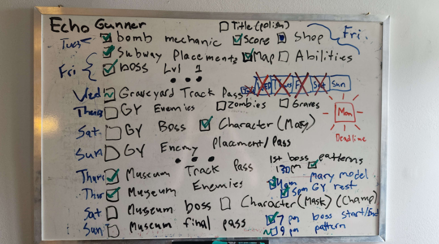
Not too much the report I've fallen behind on some stuff and still have the last bit of level 1 done, but with the last 5 days or so off I decided to slap all of the tasks on the whiteboard and look at it from a lateral progress angle than a vertical one. I tend to bounce between the two but it's hard to get out of the habit of being very vertical and making everything super linearly.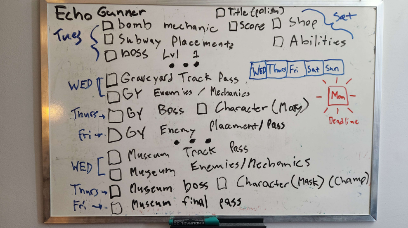
I also tested the game with some folks and level 1 probably needs work balance/onboarding wise but I think worst case I just have a default easy mode where you merely take a penalty to score if the game ends up being too hard. It took 3 weeks to get a solid foundation and level 1 done but I think I'm just going to have do a little bit of corner cutting to get 2 levels done in a week. It's really a matter of how polished/varied the game will be that's the big question mark. I think I just want to live up to the music though as Cowberry's been doing a really solid job with it.
So got the first half of level done enemy placements wise. I had to overhaul how enemies are spawned since basically echo location makes its pretty useful to see enemies behind walls but if you see through walls... well.... it'll look weird if enemies spawned out of thin air. So i had to set up parameters like enemies being activated at certain times rather than created. But I think having them already in the scene is easier to manage, I just have to be careful about loading the ones that you don't even see til the camera orientation actually sees them. One of those things where I try not to engage in premature optimization and just roll with it til it's a problem
My plan is to get the first boss done then flesh out then subway, then test it tomorrow with local gamedevs at the meetup (maybe using the wiimote). Then get the shop done and whatever extras and then gun for the last 2 levels. The first level is likely going to be the framework for the next 2 and I don't know if I can promise the most spice and variety.
Ultimately I'll have something but question is if it's going to feel complete or conclude in a way that isn't abrupt. 🤞
So got the title screen done and placeholdered the rest of the game. next thing to do is actually flesh out level 1 with enemies and challenges and figure out how it all ties into the shop/abilities. That's the one big problem area is just the abilities ideas I have, like melee attacks or some kind of piercing round thing idk.
There's a lot to cover with where I'm at and I can feel the time squeezing even though progress is pretty good all things concerned. The lack of enemy placement is what prevents the first game level from feeling complete, so my first priority is that and then reward/progression. The biggest wrinkle is probably the bosses... and the composer is cooking some bangers so hopefully they can live up to the audio spectacle.
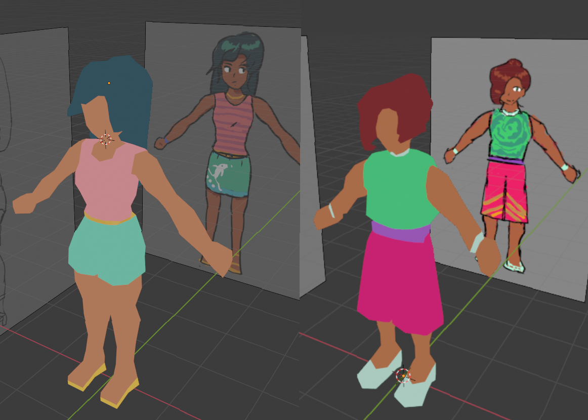
So I've modeled a basic enemy with vertex colors painted on as opposed to UVs. That one shader i talked about with making the sprites pop out from the background wasn't wasted. The ones on the left of each pair has a custom shader i made to make the lighting affect the colors much less. Making them pop out more from the background.
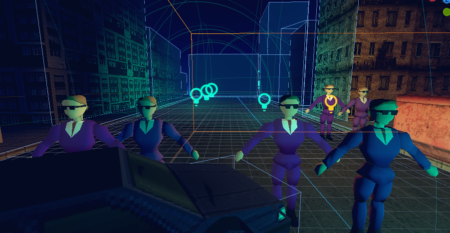
This isn't an artstyle choice so much as a readability thing. I might be overthinking it though. As long as the humanoids are the only thing moving and the environment is relatively simple. It shouldn't be too hard to point out what's relevant. Having said that it's also why I've been trying to keep the environment fairly Doom wad-ish. I plan to make anything that's modeled to be interactable to some degree, and the rest will likely be baked into whatever I manage in the quake editor.
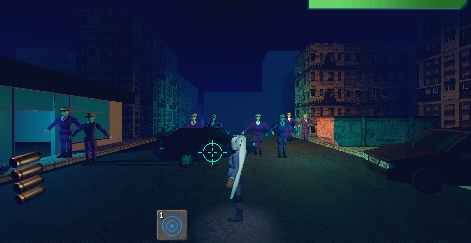
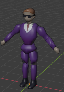
Before rigging and animating I tend to just throw the models into the ingame scene because I never know what something looks like until it's ingame. The enemies are a bit generic but I'm liking how they're brining back the Virtua Cop influence, the lack of any complicated detail I think will help with standing out. This model is actually based on the protagonist but just puff the chest up to look more stocky and bam there ya go. I'm probably going to reuse the hell out of this model though.

Next up is rigging and animating these fools
It's hard to fully know when to lay out foundation and when to polish/art things up because the game content just doesn't get worked on when you're an artist/programmer mucking around with art assets. I think my 2d sprite pivot means ramping up the art production side because i wanted to validate the look as soon as possible rather than assume it'll look good after more placerholdering. So it's a tough balancing act and there's no formula to the process I feel.
Hopefully I can get to beyond this one street sections and get rid of these sprite billboards.
So in a chaos of directions I... decided to use realtime 3D for the characters for a list of reasons, but that meant concepting, modelling/rigging/animating stuff so I hit the ground running. 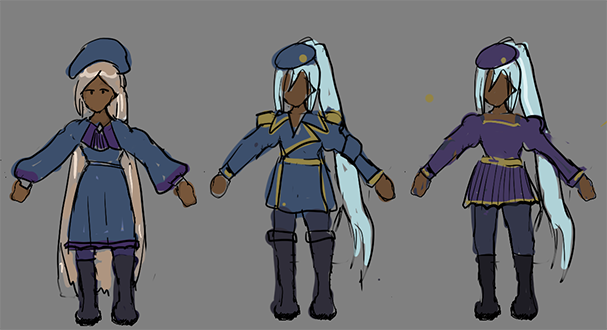
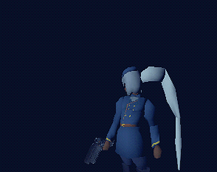
For some reason i had it in mind for her to be like Iris from MMX4 but then I realized thick long hair is a huge no no in 3d modeling so I went for an anime pony tail thing. Then I had it in mind to go not just low poly but early PS1 segmented limbs and potentially vertex colors. This is something FF7 was known for doing for enemies, which involves assigning colors to vertexes as opposed to UV textures which became more dominant as 3D became more understood. I see it as an excuse to avoid having to do extra skin weighting and get some nostalgia points. I'll likely use faceless enemies with no textures to cut down on any UVing.
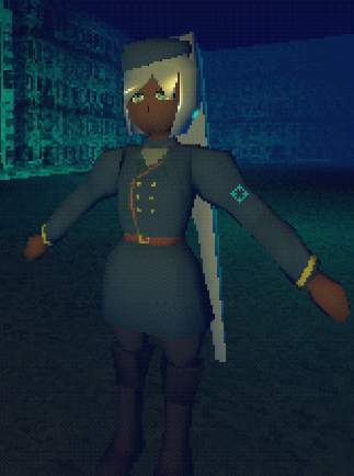
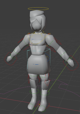
Tiringly enough this means weighing each bone to each body part specifically as I'm using Rigify to speed up the rigging process. There's probably a method to auto binding the individual meshes to only one bone each. I still need to figure out the hair as it's one solid piece but it might be more interesting to make the hair into a poly segment snake and animate it manually via programming since the auto rig doesn't provide custom options.
we in business
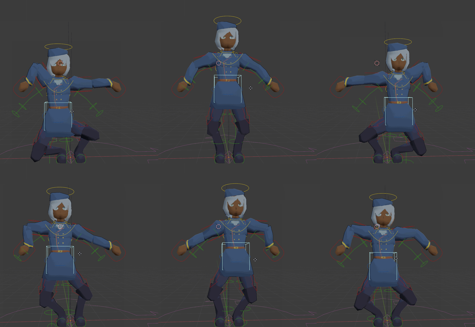
Decided to make a big change which was make the game third person. I think generally I just want to a do a mix between Sin and Punishment and Wild Guns. Probably will slow things down but I don't know wasn't as bad as I thought and I feel like the game will be less about twitch reactions and more about adapting to situations. Lots to think and worry about though.
Heya I'll be documenting my dev process here once again, probably uploading progress videos every once in awhile. I do have less time though. But essentially I went in with railshooters in mind and decided to apply the idea with whatever character interested me or would suit a shooting game well.
1.1 Changes Added since release:
Changes -
-Minor maintainance fixes
-Flowers now have graphics
-Arcade and vending machine have 3D models
-Averagmus spellchecked
-Characters are no longer T-Posed
-Warning messages for alien pirates attack, just generally less abrupt
-Barrier to escaping into the ocean added
-Anime opening added to the menu as sort of a what got cut DVD bonus
-Credits added
I doubt this will affect judging much, but just being transparent here.
Alright so working on 1.1 for the potential monday or later stream just to fix some bugs
However, the anime intro wasn't made but the song is still in the files, I'd like to at least implement the storyboard I had planned for it and play the music so that all that planning doesn't go to waste. I know it's poor form to add stuff after the deadline but I'll be transparent about marking what was clearly for the jam deadline release and the updated version and hopefully judging is based on the jam release sans the anime intro.
The game is in a rough state and is basically unfinished with a really uhhh anticlimatic cliffhanger I will not follow up on. Obviously the game was crushed by its overt ambition but I will likely do a post mortem going over my goals and uhhhhhh what the takeaway from it is.
submitted
https://shweep.itch.io/gigantimus-zx-love-never-rusts
I want to update a 1.1 later and maybe even a 1.2 if a monday stream for it is possible
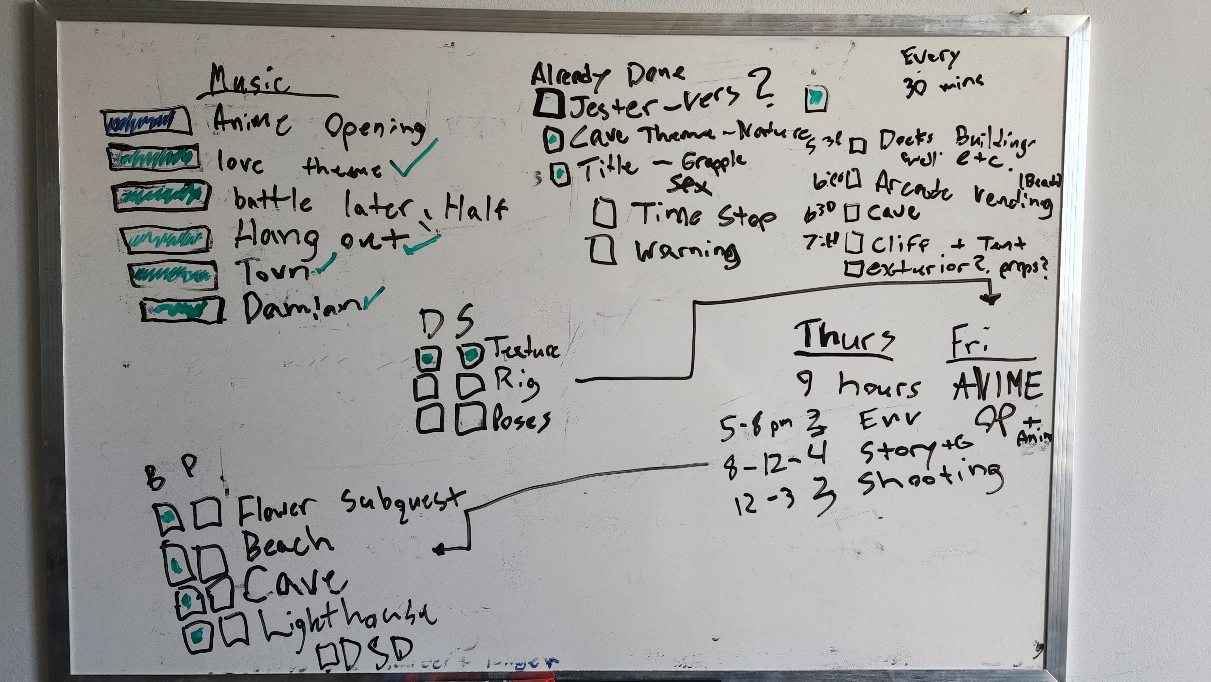
So just got off work and it's thursday here's my plan for finishing the game cutting up the environment texturing/modeling into 30 min chunks. Then switch to actually making the dang game 8 pm onwards til 3. I'm doing all of this quickly to make any time for the anime opening which might just be characters standing around who knows.
Against my better judgement I decided to show some irl footage of my work setup and went over some the woes I've been having. Mainly that maintaining a 9-5 game studio job (remote) while making a game is hard to adjust to. Sure it could not be remote and not be computer based but I feel like since both activities are at the same work station it's a bit hard to seperate the two or want to keep working after more work. I also not been getting enough sleep lately mainly due to the cat waking me up at 6am and me getting very fragmented 4-6 hour sleep at best. So really the week days didn't see much progress beyond some work done on the anime intro. Compared to the holiday I did full time on. Today Cowberry is gonna do the rest of the vocals on my decent microphone and I'll be conditioned to get the actual game part of the game done.
I'll report back after sunday if I managed to make do.
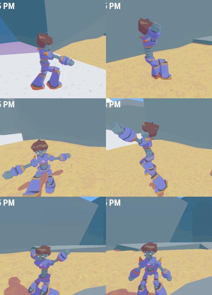
So today was Victoria day (a work day off holiday for Canadians as far as I know, not really in UK for some reason). So me and Cowberry the composer decided to work together in the same room for some good ol fashioned local game jamming like we used to before the pandemic. I got animations done for Avergmus and got them sort of okay blended together in the movement (some things seem to be missing from the run cycle somehow...). Truth be told there isn't much platforming in this, it's mostly an excuse to bounce between VN/dating +shooting segments. Some things came really well together, I also took a stab at animating a storyboard sequence for the anime opening and Cowberry timed out all the parts reall well as you can see in the devlog.
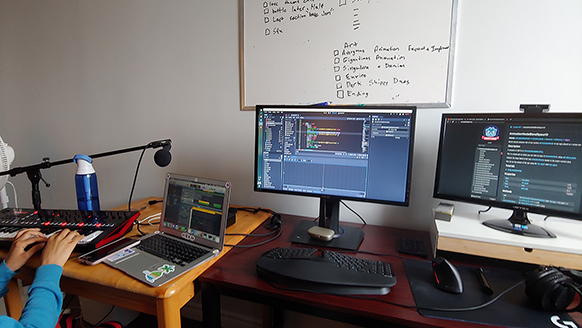
THE PROBLEM, is I forgot that doing ingame cinematics is a fucking nightmare especially when timing it to music. There are multiples ways of charting it out but since Godot's animation editor isn't as robust as say.. premiere where you can scrub through audio, it's really hard to line things up. I had to export the animation to 60 fps and did simple tests to make sure a cut would line up based on the exact frame, but no dice, the frames seem to be off by 7-8. At 60 fps this can get a little annoying so I'm considering at least trying for 24 fps to narrow it down, even if the output will do 60 fps (and EVEN if godot has a really bad measuring method). That's not even getting into syncing into the audio which is a bit of a headache along with the editing.
This isn't even getting into the animation part which I think I can handle. It's just a matter of making the characters and giving them simple posing and getting the most out of smart camera work. Lot of anime in the 80s tend to just have characters standing or walking in place (due to budgets) but also sometimes it was just impressive to animate a character spin around... which is easy with in-game cinematics and full 3D. Anyway you can see me complain about this in the devlog, and also listen to my cat meow to the music almost on beat (also I had no idea she was scratching the door, because I'm hearing impaired and with headphones).
So this is pretty much the run cycle finished... hopefully the rest of the animations such as jumping and landing will be pretty basic. Most of the animations are basic, I haven't had time to really inject the actual character and personality of Avergmus into the animation, but that usually adds 10+ hours to the animation process (and potentially a lifetime of professional experience).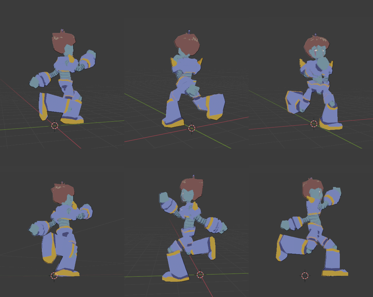
Against my better judgement, I have about 2 hours of footage of me making the entire run cycle (though some extra time after recording was spent polishing aka 3 hours of tweaking graph handles). It's mostly me fumbling with Blender but hopefully this gives some insight on how 3D game animation is made:
Doing some animation work! I tend to be getting into the groove at the start of midnight and then I realize I have work tomorrow and will probably get 5 hours of sleep. Which is probably why it takes me til midnight to get back into it. Maybe this weekend I can re-calibrate.
Here's a devlog showing off the animation process to give an idea on how I do stuff:


