Play game
Shadow Split's itch.io pageResults
| Criteria | Rank | Score* | Raw Score |
| Art Direction | #37 | 4.000 | 4.000 |
| Overall | #64 | 3.556 | 3.556 |
| Innovation | #86 | 3.444 | 3.444 |
| Fun | #102 | 3.356 | 3.356 |
| Theme | #107 | 3.622 | 3.622 |
| Game Design | #107 | 3.356 | 3.356 |
Ranked from 45 ratings. Score is adjusted from raw score by the median number of ratings per game in the jam.
Leave a comment
Log in with itch.io to leave a comment.


Comments
This is a really great concept, I could see it turning into a series. I wasn't expecting to be able to play as the second character, that was cool. The music definitely sets the right mood while exploring. Good Job!
Just letting you know I'm on Linux and tried to launch the game with Wine and I could go on the menu but clicking play left me on a grey screen.
Well, I won't know what the game feels like so... No rating! ^^
Oh, I'm sorry to hear that. I suppose its simply because this is strictly a windows build or something of the sort. If you would still like to play it, but we might add an android build once the jam is over at least, no promises of course. Thanks for letting us know and trying still!
This is a really neat little game! I like that there was a focus on the atmosphere here - not necessarily trying to make it scary or anything, but subtly unsettling. Unnerving, but still calm. Gave a unique feeling that I enjoyed a lot. The music helped with that a lot - it was perfect for the game. Chilled out, not desperate or energetic, but it still had momentum. Great job with that!
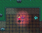
I also thought the gameplay was interesting! Simple and straightforward, but there's nothing wrong with that whatsoever. It did a great job of not introducing too many different things, keeping the core gameplay as the focus. I like that it made you think and be patient without being too challenging. Super simple concept that was very well done here! And the detail that the shadow is far more sensitive to light than the body is to dark was interesting too, I liked that.
Couple of things to note, however. To start with, (and this is almost certainly because I use an ultrawide monitor) the little blurbs (I think they were blurbs, I don't know) that would show up on the bottom of the screen sometimes were completely cut off for me. I could only see the top of the box, and not really a whole lot else. I don't know if they were telling me controls, or story, or what. Like I mentioned, it's likely because I'm using an ultrawide monitor, it's caused problems for a number of other games as well.
I don't really have anything else critical to say. Overall, I really liked this game a lot, excellent job!
Whoa thanks for taking the time for the detailed comment and for playing! We're happy the difficulty and atmosphere for you turned out to be pretty much what we were going for. Definitely still some balancing issues we could iron out but glad you didn't have much troubles.
I personally have no clue what the blurbs are you mention because we certainly didn't add anything for the controls or story in the actual gameplay levels. We did actually set the game screen to scale with width instead of height, which is normally default, in the editor, I don't know if that had anything to do with your ultrawide monitor, but I guess there's no way to know without testing it more. Hope it wasn't too big a issue though. Thank for your time again!
No problem! I think it would specifically happen when I approached like one of the boxes or items in the room, a text box of some kind would appear on the bottom of the screen that I could only see the top portion of. It didn’t prevent me from playing through the game though!
A fun little game. Interesting control scheme only needing WASD and E for the entire gameplay, really opens it up for accessibility. Wish there was a little more substance to it and more in-game visual guidance on where the "right" path is via environmental story telling, but as it sits a solid game.
Hello! Thank you for playing our game and leaving a comment! Yeah, I agree that we could have added a little bit more into the game for visual guidance on the level design. This actually was a topic during the beginning stages of our level design planning, but we ended up focusing more on polishing the mechanics and level layout more since we were running out of time unfortunately. I truly appreciate the feedback on our controls scheme and how we can make improvements to our level design as it will only help us in our future projects.
I didn't really understand what was going on for a minute, I figured it out half way through my first run. (I forgot to use my brain for a minute and add light and shadows together + cutscene). I think you could use one tiny thing to the game play, a small timer between exiting and entering a light source. I think that would give a player walking from one light source next to another a reward for staying in the light rather than loosing a tiny bit every time. I liked learning the paths on my own however starting all the way over felt frustrating.
Hey there! Thank you for taking time to play and comment on our game! The timer idea is an interesting idea that we could have explored. We did talk about adding in a way to "Recover" the light bar such as a recovery area, or a pickup. Thank you for the feedback on a way to improve our current systems in the game, it is most appreciated.
Oh if you had like small pick ups that would give you a little back that would be dope
Nice game! Think was pretty well done. I didn't understand at first why the "health" bar went down, but once I figured out I thought it was quite interesting. I wasn't a fan having to start over when dying but at the same time, I kinda liked using my previous knowledge to figure out the best path to take. I liked to visuals and the music worked pretty well. very good entry.
The "health" meter was actually suppossed to be a meter that filled up the longer you were in the darkness. We probably could have indicated it better with some sort of animation or something that we did talk about but never got around to doing. Glad it wasn't too frustrating starting over since any progress could be reused on the next attempt, but yes, multiple smaller levels scaling in difficulty could have been another approach. Thanks for the feedback and for playing!
👍 😎
This game feels special, I think primarily because the story aspect of it. If I had to categorize it under a genre, I would say walking sim (with some added mechanics of course), but even as a walking sim I felt engaged throughout. I appreciated that you didn't tell the player how to survive or how to play the game (outside of the controls). Instead, you let the player figure it out on their own, and that adds so much to the game. I do wish that the controls were presented as button prompts or text boxes that faded in while you were playing the game, and then faded away, rather than being a text on the main menu.
I think you were going for something cute, yet spooky and a bit atmospheric here. I think you could focus on making it even more spooky and atmospheric, with darker visuals, darker music, etc. Also, the lights were great, but it might be cool to make some of those moving lights come from some kind of shadow monsters or something, for that extra spooky factor.
Thanks for the feedback and for playing! We're glad you enjoyed the aspect of being thrown into the game without too much understanding since we understand quite a few people prefer some direction given to them. Of course as you said, there was a good bit of polish we could still add to it and maybe try to make is better recieved by more people even with the some of the "figure it out yourself" aspect.
We did have plans for shadow monsters! They would've looked like flowing wolf things that chase the player if they were in the dark instead of having the meter fill up. Unfortunately we scraped the idea because of time and fear of an unbalanced game with that feature, but its good to know that it would have conceptually fit in since you bring it up. Thanks again!
Yeah, if you guys have an updated build, I would be happy to play and give feedback. I would also really appreciate it if you tried out, rated and commented on our game jam game as well.
Thank you for the comment and playing our game. It makes me happy to read that you have enjoyed our game and also took the time to provide us with constructive feedback that is helpful! I agree with what you are saying about adding in some more player feedback to the game, such as the controls popup fading in/out and some spooky monsters. We will take this feedback to improve our future games! Once again, i appreciate you playing our game and i am very glad you enjoyed the experience.
Of course, I'm happy to play and give feedback. If you could do the same for my game, I would really appreciate it. Have a good one.
Just played, rated and commented on your game! Good job on the game, it was a blast to play!
Interesting idea, took me a moment to realize the requirements to survive, then more time to hunt for the correct paths :).
Good job!
Thanks for playing! Yeah for our next project we definitely need to communicate the gimmick of the mechanic better haha. But hope you enjoyed this small adventure!
Nice job! The game feels really fun to play. It's a simple concept expertly done. The art is great and I enjoyed the game overall. My only complaint is that pressing E on the Ravin (or whatever the black bird was) felt off and I had to lost twice before I was able to get it correctly. Overall, great work!
Thanks for playing our game! I'm glad we were able to make the concept work given the simplicity of it. Also, for the Bird I agree that it was a little off to press E on at times especially when its flying away to the light as you miss the key input by a tiny bit. The bird probably doesn't like us at times lol. Appreciated the feedback you gave as it will benefit us in future projects!
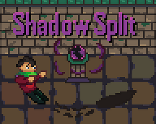
Beautiful pixel art and a good idea. The kind of game that makes you feel relaxed. I just miss a few more levels to explore.
Thanks you for leaving a comment and playing our game! I am glad that you found our game relaxing and liked the pixel artwork, our pixel artist did an awesome job working on many pieces of art that we needed!
It have a lot of mood, really nice game. I really liked that the menu is the start of the game, the music was nice helped with the inmersion and I really like the bird mecanic, overall really cool
Hello! Thank you for the kind comment and ofcourse for taking the time to play our game. I am so happy that you liked the game :D
Very nice. Animations were smooth, sounds were good, music fit the mood (but did get a little repetitive). Mechanics were very interesting, took a few tries to understand, I kind of wish it was a little more than "stay in the lights and keep exploring", but then it was a nice touch to flip the game into "stay in the dark and keep exploring". These ideas have a lot of potential. Great job yall!
Thank you for taking time to play our game and ofcourse the feedback on your experience. For me personally, I value this information so I can improve my future projects design! Much appreciated!
At first I wasn't getting it and it felt like I was aimlessly walking around - and then I saw the meter changing when in the shadows and thought ohhhhh duh. My only complaint - and I'm sure this is just me, is that for some reason, I expected the meter to go in the opposite direction - e.g. "light meter decreasing" as opposed to "dark meter increasing". I think I've played too much dark souls and am just accustomed to meters going right to left :)
Hey there! Thank you for playing and commenting on our game! To be honest, we actually had a discussion about which way the bar should fill up/deplete and we decided on one way for the first level and the opposite for the next level. For something so simple it was hard to decide which way "looked/felt" right haha. I appreciate the feedback as it helps us improve in future games!
Btw... I love dark souls, so I know what u mean haha!
Congrats!
Amazing game, loved the light mechanics.
Hey there! Thank you for playing our game and I am glad you enjoyed the light mechanic!
Immersed me right away, I always look for that in games! Nice work guys!
Glad it was immersive! Hopefully the ambience helped with that. Thanks for playing!
I like the pixel art and the game itself was an interesting experience.
Thank you! We're happy to bring the art and experience to you.
Nicely done. It took me a while to figure out the light mechanic but once I did it added an interesting twist to the game. I also didn't realise I had been cut off from my shadow until we reconnected at the end and it felt like I was wandering around somewhat randomly until a transition happened.
It was a nice game, just a little confusing at first.
Thanks for playing and the feedback! Looking back at this, we agree that we should've introduce the light mechanic better so that players won't have to retry after discovering it late. As for transitions, next time we shall add something different towards the end paths that would indicate a transition is going to happen. None the less I hope you enjoyed!
Nice art but the game itself feels pointless
Thanks for enjoying my art! Well it depends on how you define pointless. For the character he was able to appreciate his shadow a lot more now. As this experience told him what it was like without a shadow, thus deepening their connection