Indie game storeFree gamesFun gamesHorror games
Game developmentAssetsComics
SalesBundles
Jobs
TagsGame Engines

Asmodeus

40
Posts
15
Followers
27
Following
A member registered Sep 29, 2019 · View creator page →

Creator of

Recent community posts

The game has a nice atmosphere, and the music is really cool. I also like the visual design, although I often find that some elements aren't super clear (it took me a hit to realize the lit areas were lit areas for instance)

Now for what didn't work for me : 

-after the first death, skully would repeat its "great we're back to start" every time I entered a room

-being hurt by light didn't show the character health decreasing so I had a surprise death to a monster

-right when starting when I jumped at max height the background would be glitched a bit, this went away after I travelled right and left a bit, maybe that was only an issue on my end

-dash can be finicky when it comes on corners but doesn't land on solid ground
About design choices :

-the dash item looks like a flame so when i first came into its room (which taught me to avoid light) I was thinking it would be an enemy, whereas the real enemies were the bland looking mobs left and right. 

-the character feels a bit tedious to control (she's basically a truck). With simply moving I can cope, but the jump is very slow when going up and it feels like a drag. During the boss fight I couldn't react to its dash because of the jump, or at least that's how it felt. the character's scream also takes time to do its animation, so when I jump to hit something often the scream will start when I'm on the floor... but during the boss fight it still seemed to hit the boss, so that might be a visual issue only.

-I didn't really understand the boss' patterns from its visuals, and the constant screen shake from the scream was adding to the confusion (I also don't know how I managed to beat it).

Finally, it does feel a bit silly that the character is all ghost-like and floaty but affected by gravity. Maybe you could add ghost legs to her sprite or something, or just have the skull say he's heavy or anything like that.

Hope all this helps and doesn't come across too harsh, and I look forward to the development of this game!

by maintaining click you build houses of increasing sizes, and must place a house of a size that matches the customer in front to please it and earn money. The goal is simply to get the highest amount of money you can

clicking on a house makes you lose points because everytime you click, you spawn a new house, and spawning or dropping a house on another one destroys it. You earn points by building houses, and everytime a house is destroyed you lose points. The idea is that once the space becomes filled with houses, you have to clear it by paying to have space to build again

For now it's endless. I planned to add a secret true ending but did not have the time to do it during the jam. I might add it to the game at some point but it's not among my priorities.

The attacks looked cool but were hard to guard, I wished there were some better telegraphy/hint for that. 

I liked this one thanks to its various twists and silly dialogues/concepts, also neat attacks for the last phase. 

I was definitely wow factored, nice dumb funny little film. Getting to the end is frustrating cause you want more...

The battle was turning into a bit of a slog, then I got surprised with the twist, which made me laugh a good bit. Funny attacks, overall it was nice. 

I really enjoyed this battle, especially all the cutscenes and dialogues, although it did make the fight a bit lengthy. The various boss attacks were very cool. It's also nice that it was accessible difficulty for a beginner like me. I was a bit sad when the music changed mid-fight, but I guess it does fit the more comic last part of the battle. 

Great boss fights! Since they had interesting patterns I want to detail a bit more what I liked and disliked in each.

1) Frog : I liked how the jump makes you bounce upwards if you don't jump, which seems not to matter until the frog starts chaining jumps. The tongue and vomit attacks had very similar telegraphies, and it was hard to see which one would come out during the fight because the frog's designs is so "simple". It seemed unfair to me because these attacks need to be evaded in different ways usually although I get the point to design it this way, the telegraphy just needs to be clearer. Also might be me but I took a number of hits just getting close to the frog cause the sword's hitbox seemed small and the frog's hitbox didn't seem as big.

2)Eagle : this one was a bit less fun because of the character controls and the time it took. Compared to the first boss where you never feel like you're waiting, this one feels more tedious and less hard, it's simply annoying to die close to the end and have to redo it whole... I would have loved it if the frog's dps was slightly higher. The attacks worked well. 

3)Dragon : this felt like the easiest of the 3 bosses to me, but might be just cause I got used to the game. I liked the claws and the basic flame breath, and I didn't like when he starts attacking from the side of the screen all the time and I need to wait again and again. 

Also it may be just me but I feel your description of easy mode is a bit condescending, just a matter of phrasing (if you want your game to be challenging that much just take out the easy mode and be done with it).

Musics, art and artstyle were great. 

(1 edit)

The atmosphere was nice, would have benefitted from some tense/action music tho. But I felt a bit lost with the gameplay, it felt like I was controlling a truck rather than a mouse and I had trouble avoiding the boss attacks (I would have expected attacking the boss to stop it mid-dive since my own character's mobility is so low). I also had a bit of trouble picking up the rocks because of the everchanging camera, as well as their small size. A way to get new rocks once you've thrown all those you have and the boss isn't dead would be nice. Finally, the way the healthbar worked wasn't super clear, and I also think the splash screen at the start of each fight is a really cool feature but should be much faster. 

The art in itself isn't anything special but the artstyle works wonders, and the sound fx were great. (I may sound negative in my feedback but overall I just think a faster+easier to control character would make this game into a great one). 

gameplay in itself was rather lackluster but the experience was good. I feel like the game's strongest point is its atmosphere and storytelling, full of weirdness but approachable. The art lacked in cohesion but it kind of fit with the various weird rooms I guess. The use of different musics for each room was cool.

I loved the visuals, the sound was great, and the characters charming and (relatively) funny. Also it felt great puffing up and dashing in corridors, great job on the controls

There's potential in the gameplay but a lot of things made it frustrating to play for me. First, it's kind of hard reading a tutorial text while a boss is hitting you at the same time. This means it took me a good while before noticing my life was just a timer and I kept wondering why I died, even after beating the first boss. Second, the dash seemed to sometimes steal life and sometimes not? That might be due to a specific hitbox of the boss or a cooldown, but even if it was visible, I did not catch it, there are too many things happening on the screen which make the game not read well.

The shooting itself felt good. The jumping, not so much, movement felt a bit sluggish. As for dashing, several times I was confused to see my dash go in the wrong direction, even if you tell it in the instructions, it's still weird for my brain to click to use a dash but not direct this dash using the mouse, I just think the keyboard would be a better fit for this one. 

After the boss was "detained" I stayed until the music was over. And I was surprised to see that it ends. 

The bossfight was fun, I feel like the falling projectiles attack would be more interesting if they fell a bit slower but were more numerous. The feel of the shooting was great (art and sound fx overall work really well), the feel of moving around, not as much, I'm not used to such low gravity and these platforms have a tricky hitbox compared to their appearance.

I followed your suggestion and chilled in the grasslands, it's got nice music. I enjoyed the trader's dialogue and I thought the funnel attack worked well, the fx in general seem rather good. This game gave me the same feels as flash games like chibi knight I played during childhood. It would make a nice simple adventure game and I hope to see more of it.

you monster you made me kill the fight the slums cadet (insert biblethump). Excellent game, can't say if it's exactly cobalt core cause I haven't played cobalt core, but it's great nonetheless. I cleared every fight with only 1 or 2 parts left on my ship and then I perfected the final boss, so either at that point I decided to turn my brain on or there's something weird in the balance of fights. 

I loved the writing, the musics (it's really nice there was such a variety of them) and the art looked really good (although I didn't find the ship designs super interesting but it's a matter of taste I suppose). Gameplay was fun, somewhat unclear on some aspects (you keep parts on your ship even when they're destroyed, but you can't see what a part was before it got destroyed so you risk replacing something precious).

A great experience overall.

A promising start but lots of things to improve. 

I did not enjoy the controls, with the turn left control that worked improperly (seemed to be a pivot point issue), but mostly having to keep the mouse button down to shoot all the time can get tiring : unless you add some bosses where it can be advantageous not to fire during some phases, you might as well make shooting automatic.

Moving the ship with the mouse was kind of tedious as it is slow, and the boss is faster. However, that's a matter of taste, if you want to make a game where you have to be careful and anticipate a lot, go for it. 

The hitbox on the boss seemed really small, was it only the middle red dot? Some feedback when you damage the boss would be nice, ideally a flicker/white flash/explosion fx etc. Thankfully there was a health bar at the top, because of this small hitbox and the speed /scarcity of player bullets made it hard to keep hoping the boss would die.

Oh, and you might want to restrict player movement to the screen and not allow it to go out of bounds.

On the good side, the music was great, and the background with the stars was a nice touch.
Finally, I'm curious about the lore you cooked up for this.... how does the angel metatron relate to some flowers? Hoping to see more of this later on!

For now, it's endless, I planned an end but did not have the time to implement it for the game jam. I'll see when i have the time to finish the game.

tried it, I'm bad with slightly complex gameplay like this but the game is fun! It's easy to get lost in which character is where and so on. Also, art and music are gorgeous.

controls say arrow keys work for moving, which wasn't the case for me, but wasd worked instead.

thx for the bug report, I found the cause and it'll be fixed.

That's fair, I'll cook up something, thx.

Noted, thx.

Thx for the feedback, this should be fixed in the version I uploaded.

I got to test this at the play sorbonne festival, it was really cool! I look forward to seeing the finished game.

Really fun concept and cool artstyle to go with it.

It took me a bit of time to understand what losing items and losing clients did at the start, a quick "help" panel explaining mechanics in more detail can easily fix that. Some item sprites were a bit too complex to really understand what the item was (mainly thinking of the big red armor) and it took me more time to get which item item category they were part of. It is a bit frustrating to see clients ask stuff you don't have and the game won't give you at times, maybe showing what the next client will want (in addition to showing the current client) would help to plan better.

But really cool stuff overall, love the drawings.

Thx for all the comments and feedback!

(1 edit)

The game is simple and cool, the character and monsters work well visually. (although the corn projectile & explosion do not fit the art style). Having a different sprite for the enemy bullet carrots, your own bullet carrots and the ammo carrot would be nice to avoid confusions at the start (even though it's pretty obvious, it does make the game look unpolished). I wish the camera was less zoomed in. It also seems that ammo disappears as soon as it's offscreen, which can be a problem when you think you'll leave it for later or such. If you want the resource management to go this way, it might be better to give a limited lifetime to each ammo, shown by it starting to blink of fade over time.

Super cool art and music. A better bomb effect when you die would be nice, cause the game is pretty simple as long as you can kill enemies shortly after they spawn, but if you die you can quickly get overwhelmed and lose your remaining lives. The bosses felt much harder than the levels, but that was offset by them having low life, which felt a bit weird.

(1 edit)

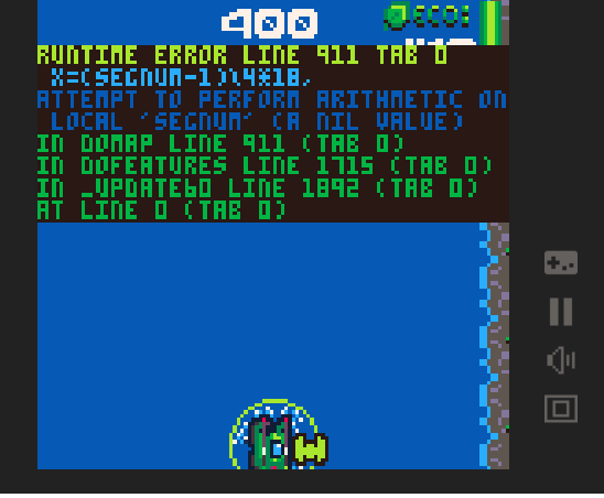
I tested in browser, I like the visuals and the audio. I did not really understand the restart/respawn mechanics so I'm thinking it might have bugged (it would make me go back to the exact point of my death). Twice, enemies stopped spawning and after a few seconds the game would stop and show this.

I really liked the theming, the music, and how each sea creature spawned bullets in a creative way that felt logic.

Several things annoyed me, however. The hitbox of enemies and bullets often didn't seem to match their size, the dash felt a bit weird to angle. I would either make the enemy hitboxes bigger, or increase the speed of your own bullets so that enemies are less frustrating to hit.
The ammo replenishing works well, I think it could use some tweaks to make the game flow better. For instance, during the boss battle it's wait a bunch of seconds while doing basic evasion, catch the blue bullet wave, repeat the waiting. Maybe having ways to replenish your ammo through risk could help ease the waiting (dashing through red bullets for instance, or staying close to red bullets for long periods of time).

I liked the visuals and music, it's all very cute. The hats are a nice touch.

The background being plain and the only indication that we're moving being the coordinates feels confusing. The first time I played I went to the right for 30 seconds without encountering anything, wondering if I should quit the game. You should probably either make the game world smaller or increase the chances of finding something. Other than that, variety in the scenery would help give the urge to explore more. 
I didn't really understand why the gardens were despawning after a few seconds when I reached them (is it a bug? are the enemies destroying them? do they disappear once you collect all resources?), that and the randomness+scarcity of encounters kept me from really having fun. 
At some times my character would move in one direction on its own.
Finally, writing the character controls in the game description would be nice.

I like the concept, it's neat to go through the game the first time thinking "this is a bit lackluster" only to see I got a bad ending. Unless you want it to be part of the difficulty, it would be nice to have a way to go back through phases when you target the good ending, as dying will reset the current phase, but harming the boss enough will go to the next one, forcing to reset the whole attempt.
That may only be me but with the various small rotating elements I had trouble locating my mouse cursor on screen at times.

Glad you liked it!

au passage gg pour ce jeu si bien

Done, i'm asmodeus on discord

Hi! if you're still looking for someone, I'm interested. 

Here's my book : https://josephgignoux.artstation.com/

Asmodeus#7219

Hi! I'm interested in joining a team like yours. I do 2D art and animation, mostly sprites for monsters and such. I love level design too.

I also love the Hollow Knight graphical style and have worked with it a bit.

I am 21 and just finished my studies. I'm really interested by your offer as a first professionnal experience, I am aware it's a volunteer position but I'd like to know if I can expect some income in the future.

Here's my book if you want to check : https://josephgignoux.artstation.com/

Hi! I started composing tracks about a year ago for my game projects and ideas I had. I don't really know what style they are, but I mostly use orchestral instrumentation and bells for now. I usually base my music on the visual idea I have from the game.

I'll post some new tracks from time to time. 

https://soundcloud.com/user-822394732/tracks