Hi! For the moment, this is only available as part of this GDC Relief Bundle here:
https://itch.io/b/471/gdc-relief-bundle
It's a pay-what-you-want bundle full of a ton of great games, and all the money goes to support indie devs struggling due to event cancellations. In the future, the game will be available on its own, but for now, this is the only way to get it!
SplitHare
Creator of
Recent community posts
The new Polter Pals demo is here!
When you're a lonely ghost, you have to get creative to make new friends. Using your powers of possession, you can steer the living into hazards to release the friendly ghosts trapped within. To keep up with the latest memes and get popular on the afterlife's hottest social media app, LiveBurial, you'll have to make ghost friends in the most literal ways imaginable. Every Ooman you ghost will add you on LiveBurial, giving you a unique look at the dysfunctional world of the living through the lens of the afterlife. Each level is a puzzle-like diorama, styled after classic children's stop-motion cartoons, where you have to figure out how to make all the friends using the available hazards.
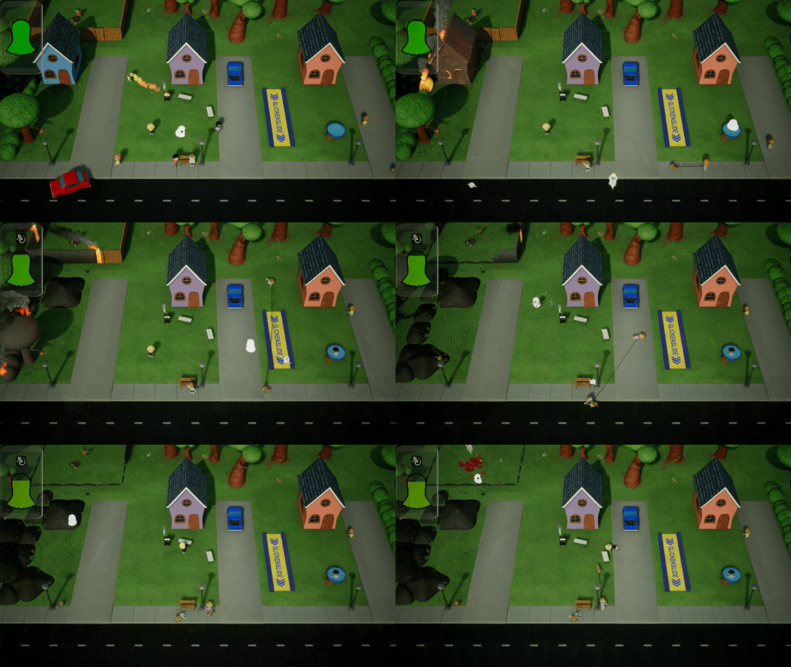
The branding in this one is out of this world. It's got a lot of spirit. Some of the juice is close to being awesome, but the camera effects feel a little weird.
The concept itself is good, but the execution makes it a little tough to pull things off. The enemy bullets are way too small. I found it very hard to get enemies to hit each other. The parry window is super small, as well. Then on top of that, being able to just dodge through all the levels sort of invalidates the mechanics.
I have to be honest, I went into this with low expectations. I've played a lot of really well done zero-G games in the jam, and some of them have a very similar base mechanic/set of intro puzzles. That said, you did a great job differentiating yourself and adding your own mechanics, which made it a lot of fun.
My only real complaint was the boss. I didn't understand what to do, and it kept killing me when the crosshair wasn't on me.
I really liked it. This isn't the first time I've seen this concept in this jam, but you've implemented it well. I think there are probably two ways you can go with this. With so much air control, there's less I feel that's interesting about it mechanically, but you've made it fun regardless.
The art is decent, and the animations on the little guy are great. The music and sound fit well. The intro made me laugh and the ending made me laugh even harder. Great job!
I really like the concept and it's executed super well. My main complaint is that the play space is just far too small. I think it would be a lot more interesting if there was a bigger playspace with obstacles and pitfalls in it. Also, tried to do the easy mode with movement, but it makes it waaaaay harder because of how fast you move.
Hilarious idea, and manages to fit the theme well in the funny way. The exhib-...execution is pretty solid. The game is a little...bare bones. I think the game would be more interesting if there was more to play around with. While the concept is enticing, when you really get down to it, there's just not a whole lot going on.
Also, you should be advertising the life-like physics. It's a triumph of game design.
Very cool concept with an amazing amount of content included. I understand people saying they don't think it fits the theme and saying they've seen it before, but I think the application of it with this type of game is uniques and ties it in.
The graphics are great and the sound effects are pretty good. I think the camera can make things a little difficult when you rotate the cube.
I also noticed a lot of issues with the bullets teleporting around when the cube was rotating, and I had issues with weird physics with dead towers when the cube was rotating. Sometimes this ended up throwing me off so much I died.
Also, the bright white auto-exposure when the cube is rotated towards you makes it difficult to see things.
Overall, very cool entry.
Good concept and good execution. The aesthetics are adorable. The animation on the main character is amazingly smooth. My only real gripe is that the game is kind of slow and the level design didn't seem to do much exploration of the mechanic as far as I got.
It might be smart to try and implement some mechanics in the level (like conveyors belt or rivers that carry you along at a swift pace) to alleviate the pacing a bit.
The concept and art are good, but the gameplay needs a little work. The main mechanic seems to work well except that sometimes it suddenly stops with what seems like no warning and sometimes the fan sticks in place until you clicked again. None of this is really explained, so I'm not sure if it's supposed to do those things or it's just a little buggy.
At any rate, being able to keep fanning almost indefinitely makes the first level trivial. It seems like the fan needs to only work for a short burst and then have a cooldown (ha). I couldn't navigate the second level, because not being able to tell when the fan was going to switch off made it hard to get through the cannonballs. If the fan shutting off is intentional, there needs to be some visual feedback to let the player know when it's going to happen. Or at least more consistency.
Decent little game that just needs some mechanical polish and a little more time into level design.
One of the best in the jam. The idea is great and totally fits the theme. Kinda reminds me of Breakout meets Space Invaders meets soccer. The hand drawn art is gorgeous, the sounds work well, and above all, the game feels incredibly good to play.
My only gripe is that the ball's reaction to being hit doesn't seem super consistent. Feels like there should be multiple methods of hitting it that produce different movement styles.
At any rate, absolutely wonderful entry.
Yeah, not saying you crossed any lines or anything. Just advising caution when dealing with topics like that (especially when you have so little time to consider what you're saying). When dealing with touchy subjects, the difference between something considered meaningful/worthwhile and something considered offensive is often just how well it's done.
I absolutely love this concept and this game is super charming, so be forewarned that this is going to be a long post but know that everything I say is meant to be constructive. I feel like this concept is exactly the kind of thing that Mark was hoping for when he picked the theme. The game is just so incredibly charming, and totally reminds me of something that I would've played on the Amiga as a kid. The art style and sound are perfect, and feel like they literally could've been part of a full game from that era. The amount of content is amazing. I didn't get past the level with the cannons, but it would still be a crazy amount of content for a jam if that was the last level.
Gushing out of the way, I feel like the controls are a little bit difficult and make the game kind of a chore at times. They're perfectly serviceable when not much is going on, but as soon as there are a handful of hazards on the screen, I started feeling like I could've predict how Blubs was going to handle.
Another issue I had was the collision. It feels super easy to get hung up on things. I also felt like I died numerous times when I clearly was not touching a hazard. A lot of this came in conjunction with changing sizes, and I understand that can be kind of difficult to rapidly change the collision and convey it to the player in a way that allows them to react. Perhaps maybe a little leeway on the collision and also increase the collision when you puff up on a little bit of a delay would be nice.
The mine enemies not coming back when you respawn makes them feel kind of pointless. I essentially ended up dying to them almost every time and just having to platform back to that spot. I didn't really learn much each time, I just got back to the same spot and continued on.
Only other gripe is that there's a glitch where you land on a surface after being on a wet surface and keep sliding.
But seriously, great game that just needs a little bit of polish. I would totally buy a longer, polished version of this game, so I hope you folks keep working on it.
I really like this concept, and the execution from an art and how the game works in general is great. However, it's too difficult to figure out what mood will work with what attack. It honestly feels like you could come up with an argument to fit any mood that could potentially be a "winning argument."
Maybe if the system was a little more like insult sword-fighting in Monkey Island where you can see what the actual response is, so you can kind of judge it on the merits of the actual argument. It would also be super nice to have an AI that just picks random things or something just to have someone to go against.
And, of course, as was mentioned before, some of the content is a little iffy. I saw you mentioned that you intended to satirize common couples, which is fine. It's just always something that you have to be careful with when covering heavy topics (domestic/emotional abuse are beyond heavy). You can get away with playing around with topics like that, but it has to be very smartly done. Just food for thought.
I just don't see the concept here. I get what you're going for, but it doesn't really fit the theme in practice. Since you can just infinitely re-talk to people, the lack of being able to actually choose makes no difference. On top of that, there are no meaningful choices to even be made. You can literally just make small talk with people.
In terms of aesthetics, it is of course one of the best games in the jam. Unfortunately, that's not what the jam is about.
I loved Orbital Punch last year, and it's great to see you folks coming back with another good one. The concept is solid and works pretty well. I can't help but feel that you should either go all in on the weapon-swapping (like you can't control it at all) or just not even do the weapon roulette.
As it stands, it doesn't really do anything extra for the theme/gameplay, and it just kinda makes the gameplay a little bit more tedious. If weapon swapping was uncontrollable, it would at least be a fact of life and be something tactical that you have to plan around.
The graphics and sound are great, of course. I feels like the enemies could use a little more feedback when they get hit, though. Also, while the ground looks great, it is super busy. It could do with looking a little more faded so the game seems a little less cluttered.
Great entry! Can't wait to see what ya'll do next year.
I don't really think this fits the theme very well, but it's a cool idea and well-executed nonetheless. The art and sound are both really well done, and I was having fun with it for a bit. My only gripe is that the controls aren't super great. Having to press instead of being able to hold is a little tedious. Also the length that the shotgun sits away from you makes it a little difficult to shoot things at time.
Overall, it's a neat little game.
Loved it! The concept, art, sound, and general execution were all great! The only constructive feedback I can really give is that it probably needs some balancing. Once you get the knife, you're able to just kill all the big blue fish and buy everything in a day or two. Then, fully kitted out, you still get wrecked by the group of sharks. There should be some stuff that takes a couple more days to farm for that totally destroys the shark (like an Iron Man suit or grenades).
Pretty cool idea, and the art/sound are great. It would be super nice to have some visual indicator (like swarms of emojis coming from the dragon after you say something and gauges that show you how you're doing).
Also, it would be pretty cool if there were further actions you could take, such as emotes or giving gifts that could also elicit reactions from the dragon.
I think the concept of this is pretty cool, though I think it's a little arguable whether or not it fits the theme well. The graphics and sound are fantastic. My biggest complaint is the ghost controls. The game comes to a screeching halt when you die. I think it would be much cooler if, rather than making the ghost hard to control, you had to have an enemy alive to possess once you die. Or some other method of adding challenge to the ghost mechanic without it literally just feeling like pulling the lever on a slot machine.
I really like the description of the concept, but it doesn't really seem to come through in the execution. You don't really get a very good feel for how much damage you are doing and what that actually means. It would be a lot better if you added some sort of goals on the screen (i.e. less than a certain amount of damage is gold/silver/bronze etc.).
Also, really the only reason why you would hit things is because it's hard to see where you're going. That just feels like artificial difficulty, though. The lack of camera control hurts the gameplay more than anything, honestly. It'd be much cooler if you added the difficulty in by putting the necessary items on shelves or narrow planks or above stacks of items that you need to jump over with ramps.
Finally, the unfinished nature of the assets makes it very difficult to find the thing you're looking for. I rolled around the entire map several times and could not find the bread. It seems that there are plenty of finished assets, almost none of which are the things you're actually looking for. This makes it very confusing to find things.
Overall, the art, sound, and concept are all great. But the gameplay itself needs quite a lot of polish.
The art is excellent, but there's really not much to the game with regards to the theme of the jam. I think the concept of an underwater game without water could have some really cool gameplay implications, but this doesn't feel like an underwater game without water. You could have told me that there was actually water without having changed anything, and I wouldn't have known any better.
Super cool concept that is mechanically executed so well. Everything feels so smooth. Unfortunately, it doesn't feel like it's super well utilized. It feels like it needs some more scenarios that really make great use of the mechanic. Also, it feels like the mechanic needs some restrictions like a resource pool that needs to be recharged. As it stands, you feel practically invincible.
This is a really great concept, and the execution is fairly technically sound. I think there are a lot of things that you could do to improve this into something much better, though.
Obviously there are the issues that you have listed in the description. Outside of that, I think there is often very little time to see and click on signs. It also felt like there was a delay before I could attach if I tried to click before I was in range. I think the game needs a much better way of relaying the range to the player. Maybe the sign itself could change color as you get into range, or maybe some sort of visual indicator between the cart and the sign.
It also feels like maybe there could be some obstacles other than just sharp turns to keep it fresh. Perhaps some things swinging onto the track that you need to slow down for? And, I know this would be a lot of work to implement, but perhaps sections where the track is out and you now have to use the rope to swing over the gap.
At any rate, the concept is awesome. The execution is pretty good if flawed. The aesthetics are fantastic. Good job!
This is really good. The concept is actually a pretty great one for the theme, and it's well executed. The way the cat moves after the pointer can make the controls a bit tough to wrangle at times, but it mostly works.
The aesthetic is adorable, and the sound effects are hilariously bad in all the right way. The animation at the end literally made me laugh out loud.
I think it's a good concept and well executed, but the range on the gun feels like it shouldn't be a thing. You already have zombies with ranged attacks to keep you from just sitting in a corner. Having to position yourself really close for melee enemies just seems like a way to make it artificially difficult.


