That's a good suggestion. There were a lot of exhaustive 3-d physics involved in programming the yaw, pitch and roll of the plane, but I will tinker with it to see if I can get more roll out of it. Thanks for the feedback.
StefanMcNinch
Creator of
Recent community posts
Clearly the game is beautiful. The best-looking game I've played on the jam so far. And I also want to recognize how well thought out and put together your menu is, and the introductory writing and tutorial.
But then I will echo a few points made by other commenters. I'd definitely appreciate more UI for health and progress and possibly enemy health. Your moon eclipsing gauge was so brilliant I would have loved to see that applied elsewhere.
And lastly for gameplay, I thought it was the only real weak point. I died on the boat and really wanted to get to the parts in your screenshots, but didn't have much incentive to keep playing. I didn't know how much longer I had left on the boat, and I was craving to do new things in the game except deal with more and more bad guys. And maybe the later levels do offer some innovative gameplay, but then I'd recommend nerfing the boat level, or adding some metagame (maybe some items to collect or a reason to dash around the boat) in the middle of it so that players don't lose momentum and give up.
Really well done game. Very complete feeling. I liked the lag in shooting, made for a good level of challenge. Clear theme and storyline. The boss fight was a great level of difficulty.
My one suggestion would be a more progressive level design. I think each level the player should learn or develop one particular skill, and practice and master the skill to be able to complete the level. Then the next level can build on that. It would help the levels feel more varied and engaging.
Ta-da! It did load with some patience. I'm glad you pointed that out. I really liked the art style. The game had a great aesthetic. And the ships degradation animations were really fun, especially throwing off sparks. However, the planting sensitivity was inconsistent for me. I'm not sure if that's a collider mismatch or what, but sometimes I'd hit outside of the mound and it would trigger a plant, and other times I'd hit dead in the center and got nothing. Overall a very nice package though.
I'm not normally a fan of platformers, but I enjoyed this one. You can tell a lot of thought went into the details and pacing. I will echo that the level selection is not intuitive. Had I not read the comments on here I would have assumed it was a glitch and given up. My main critique is that I immediately turned the sound effects off because the sounds were very harsh compared to the calm and well-chosen music.
Thanks for playing and the follow. I actually told my girlfriend about your game yesterday, speaking to how much I liked the completeness of it. I played your other game too and again, have to give you props for the dynamite UI. If I ever need UI/UX work, I will seek you out. And if you ever need narrative design or copywriting, lemme know. I'm happy to help out.
Thanks for playing and thanks for the kind words. The difficulty curve has definitely been the biggest feedback. It was tough to maintain the right balance given how experienced I got through playtesting. I was too distanced from the experience of the player picking it up for the first time. But strategic checkpoints is a great idea.
I really liked this game. Probably the most purely fun game I've played on this jam so far. It isn't necessarily the most innovative, but goes to show that doing something elegantly and well means more than doing something ambitious poorly. So congrats on that.
Also, your UI and user friendliness is sooooo much better than anything I've seen thus far. That was such a big strength.
Though simple, the gameplay was engaging and fun. My one complaint was that there was no in-game UI for my current height or high score (unless I missed something obvious), so I couldn't see how I compared. I think it would help replay to add a little tension for the player to know when they are close/how close they are to improving on their last run.
And maybe a nitpick. There were some instances where the blue booster pads were almost on top of the pink ones, but I was blocked from accessing them. Consider adding some code to prevent an overlap of pads.
Overall, excellent game and great design on all fronts. I really enjoyed it.
Your theme and ambition was great. I liked how much thought and depth went into the game. Unfortunately I got stuck trying to figure out how to navigate the game. The UI was really small and though I appreciated the tutorial, I got lost trying to figure out how to advance the game. I could buy rockets and ships and policy, etc, but I wasn't sure where the money was coming from, nor could I figure out how to deploy them.
I really liked the music as well. Maybe I missed something obvious in the gameplay, but I think it's definitely a concept worth expanding. Nice job.
There was some great stuff going on in your game. I really liked some of the puzzle mechanics you used, namely the ball, and advanced the difficulty well in the late-level by combining the previous skills the player learned through the level. Good level design.
The art style grew on me. Though I did find the main menu difficult to read or explore because it was harsh and maybe not the best style for information-seeking. I'd recommend more contrast when it comes to the UI.
Gameplay was fun and was tight and loose at the right places. The only thing that seemed inconsistent or was hard to get my bearings on was the use of the right mouse to arm my weapon and it shot inconsistently. That could be tighter or eliminated altogether. Just one click shoot.
Otherwise great submission. Nice job.
I ran the game on my browser and got the initial title screen with the beginning text, but the bottom was cut off at "float down to sheets of" and I couldn't see anything lower. Did you make sure you uploaded the game with the same resolution with which you built it? I tried all sorts of mouse and keyboard inputs and nothing worked to scroll down or advance the screen.
Seems like an interesting concept and the writing seemed strong for those first few sentences. Let me know if I missed anything obvious or if you end up fixing whatever issue caused that. I'd love to give it a try.
I liked a lot about this game. It was easy to get into, very fun, had a unique and refreshing look and very cool gameplay. Great job.
My one critique that made me stop playing eventually was a lack of golden path. Not that it had to be linear, but because everything is hook-able, I had no idea where to go to collect anything or how to accomplish my objective. I like that everything is hook-able (it saved my butt a lot and made for great fast-paced momentum) but consider maybe a different color for objects that are targets or goals for the player.
And a minor point, I thought the momentum from a slash attack was too powerful. It was hard to predict and carried me over the edge almost every time.
Otherwise, awesome game. I really enjoyed it. Congrats.
Great music and original style/look to the game.
I agree with the points about locking the rotation. It felt a little slippery; and also I felt there was an impossible jump as well. I ran into a similar problem after having played my own game so many times that I didn't realize how difficult it was for others who hadn't playtested it a billion times.
Congrats on your submission.
Thanks! My friend Adam Snow is an aspiring voice actor who did all the characters. Check out his portfolio if you anyone needs voice work.
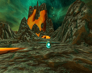
Crucible is an on-rails flyer that pits your reflexes and memory against the flora, fauna and terrain of a dying planet. Face a crumbling canyon, murky subterranean life and and spewing volcano armed only with an unreliable mining ship and sonic charges.
Play the game here: https://stefanmcninch.itch.io/crucible
Watch the trailer here:
Crucible is my first independent game under my own label, ILL LUSORY Games. I am an aspiring narrative designer and indie game developer. View the game's development journal at www.StefanMcNinch.com/illlusory or visit my full portfolio of writing and design content at www.StefanMcNinch.com.


