BOIN BOIN!
St0rmbringer
Creator of
Recent community posts
Awesome feedback mate, much appreciated. As a not very avid shmup player, reading this was very helpful.
Ideally I'll set up a way to configure controls for both controllers and remapping keys, but the most difficult to get right surely is the gameplay loop. Thanks again Henry and best of luck during conscription!
Oh fug, I think you're right, but I'm having a hard time replicating. Either way, I noticed the fullscreen bug.
I'll put up something to skip dialog in the future. I might need to set some insights to see where people die the most.
Heavy shot is supposed to be good for dealing single target damage but slow and hard to aim. I think you're playing the best!
Overall excellent feedback and I agree with you on many points. I'll make sure to write them down :)
Cheers and thanks for playing!
>Please tell me the difference between Normal and Hardcore mode.
There is none for now, but it might help as a placebo :^)
>At least at some placeholder music. It feels very empty without.
Yeah, there's a lot of places where we still don't have jingles. Are you referring to one specifically? I also have a hard time finding music to fit in but surely we'll get those in.
>After pressing sortie you can still move around in the menu for a bit, which feels a bit jarring.
Oh fug, you're right
>The challenge mission feels a bit weird since your movement is quite janky, you can only move up or down a fixed amount even with shift pressed.
I see, I probably need to adjust movement a bit. Angel moves too fast right now per single press.\
>Q doesn't kill bunkers, this got me killed.
kek
Appreciate a lot the feedback, madodev! I'll write down most of these since there's some actionable items I gotta get sorted asap.
Cheers and thanks again for playing!
Had a lot of fun with this one! It shows the skills you've acquired from using Unity and doing a new project. The visual effects are really good and the gameplay feels nice. Since this genre of gameplay is very formulaic, I don't have other input other than my final score.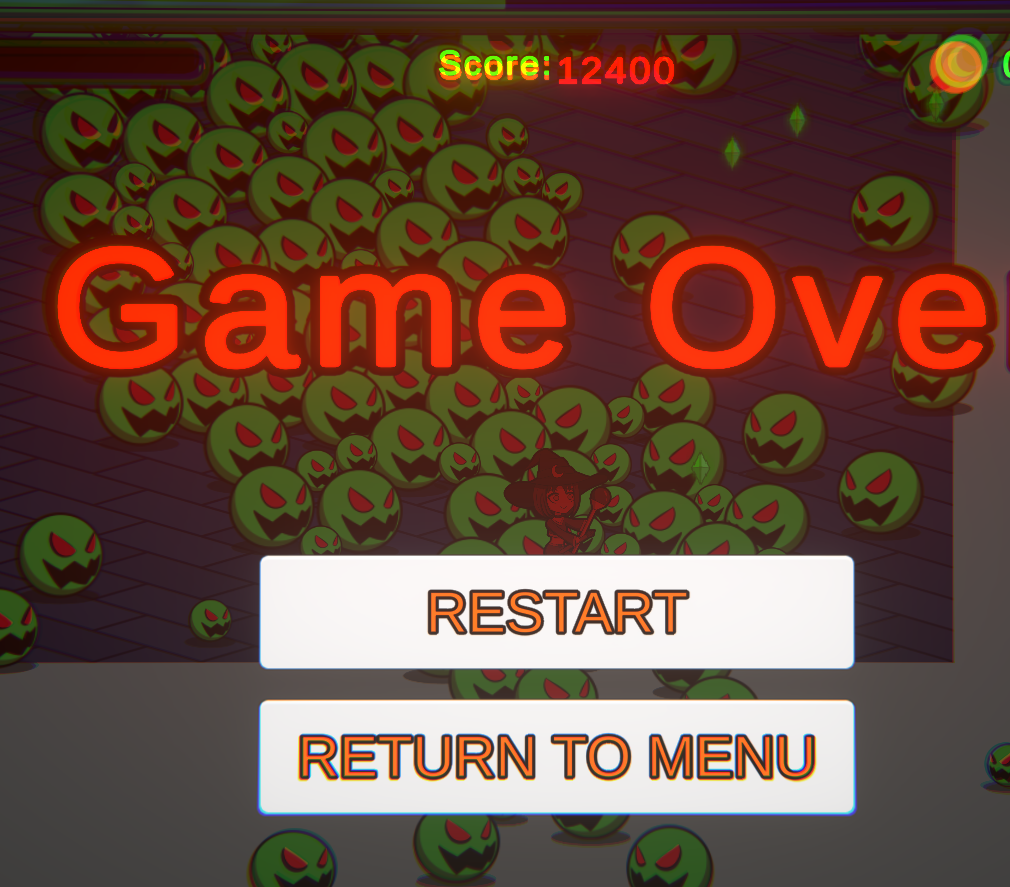
I must only complain that the breast sizes in this demo were lacking. Other than that, 9/10
GIGA based WebCough as usual.
I really felt that "NO!!" when you died to the rival on your first attempt. This is all great feedback and I'll make sure to add some of the stuff you point out in the video. I'm really glad you enjoyed the demo so far. I'll be checking Goblin Resort on the weekend and hopefully make a recording like last time :D
Cheers!
Hey! Thanks a lot for the feedback, there's some stuff I'm going to write down and implement for sure.
You're right about the slow motion. In this case, I actually increase Angel's movement speed while in slowed time, so she moves almost like normal speed. I'm gonna add the option to always show the hitbox and experiment with slower moving speed.
Just one question, did you try the most recent build? and if so, was it Linux? I thought I had already patched the stuck bug :^(
Seeing some new stuff which is pretty neato! I like playing for a bit but I often get lost in just punching hoes all over the place.
I think that there's some issues with the main player controller, most notably the animator that handles movement which often results in the MC doing some really strange walking/stride interpolations. I'm unsure how 3D works at all, but I'm sure you've got plans to revamp the controller in the future. Other than that, solid progress and looking forward to another release :)
I think this is an interesting idea and there seems to be a lot of information already fleshed out in terms of characters and worldbuilding which is great! but I have to be sincere with you and say that both the UI and the sprites ingame are a bit lacking to the point where it might hurt the game and it's playability.
Regarding the game mechanics, I found it to be a bit tedious to get the companion to behave like I wanted and often I felt like I was battling against the controls to get the desired outcome. Companion games are usually a hit or miss and I think that there's still some room for improvement in the companion behavior.
Keep up deving!
Played till the end I think. Good stuff all over the place.
I think you've got some beautiful UI here and the game is very well orchestrated in holding your hand through the initial setup and controls while also not feeling too rigid. The controls were sweet and the animations are all great. I think you're using shaders very well and you should keep it up!
The only thing I didn't particularly enjoy was the sound effect for the initial intercomm messages which sounded a bit blunt imo ( also some sounds can be a bit too loud, but I think that's Unity )
Great game!
That was a refreshing game experience! I enjoyed the demo so far. Before I realized it, I had spent more than an hour on this demo.
There's a few things that I'd point out as feedback:
- I got soft locked while talking to the father in the screenshot below. I saved before doing the dialog where the Billy rests.
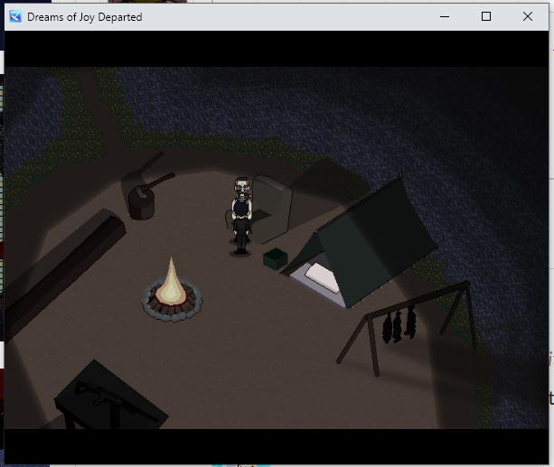
- The movement feels good, but for some reason I have issues entering and exiting areas. This happened to me the most while on the Bone Field and moving towards the swirling tree. I will exit bone field, but any movement after leaving will make me return to the bone field. Sometimes it won't do it and I'll be able to continue.
- It's sometimes hard to find the right square on the screen which will trigger an item pickup, so I'll find myself trying to click everywhere around the object which I think could be improved with a bigger square or some kind of highlight over objects through shaders? I'm unsure how it works behind scenes.
- The player could use a better pathfinding algorithm. I often get stuck if I don't put the cursor right exactly where I want to go instead of the player finding out where it needs to go.
- Difficulty was pretty good, not easy, not terribly hard.
- There are small spelling errors, but this is a demo so I can understand it must go proof reading first
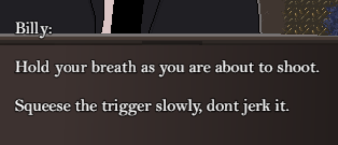
This game is really promising, keep up the good work and don't be afraid to experiment with the character art since it's still early in development. Cheers!
Thanks for playing madodev!
I saw that bug happen to me while developing and it's a dumb issue with clamping the X,Y position of the player to the bounding box for movement which I haven't ironed out. I was hoping it wasn't going to show up a lot but I think I gotta fix it ASAP.
The detention and interrogation are going to be the next things in queue for development. We plan to make it like some kind of interactive reward/progress thing. PD: Ero dungeos looks amazing.
Thanks for the review! Sadly I think that the video recording only got a black screen. I think it's because the game only runs at full screen and that might bug your recording software. Would you be able to show me the bug with the cutscene resolution? I only have a 1920x1080 screen so I'm unsure how that works in the executable.
Regarding the other points, I see a ton of possible improvements and the censored version seems like a possibility I need to consider. Thanks again for reviewing my game and I hope to see more toad poking in the future :D
This was excellent gameplay feedback and I really, really appreciate you going through the effort of finishing the bossfight. I was rooting for you to win the first time you got the rival to low health! I'll add checkpoints before bossfights and maybe put them in a different difficulty level or make them default. Either way, thanks for playing again!
PS
I owe you some goblin fanart when I go through your game. Cheers!


