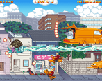
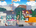
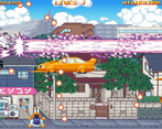
-If not fullscreen, the text on the top of the screen will overlap. Also the sound mixing is a bit off.
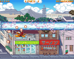
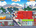
-Theme is something else, I kind of like it. Enemies seem pretty good in variety, I liked both bosses. They could stand out a bit better from the background though. I don't like how hard it is to know where my hurtbox is.
The main thing is that the enemy explosion sound is quite quiet compared to the music. Playing other shmups, I'm used to it being more punchy. And then the siren for the boss arrival was a little too loud I think. I was also under the impression that the gun fire sound was super low, but seeing other reviews I guess it isn't in yet. That should be all.
Oh, I see, thanks. In fact everything is exactly like you described, lol. Explosions and siren isn't mixed right, and there is no shooting sound indeed.
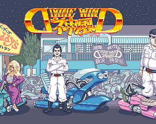
I think the logo is already close of a 10/10 with the double D play.
I think your assets could use a bit more control in the contrast department as to differentiate a bit more enemies from the background. I had a lot of fun.
The main character is very floaty with movement, all you really need to do is add a very strong de-acceleration and then it won't be floaty. Graphics are really good, needs shooting sound effects. and maybe an animation on the main sprite. The rest of it is very good. The escape key crashes the game and there is no way to continue. The UI text doesn't scale well at lower sizes when not running in full screen. It's a really good start and I hope you can make more with this.
Removed inertia in a hotfix. Shooting sound and animation is definitely planned. And escape is supposed to work this way for now, because I didn't make pause menu and it had to quit game somehow.
I played it all the way through (with continues), so that's a good sign. Like chillygamesworld mentioned, the movement seems a little slippery; if I let go of an input the player keeps moving in that direction for a moment. The player hitbox isn't obvious (at least to me). Really unique theme and I like the styling overall.
Had to playtest it again, and you're right, there's is some inertia, if your movement buttons released after being held and not tapped. Gonna fix that in next version 100%. Visible and articulate player hitbox is planned too.
It turns out that shooting frequency depends on PC specs, if that's what you're talking about. Better PC leads to more frequent shots. Definitely gonna fix it. And character sprite will be redone too, and will have animations for sure.
I wanna play more of this later because it's pretty fun and I love STGs, but I'll say right now inertia based movement really doesn't belong in shooting games like this, you need pin point accuracy in your ship movement.
You sure, you've felt inertia? Cause I deliberately didn't add any. Classic-Cave-shmup-101 and all that stuff. Is character moves too much, when you tap button lightly?
Edit: turns out there is some inertia. Will fix it for next version for sure.
Comments
Really good music and art. Just needs some powerups for combat variety. Also the sound is a little loud
Thanks for playing and thanks for streaming especially! Powerups are planned, so is sound balancing.
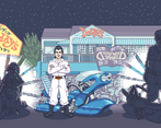
-Nice pixel art, I like the loading animation.
-If not fullscreen, the text on the top of the screen will overlap. Also the sound mixing is a bit off.
-Theme is something else, I kind of like it. Enemies seem pretty good in variety, I liked both bosses. They could stand out a bit better from the background though. I don't like how hard it is to know where my hurtbox is.
Good base of a game, keep it up.
Thanks for review!
And can you tell, what's off with the sound?
My bad, should have specified.
The main thing is that the enemy explosion sound is quite quiet compared to the music. Playing other shmups, I'm used to it being more punchy. And then the siren for the boss arrival was a little too loud I think. I was also under the impression that the gun fire sound was super low, but seeing other reviews I guess it isn't in yet. That should be all.
Oh, I see, thanks. In fact everything is exactly like you described, lol. Explosions and siren isn't mixed right, and there is no shooting sound indeed.
Superb theme! Fun looking enemies too.
I think the logo is already close of a 10/10 with the double D play.
I think your assets could use a bit more control in the contrast department as to differentiate a bit more enemies from the background. I had a lot of fun.
Overall, I wanna see moar!
Already looking for a ways to fix the background's palette. There's a chance it will see a complete rehaul.
The main character is very floaty with movement, all you really need to do is add a very strong de-acceleration and then it won't be floaty. Graphics are really good, needs shooting sound effects. and maybe an animation on the main sprite. The rest of it is very good. The escape key crashes the game and there is no way to continue. The UI text doesn't scale well at lower sizes when not running in full screen. It's a really good start and I hope you can make more with this.
Removed inertia in a hotfix. Shooting sound and animation is definitely planned. And escape is supposed to work this way for now, because I didn't make pause menu and it had to quit game somehow.
I played it all the way through (with continues), so that's a good sign. Like chillygamesworld mentioned, the movement seems a little slippery; if I let go of an input the player keeps moving in that direction for a moment. The player hitbox isn't obvious (at least to me). Really unique theme and I like the styling overall.
Had to playtest it again, and you're right, there's is some inertia, if your movement buttons released after being held and not tapped. Gonna fix that in next version 100%. Visible and articulate player hitbox is planned too.
aren't the bullets shot by the player a bit too fast? it kind of trivializes the whole thing
i liked the art, the ost etc, BUT i didn't really like the main character sprite. maybe i would have liked it better if it had some animations
It turns out that shooting frequency depends on PC specs, if that's what you're talking about. Better PC leads to more frequent shots. Definitely gonna fix it. And character sprite will be redone too, and will have animations for sure.
I wanna play more of this later because it's pretty fun and I love STGs, but I'll say right now inertia based movement really doesn't belong in shooting games like this, you need pin point accuracy in your ship movement.
You sure, you've felt inertia? Cause I deliberately didn't add any. Classic-Cave-shmup-101 and all that stuff. Is character moves too much, when you tap button lightly?
Edit: turns out there is some inertia. Will fix it for next version for sure.
Had an easier time with the second boss.
Like the designs of some of the enemies' vehicles.
Noted. Guess I'll redo second boss attacks. Thanks for review!