Indie game storeFree gamesFun gamesHorror games
Game developmentAssetsComics
SalesBundles
Jobs
TagsGame Engines
A jam submission

Air-Strip AngelView game page

An erotic shmup game
Submitted by St0rmbringer — 2 days, 9 hours before the deadline
Add to collection

Play shmup

Air-Strip Angel's itch.io page

Leave a comment

Log in with itch.io to leave a comment.

Comments

Submitted

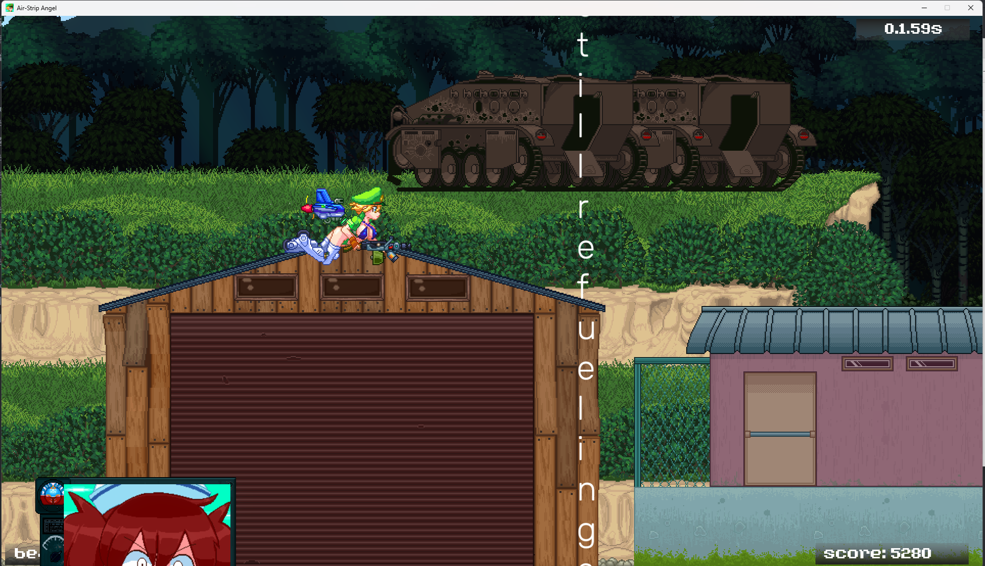
No video this time, but I wrote some bullet points and took screenshots while testing.

  • No music in the hub, but there is music in other places e.g. the shop

  • Hub still allows player input while playing animation before loading another scene e.g. You can press “Sortie”, and then quickly press “Detention”, which will first load detention and then sortie. It’s bug prone.

  • I thought clicking on Challenge #1 was just going to display a text of some bonus objectives I should do in the swamp stage, not open a different challenge stage. I guess you could call then Challenge/Bonus Stages, or add selection screen for either story stages or challenges.

  • Timer in Challenge #1 starts before “START” text shows up. Same goes for the Swamp Mission (I start with 25 seconds if I don’t skip the initial cutscene). The timer should pause when cutscenes play and it should start after countdown when player is able to move.

  • You can still shoot after dying

  • I finished Challenge #1 and it took me around 7 attempts. I was really close twice, but I died to the last moving block. I wish there was some progress bar showing how close I was.

  • The Challenge #1 made me think the time player is invincible after taking a hit is not long enough. There was even a time I accidentally got hit by the same moving block twice. Of course I could play better, but maybe at least the blocks could disappear after hitting player for the first time.

  • The audio of the character talking at the shop does not match the lip flaps. I do not expect it to be perfectly in sync, but I found it glaring when I could hear her with her mouth closed, so I thought I would mention it.

  • The chibi aesthetic found in the main menu is still my favourite. The big character avatar at the shop just does not fit in my opinion.

  • Pausing the game with ESC during the swamp stage while characters speak does not stop them from speaking their current line.

  • You need separate audio sliders for music, voices, sfx

  • The option to always display the hitbox is very useful

  • The PP was capped at 20, I never received any of my PP rewards T_T

  • I could not figure out how to get the secret database window.
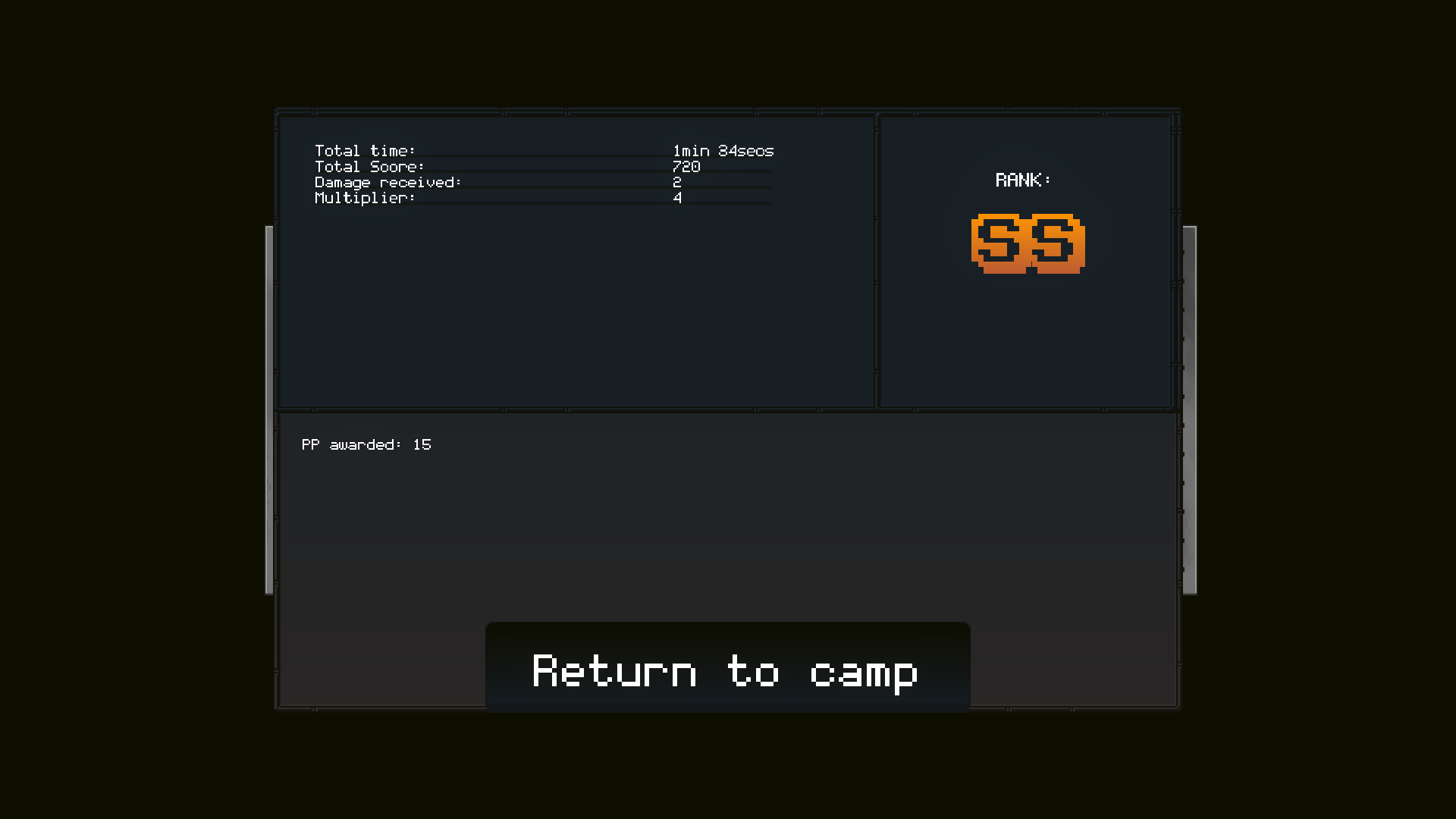

Challenge #1

It took me multiple tries, but when I got it, it was SS

Swamp Mission

I did not do it on the first try, but I am still happy

Lots of fun but web fullscreen didnt work as intended on web version. The level felt a little long to me. The art in the game was really well done and nice to look at. Also really liked the database entries, it was a nice little meta prog.

Submitted

Tried web-version and interrogation room didn't scale to fullscreen, so I've downloaded and interrogated, but just one prisoner can be interrogated. Then I was struggling with the player's hitbox and realised it's the boobs. Nice. After finishing first mission and additional mission, I've thought I can spend my hard earned PP, but somehow I had exactly zero, though I remember getting 15 for each mission.

Girl hanging from the tree is my favorite.

(2 edits)

At first I was like what is this control scheme... but then oh, right lol, nevermind. Makes sense. Still, I won't complain about it, but it made the game a bit harder since the default controls ghost on my keyboard.

I think the difficulty is alright for the kind of game it is. As a shmup player, it was pretty easy for me, but enjoyable. I like how you can switch between the weapons you've picked up whenever you want. I stuck with the default gun most of the time. I found a bit weird how the laser and that other weapon make you go slower, but I can live with it.

Is the bomb not supposed to make you invulnerable? I got hit a couple of times in the middle of it. It's a bit unintuitive considering in pretty much any shmup it's pretty much a get out of jail card.

I have some peeves about the shift/slow down button. I don't like how the slow down takes some time to start after you press the button, especially considering I was using it to micro adjust my position since the normal movement is very fast. I think you could add a dedicated focused/slow movement button separate from bullet time.

The horizontal movement rate being different from the vertical movement didn't bother me, but it's a bit odd considering this is a widescreen game.

Also, I couldn't read the tutorial properly because the hud was covering the text. I think it would be nice if you could advance the tutorial at your own pace. Same with the text in the cutscenes. I had some other minor UI glitches like different option menus overlapping each other. 

Some kind of gallery mode where you can view the sprites would be nice. The action is frantic so you can't pay too much attention to all the fantastic details and the girls while playing.

Were the voices AI? I liked how the shopkeeper talked better.

Submitted (4 edits)

Lots of cute art, but the UI's art style is all over the place, and it's what's grabbing my attention the most.

  • Escape menu has a very smooth sci-fi look (looks great, just doesn't look like anything else)
  • Loading screen + all the character art is another style
  • Main menu has a "modern indie game" look for its buttons
  • Detention has clean pixel art for the rooms and characters
  • Sortie screen has a kinda "Unity game" look to it.
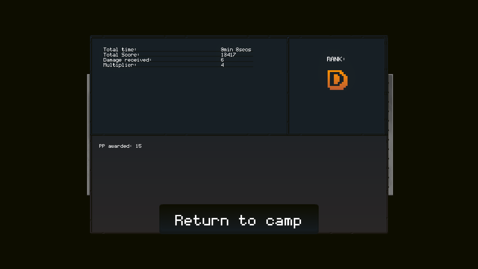
  • The mission complete screen uses a pixel font that I don't think is used anywhere else?

While having multiple styles in the same game isn't necessarily bad (and to be honest, there are very pragmatic reasons to do so), it really should be kept to 2, maybe 3, and they should all be internally consistent with each other. While I'm not a huge fan of what to me feels like clashing styles, the Celeste artist wrote a good article on the subject that I think is worth considering.

Other notes

  • I love the main menu scrolling around the base.
  • Ability to rebind controls would be nice, though I assume is planned since there's a space for it in the escape menu. I prefer to play a shmup with arrow keys and Z/X/C.
  • The actual in-stage gameplay/graphics is pretty good!
  • The (starter?) character is faster and twitchier than I was expecting. She feels like the speedier version of the main character.
  • In the cutscene with the big wooden platform, they started shooting and I got hurt before the camera scrolled back. Might have had something to do with my having paused in the middle of it?
  • If there are multiple weapons, having a faster way to get to them versus cycling between them might be useful.
  • The hitbox was kinda confusing when your "stand" is out. My brain knows it didn't change, but when I have to make intuitive split second dodges, it confused me.
  • I liked purple green boss a lot.
  • I never got any points to unlock stuff on the database (maybe I missed something) but I think that's a fun idea and love "codexes" like that. Making it unlockable also gives a fun meta-progression to the game.
Submitted

I like the new menu and the small sprites for all the characters, they are very cute.

I beat the game in hardcore mode, I don't try the normal one. It was fun. Also beat the challenge N#1 with no problems.... because I used the left stick of my gamepad which allow me to be more precise with the movements, I shoot the crates and enemies in the challenge with the spacebar.

I  also notice a bug,  I didn't gain any PP after beating the challenge, neither unlocked the other challenges. I really wanted Points to keep unlocking more of the the gallery and see what's new. Anyways, I modify the registry saveprefs to get the points and keep seeing stuff.

I was shocked when I unlocked everything and my favorite image (the one of the shopkeeper with ammo bra ) wasn't there, but I found the "secret" and found it. Nice.

I tested the SFW mode, and is impressive you modified all the sprites to have those alternative SFW animations, good job.

I really like this game, and wish you success in the future.


Submitted

I haven't checked out the game since DD52, so you'll have to forgive me if any of this is old news.

The browser version is new, isn't it? I tried it out and it worked just fine from what I can tell, although the "exit to desktop" options should probably be removed for it. Should be pretty simple to just disable the buttons when you build for WebGL.

I like the blips and bloops of the shopkeeper better for the voices than the AI stuff, but it's a little loud compared to the BGM or the other sound effects.

The new menu screen is great, but I do wish there was a zoomed-out view of the base at some point, since the camera zipping about so fast is a bit disorienting.

I could still move the view around the base after clicking "sortie" for a little bit before the loading screen showed up, which was a bit jarring since it made me wonder if the button had actually worked.

Moving on to actually trying to play the game - I'm astounded at the amount of sprites you've had to modify to add a nipple-free version. Hats off to you.

The addition of a non-hardcore mode for shitters like myself is also much appreciated.

The Heavy shot seems like a strict downgrade compared to any other weapon. But maybe it makes sense for people who are better at the game.


Overall, much smoother and more polished experience playing than I remember. Good damn job mate, keep it up.

Developer

Don't worry, there's not much new stuff I'm afraid :)

I think most of your points are shared by other reviews so that means you're on the money. I'll have to double check some of the bugs and fix some small things but overall good feedback.


Thanks a lot for playing!

Some notes from my stream:

  • Goddamn movement is twitchy, why do you move up and down faster than you move left to right? And then why is this fixed when you're shooting a laser. Is this a placebo effect on my part?
  • The art is great! Very expressive, the streamer mode was nice too
  • Fun first boss! Maybe a little long but the patterns were decent
  • Ranking system could be a good substitute for 1cc given there's no lives, it also discourages credit feeding

Overall I had fun with it, I can't wait to see it expanded on more

Developer(+1)

I actually saw your stream from the shadows and I had fun looking at the gameplay! Thanks a lot for playing monkey bro :)

(+1)

Bug when opening settings, it seems multiple tabs are on top of each other.

To reproduce it I needed to toggle full screen. It also caused a second bug...

Full screen toggle seems to be reversed. on = window mode, off = full screen

Even if you turn nsfw off there's still naked boobs.

Skip button is necessary, seeing dialogue again after dying is agonizing.

Either Heavy weapon is OP or other weapons are weak. Reaching 2nd stage of the final boss took ages with other weapons, but when I got heavy weapon the boss got annihilated in like a minute.

There's no fine control. Slowing time should make movement slower.

Purple laser shot by duck-plane enemies are hard to see.

Overall very impressive.

The gameplay it pretty fun so far. I was compelled to beat the level.

Obviously the sprites are very nice. What really makes it stands out are unique small things that exist only for the sake of comedy or just looking cool like when enemy soldier hits the screen or different scenes showing the base in main menu. Stuff that's not just constantly repeating with the gameplay loop.

The voiced lines surprised me, but they are a very good addition, very fitting for this genre. This is an action game, not reading game.

Developer

Oh fug, I think you're right, but I'm having a hard time replicating. Either way, I noticed the fullscreen bug.

I'll put up something to skip dialog in the future. I might need to set some insights to see where people die the most.

Heavy shot is supposed to be good for dealing single target damage but slow and hard to aim. I think you're playing the best!


Overall excellent feedback and I agree with you on many points. I'll make sure to write them down :)


Cheers and thanks for playing!

Submitted(+1)

Played the first mission and first challenge, some thoughts:

  • Please tell me the difference between Normal and Hardcore mode.
  • At least at some placeholder music. It feels very empty without.
  • After pressing sortie you can still move around in the menu for a bit, which feels a bit jarring.
  • The challenge mission feels a bit weird since your movement is quite janky, you can only move up or down a fixed amount even with shift pressed.
  • Strange that you learn that tab switches weapons, but at the start of the first mission you only get one weapon.
  • Q doesn't kill bunkers, this got me killed.
  • Level feels pretty long, I expected it to end after the robot boss.
  • Please give me a way to skip the non-starting cutscenes.

Game feels good to play. Shmup with boobs. Nice.

Though from a dev perspective, the interrogations seem like they'll take a lot of work for something only tangentially related to the game. Same for the detention where every girl has a custom animation. It looks like there are textures for two different games in here. I'd say, just drop that part and focus on the boob infused gameplay.

Developer

>Please tell me the difference between Normal and Hardcore mode.

There is none for now, but it might help as a placebo :^)

>At least at some placeholder music. It feels very empty without.

Yeah, there's a lot of places where we still don't have jingles. Are you referring to one specifically? I also have a hard time finding music to fit in but surely we'll get those in.

>After pressing sortie you can still move around in the menu for a bit, which feels a bit jarring.

Oh fug, you're right

>The challenge mission feels a bit weird since your movement is quite janky, you can only move up or down a fixed amount even with shift pressed.

I see, I probably need to adjust movement a bit. Angel moves too fast right now per single press.\

>Q doesn't kill bunkers, this got me killed.

kek


Appreciate a lot the feedback, madodev! I'll write down most of these since there's some actionable items I gotta get sorted asap.

Cheers and thanks again for playing!

Submitted(+1)

boobs.

boobas, even.

but anyway, first time playing, beat the swamp stage. i suck at these games, but i still had a lot of fun. reminded me of metal slug, with a lot of background stuff and varied enemy animations which makes it a joy to look at things. the fact that this is nsfw on top of that guarantees you will be a very, very rich dev.

i'm sure you're aware of how good your art and animations are so i won't repeat what i'm sure many others have said. i did have some issues, namely three:


i switched to windowed mode because it fullscreened on my second (non main) monitor. i think doing this messed up the textbox - since this is what i got. the screenshot isn't cropped, this is how the game looked. all textboxes looked like this. restarting the game keeps this issue. i then reverted to fullscreen, and still had this issue - so i don't know if undoing fullscreen broke something, or if this is how things look in this build? no clue.

second issue: the second bossfight, with the mechsuit lady. on her second phase, she spams a lot of green orbs as the background turns black. these orbs then flicker, which i guarantee will give some players a headache, too many pulsating objects at a time. perhaps this can be changed to be a flat color, or just to reduce the strength of the pulses. it was uncomfortable for my weak eyes.

issue number three: boobs too small

the interrogation room i assumed is just lewd fanservice so i didn't bother digging too deep into it, since i don't really play NSFW games (you're the first one i ever played, well done!)

keep up the good work and remember us once you're rich.

Developer(+1)

Hey, thanks a lot for giving the game a try! I hope you're right with the sales too :^)

I think I might have fixed the dialog issue thanks solely to your post!  I'll put those other fixes on the queue and try to get em ironed out.

Cheers m8

Submitted(+1)

i have seen your game posted semi often on /v/, and every time everyone is excited to play it and asks for the source.

guaranteed success, the effort you put in the sprites and animations is insane

the volume of the voices is too low though, i can't hear them

Developer

Maximum shilling achieved. Thanks a lot for playing :)

I'll check on the voices since we might just scrap them alltogether and make generic chirping sounds. Cheers!