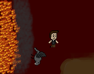
Very interesting concept. The atmosphere was something special that's for sure. Wouldn't mind seeing an online version of this. Feels like it could either be a mini game in a collection or fleshed out into a fun mini project.
VideoGamester
Creator of
Recent community posts
Visually a pretty awesome aesthetic. Had some old school vibes gameplay wise. It did feel like my toolset was a bit too limited at the start. Made it feel more like luck than skill when it came to avoiding attacks. Often the enemies were just right on top of me or my dash was still on recharge so I had little choice when it came to damage.
Base concept is interesting. Seen a few build your die games in the past but they were always turned based so it was novel to see it applied elsewhere. The die faces pricing felt a bit limiting. I think a rebalance around that would do wonders. Elemental die faces have potential if switching the die I'm using on the fly. I think changing it so the die face facing the player is the damage would make the dice feel more intuitive for how much damage I just rolled. And making everything faster pace. You have the beginnings of what could be interesting Metroidvania material.
The movement felt really good. Was interesting trying to get everything lined up. Got just over a thousand points so I wouldn't claim to be super skilled at it but I had fun trying to figure out movement algorithms similar to like a Rubix cube to control what number to land on. Surprising amount of depth. Would be interesting to see some random additional challenges added to the board on occasion like no go areas or bombs or something. To change up the flow. Overall a solid entry.
The puzzles had a lot of depth to them for a jam game. It had some interesting mechanics that took me a bit to master. Had to change up the way I was thinking a few times which is always good in a puzzle game. The only thing I really felt was missing was like an undo button. There were a few times I had to reset semi-complicated sets of movement just to undo a single bad move which was a bit frustrating at times with the larger puzzles. Overall one of the better titles I've tried so great job!
Always a fan of the on-stage theming. Good design choices for the main character. I think the battle system suffered a bit for the theme. Not a bad system but if you decide to move forward I think that it could be tweaked a bit to make something really special. Plus any spiritual descendent of a Paper Mario title has my full support.
I had some fun with the base concept. I knew I was over scoped from the start but I just couldn't pull myself away from the core use of the theme after it occurred to me. Honestly got a lot more done than I initially thought I would. Not my strongest Game Jam entry but I had fun.
I've considered taking the concept a bit further. I think it has a solid core that could be interesting. But I also have a team project going right now so it might be some time before I ever get a chance to analyze what parts to keep or discard.
Thanks for Playing!
Love the art and music with this concept. All works together well. The actual rythm part of the UI with the buttons was well designed. Rough part is its easy to miss the rest of what's happening as I laser focus in on it. That is of course not the fault of the game and isn't meant in a negative way. Just took a minute afterward to take in more of what was happening and realized I missed a decent amount of cool environment and some UI on the side informing me of the current ugrades/downgrades.
From a feedback standpoint I have to agree with the issue of flow. The base concept of an upgrade and a downgrade is super cool. It generally works well so if you can figure out a way to present it that doesn't interrupt flow you have a great formula going.
Conceptually awesome. Been a while since I've played a tower climb game. The use of theme is interesting. The use of dice as the tower looks awesome. Being able to use the walls as platforms by breaking them was something I've never seen before and had some interesting applications.
Best feedback I can give is it feels a bit punishing even for a tower climber. The standing jump is just short of being reliable to go up levels. And if you get a platform of ones with 4s or higher above the floor disappears so quickly that it feels impossible most of the time. The keys and locks seem to be an answer to that problem but they are often to hard to reliably collect and when paired with the short jump height and a narrow opening its hard to feel like a justifiable loss, which for this genre is a key component.
Always nice to see other Gamemaker projects in these. Overall, a lot of good work. You have a solid concept and generally executed it well.
I'm going to start off with something it seems some disagree with. I actually think the slidy feel adds to the game. It takes a second to get used too but I think its not a bad fit. The levels are challenging which is something I personally like. I tend to make my games on the tougher side as I enjoy a challenge.
The best feedback I can give would be from a design perspective. The concept of rolling a D4 for powers is an interesting one. However the levels are designed in such a way that it often feels you need a utility power but makes it difficult to move from utility to combat. I think separate dice for utility and combat would help the players feel less like they are just sitting rolling for the right element. It also would let the players flow through the combat and movement. A smooth flow with the type of movement you went with would be an awesome feel, Think more Sonic than Mario.
I mean its far from a fatal flaw, especially with a jam game. I still had a good time for sure. I mostly give feedback with the intention of ideas moving forward post-jam. Even if its not this specific game. And I don't want anyone to take it as commandment or something. My entry is far too flawed for that kind of attitude. lol.
Always feel like honest feedback on general concepts rather than the game are more useful. Mechanical ideas more than just "Ther is bug" or "Art Bad" which I know I'm going to get plenty of.
Strong on the graphics presentation. The art and game feel all felt very polished. The swing especially felt satisfying. Sound effects were all good choices but the balancing felt a bit off. The mechanics were well presented and quick to understand with what felt like the right amount of variety of targets to make it challenging. Well done
As a die hard (lol) Artificer main the title definitely caught my eye. I think the base concept here has potential. I think the beginning of the game can feel a bit too rng reliant. There is some basic strategy of course but it would be nice to feel a little more control at the start. Little frustrating to lose multiple early game battles just because the dice feel like they can't roll above a three. But that is one of the banes of game dev. Actual odds never feel accurate. The characters are fun and the die animation in battle has a nice feel to it. Plus a functioning menu with settings. I rarely even get close to getting comfortable enough with my games to put time into but its a big part of feeling polished.
Love the paper presentation. Reading the descriptions of the monsters was interesting as well. As a fan of Modron I'm happy to see them just about anywhere. lol. The planning ahead based on monsters you've seen in the past is also an interesting bit of extra strategy if you have the dice for it.
The two bits of feedback from my experience. The dice are hard to read and I basically always have to hover which feels like a waste of time. The second is the chests. They don't feel super impactful. I missed what I got from them half the time or just got nothing at all. A bit of flare and feedback could go a long way for the loots game feel.
Overall, a solid jam game. Feels well polished, something I know I always fall short of on my own jam games. Good scope and incorporates the theme well in an interesting mechanical way.
There are 8-10 frames of coyote time depending on the character which is a bit more forgiving then the standard 6 frames. What was happening in game when the sfx made the odd noise? Could it be the explosion from the barrel or tnt? It may be mixed a bit too loud, my speakers suck. Opinion on the Match noted.


