Play game
Metal Lance's itch.io pageResults
| Criteria | Rank | Score* | Raw Score |
| Music | #1 | 4.500 | 4.500 |
| Gameplay | #12 | 3.929 | 3.929 |
| Art | #16 | 4.000 | 4.000 |
| Overall | #23 | 3.821 | 3.821 |
| Is the graphics 1 bit? | #35 | 4.857 | 4.857 |
| Originality | #70 | 3.000 | 3.000 |
| Theme | #75 | 2.643 | 2.643 |
Ranked from 14 ratings. Score is adjusted from raw score by the median number of ratings per game in the jam.
Please enter your nicknames in discord and the nicknames of your teammates.
matte_made, nicolestarlight
Leave a comment
Log in with itch.io to leave a comment.




Comments
This was a fun Gradius clone. I wasn't able to finish the whole thing and due to getting my butt stomped for the first few tries, but managed to get to the second boss. I enjoyed the opening cutscene and the art had charm despite being simple. The music was awesome. Would have liked to see maybe a more unique spin on the transformation aspect, but this was really well made. Good job!
Thanks for giving it a go!
Originally I was thinking to make a mix of a classic scrolling shooter (Life Force -esque, so such Gradius) with a classic beat 'em up (Double Dragon -ish) with a robot transforming between them, but in the end of the day I had too much fun designing the shooter.
The second boss is the most difficult part, and with so many people struggling I wish to make the easy mode a bit easier to discover (you can only see it if you lose at least two times on the same level). That is a very good lesson for me to learn!
I really enjoyed playing, its deffinetly an issue how out of hands things get if you lose a life, since you get back to normal attack no power lol, other than aknowledging that snowball effect, awesome! keep at it
Yeah, I tried to convey the importance of evasion through gameplay, but looks like I was overdoing it.
Sorry for that, and thank you for playing!
I really enjoyed playing, its deffinetly an issue how out of hands things get if you lose a life, since you get back to normal attack no power lol, other than aknowledging that snowball effect, awesome! keep at it
The artwork of this game is insane! From the artwork to the huge amount of enemy attacks and player upgrades to even having an easy mode for people struggling, I can tell you put a lot of effort into this game... And it paid off! I enjoyed this game thoroughly, It was difficult but satisfying. I think that the double-shot ship with max power is the most OP one, so it felt a bit like a downgrade moving to increase ship size to shoot more bullets at a time. Having played the game when you first released it on itch.io a few days into development, I can see you hugely improved the feel and story of the game; I liked the start that showed off the storyline :). Overall this is a fantastic game with insanely good and unique graphics for a 1-bit style and I am extremely impressed!
Thank you, ForkNSpoon!
I tried to keep it as close to a classic scrolling shooter formula as possible, just to experiment with the game mechanics I had never done before, so the version you've seen back then could have been not very far from the final version (since it conveyed pretty much everything I wanted initially). But having such a great composer on my side made me to put more effort into other aspects.
I'm supper happy that you liked our game!
The artwork and audio really stand out to me. I like how you did more with less in that regard. The background was drawn very nicely for a 1-bit requirement.
Thank you for playing!
Hehe, the background, in fact, consisted of a colorful images. I just had to play some graphics tricks to restrict it into 1-bit, but it accidentally helped to make it look really cool.
This game reminded me of eliminate down for sega genesis. good submission. Thank you for the work you have done
Thanks for such a comparison!
Yo matte and nicole! This was so fun! I loved this noisy half tone effect you're using. It gave something really interesting and unique to the 1bit aesthetic. The music is also so good and fits great with the game. And the final boss was so cool!
Keep up the great work, you all!
Thanks!
That simple noisy shader effect was just a safety measure for me not to stray too far from the 1-bit constraint, but in the end it worked surprisingly well to define the game style.
I'll coment here as well haha, pretty good game i liked it a lot. At first i saw the cinematics and thought mm this will have regular visuals probably but then the game started and damnn it looked fantastic. I would like to make it in the normal way but even the easy way was fun, i was kinda op but it felt great. I liked how the enemies were made as well, kinda like old and modern school. About the music, wonderful, perfefct. The composer made a good work showing how expresive the 8 bit style can be, i liked that every level had their own music and how well accompanies the action of the game. Great work everyone!
Thanks for giving it a go (and for giving two reviews, lol)!
Re: music, I totally agree. Nicole's music had defined a lot of aspect of the final game. Initially I thought just to add some background ambient after the game is ready, but hearing the first level tune made me to build everything around it.
Commercial level old school horizontal shooter! The power-up system reminds me of an old Amiga classic "Project X"! Absolutely impressive!
Thanks, I hope you enjoyed it!
Yeah, I was trying to add more different weapons, like in Project X or Contra, but at some point adding any new feature started to break half of the game ¯\_(ツ)_/¯
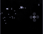
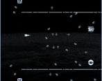
This is honestly a really fun and nice game! I love the idea of powering up and getting more powerful as you kill enemies. The fact at you used WORDS as representations on which bar is which and the highlighted letters as charges is honestly genius. The music and sound design is also really good! And I was shocked at the fact you managed to add bosses and a starting cutscene to this game! The usage of the 1bit style here is insane as well! I love the static noise looking backgrounds and objects, you very much achieved a very unique 1bit style here and its quite impressive.
I only have 2 complaints, in all honesty.
First is that the margin for error is incredibly tight. Losing EVERYTHING when you lose a life makes it hard to recover afterwards. Theres no way to regain health, and health doesnt regen after stages, so you basically have to no hit the entire game if you wanna reach the end. I got up to stage 2 before I decided to move on because i kept losing lives and then being unable to recover. decreasing power instead of resetting it wouldve been nice, and adding the ability to gain lives back would have been nice too.
Second is very minor but I dont think the tutorial does a very good job of explaining everything. The way POWER works is completely unmentioned in the tutorial and I was super confused on what it meant when playing for the first time, though I did quickly figure it out after noticing my firerate speeding up. Maybe upgrades could have had an explanation too? But I think upgrades are simple and easily obvious enough to figure out what they do immediately upon collecting them.
Again, this is an insane amount of quality for a jam game, would totally play this in my free time if it recieved some rebalancing and was made a little less frustrating.
Thank you for such a detailed review, I really appreciate that!
I tend to believe in people intelligence, so tutorial only explains two not-so-obvious yet fundamental mechanics. For me it's more fun to figure things out rather than get all the explanations.
But you have a good points that tutorial does not properly convey the importance of moving slowly, and that punishment is always much greater than any of the rewards. Sorry for making your experience that frustrating! Maybe it would be better to put "easy mode" option right in the main menu rather than on continue screen after the second game over.
the techniques to keep it to 2 colors are incredibly impressive and creative, the music and sound design is also really good, and it feels super fun to play. only thing i would change is having the lance recharge over time or something because it's super fun to use and gives the player a great option in a tight spot. allowing the lance to go backwards would also help with this utility-usage idea. i really like this one!
Having a backward lance is a great idea! I never though of that, and that feature could nicely work together with auto-recharge, if balanced properly.
In my mind, Lance supposed to be a scarce resource that drives the risky exploration to get more of that stuff. Probably I should have done that exploration less punishing.